Variety Magazine
Awards Roundup
Marcus King
Netflix’s The Sea Beast
Balvenie Flavors Campaign
Stella Artois
Photographer Nick Meek was commissioned by Mother London to shoot the latest Stella Artois campaign in Mallorca, Spain.
CREDITS Agency: Mother London Creatives: Oli Rimoldi & Anthony Montague Print Producer: Hannah Tozer Project Director: Andy Redpath Account Executive: Anne-Ca Greatti
Mini Golf at Canary Wharf, London
Illustration and installation visionaries Craig & Karl were commissioned by Canary Wharf in London to design a mini-golf course in the Craig & Karl image. The brightly patterned course transformed Montgomery Square with vibrant colors and fun geometric shapes.
The course includes joyful novelty features with a design oriented approach making it a truly one-of-a-kind experience. As Karl says: “The element of surprise is one of things we love about creating work for public spaces – encountering something in an unexpected context can make it quite powerful.”
The 9-hole course is free and open every day throughout the summer from 12-6pm.
Installation by White Wall Co. Photography by Sean Pollock.
Hermès
Director, animator, and illustrator Danaé Gosset was commissioned by Hèrmes to direct their Spring/ Summer 2022 campaign alongside Santiago Carrasquilla. The campaign consists of three imaginative scenes created in Danaé’s hand drawn mixed media style, showcasing signature fashion accessories for the upcoming season.
CREDITS: Made at Art Camp with Pencil Directed by Santiago Carrasquilla and Danae Gosset Art Directed by Danae Gosset and Santiago Carrasquilla 3D Lead: Vasco Gross 3D Design and Animation: Vasco Gross, Jean-Baptiste Castel 3D Modeler: David Bonilla Additional 3D Design and Art Direction: Steven Guas 2D Lead: Aliénor Delaporte 2D Design and Animation: Aliénor Delaporte, Britton, Lea Becquet Post Production Assistant: Kyle Music by Timotée Pedron-Desclaux Executive Producers Jos Diaz Contreras & Santiago Carrasquilla
Océano, Marea, & Azul
Sawdust, the UK based digital design studio, launched a new motion series inspired by ocean life and it’s various textures, colors, and patterns. The trio explores rippling and growing-like movements through light, sound, and motion that ebb and flow both optically and sonically. It’s an expression of the splendor of life in full bloom and the inevitable receding that follows.
The work is currently on display at the port of Puerto Banús, Spain, as part of a mural art installation created by Debbie Wingham.
The artwork is also available as an NFT through @knownorigin.io
https://vimeo.com/715722516
https://vimeo.com/715722274
https://vimeo.com/715722019
New Artist
‘Unreliable Memories’
Nick Meek’s personal photography book, Unreliable Memories, has just been selected as one of the best photography books of the year by Photo España. The book is described as Nick’s ‘visual mythology of America’s pasts and futures.’
More below:
For British photographer Nick Meek, growing up in the North of England and raised on Hollywood movies and TV shows, the American West always seemed a terrain full of golden prospect and possibility. In this luscious photographic portrait, the country’s highways, motels, national parks, movie theaters, road signs, airports, waterfalls and beaches appear at once romantic and eerie, optimistic and ironic, hazy and hyperreal, soaked in emotion and overtly artificial.
Here, in washed-out, almost painterly Kodachrome oranges, yellows and pale blues, Meek constructs a Hollywood-style nostalgia, subtly exaggerating the photographic style and iconography that typically accompany such portrayals of the West, while nonetheless ingeniously accessing their emotional pull.
The process of remembering entails a certain amount of forgetting. In these photos, Meek mines this gap, creating space for scenes and meanings that might never have really been there. This is Meek’s debut monograph, compiling a selection from his acclaimed series, created between 2002 and 2017.
Thai Desserts
Illustrator Pomme Chan’s latest self initiated series is called Thai Desserts. The work was inspired by the graphic patterns and bold colorways of the 1980s and 90s and is a bold move away from the traditionally hand-drawn feminine pieces Pomme is known for.
Thai Desserts was created while Pomme was on a 12 hour flight from Bangkok to London and goes to show how dedicated she is to constantly exploring new styles and mediums to add to her extensive portfolio.
Open Up
Paper craft artist Owen Gildersleeve was commissioned by Meta Open Arts to create their new Mental Health Awareness Week campaign: Open Up
“To commemorate Mental Health Awareness Week, Open Arts commissioned British cut-paper artist Owen Gildersleeve to reimagine how we understand and talk about mental health. Owen’s delicate and meticulously constructed paper illustrations take a gentle and empathetic perspective toward the often-invisible struggles that affect our mental health. These 6 illustrations are centered around various themes, including Talk About It, Switching Off, Telling My Story, The Path Twists and Turns, Neurodiversity and Metamorphosis. Each of these represent small, simple actions we can each take to build resilience and eliminate the shame and stigma often associated with mental health struggles.” – META Open Arts
https://vimeo.com/708380485
https://vimeo.com/708380887
https://vimeo.com/708380750
https://vimeo.com/708380204
https://vimeo.com/708380373
https://vimeo.com/708380248
Backstage at Love Rocks
Photographer Danny Clinch returned to the Love Rocks concert this year with his backstage setup, photographing much of the talent that performed at the annual event.
Love Rocks NYC is a marquee annual music event that raises money and unites new and existing supporters for God’s Love We Deliver. The concert, which has become one of the premiere benefit concerts in the country, is known for hosting riveting performances, and unique artist collaborations from many of the world’s most talented and revered artists. Each year, on the stage at the historic Beacon Theatre, artists, actors and the audience are brought together for one common goal: to help feed New Yorkers who are too sick to cook or shop for themselves, and do it through the healing power of live music!
All proceeds from Love Rocks NYC benefit God’s Love We Deliver.
The Wonderers
Photographer Nick Meek’s series The Wonderers recently became a finalist in the AOP awards, have been selected for the judges gallery in the Lens Cultural critics choice award, and will also be exhibited at Paris Photo on the Momentum Fine Art stand.
The series was created in Lac Blanc, Chamonix at the height of summer tourism. Nick documented the visitors’ social distancing efforts and how, despite being on a sprawling mountain range, everyone gathered in the same places.
Zurpa Durpa Installation
The creative power duo Brosmind were commissioned by Westfield Glòries shopping center in Barcelona to create an installation at one of their properties. As they do with most briefs, the Bros developed a narrative in which their studio unicorn is a god in a Brosmind universe called Zurpa Durpa. The inhabitants of Zurpa Durpa make offerings to their god, as shown in the other window displays, to be later enjoyed by all in paradise.
The installation gives shoppers a fun respite from traditional window displays, introducing them to the Brosmind universe while engaging their imagination.
Come into the Garden, Observer Magazine Cover
Paper craft illustrator Owen Gildersleeve was commissioned by The Guardians’ Observer Magazine to create the cover for their latest Spring Garden issue. The handcrafted paper cut cover was released just in time for Easter.
https://vimeo.com/704677274
Regina Hall for People Magazine
Photographer Sophy Holland was commissioned by People Magazine to shoot comedian and actress Regina Hall for their 2022 Beautiful People issue. Sophy photographed Regina with the members of Gotham Roller Derby at their location in Brooklyn, where Regina went on to do some skating with the team. In her interview, Regina also shares why humor is incredible, how staying active has brought her joy, and what beauty means to her.
Blooming Summer Installations
Illustrator Pomme Chan was commissioned to create patterns, animations, and other illustrated assets to be used in signage, decor, and installations at all Central Department Store malls in Thailand. Aptly titled Blooming Summer, the artwork created by Pomme and her team, Happy People Studio, beckons shoppers to embrace Spring and experience the whimsicality of Pomme’s joyous world.
https://vimeo.com/703049831
https://vimeo.com/703049787
https://vimeo.com/703049761
https://vimeo.com/703049728
Neo Deluxe Genesis
Motion design studio Pleid St. has just launched their first NFT collection: Neo Deluxe Genesis, or NEO DLX.
NEO DLX is a synthetic brand built in and for the metaverse. The 5 characters’ computer-generated imagery is at the intersection of synthetics and reality, combining a mix of visuals into a contemporary aesthetics, all inspired by nature, culture, music, tech, and more.
Meet the NEO DLX characters on the metaverse catwalk below:
https://vimeo.com/703050438
https://vimeo.com/703050366
https://vimeo.com/703050661
https://vimeo.com/703050514
https://vimeo.com/703050598
The collection is available now on Nifty Gateway.
Shoutout to the dream team: Juanma Mota, Noemí Alvarez, Alvaro Polo, and Gonzalo @gonzosw
Icons
Illustrator Daniel Ramirez Perez just updated his icon portfolio with a variety of new designs spanning sports, food, leisure, communications, and wellness. Enjoy!
Shelter
Sean Freeman and Eve Steben of There Is Studio were commissioned by Superunion to create a font, a collection of graphics, and the roof logo mark for Shelter, a charity fighting for housing rights.
The red painted stroke treatment was designed as an urgent symbol for positive change – proud, purposeful, provocative, powerful, and inspired by the language of protest. Paired with black & white visuals, it’s used as strong graphic statement making interventions, highlighting issues, or taking a stance. It’s a representation of the charity’s role in making a difference to people who need them most.
The uppercase brush font Sean & Eve developed is called ‘Activist’ and is based on Barlow Condensed. Each item was hand painted, photographed, then digitized by the team – full of beautiful and dynamic details. The set is comprised of 109 characters with built-in contextual alternatives in a true type font format, with 10k vector points per to preserve the integrity of the physical brush stroke, thus providing an incredible level of detail.
https://vimeo.com/700974667
Target Mural
Illustration duo Craig & Karl were commissioned by Target to design a large scale mosaic mural at their Times Square NYC flagship store.
I Love My Nails
Illustrator and animator Yuval Haker was commissioned by Israeli singer/ songwriter Netta to direct her latest lyric video for ‘I Love My Nails’. The video follows Netta’s lyrics on an exciting journey expressing how much she loves her nails, no matter what.
https://vimeo.com/697043929
SenseArt Installation
Illustrator Daniel Ramirez Perez was commissioned by SENSEART, an art installation agency working with international artists on commercial projects in the Chinese market, to help them develop their newest project. Daniel worked with their team to create a larger than life Spring themed installation at the Suzhou Joy Breeze mall. The installation was inspired by one Daniel’s recent personal works, inviting dreamers from all over the bustling city ofXiangcheng to embrace a colorful life this new season.
TDC68 Winners!
Congratulations to Sean Freeman & Eve Steben of There Is Studio and 360i for winning the TDC Advertising Award for typographic excellence! The TDC awards recognize typographic excellence and innovation along with the art and craft of design with a focus on how letterforms are drawn.
About the winning work: Built to Host was created for the New Orleans Tourism Board with the idea to incorporate their message ‘Built to Host’ into iconic NOLA elements, like their famed jazz heritage.
“We created this dimensional lettering within a tuba’s real-life intricate composition, as part of a New Orleans Tourism campaign, building messaging into iconic Nola elements with hints of hospitality and contextual headline embedded into inviting photographic scenes – here representing the historical jazz scene of the vibrant city. The typography was crafted as a 3-dimensional object based on the actual anatomy of this classic Nola instrument – using photogrammetry, realistic details and textures. Bending and connecting pipes and keys in the inner section of the original tuba to design the headline, we aimed to create a legible, believable photorealistic digital object, composited to be visually seamlessly held by a musician.” – There Is Studio
https://vimeo.com/637184409
The Art of Wonder
Illustrator Pomme Chan was commissioned by the Thailand Biennale, Korat, to create a permanent installation at their local zoo. Her piece, titled The Art of Wonder, is presented on ceramic tiles and was inspired by the historic biodiversity on the Khorat Plateau, tracing the natural history of the area back to prehistoric times and reimagining the prehistoric four-trunked elephants that once roamed the area. The work also includes another layer of Augmented Reality so viewers can also experience the work as a living scene.
https://vimeo.com/691925847
https://vimeo.com/691925814
https://vimeo.com/691925775
Calibre Magazine
Photographer James Day was commissioned to shoot a collection of watches for Calibre Magazine, the official magazine from The Watches of Switzerland Group. The results are a series of stills and motion clips featuring expertly lit luxury watches.
https://vimeo.com/691902291
https://vimeo.com/691902345
Lovers
Illustrator Pomme Chan began a new NFT series is about lovers and the space they share. Pomme took inspiration from her own marriage, the peaceful moments she shares with her partner watching their coi fish grow, and how they cherish those quiet shared moments.
https://vimeo.com/689837623
https://vimeo.com/689837648
Trey Anastasio
Photographer Danny Clinch was commissioned by Red Light Management to shoot Trey Anastasio’s first-ever solo acoustic album cover: Mercy. The album is available now on all digital platforms.
https://vimeo.com/689831175
Current, The New Way to Money
Photographer and director Kelsey McClellan was commissioned by Current, the mobile banking fintech, to create the visuals behind their latest digital campaign: The New Way to Money. Kelsey worked closely with prop stylist Pakayla Rae to create dynamic sets and scenarios, including a custom built ATM. The results are a vibrant library of assets that match Curren’t brand colors.
https://vimeo.com/686576540
Production: Crucial Creative Set and Prop Styling: Pakayla Rae DP: Rory Brennan, 1st AC: Jerome Stolly Digital: Alexey Gulenko Gaffer: alan steinheimer Wardrobe Styling: Lionel Dulce HMU: Diane C. Beauty, Manicurist: Lavinia Turner Custom ATM Build: Jason M. Retouching: Zach Vitale Models: Madison Mendez, Kayla Dickson, Delano Bannister, & Jake Ashton
ADC Creativity 101 Poster
Illustrator Armando Veve was commissioned by The Art Director’s Club to create a poster for this year’s ADC Annual Awards, celebrating 101 years of excellence in design and craft. This iconic design and advertising awards show honors the best creative talent and groundbreaking work across many different creative disciplines, from graphic design to illustration, from publishing to packaging, from advertising to photography and all points in between.
For his poster, Armando illustrated what he goes through when creating a new artwork:
Whether I am illustrating the fantastical or scientific, I am in the business of crafting illusions. What happens behind the curtain? For this drawing, I imagined my creative process in four distinct acts: Act I: Consumption Act II: Regurgitation Act III: Doubt and Destruction and Act IV: Regeneration.
Seasons Exhibition
Designer, typographer, and international muralist Gemma O’Brien has a new show titled Seasons. The solo exhibition showcases a collection of works that explore the world through sensation. In her artist statement Gemma explains:
“Seasons is a series of paintings and drawings created over the last twelve months in my studio in Sydney. With more time at home due to cancelled international projects and travel, I welcomed the chance to take in my immediate surroundings… Unlike my previous work, I became less interested in illustrating specific elements from nature and more drawn towards representing sensations of shifting light, motion and atmosphere through bright colours, repeating lines and unadorned typography. I wanted this body of work to describe a time that was defined by brilliant peaks and dark spirals but with a consistent undercurrent of optimism. I am beginning to welcome a new experience of the world through sensation, not merely language, and Seasons is a record of this time.“
Seasons is Gemma’s fourth solo show at China Heights Gallery in Sydney and will be on view until March 6.
https://vimeo.com/683032584
Gemma O’Brien Artist Talk on ‘Seasons’
Falling For You
Illustrator Pomme Chan created a new animated NFT design, Falling for You, meant to express the moment you feel butterflies in your stomach when you meet someone special. That euphoric sensation of bubbling romance that gives us hope.
Pomme worked on a 2D sketch first. She and motion designer Mac Sittiapakij later worked together to bring the piece into its final 3D form.
Falling for You became a part of Phillips Auction’s recent ‘My Kawaii Valentine’ NFT collection.
https://vimeo.com/683513671
https://vimeo.com/683513846
Vlisco Fabrics
Motion design studio Pleid was commissioned once again by Vlisco fabrics to create 6 new clips showcasing their latest unique fabric designs. Vlisco has been designing and manufacturing distinctive fabrics since 1846 and they continue to use their time-honored methods and materials today. Each of Pleid’s scenes focus on one of Vlisco’s new fabrics, bringing it alive through movement, color, and sound.
https://vimeo.com/683504431
https://vimeo.com/683504520
https://vimeo.com/683504375
https://vimeo.com/683504409
https://vimeo.com/683504489
https://vimeo.com/683504458
Alon Eder Music
Animator and Illustrator Yuval Haker was commissioned by Israeli band Alon Eder to illustrate their new album cover. Unlike their previous releases, this album, titled ‘Yes Yes Yes Yes!’, is a collection of honest lyrics, illustrating the changes the band has undergone while trying to start their own families in a turbulent Tel Aviv.
For the cover, Yuval created a modern version of the story of Noah’s Ark, but despite the apocalyptic flood scene a dove of peace is approaching. However, notice that she is really not the immaculate figure we would’ve expected.
Shamanzs
Illustration duo Brosmind have been busy designing a new universe, the Shamaverse! Shamanzs is an original collection of programmatically and randomly generated NFTs on the Ethereum blockchain. For that to work Brosmind illustrated hundreds of traits, all hand drawn, to create a vast array of high quality and unique characters.
These loving leaders are meant to be the wisest Monkzs, Sadhuzs, Godzs and Guruzs on spiritual land, hailing from different religions and backgrounds but joining forces to spread love and peace throughout the Earth.
Follow the growing Shamanzs community on Twitter @shamanzs and Instagram @shamanzsnft, and stay tuned for more!
https://vimeo.com/678862891
Sculptor’s Tongue
Photographer James Day was commissioned by Sculptor’s Tongue, a brand new small batch gin based in London, to create all the images for their recent launch. The handcrafted gin was created with a carefully selected combination of six botanicals that make for a powerful yet smooth gin.
Birds
Illustrator Ricard Jorge’s latest personal series on birds. Featuring the Hill Blue Flycatcher, Kiskadee, Blue Jay, and a Hooded Oriole. Can you guess which is which?
Geometric Patternation
Paper craft illustration specailist Owen Gildersleeve created a fun animation color loop, using one of his original handcrafted papercut designs.
Gentle Woman Sweet & Sour Collection
Illustrator Pomme Chan was approached by fashion brand Gentle Woman to partner with them on a new capsule collection: Sweet & Sour. For the collection, Pomme and her team, Happy People Studio, developed a series of whimsical patterns that could be mixed and matched for city life as well as resort relaxation.
Frontier Communications
Photographer James Day was commissioned by Frontier Communications to create their latest library of content. The stills and GIFs were intentionally styled in red and white echo the brand colors and they illustrate how the internet service provider can power as many devices as you need at home, at any time.
Shoutout to Hill Holiday, creative director Duda Bosnic, and producer Andrea Ricker for their help in making this campaign come to life.
2022 Year of the Tiger
Illustrator Steve Wilson is helping us ring in this year’s Chinese New Year! 2022 is the year of the Tiger, specifically the Water Tiger. That means that people born this year may posess qualities such as bravery, competitivness, confidence, and unpredictability.
The Hunger Games, SteelBook Collection
In honor of the 10th year anniversary of The Hunger Games, illustrator Gemma O’Brien created a celebratory illustration for the first of the new upcoming SteelBooks collection.
The complete steelbook collection will be available starting 3/22
Bearing Witness
The creative duo that is Sawdust, Rob Gonzalez and Jonathan Quainton, were commissioned by Wired UK to create the headline and drop cap for a special feature article with Sir David Attenborough, Bearing Witness.
Tableau
Photographer and Director James Day was commissioned by data software company Tableau, via Wunderman Thompson, for their latest global campaign. The commercial uses stop motion animation on all of the actors, showing them before and after incorporating Tableau into their company needs.
https://vimeo.com/670323214
New Artist: Ricard Jorge
We are thrilled to announce that Ricard Jorge has joined the Levine/ Leavitt roster!
Ricard is an illustrator whose work is a nod to deco style, with a really fresh, modern, minimalist approach. He is currently based in Barcelona and works internationally with clients such as Coca-cola, National Geographic, Volkswagen, and agencies such as BBDO, Saatchi, DDB, and more.
Please reach out to the reps at L/L for any questions about Ricard or projects you have in mind for him.
Wrap Exhibition
Illustrator Pomme Chan started off 2022 with a brand new exhibition: Wrap. The show brings together her handmade paintings, wooden home decor, and carpets into very personal and meaningful installations.
When asked about the show, Pomme said:
To me, Wrap is home. Home is the first place that nurtures us to become who we are… And most of my family quality time was spent over dinner… Our family dinner conversations were always meaningful, and it’s become a fond memory for me, especially since my father isn’t around anymore.
Good Sam
Photographer Sophy Holland was commissioned by CBS to shoot the cast of GOOD SAM. The new drama stars Sophia Bush and Jason Isaacs in a drama about Dr. Sam Griffith, a gifted heart surgeon who excels in her new leadership role as chief of surgery after her renowned boss falls into a coma.
Jason Isaacs as “Dr. Rob “Griff” Griffith
Sophia Bush as “Dr. Sam Griffith”
Pictured Michael Stahl-David as “Dr. Caleb Tucker”
Davi Santos as ”Dr. Joey Costa”
Skye P. Marshall as “Dr. Lex Trulie”
2022 Calendar
The 2022 calendar by illustrator Daniel Ramirez Perez is here!
Daniel’s annual calendars have been a way for him to develop his visual universe while working on 12 self initiated designs, and this year’s calendar does not disappoint. The new annual release is full of bright colors and new icons, specially designed to keep us feeling fresh and inspired throughout the year!
Variety Magazine, Directors on Directors
Photographer Sophy Holland was commissioned by Variety Magazine to shoot the cover for their latest directors on directors issue featuring Guillermo del Toro and Jane Campion. In this year’s interview the filmakers discuss “Nightmare Alley,” “The Power of the Dog” and learning to love Netflix.
YG 19 WINNER, L/L ARTIST-IN-RESIDENCE
For the past eight years, Levine/Leavitt has proudly sponsored the Young Guns Awards and created a successful Artist-In-Residence program for selected winners. The program will offer this year’s winner one year of guidance to help take the young artist’s portfolio and career to the next level, plus a board of advisors that includes award winning creatives from ad agencies and record labels. That said, we are thrilled to announce this year’s Levine/Leavitt Artist-In-Residence award winner: Danaé Gosset!
Danaé is a French born animator, designer, and director who specializes in mixed-media moving images. Her aim is to continuously explore various techniques and evoke feeling using powerful narratives. Her work is rich in texture, mood, and storytelling.
Congratulations to Danaé! We could not be more proud to welcome her to the L/L family.
https://vimeo.com/652939122
Travel + Leisure
Photographer Joaquin Trujillo was commissioned by Travel + Leisure magazine to shoot one of their Mexican destinations of the year: Chiapas, Mexico. For the story, Joaquin retraced the writer’s steps for a week, visiting hotels, restaurants, ruins, waterfalls, and local vendors.
Scalapay Campaign
Photographer Peter Funch was commissioned by Buzzman Agency to shoot the new Scalapay campaign. Scalapay is a buy now, pay later (BNPL) technology provider that has made significant headway with retailers and consumers in Europe.
Sephora’s We Belong to Something Beautiful
Illustrator Daniel Ramirez Perez was commissioned by Sephora to create customized and interactive lettering for their brand motto: We Belong to Something Beautiful.
Levine/Leavitt x LOQI Artist Collection
We’re very excited to share that we’ve partnered with artist collaborators and product creators LOQI for a collection that is guaranteed to make you smile, stand out, or all of the above!
We’ve brought together 10 of our illustrators, spanning a wide range, from pattern design and character illustration, to typography and paper craft. Each artist brings a different flavor, a fresh approach, and an individual sense of style to the collection.
Owen Gildersleeve’s Hello laptop case with Pomme Chan’s Thai Floral weekender bag.
LOQI’s mission is to bring art to the masses via eco-friendly reusable bags. From art history classics to local artist specials, LOQI’s product showcases it all and is widely distributed in the finest museums, like the TATE, the Guggenheim, and the Louvre, to small shops.
We’re thrilled to be able to share our Loqi collection this season and would especially like to thank all the participating artists: Armando Veve, Brosmind, Craig & Karl, Daniel Ramirez Perez, Gemma O’Brien, Owen Gildersleeve, Pomme Chan, Sawdust, Steven Wilson, and Yuval Haker.
Steven Wilson’s Love and Hope bag with Craig & Karl’s Don’t Look Now laptop case. Brosmind’s Slasher the Slice & Eat your Greens zip pouch set with Daniel Ramirez Perez’s Lucky Lemons bag.
Gemma O’Brien’s One of a Kind bag with Sawdust’s Paint Strokes bum bag.
Armando Veve’s Flying Purr-ple Cat bag with Yuval Haker’s Lippy Lips bag.
A very special thank you also goes out to photographer Kelsey McClellan and stylist Audrey Taylor who brought it all together in this fun series of imaginative gifs.
Opuntia
Photographer Joaquin Trujillo was commissioned by local Mexican product brand Opuntia to capture imagery that reflects the product line’s all natural ingredients, texture, and brand story.
Girl From the North Country
Photographer Josh Goleman was commissioned by AKA Agency to shoot the cast of the new Broadway show ‘Girl from the North Country’. Josh later composited his portraits into one main image to be used for the show’s main print and digital advertising efforts.
Día de los Muertos
Mexican Photographer Joaquin Trujillo’s newest personal project was created in honor of today’s Día de los Muertos, or Day of the Day. The annual event is a centuries-old tradition that has roots in Indigenous culture and Catholicism and, while celebrated throughout the Americas, it is primarily a Mexican tradition meant to remember family and friends that have passed on. For his series, Joaquin created portraits honoring his cultural heritage and the traditional clothing and face paint that are seen on Día de los Muertos.
Armando Veve: Vagina Obscura
Illustrator Armando Veve was commissioned by award-winning science journalist Rachel E. Gross to illustrate the cover and interior of her latest book, Vagina Obscura. More on the book below:
A scientific journey to the center of the new female body.
The Latin term for the female genitalia, pudendum, means “parts for which you should be ashamed.” Until 1651, ovaries were called female testicles. The fallopian tubes are named for a man. Named, claimed, and shamed: Welcome to the story of the female body, as penned by men.
Today, a new generation of (mostly) women scientists is finally redrawing the map. With modern tools and fresh perspectives, they’re looking at the organs traditionally bound up in reproduction—the uterus, ovaries, vagina—and seeing within them a new biology of change and resilience. Through their eyes, journalist Rachel E. Gross takes readers on an anatomical odyssey to the center of this new world—a world where the uterus regrows itself, ovaries pump out fresh eggs, and the clitoris pulses beneath the surface like a shimmering pyramid of nerves. Full of wit and wonder, Vagina Obscura is a celebratory testament to how the landscape of knowledge can be rewritten to better serve everyone.
Owen Gildersleeve: Balvenie
Paper craft illustrator Owen Gildersleeve was commissioned by Here Design in London to collaborate on artwork for renowned whiskey brand Balvenie’s latest campaign for their 12, 14, and 21 year old single malt. Balvenie is considered “the most hand-crafted of single malts”, thanks to natural alchemy and centuries-old craftsmanship. For their campaign, Owen created a series of layered paper sets in which to house a range of their bottles of single malt whisky.
When asked about his approach, Owen explained:
“For each set I was tasked with trying to convey the flavor profiles of the whisky in my layered graphic and abstract style. We then teamed up with the super talented photographer Mitch Payne to capture the sets and create these wonderful short films in collaboration with The Forge, which really show off the depth and detail of the sets, as well as Balvenie’s stunning bottles!”
https://vimeo.com/635693282
https://vimeo.com/635693131
https://vimeo.com/635693384
https://vimeo.com/635693414
There is Studio: Taking Another Stab for Entertainment Weekly
Photo Illustration studio There Is Studio, comprised of Sean Freeman and his creative partner Eve Steben, were commissioned by Entertainment Weekly magazine to create the lettering for their recent headline, Taking Another Stab. The article announces the new Dexter season preview and playfully uses strawberry syrup to reference the popular show’s gory nature. For the headline, Sean and Eve echo the photograph of the show’s main character, played by Michael C. Hall who is photographed by Michael Muller for Entertainment Weekly, stabbing a stack of pancakes.
Nick Meek: Primary Elements
Photographer Nick Meek’s latest self initiated series brings together some of Nick’s various explorations of glaciers. The collection is titled Primary Elements and it’s actually an ongoing work in progress. However, recently Nick has been mixing primary colors into his studies, just as the elements are mixed, to produce these stunning formations where color serves to abstract the content. Enjoy!
Audi RS7 Film
Photographer and director Markus Wendler’s latest self initiated project is a thrilling transportation and lifestyle film. The story features the Audi RS 7 Sportback and a Japanese Kendo fighter, both paired on screen as the epitome of determination, moral integrity, and speed. Markus also created a book showing a summary of his stills that were originally shot for Audi, although the film remains a personal project.
https://vimeo.com/622976553
Grading and editing were taken care of by Markus together with Thomas Ternes and Anton Schenk. It was produced by Cape Town Productions and Tim Michel.
When asked about the book Markus explained that
It was originally a job for Audi and Philipp & Keuntje, for which I co-produced lots of content. The material has been used to generate everything from the catalogue to an ad and social media content. The book is my personal summary of the job in the form of a storyline, encompassing the entire project.
https://vimeo.com/623048707
Armando Veve: Lucius Shepard Book Covers
Illustrator Armando Veve was commissioned by Subterranean Press to design two book covers for author Lucius Shepard.
The Best of Lucius Shepard, Volume Two weighs in at more than 300,000 words, spread across nearly 850 pages, and brings together fourteen stories and novellas, three of which (“Aztechs,” “The Last Time,” and “Ariel”) have never been previously collected. Each of them, without exception, is worth returning to over and over again.
The limited edition is supplemented by an extraordinary bonus hardcover, Youthful Folly and Other Lost Stories, which contains an additional 400 pages of previously uncollected fiction. The result is a major addition to Shepard’s literary legacy, and a fitting memorial to a profoundly gifted writer who died much too soon.
Audible’s MIND BODY ZONE with Deepak Chopra
https://vimeo.com/612750167
Photographer/ Director Sophy Holland was commissioned by Audible for their latest campaign, MIND BODY ZONE with Deepak Chopra. The new series aims to help listeners harness a mind-body connection and redefine their lives. To help make this happen, Chopra features 12 influential leaders to share their stories and how they used their mind-body connection as a way to improve their lives.
When asked about her approach, Sophy explained that she went about it “holistically, and thoughtfully: to try to create a striking visual narrative that supports the words and ethos of Deepak Chopra. I took the challenges and process of unboxing yourself in your life, such as distortion of appearance, privilege and expectations, being consumed by fear of failure, etc. and represented them with performers and everyday people in abstract sets that we built, fighting against the spaces. We added limitations in the sets such as tall stairs, a suspended 3d box, and a tube of fabric, and filmed them in their ‘worlds’ finding their way out. As with all processes, we see them being consumed, the process of breaking free, and final liberation.”
Nick meek: Gotica Portraits
Photographer Nick Meek’s latest personal project is a series of gritty portraits made in Barcelona’s Gothic Quarter. Here’s what Nick had to say about the collection:
I spent two days with my camera, some simple lighting and an assistant patiently waiting for interesting people to pass by and asking if they would mind me making a portrait of them.
The gothic quarter is interesting to me as it attracts a certain type of free thinking person that somehow wears their personality on the outside. Not afraid to be different and outward going, nearly everyone that I asked was interested in the project… proud and happy for me to photograph them and their look.
Taking inspiration from the greats like Avedon and Watson I choose to photograph these people always on a white back- ground.
The intensity of the sun and the heat on their skin seems to add a visceral quality to the images and these exquisitely details prints should be shown at life size so our viewer is confronted face to face and drawn into their world.
Steve Wilson: The Hollywood Reporter
Illustrator Steve Wilson was commissioned by The Hollywood Reporter to create a portrait of Jon Stewart for their latest cover and cover story ‘Jon Stewart isn’t Laughing’. The illustration was created in one of Steve’s signature portrait styles, with overlapping colors and abstract shapes combined to create a distinct portrait.
Pleid: Vlisco, Chapter 3
Motion design studio Pleid was commissioned to collaborate with Vlisco on their latest collection for three videos. Chapter 3 of the three part campaign is titled “Metallic Sunset” and highlights the vibrant new collection of patterned fabrics.
Vlisco has been designing and manufacturing distinctive fabrics loved by African women since 1846. The specially crafted fabrics – Wax Hollandais, Super-Wax and Java – continue to be made with time-honored methods and materials in Helmond, the Netherlands.
Sound Design by Bruma FX
https://vimeo.com/605950860
Nick Meek: Evian Drink True
Photographer Nick Meek was commissioned by Wieden + Kennedy Amsterdam to photograph the famous French Alps for the newest Evian campaign, Drink True. The images were shot back in February. Nick and his team spent four days on foot, ski, and helicopter photographing the incredible winter landscape where Evians water originates. The resulting images will be shown globally on giant poster sites and digital bill boards.
https://vimeo.com/595521561
https://vimeo.com/595521528
FAZ Campaign
Photographer Markus Wendler was commissioned by the Frankfurt newspaper Frankfurter Allgemeine Zeitung (or FAZ) to create their latest ad starring Malaika Mihambo, the Olympic champion and world champion in long jump.
FAZ’s campaign has been running for 25 years and is one of the most well known ads in Germany, winning many awards and always featuring the following motif: ‘There’s always a clever head behind it’
Alex Trochut: Tums, The Autoburn
Illustration and lettering artist Alex Trochut was commissioned by agency 360i to create the latest Tums antacid campaign, The Autoburn. The campaign centers around a cross-country road trip to 7 restaurants with the spiciest dishes. Alex designed a poster for every restaurant, each known for their own kind of hot and spicy foods.
Owen Gildersleeve: The Art of Papercraft
Papercraft illustrator Owen Gildersleeve was commissioned by Storey Publishing to create the cover for Helen Hiebert’s upcoming new book ‘The Art of Papercraft’. The book brings together a range of ‘unique one-sheet projects using origami, weaving, quilling, pop-up and other inventive techniques.’
“I really wanted to give the cover a sense of warmth and approachability, which I felt nicely represented the tactile nature of paper crafted artworks, whilst still maintaining a sense of sophistication, style and energy. This fits well with the graphic layout of the cover and the current excitement around the craft, which is becoming ever more popular. And rightly so! ” says Owen.
You can pre-order the book now.
Kelsey McClellan: Quaker Rice Chips
Photographer Kelsey McClellan was commissioned by Quaker for their latest rice chips campaign. The end results feature the product carefully placed in a frame filled with Kelsey’s signature bright colorways and cropped portraits. Shoutout to West Coast agency Mekanism and the entire team that made this possible. Full credit list below:
Production: Mike Byrne Casting: Purple Productions Talent: Alexis Conway & Alaina Heinz Glam: Sherrie Long & Lavinia Turner Set Styling: Pakayla Rae Wardrobe Styling: Lionel Dulce Digi Tech: Alexey Gulenko Photo Assistant: Nerve Studio
James Day: The Vitra Panton Chair
Photographer James Day’s latest personal project stars the iconic Vitra Panton Chair. This classic was designed by Verner Panton in 1967 and continues to be sold today.
Facebook x Skateboarding
Sawdust Studio was commissioned by Droga5 in New York to develop the titles for Facebook films ‘Once Upon A Time Everywhere’, looking at the intersection of skating and Oculus, VR technology, and ‘No Comply’, a film celebrating one of the earliest and ever-evolving tricks in skateboarding culture. The films ran during NBC’s coverage of the Tokyo Olympics this month.
View the full 2 minute films here:
https://vimeo.com/585487392
Instagram / No Comply Film Director: Yann Demange
https://vimeo.com/585487530
Oculus / Once Upon A Time Everywhere Film Director: Juan Cabral
Danny Clinch: Caddis
Photographer Danny Clinch was approached by Caddis, the ‘anti anti-aging’ eyewear brand, to photograph their newest group of ambassadors, which includes the likes of musicians, chefs, and Danny himself.
Owen Gildersleeve: Atmospheric Rivers
Papercraft illustrator Owen Gildersleeve was approached by NASA to create original artwork for their Earth Science wing at the NASA JPL HQ in Pasadena, CA.
For this piece, Owen worked closely with scientists from the Earth Science team on how to best portray water vapor levels in the West Coast’s Atmospheric River – Concentrated streams of water vapor in the atmosphere that have been likened to rivers in the sky. They account for 90% of the global water vapor transport and on average 30% to 50% of the West Coast’s annual precipitation comes from a few atmospheric rivers each year.
The final artwork features 15 layers of handcut paper that have each been carefully pieced together using pieces of board to add depth and shadow. The artwork depicts the increased water vapor levels towards the centre of the Atmospheric Rivers, as well as the West Coast’s topography, with small symbols relating to the increased areas of snow fall and flooding caused by this phenomenon.
Special shoutout to David Levine at NASA JPL for getting Owen involved with this wonderful project as well as the Earth Science team for all their input and guidance.
Pleid: Vlisco, Chapter 2
Motion design studio Pleid was commissioned to collaborate with Vlisco on their latest collection for three videos. Chapter 2 of the three part installment expands on the original’s garden theme, with a focus on blossoming flowers!
Vlisco has been designing and manufacturing distinctive fabrics loved by African women since 1846. The specially crafted fabrics – Wax Hollandais, Super-Wax and Java – continue to be made with time-honored methods and materials in Helmond, the Netherlands.
Sound Design by Bruma FX
https://vimeo.com/578632383
Danny Clinch: Pressure Machine by The Killers
Photographer/ Director Danny Clinch was commissioned by Universal to photograph The Killers for their upcoming album Pressure Machine. In addition to stills, Danny also directed a series of trailers for the record.
Danny shot the band on location in Utah, where frontman Brandon Flowers grew up. The location was a major inspiration for the new album too, as was the pandemic. Flowers explained that “It was the first time in a long time for me that I was faced with silence,” he said. “And out of that silence this record began to bloom, full of songs that would have otherwise been too quiet and drowned out by the noise of typical Killers records.”
Pressure Machine is the follow-up to The Killers’ 2020 Imploding the Mirage record and will be out on August 13th.
https://vimeo.com/577652704
Craig & Karl: Luckin Coffee
Illustration duo Craig & Karl were commissioned by Luckin Coffee to collaborate on a collection of product packaging and patterns. Luckin Coffee is one of the largest coffeehouse chains in China. The collaboration is centered around summer themes like beach balls, sunshine, and iced coffee. Good times!
Beets & Roots
Illustrator Daniel Ramirez Perez was commissioned by Beets & Roots to illustrate patterns and designs to be displayed in their German restaurants as prints and murals.
Owen Gildersleeve: Burntcoat
Papercraft illustrator Owen Gildersleeve was commissioned by Harper Collins for the cover of Sarah Hall’s stunning new novel, Burntcoat. The story follows an artist in lockdown at her immense studio whilst the world around her burns.
Pleid: Vlisco
Motion design studio Pleid was commissioned to collaborate with Vlisco on their latest collection. Vlisco has been designing and manufacturing distinctive fabrics loved by African women since 1846. The specially crafted fabrics – Wax Hollandais, Super-Wax and Java – continue to be made with time-honored methods and materials in Helmond, the Netherlands.
Sound Design by Bruma FX
https://vimeo.com/572229262
Kelsey McClellan: Faux Flowers
Photographer Kelsey McClellan’s latest personal series explores a selection of faux flowers made of plastic, glass, fruits, and balloons.
Made in collaboration with friend & prop stylist Michelle Maguire.
Craig & Karl: Adidas
Illustration duo Craig & Karl were approached by Adidas’ Asia team to collaborate on their very own Craig & Karl collection. The collection includes footwear and apparel, including their spin on the iconic Superstars, Boost ZX 2K, Nite Joggers, the Nizza sneakers, and the Adilette slides.
Brosmind: More Why How What Book
Brosmind’s latest book release is a reboot of their classic 2014 book in a new layout. “More Why How What” includes 56 new projects and 397 extra images of illustrations, sketches and photographs. Their book goes on sale today!
Special thank you to Norma Editorial and Oscar Valiente.
https://vimeo.com/567157138
Huawei Dreamscapes
Illustrator Pomme Chan was commissioned by Huawei to develop designs for their latest MatePad Pro campaign. Pomme and her team, Happy People Studio, took their assigned Dreamscape concept and, while bearing travel restrictions in mind, reimagined 8 cities as if we could travel through them in our imagination. Pomme’s swoops and swirls guide us on a whimsical journey, connecting the cities and reminding us of wonder of travel.
Steven Wilson: 35 years of the Hopkins-Nanjing Center
Illustrator Steven Wilson was commissioned to create 4 typographic gifs for Johns Hopkins SAIS Magazine’s celebratory cover story on the 35th year anniversary of the Hopkins-Nanjing Center. For his gifs, Steve was prompted to play with English and Mandarin words that sum up the center’s goals of connection, diplomacy, leadership, and long term vision. The center is known for being an ‘oasis of academic learning’ that crosses cultural divides despite all the diplomatic and pandemic challenges faced along its history.
https://vimeo.com/561010951
https://vimeo.com/561010936
https://vimeo.com/561010971
https://vimeo.com/561010995
Owen Gildersleeve: BBC Studios’ 2021 The People Awards
Owen Gildersleeve was approached by the creative team behind BBC Studios to create a one-of-a-kind keepsake for this year’s People Awards. The award winning BBC show creators and stars are noted for their exceptional effort and achievement and are celebrated for their resourcefulness and creativity in a challenging year.
Owen’s graphic symbol was inspired by the themes of wellbeing, wholeness, collaboration and inspiration, as well as the general sense of celebration, togetherness and achievement. A grand total of 50 were carefully made and framed.
Pleid: Oreo Pride
Pleid Studio was commissioned by Oreo to design motion work in honor of Pride month and in celebration of their ongoing partnership with PFLAG’s Proud Parent Campaign. The partnership aims to support PFLAG’s important mission and to shine a spotlight on the powerful impact love & acceptance can have on LGBTQ+ youth.
PFLAG is the nation’s largest organization dedicated to providing peer support, education, and advocacy to LGBTQ+ people, their parents and families.
Learn more about OREO x PFLAG at oreo.com/pride
There is Studio: Men’s Health Magazine
Photo Illustration duo Sean Freeman and Eve Steban were recently commissioned by Men’s Health Magazine to create the lettering artwork for their recent article on how doing ‘nothing’ could be the secret to getting more out of life.
Read the full article and the 4 lessons we can learn from idleness on Men’s Health here.
Gemma O’Brien: ‘Your Destiny Has Just Begun’ Nike Mural
Illustration and lettering artist Gemma O’Brien was commissioned by Nike to create a mural for the new Serena Williams building at the company’s world headquarters in Beaverton, OR. While Gemma began working on the mural in 2019, when the world was a different place, it’s finally been installed this year.
For this piece, Gemma felt that Serena’s own words should be the focus of the artwork. Gemma discovered that when the Williams sisters trained as kids in Compton, their father would hang motivational phrases on the courts and encouraged them to write down their goals and dreams on paper. As Serena’s career progressed, she went on to keep a little match book, filled with handwritten aphorisms and match notes. When Gemma came across the words ‘Your Destiny Has Just Begun’, it seemed like the perfect fit: it’s bold, empowering and optimistic. It also felt like a sentiment that could ring true for anyone, a mindset that no matter where you’re at, each moment could be a fresh start with a world of possibilities ahead.
Inside the border of this super-sized phrase, there are references to Serena’s life and career – her early days in Compton, palm trees from her home in Florida and her favorite flower: the rose. Bright blues, yellows and greens echo the courts and surrounds of the Australian Open, while graphic icons make reference to Williams’ role models and the pivotal moments in her career. The end result is a piece that speaks to Serena’s power and presence as an athlete, but also celebrates her spirit, multi-faceted personality and playful energy.
Joel Embiid for ESPN
Photographer Sophy Holland was commissioned by ESPN for their latest cover story on Joel Embiid, the towering NBA 76ers player, and what his goals are after becoming a father and recovering from a near catastrophic fall.
James Day: Tipsy Turvy
Photographer James Day’s latest self initiated project is a series of refreshing still lifes. He, along with stylist Vicky Lees, wanted to explore liquid and gravity and the end results are a collection of colorful, crisp, and captivating stills and gifs. Enjoy!
Variety’s Power of Women
Photographer & Director Sophy Holland was commissioned by Variety to shoot their annual Power of Women issue, celebrating women in entertainment who are making a difference. This year they’re highlighting 6 leading ladies in comedy, all shot in New York, Los Angeles and Ghana.
Check out Variety’s interview with Sophy below on how this all came together:
What drew you to this project? I love shooting for Variety and am so grateful that this is my second time being asked to work on the Power of Women portfolio. I spent my entire career in photography celebrating strong women, so this was a natural fit for me. Portraiture in my opinion should honor the character as well as the physical beauty of the subject, and these six comediennes have both, in spades, which made my job even easier.
Any standout moments? There were definite challenges on this portfolio – the main one being that we had women all around the world, from Los Angeles to New York to Ghana and I had to shoot this during COVID times, and therefore there was a lot of prepping for the technical and logistical issues I needed to solve. Some of the shoots I shot in person and some were done ‘remotely’ with a newly developed technique and a very strong support crew. I think it worked out but that was definitely memorable. The time change in Ghana was also fun – my first time shooting a daylight shoot at 3am. haha.
Inspiration for the look and feel of the shoots? When deciding on creative direction for the project, one thing that was important to me was celebrating the fact that we as a world were transitioning through (hopefully) the tail end of a crazy winter with COVID-19 and lockdown. There was a new vaccine out, and there was new hope, and Spring was on the way. Therefore, the only thing I kept coming back to was Nature. I wanted to take all the shoots authentically outdoors, wherever each actress was in the world, and show them in a Spring/Summer explosion of color and life. That’s what we ended up doing and I am so happy we went with this direction.
All 6 women will be honored as part of “Lifetime Presents Variety’s Power Of Women The Comedians” special, premiering May 10th at 8pm on Lifetime.
Kelsey Mcclellan: New Color in the Times of Slow Coffee
Photographer Kelsey McClellan, along with friend, visual artist, and stylist Michelle Maguire collaborated to reimagine the abstract oil paintings by Kristin Texeira through photography. Read on for a review of the project by Amanda Reed.
Color is the magnetic force that bonds this trio, asserting their collective vision in this new series, New Color in the Times of Slow Coffee.
… amid the onset of coronavirus, Kelsey, Kristin, and Michelle found themselves working together in a sort-of artists’ residence. Despite the suspension of traditional “work,” they chose to work together [and] found common studio space between lines of snail mail, text messages, video chats, and volleys of emails.
Under stay-at-home orders from 3 different states [Kelsey in California, Michelle in Ohio, and Kristin in Upstate New York] and reliant on using items already in their respective possessions, Michelle and Kelsey worked together to assemble props and materials to create sets that replicated Kristin’s paintings.
The way it all unfolded was slow, careful, precise. Loose but structured. A daydream with a deadline. This tempered pace, and separation of time and space, carried these three and their work through the year. Each artist’s respective medium blended to expose a colorfully cyclical conversation.
This work suggests a revelation… Unexpected combinations can be born and thrive when we pause to bask in creativity and connection. And that can be the prize.
Photographer Josh Goleman’s latest personal project takes place in New Orleans. After taking all the necessary precautions to ensure the safety of himself and those around him, he photographed the legendary Preservation Hall Jazz Band. The band members are all fully vaccinated and regularly getting tested to keep their musical pods safe. Their examples paving the way for hopeful and happy days ahead.
You Are My Kitchen
Illustrator Pomme Chan was selected by AP Thailand, a leading property development company, to imagine her ideal room and build it into an immersive installation. Pomme was one of thirty artists chosen to realize the brief as part of AP Thailand’s 30th anniversary.
Pomme’s installation, You Are My Kitchen, envisions a kitchen as the heart of the home, where family members come to be nourished both physically and mentally.
Anti Bullying Campaign
Photographer & Director Peter Funch was commissioned by The Mary Foundation in Denmark to direct their latest campaign on anti bullying. The campaign’s message focuses on the importance of adults for safe and inclusive communities among children. It’s also a thank you to everyone who works in the aid and prevention of bullying.
Special thanks to the client Maryfonden, the producer White Cloud, Director of Photography David Bauer, & Editor Adam Nielsen for coming together to make this happen.
Brosmind: Ok Cosmos & The Yum Yums
Illustration duo Brosmind have added some very special items to their shop. The two new sticker families, Ok Cosmos and The Yum Yums, explore topics the Bros have always been notoriously interested in – space and food!
OK COSMOS and THE YUM YUMS each come as a collection of 12 stickers. Click here to purchase the stickers along with other fun items!
How it Happened- Blackout at the Superbowl
Yuval Haker was commissioned by the Players Tribune sports media group as the Design Director for their latest animation, How it Happened- Blackout at the Superbowl. The animation, which was produced for Turbo Tax and Roku, investigates the 2013 championship game in New Orleans, between the Baltimore Ravens and the San Francisco 49ers, in which a 40 minute blackout occurred after the halftime show. Some of our favorite clips from the animation are below, but you can enjoy the full story on Yuval’s instagram, here.
https://vimeo.com/532467304
https://vimeo.com/532467246
Creative Director Andrew Jerez Executive Producer Christopher Grey Design Director Yuval Haker Editor Joe Slavin Lead Animator Pavelas Laptevas Animator / Storyboard Artist Mitch Fields Animator Alon Sivan Jr. Animator Jesse Ray Payne Sound Design / Music Yuta Endo
James Day: Dynamite, Marmite’s New Chilli Spread
Photographer James Day was commissioned by Adam & Eve/DDB to shoot the latest campaign for Marmite’s new chilli spread called “Dynamite”.
James was tasked with playing off their tag line “Love it. Hate it.” He shot the jars in his studio, in various incarnations of exploded Marmite. Three posters were later created to give the impression that the iconic yellow lid was blown out the top of the poster and into the real world. The animation was created to run on in store digital posters to augment the OOH executions.
Shout out to Ben Tollett, Creative Directors Jon Farley and Alex Lucas, and producer Jaki Jo Hannan for their help in bringing the campaign to life.
Transient Fault
Presenting Sawdust Studio’s newest self initiated piece, Transient Fault. The 3D animation follows two objects traveling toward each other before breaking inertia and changing course. Be sure to turn up the sound for the full cinematic experience.
Sound design by Sawdust. The piece is also available to own as an NFT on foundation.app
https://vimeo.com/531776828
Kelsey McClellan: Bloomberg Businessweek
Photographer Kelsey McClellan was commissioned by Bloomberg Businessweek to lead a virtual photoshoot for a story on how Black influencers are grossly under paid by marketers and held to very different standards than White influencers.
Shoutout to Amanda Savinon for the assignment and to all the influencers (Landon Moss, Skai Beauty, The Crib Around the Corner, Kenny Knox, and Demetrius Harmon) for being amazingly patient & collaborative on these virtual shoots.
James Day: Vegetables
Photographer James Day’s latest self initiated series displays a healthy dose of greens. The new still lifes are color studies for vegetables of similar hues of greens, deep greens, reds, and violets.
Nick Meek: Engine Off Every Stop Campaign
Photographer & director Nick Meek was commissioned by Idling Action London for their latest commercial campaign, Engine Off Every Stop, encouraging drivers to switch off their cars when pulled over. This small action is the easiest way to protect public health and make an immediate improvement to local air quality.
For more information on research associated with Engine Off Every Stop click here.
https://vimeo.com/522020298
Gemma O’Brien: Truly Citrus
Illustrator Gemma O’Brien was commissioned to create a limited edition can design, print, and motion piece for Truly’s new Citrus flavor – Taste The Squeeze. The brand’s initiative aimed at launching their new hard seltzer, whilst showcasing some flavor-inspired artwork.
Pure Leaf
Illustrator Pomme Chan was commissioned by Pure Leaf for their International Women’s Day campaign – No is Beautiful. The campaign celebrates women like Lauren Simmons, Chelsie Hill, and the blogger behind Crap Nap Chronicles who have said NO to limitations so they can say YES to what really matters. The campaign also includes AR filters on instagram stories, also designed by Pomme Chan, so users can share their NO story. In honor of every story shared, Pure Leaf has pledged to make a donations to Strong Women Strong Girls, a nonprofit championing the next generation of female leaders through multi-generational mentorship.
Owen Gildersleeve: Earth Friends by Holly Webb
Paper cutting illustrator Owen Gildersleeve was commissioned by Nosy Crow to create a new set of covers for best selling author Holly Webb’s Earth Friends. The book series follows four friends who want to make the world a better place, with a focus on cclimate change.
Fearless Girl’s Shattered Ceiling
Photographer Sophy Holland was commissioned by State Street Global Advisors through McCann Worldwide to photograph the latest installation around the Fearless Girl sculpture- a literal shattered ceiling placed in time for International Women’s Day.
In a year of so much progress for women, Fearless Girl reminds us that there are still ceilings to be broken in and out of the boardroom.
Kelsey McClellan: Cosmetics
In the latest personal work from photographer Kelsey McClellan we see colorful reflective still lifes using cosmetics. Perfumes, foundations, and glosses are arranged much in the way Kelsey composes most of her still lifes, as objects of curiosity and wonder.
Big thank you to prop stylist Audrey Taylor Visuals who helped make this series possible.
Mimetic Pollyalloy
Presenting Sawdust Studio’s “Mimetic Pollyalloy”. The series is an homage to sci-fi films and the groundbreaking visual effects artists who paved the way in computer animation, resulting in pop cult films such as TRON, Flight of the Navigator, and Terminator 2. Randel Kleiser, director of Flight of the Navigator, tells the story of when he asked his brother Jeffrey Kleiser, a pioneer in visual effects at the time, ‘is there any new things you can show me’. Jeffrey showed him a Tide commercial of a bottle morphing into something else and the beginnings of a technique that was being worked on called ‘reflectance mapping’. With that, the famous ship in the film was brought to life. These people who were right at the cutting edge of computer animation went on to inspire a wave of film directors, including James Cameron with his ‘mimetic polyalloy’, the liquid metal killing machine from the future, in Terminator 2.
https://vimeo.com/518257210
https://vimeo.com/518257243
https://vimeo.com/486087712
https://vimeo.com/518257174
Brosmind: Facebook’s House Plant Hobbyist
Illustration duo Brosmind were commissioned by Facebook to create a 360 illustration for the Facebook App House Plant Hobbyist Facebook group. The group, blog, and business was founded, and is run, by two women who have a passion for plants.
Elements animated by Christian Villacañas.
https://vimeo.com/518858009
https://vimeo.com/518850966
There is Studio: Washington Post Magazine, A Mind of Their Own
Sean Freeman and his creative partner Eve Steben were commissioned by the Washington Post Magazine to create the cover art & feature illustration for a special issue, focusing on ethical questions related to artificial intelligence and the future of warfare.
“Complex ethical dilemmas shape warfare. What will happen once machines start making these decisions? That’s the question at the centre of this cover story. The notion of “killer robots” is a trope of science fiction, but the ability of machines to kill autonomously is no longer just for movie screens. The military is debating where to draw a line on letting war machines kill on their own. Such autonomous machines were once beyond the technical grasp of scientists that are debating their ethics was merely an intellectual exercise. As the technology has caught up to the idea, that debate has become very real, driven by waves of investments by the Pentagon.”
Craig & Karl: Sports Series
Illustration duo Craig & Karl’s latest series, Sports, features an array of silhouetted characters breaking a sweat in a variety of activities.
‘Hard Drive’ Music Video for Cassandra Jenkins
Photographer Josh Goleman was approached by friend and musician Cassandra Jenkins to direct the music video for her latest single ‘Hard Drive’. Josh directed the video in Upstate New York during the peak of autumn. After it’s release Pitchfork described the tune as “elegant and kaleidoscopic…a glassy, sophisti-pop groove that glides like a slow journey uphill.”
Nick Meek: Unreliable Memories
Photographer Nick Meek’s virtual gallery show, Unreliable Memories (2002-2017), looks back at his fascination with Hollywood constructions of culture and considers how the afterglow of its optimism lingers and morphs in the mind. The show, presented by De Soto Gallery, is on view on the Artsy website until Feb. 14th. You can check it out here.
Kelsey McClellan: Yuul Yie’s Tisha Boots
Photographer Kelsey McClellan was commissioned by Korean designer brand Yuul Yie to photograph their Tisha boot. The boot is currently the centerpiece in the brand’s ‘Beautiful Imperfection’ campaign, which celebrates the beauty in imperfection and individuality. For the campaign, Kelsey incorporated vivid stripes and contrasting color palettes to highlight the boots’ organic folds and irregular curved silhouettes with styling help from long time collaborator Michelle Maguire and Lionel Dulce.
Yuul Yie also conducted an interview with Kelsey. Enjoy snippets from their chat below.
YY: If you could imagine the Tisha boot as a person, how would you describe its personality? Kelsey: I can imagine someone who is playful and bold! They appreciate the boots nod to 80s new wave while being more contemporary and elegant.
YY: What are 3 words that came to mind when you first saw the Tisha boots? Kelsey: Elevated, Colorful, Surreal – These were words I used to describe the boots when I first saw them and then used the same words when coming up with how to photograph them.
YY: Is there any significant message that you would like to send through the photos or through this campaign? Kelsey: Always explore unusual or unexpected and pleasing color palettes! They are exciting and rewarding and good for your soul!
James Day: Gordon’s Sicilian Lemon & Alcohol Free Gin
Photographer James Day was commissioned to work on recent campaigns for the world’s #1 gin, Gordon’s. The campaigns celebrate Gordon’s new Sicilian Lemon flavor and Gordon’s new Alcohol Free gin.
The British brand, which was started in 1769 and boasts a rich heritage in both the gin and its culture, is the top choice in an overwhelming category of options. The campaign is simple but meaningful, using clean, crisp images with its invitation to enjoy a Gordon’s G&T in the early evening.
Owen Gildersleeve: The Ways We Disconnect
Paper craft illustrator Owen Gildersleeve was commissioned by Godfrey Dadich to create illustrations for Microsoft’s new editorial experience, Work Lab, examining the future of work. The story, called ‘The Ways We Disconnect’, is a three part illustration series that explores the various global practices helping to ensure a good work/life balance, including the German phrase Schönen Feierabend – translated as ‘evening celebration’.
Reebok Les Mills
Sawdust was recently commissioned by Reebok to create typography for the Reebok x Les Mills Fall/Winter 2020 collection. Sawdust was asked to develop typographic approaches for LES MILLS, LM, BODYCOMBAT and BODYPUMP creating a unified but versatile set of typographic assets to be used across their sportswear range.
The Headspace Guide to Meditation
Illustrator and animator Yuval Haker, who has just joined Levine/Leavitt as our newest Artist-In-Residence, has launched his latest project with Netflix’s The Headspace Guide to Meditation series (streaming now!)
The series is led by Andy (creator of headspace) and takes viewers through the benefits and science behind meditation. Yuval was tasked with directing Episode 6 with co-director Magnus Atom. The episode was produced by Strange Beast.
Clouds
Illustrator Pomme Chan has created a new series of cloud designs in varying colors for her latest carpet collection. Made specially for the interior design division of her creative practice, Swoon, Pomme’s carpets are made to order using eco yarn. The material, made of upcycled plastic waste, is also endowed with qualities such as water repellency, flame retardancy, and stain and mildew resistance.
2021 Calendar
Illustrator Daniel Ramirez Perez has launched his 2021 calendar. His annual release is always full of bright colors and new icons and is specially designed to keep us feeling fresh and inspired throughout the year. Happy New Year!
Steven Wilson: Omnicom Holiday Card
Illustrator Steven Wilson was commissioned by Omnicom to create their 2020 Holiday greeting. Steve’s animation depicts major cities being visited by a dove, spreading peace and joy to the world after an unprecedented year.
https://vimeo.com/494210429
Danny Clinch: Eminem Deluxe Album
Danny Clinch was commissioned by rapper Eminem’s management to photograph the artist for his album Music to be Murdered by (MTBMB). Now, after popular demand, the artist has released the deluxe album, MTBMB Side B, featuring more Danny’s photography. Danny’s image is being used to promote the new album on all streaming platforms, including a Spotify billboard in the center of Times Square NYC.
Salt N Pepa
Photographer Sophy Holland was commissioned by Lifetime TV to shoot Salt N Pepa for the upcoming movie on their incredible careers as ‘the First Ladies of Rap and HipHop’.
Stylist: Christina Joy Pacelli Post Production: Lagom
YG 18 WINNER, L/L ARTIST-IN-RESIDENCE
For the past seven years, Levine/Leavitt has proudly sponsored the Young Guns Awards and created a successful Artist-In-Residence program for selected winners. The program will offer this year’s winner one year of guidance to help take the young artist’s portfolio and career to the next level, plus a board of advisors that includes award winning creatives from ad agencies and record labels. We are thrilled to announce this year’s Levine/Leavitt Artist-In-Residence award winner, Yuval Haker!
Yuval is a California born animator raised between London and Tel Aviv and currently based in Brooklyn. Humor, anxiety, and play are a big part of his work. He’s worked on music videos, commercials, and short films for a variety of clients, including Google, Netflix, Sharpie, Headspace, GE, and Vox to name a few.
Congratulations to Yuval! We could not be more proud to welcome him to the L/L family.
https://vimeo.com/490591445
Tendril Collaboration for Auto Store
Sawdust was commissioned by Tendril Studio to collaborate with their design team on a new film for AutoStore. Tendril were tasked with creating a film that visually captured AutoStore’s Router and its unique and powerful benefits. Sawdust’s role was to use the pre-existing Router logo and transform it into a three dimensional artistic representation of the technology.
Creative Director: Chris Bahry Director: Joey Recoskie Art Director: Evaldas Cesnavicius Executive Producer: Ivelle Jargalyn Producer: Leah Wesolowski Music + SD: Cypher Audio
https://vimeo.com/486494638
There is Studio: Time Magazine’s COVID Winter
Photographer and illustrator Sean Freeman, with creative partner Eve Steben, were commissioned to create the latest Time Magazine cover on the upcoming COVID Winter. When discussing their process for this cover, Sean and Eve shared:
Creating a cover about lockdown while in lockdown is an interesting artistic & production challenge, where constraints can suddenly transform into a creative springboard, and where collecting a material vault as big as a house comes very handy. We created this special cover against the clock, within our own small isolation bubble – using our own windows, as well as a tremendous amount of prop snow (which for a bit felt quite festive), shot during a grey, but rather warm London day. Needless to say, the neighbours were curious.
Shoutout to DW Pine for the commission. Animation by Brobel Design.
Owen Gildersleeve: Vistaprint
Paper crafting illustrator Owen Gildersleeve was commissioned by Vistaprint to design their 2020 holiday collection campaign. Owen was tasked with creating over 30 festive illustrations and animations to be used across their digital and print advertising over the holiday period.
Alongside the ad campaign, Owen was also asked to create a series of Holiday Cards for their Artist Series. These are now available to purchase from the Vistaprint Holiday Store as part of their Global Artist Collection.
A big thanks to Alex Purcell for his animation skills and to Owen’s assistants for all their help.
Danny Clinch: Foo Fighters
Photographer Danny Clinch was recently commissioned to shoot the Foo Fighters for their upcoming album, Medicine at Midnight. The images are being used for all press and PR while the band teases music snippets from the new album throughout television media. Currently, One of Danny’s images can also be seen on a spotify billboard in NYC’s Times Square.
Kelsey McClellan: 2020 Honoree of The 30
Photographer Kelsey McClellan has been named one of 2020’s Honorees of The 30. Established in 1999 by the editorial staff of Photo District News magazine, The 30 is recognized throughout the photography industry as a “go-to outlet to discover up-and-coming photographers” (TIME, 2015). Each year, The 30 are selected through a nomination and jurying process that includes the input of established photographers, photography editors, art directors, curators and other photography industry leaders.
Photographer Josh Goleman’s recent personal series features his friend and musician Cassandra Jenkins. The pair took advantage of the turning leaves in upstate New York to create some stunning autumnal portraits with rich shadows and warm tones.
Craig & Karl: NY Times’ Holiday Gift Guide
Illustration duo Craig & Karl were commissioned by The New York Times to design their 2020 Holiday Gift Guide. The annual guide features a list of curated gift ideas for all your holiday shopping needs, and this year they are being accompanied by Craig & Karl’s joyous designs and icons. You can enjoy the full feature here!
Kelsey McClellan: Sonic
Photographer Kelsey McClellan was commissioned by Sonic to create some Halloween gifs featuring their famous Sonic Blasts (soft serve + oreos m&m‘s & snickers) wearing adorable DIY costumes.
Styled by Pakayla Rae / Food Styling by Kim Kissling / Costumes by Swazzle Puppet Studio / Tech Alexey Gulenko / Assistants Nima Khazaei & Mercedes Merjil / Agency Mother NY / production Versatile Studios
Danny Clinch: Bruce Springsteen’s Letter To You Album Cover
Photographer Danny Clinch has another Bruce Springsteen album cover to add to his portfolio: Bruce Springsteen’s Letter to You. As described by Danny, “Without much in mind aside from the fact he was toward the end of the Broadway run, I mentioned to Bruce that we should take a walk and shoot some photographs in NYC. So we met in Central Park on what turned in to a snow squall of a day. He showed anyway and said ‘Hey Dan! You got a plan?’ I said of course, and I literally captured this moment less than 5 mins after he got out of a cab. We wandered around the park for some more photographs. Then he put on his headphones and wandered off into the snowscape!“
Mercedes-Benz
Photographer Markus Wendler was commissioned by Mercedes-Benz to shoot a series of landscapes and a lineup of their newest automobiles. Each image is wide enough to showcase up to 6 vehicles in a modular system where vehicles can be replaced and/or moved around. The modular system also allows Mercedes the flexibility of tailoring each advertisement to each specific location in a worldwide campaign.
Agency: Publicis London Production: Sonda Productions, Werner Duersteler, and Tim Michel Postproduction & Vehicle CGI: Recom Farmhouse Shot on location in Barcelona, Spain
Brosmind: 100 Years of TOUS
Illustration duo Brosmind were commissioned by TOUS, a jewelry company based in Spain, to celebrate their 100th anniversary with a special illustration joining both brands. The artwork features the iconic TOUS bear as a portal between the Brosmind and TOUS universes.
https://vimeo.com/471143803
Nick Meek: El Trovatore
Photographer and Director Nick Meek just released his latest personal film – El Trovatore.
A hundred miles away from Las Vegas is the dusty railroad town of Kingman. Lewis Kingman built the line from Flagstaff in 1800, making the railway line almost a century older than the state itself. Since then freight trains have been passing through town roughly every seven minutes – a town that is inextricably linked with the railroad and its soundtrack of rumbling iron and chiming crossing bells. During his travels documenting the American Southwest, Nick Meek passed through the town several times. Together with writer Vicky Churchill and cinematographer Paul Blundell, he made a dedicated trip back to Kingman, exploring life surrounded by the rhythms of the railroad line, and the people who have chosen this place of transit and passage to call their home.
These words and images from just prior to the coronavirus have gained an unexpected thematic resonance and relevancy in the context of the pandemic.
https://vimeo.com/465153435
Owen Gildersleeve: Monoliths
Paper craft illustrator Owen Gildersleeve just released a new personal project exploring monotone watercolour paintings framed by handcut layers. The series, titled Monoliths, celebrates some of the world’s greatest natural monoliths such as Stawamus Chief, Pena de Bernal, Torres del Paine, and El Capitan to name a few.
Each piece is available for purchase on Owen’s site and each is unique and a one of a kind print due to the nature of the original watercolour paintings and handcut layers.
Danny Clinch: Bruce Springsteen for Rolling Stone Magazine
Photographer Danny Clinch was commissioned by Rolling Stone Magazine to shoot musician and long time friend Bruce Springsteen for their latest issue. You can read the cover story here.
Kelsey McClellan : PAX Vapors
Photographer Kelsey McClellan was commissioned by PAX Vapors to shoot their newest product, the PAX 3. Kelsey photographed the sleek dual-use cannabis vaporizers in different colored settings using materials she had on hand and with styling guidance from Michelle Maguire via video chat. Kelsey also worked with partner Ryan Monroe to create video content for the campaign.
Everything was successfully executed while following COVID safety measures.
James Day: Social Distancing Accessories
Photographer James Day’s latest personal series explores PPE and Social Distancing Hats of a different variety. The images were shot just after the easing of lockdown in the UK and under APA guidelines.
Accessories by Vicky Lee, styling by Karen Smith, and modeling by James’ own daughter Elfie.
Nick Meek: Lac Blanc
Photographer Nick Meek’s latest personal series takes us to Lac Blanc in Chamonix at the height of summer tourism, when the town normally swells from 20k people to over 100k. This year however, Nick documented the visitors’ social distancing efforts and how, despite being on a sprawling mountain range, everyone goes to the same places.
Kelsey McClellan: Kids’ Quarantine Hair for the New York Times
Photographer Kelsey McClellan was commissioned by The New York Times to document Kids’ Quarantine Hair. The portraits were all shot in each kids’ backyard as they show off their new growth, cuts, and colors.
Brosmind: Cricket Wireless
Juan and Alejandro of Brosmind were commissioned by Cricket Wireless to take their mascot Miles and wrestler Kofi Kingston into the Brosmind Universe! The ad showcases Cricket’s latest promotion and their ongoing WWE partnership.
Shoutout to to the Argonaut team and Christian Villacañas for making this animation possible!
https://vimeo.com/451265699
Nick Meek: Our Second Chance
London advertising agency New Commercial Arts was tasked by The World Out of Home Organization (WOO) to fill the last empty billboards around the world for a digital out of home campaign, Our Second Chance, and chose one of photographer Nick Meek’s photographs of the Everest region to highlight the possible effect of climate change.
WOO President Tom Goddard says the campaign ‘reflects on the new post Covid world, in a non-partisan way, and highlights the opportunity it gives citizens across the world, to consider their priorities and aspirations.‘
Alongside the massive DOOH campaign will be a major social initiative with the hashtag #OurSecondChance deploying Twitter polls to explore consumer attitudes to the choices and opportunities presented in a world changed by Covid-19.
Neuro X Typeface
Introducing Neuro X, Sawdust Studio’s latest typeface release. Neuro X is a narrow sans serif typeface consisting of three weights with additional rounded versions and matching italics.
Available now through myfonts.com
Armando Veve: Mechanical Botanical for NYC’s MTA
Illustrator Armando Veve was commissioned by New York’s Metropolitan Transportation Authority to create a poster for their Arts & Design division. The collectible poster can now be purchased from the NY Transit Museum store and can be seen at select MTA subway stations.
Alex Trochut: HP’s Power Your Breakthrough
Type guru Alex Trochut was commissioned by HP to create a series of typographic key visuals and animations for their Power Your Breakthrough campaign. The initiative aimed at exploring how high computer trends like AI, (n)K, and 3D are opening up a world of possibilities for creatives across different industries.
For this project Alex collaborated with artist Shane Griffin, who developed all animations and rendering while Alex worked on the typographic side of things in 3D as well as the look and feel of the materials and lighting. Together they shared the creative direction, resulting in a mesmerizing collection of animations and designs that showcase how they utilized HP software to power their own breakthrough.
AI by Alex Trochut and Shane Griffin explores how high compute trends are impacting creativity across industries.
(n)K by Alex Trochut and Shane Griffin explores how infinite pixels and the future of display resolution is opening up a world of creative possibilities.
3D by Alex Trochut and Shane Griffin explores how media occupies space and is defined by height, width, and depth.
Steve Wilson: Love & Hope
Illustrator Steve Wilson was commissioned by WWD Korea to create a series of posters for their Love & Hope campaign.
Armando Veve: Truly Mango Lemonade
Illustrator Armando Veve was commissioned to create a limited edition print, package design, and motion piece for Truly’s Mango Lemon flavor. The brand’s initiative aimed at creating an unboxing experience for their hard seltzer, whilst showcasing some flavor-inspired artwork.
Armando’s first piece, called Mango Lemonade Fantasy, promotes their new Mango Lemonade flavor. He set the image in a magical underwater bubbly world where deep sea aliens traverse the space between 2 walls of a fluorescent coral reef crawling with biodiversity. Transparent membranes reveal intricate kinetic machinery of watch gears made of lemon slices and glowing nuclei with mango pits.
The artwork is featured on a limited edition box, poster, and t-shirt, and it is currently on view in NYC’s Time Square. Shoutout to animator Jurriaan Hos.
Parrot Dream, Armando’s second illustration for Truly, can also be found at local Truly distributors.
https://vimeo.com/424926355
Kelsey McClellan: Cava
Photographer Kelsey McClellan was commissioned by Cava, the growing Mediterranean fast-casual restaurant chain, to photograph their latest campaign to promote their new Denver location.
James Day: McDonald’s Delivery
Photographer James Day was commissioned by McDonald’s in Dubai to photograph their latest campaign promoting McDonald’s delivery service.
Steve Wilson: Postcards
Illustrator Steve Wilson’s latest personal series is a collection of typographical postcards of the destinations he was planning to visit in the US this summer, before the COVID pandemic.
Danny Clinch: H.E.R Do To Me Single
Photographer Danny Clinch was commissioned by R&B singer/ song writer H.E.R. to collaborate on the cover for her latest single ‘Do To Me.’ The reggae inspired song was released yesterday and is available for listening on all streaming platforms.
Art Direction / Design: Olivia Smith Photo: Danny Clinch Style: Wouri Vice Hair: Nina Monique Makeup: Marissa Vossen Producer: Miyazu Sato / Urban NYC
Brosmind: WSJ, The Future of Transportation
The guys at Brosmind were commissioned by the team at WSJ Magazine to design a gif for their latest online article. The story, titled The Future of Transportation is Personal, explores how the lockdown has encouraged more people to explore different transportation methods (like bikes, scooters, and vespas) and whether or not this trend will stick as cities start to loosen lockdown laws.
Vintage Wallpaper
Illustrator Pomme Chan and her team at Happy Pomme Studio have created a new series of vintage inspired wallpaper for the interior design division of Pomme’s creative practice.
Danny Clinch: Less is More
Photographer Danny Clinch has always embraced the idea that less is more: a small crew, no frills, and some natural light is all he needs to create timeless images. The same applies to his motion work as well. Given current restrictions meant to keep us safe and covid free, this simplified approach is now more important than ever.
Here are a few images from Danny’s portfolio that exemplify this kind of workflow. We hope it inspires you!
Gary Clark Jr. for John Varvatos, 2019 Campaign
Right: Nikki Lane at Bonnaroo, 2018 Left: Bruce Springsteen for Rolling Stone magazine, 2016
Maggie Rogers backstage at Governor’s Ball, 2018
Above: Danny Clinch shooting Bruce Springsteen for Variety Magazine, 2017 Below: The end result
Owen Gildersleeve: Intimations Book Cover
Paper crafting illustrator Owen Gildersleeve was approached by author Zadie Smith to use one of his images for the cover of her newest book, Intimations. The book is a short and timely series of reflective essays written during the early months of Lockdown. Zadie selected an image from Owen’s personal series Shadow Spaces, which was made in collaboration with Lenny Lenthall and studying the relationship between space, form, light and it’s natural counterpart shadow, featuring a series of miniature paper architectural spaces, each defined by the way they reflected light.
Shoutout to Art Director Darren Haggar at Penguin Press! Intimations will be released on July 28th via Penguin Random House.
Pleid Studio: Tales from the Land
Pleid Studio’s latest personal project, Tales of the Land, is a series of stills that depict a faraway place of futuristic landscapes and abstract sculptures.
Pleid Studio: Tales from the Land
Pleid Studio’s latest personal project, Tales of the Land, is a series of stills that depict a faraway place of futuristic landscapes and abstract sculptures.
Kelsey McClellan: Toro Y Moi
New from Photographer Kelsey McClellan for singer, songwriter, and designer Chaz Bear, known professionally as Toro Y Moi, for his newest single ‘Ordinary Guy’
Jaguar
Illustrator Pomme Chan was invited to customize a Jaguar I-PACE vehicle, Jaguar’s first all electric performance SUV. For the art, Pomme first hand drew her illustration, then refined all elements digitally before transferring it to the car. It’s on view now in Thailand’s Jaguar Paragon Showroom.
Alex Trochut: Net-A-Porter Sale
Alex Trochut was recently commissioned by Net-A-Porter to create their current 3D sale banners in a variety of textural finishes.
Steve Wilson: Sports Star Portraits
Illustrator Steve Wilson started a new personal series of sports star portraits. So far it includes basketball legends Michael Jordan and Lebron James, tennis champions Serena Williams and Roger Federer, and soccer player Zinedine Zidane.
Microsoft, Fluent UI
Type masters Rob & Jon of Sawdust were approached by Microsoft to create an alternative typographic take on their Fluent UI logotype which uses their brand typeface Segoe. The idea was that Sawdust’s more expressive version would transform to become Segoe in its rested state. They built and modelled type that took the proportions of Segoe and elevated it, making it technical, physical and transformative. This served as the opener for an animated film introducing Fluent UI at the Microsoft Build 2020 conference.
Fluent UI is a collection of UX frameworks — a cross-platform, open-source approach that enables people to contribute and improve on the design-to-code system.
Cosmetic Flores
Photographer Joaquin Trujillo’s latest personal project takes from his iconic Flores series but adds a touch of makeup and glitter for a surreal effect. The collection was initially inspired by Irvin Penn’s beauty editorials for Vogue in the 1950s which were conceived to illustrate concepts loosely related to cosmetics.
Variety’s Power of Women issue
Photographer Sophy Holland shot the covers for Variety’s Power of Women issue. The annual special issue celebrates women in entertainment who are making a difference through charitable efforts and this year they’re highlighting Cate Blanchett, Janelle Monae and Patti LuPone.
There is Studio: Splash, for Wired
Photo illustration specialists Sean Freeman and Eve Steben were commissioned by Wired to create their latest artist showcasing Splash page. The image was made by photographing some large scale poursed paint to create a colorful marblinf effect to frame a 3D Wired logo.
In addition to the still, the brief also inspired them to create ‘Attraction’ – a digitally animated b-side exploration made prior to shooting the actual artwork, with a reveal of the iconic logo mark formed by the amalgamation of flying magnetised particles.
Sound design by Marc-André Mignault.
LOVE
Typography & Design duo Sawdust Studio have launched their first short animated film about love – its power, tension, beauty and the destruction caused by its loss.
https://vimeo.com/420090493
And with the new film, they’ve also just released their new website, featuring the new Sawdust logo! Check it out here.
Danny Clinch: Tycoon Music Video
Photographer & Director Danny Clinch was commissioned by Sony Music, Future’s record label, to direct the rapper’s latest music video for his song Tycoon. They shot at the beautiful Amangiri Hotel in Utah and it’s astonishing dessert surroundings. Enjoy!
Owen Gildersleeve: California Avocados
Illustrator Owen Gildersleeve was commissioned by California Avocados to reimagine their ‘CA’ logo using his signature papercraft look, with animation by Alex Purcell Studio.
Utilitario
Photographer Joaquin Trujillo’s latest personal project, Utilitario, is named after a highly curated shop in Mexico City called Utilitario Mexicano. It is from their shelves that Joaquin pulled products to build his new collection of colorful and well thought out still lives. The store features a variety of locally sourced household utility items that Joaquin, with his distinct eye for color, displayed on a variety of backdrops and arrangements.
2020 Tanlines
Illustrator Daniel Ramirez Perez’s latest personal piece reveals the summer 2020 tanlines we can look forward to- bikini straps and masks!
Brosmind: HP Windows of Hope
Illustration duo Brosmind were commissioned by HP to design a poster for their new initiative: Windows of Hope. Anyone can print and display a free inspirational poster from world-famous artists, like Brosmind, to spread hope in quarantined communities.
Illustrator/ Lettering artist Alex Trochut was commissioned by HP to design a poster for their new initiative: Windows of Hope. Anyone can print and display a free inspirational poster from world-famous artists, like Alex Trochut, to spread hope in quarantined communities.
Sawdust has a special studio feature in the latest Communication Arts issue. In it they profile Rob Gonzalez and Jonathan Quainton, how they started working together, their greatest hits, and what their hopes for the future look like.
Photographer Kelsey McClellan was commissioned by Haagen Dazs to create the campaign for their new Soft Dipped ice cream bars, their newest indulgent snack.
Brosmind: Wash Your Hands!
Illustration duo Brosmind have put together some friendly reminders for us all to keep in mind during the age of COVID. Using our favorite characters from the Bromsind universe, Cosmic Boots, they would like to thank all health care workers while asking that we continue washing our hands and maintain the social distancing guidelines put in place in our neighborhoods.
Gemma O’Brien: Thank You Essential Workers
Illustration and lettering expert Gemma O’Brien was one of the artists selected for a new large scale public arts campaign initiated by Poster House NYC, Print Magazine, For Freedoms, and Time Square Arts. The public artworks are being displayed across 1,800 digital billboards and screens in all NYC boroughs as well as the New Jersey side of the Lincoln Tunnel. Gemma’s piece, that reads “Thank You Health Essential Workers!”, is being displayed on one of the most iconic screens in the world, in the center of Times Square.
Craig & Karl: The Great Indoors
Illustration duo Craig & Karl’s latest personal work explores what our neighbors may be up to. This comical collection implies the hilarious activities we could try while in quarantine and reminds us that we truly are alone together.
Owen Gildersleeve: Stay Home, Make Art
Paper crafting illustrator Owen Gildersleeve has created a new personal project called Stay Home Make Art that is downloadable for anyone wishing to try their own papercutting, collaging, or just coloring quarantine project.
You can download his type templates for free here. Stay Safe, Stay Home, and Make Art!
Quarantine Portraits
Photographer Josh Goleman’s latest personal project is an ongoing series of portraits of his friends amidst the Coronavirus lock down. While many photographers are doing the same, Josh is taking advantage of his Upstate New York location to frame what quarantine looks like there. All of his subjects remain indoors and do not come into contact with Josh. This new project has also become a way for Josh to stay in touch with the friends he misses while doing what he is most passionate about.
Strong Like Her
Photographer Sophy Holland was commissioned by author Haley Shapley to photograph 23 amazing female athletes in the new book Strong Like Her. The athletes ranged from lifting, running, swimming, climbing, martial arts, basketball, dance and more. Together, Sophy and Haley traveled to multiple cities over many months to reach all their subjects and document the history of women in all forms of strength and sport.
Shout out to Gallery Books, Sophy’s assistant Kendall Lynne Gough, the epic teams who worked with Sophy on all the shoots, and of course the 23 amazing and beautiful athletes below.
The book is available on amazon, bookshop.org and Gallery Press.
Coronavirus
Design studio Sawdust was commissioned by The Hollywood Reporter to create the cover art for their latest issue on Coronavirus. The cover story looks at how the COVID-19 pandemic is affecting the Hollywood industry. Given the topic, Sawdust aptly designed the virus as the Star Wars Death Star.
Stay Home, Stay Safe
Illustrator Daniel Ramirez Perez was commissioned by KaDeWe department stores to design their newest campaign- Stay Home, Stay Safe. While the global coronavirus pandemic spreads, the major Berlin store and its affiliates in Hamburg and Munich have temporarily closed their doors and are urging their customers to stay home. Together, we can all stay home and stay safe.
Sean Freeman/ There is Studio: Coronavirus
Lettering and illustration specialists Sean Freeman and Eve Steben were commissioned by Time Magazine to design the cover of their current issue on Coronavirus. While the situation continues to evolve around the world, the magazine is offering information and health guidance in this very uncertain time.
Brosmind: Barcelona Mural
Illustration duo Brosmind were chosen by Norma Editorial, a Spanish comics publisher, and Chârles Barcelona, a publishing agency, to create a mural on the exterior of one of Barcelona’s construction sites. This has been an ongoing art project to brighten up the city during renovations and improvements being built by Spanish developers Núñez i Navarro. For their mural, Brosmind drafted the art on paper and enlisted professional urban muralist Berok to put it on the wall.
WWE Natural Beauty
Photographer Sophy Holland was commissioned by WWE to shoot their female superstars in honor of Women’s History Month. For this shoot, all the women showed their natural beauty and positivity in its purest form, without any makeup. Shoutout to the lovely models Charlotte Flair, Bianca Belair, Io Shirai, Sasha Banks, Ruby Riot, Dana Brooke, Rhea Ripley, and Leah Van Dale.
Alex Trochut: St. Patrick’s Day!
Happy St. Patricks Day! Illustrator Alex Trochut was commissioned by the team at Joan Creative to create 3D art for St. Paddy’s. Celebrate responsibly!
Antimatter
Typography studio Sawdust was commissioned by the New Scientist magazine to create the cover art for their latest issue on Antimatter.
Nick Meek: Eurostar
Photographer Nick Meek was commissioned by Eurostar, the high-speed passenger train service that links London to Paris, to photograph their latest campaign: You See more when you Don’t Fly.
Craig & Karl: Pets
Illustration duo Craig & Karl’s latest personal project is an homage to our furry friends: Cats, Dogs, and Birds.
Total Bellas
Photographer Sophy Holland was commissioned to shoot the new key art campaign for the 5th season of Total Bellas, featuring Brie and Nikki Bella.
Ganesha
Illustrator Pomme Chan and her team at Happy Pomme Studio decided to explore a different technique on a personal project. By painstakingly using only dots and small etches the team, under Pomme’s leadership, created a portrait of Ganesha, the Hindu deity.
Please enjoy the following look behind the scenes at Pomme’s studio.
Alex Trochut: Progressive Insurance
Illustrator Alex Trochut was approached by the team at Arnold to take part in Progressive Insurance’s latest print campaign. His brief was to design a vintage music poster featuring the fictional band ‘Grease Fire’. The humorous idea goes to illustrate how anyone could experience a grease fire and it’s one of the reasons why one might want to consider buying insurance with Progressive.
Gemma O’Brien: Progressive Insurance
Illustrator Gemma O’Brien was approached by the team at Arnold to take part in Progressive Insurance’s latest print campaign. Her brief was to design a fictional music festival poster for the ‘Broken Window Festival’. The humorous idea goes to illustrate how any homeowner could accidentally get a broken window and it’s one of the reasons why one might want to consider buying insurance with Progressive.
James Day: Beyond the Glass
Photographer James Day’s latest personal series is a stunning collection of portraits taken from behind glass. Shoutout to all involved:
Casting: Sue Odell Hair & Makeup: Joanna Bernacka-Pettit Styling: Karen Smith Post: Dennis Tuffnell
Kelsey McClellan: Glyph Whiskey
Photographer Kelsey McClellan was commissioned by Endless West to shoot their molecular whiskey, Glyph. To make Glyph, molecules are sourced directly from plants and yeasts, rather than obtaining them through distilling and aging. Because this is the first molecular whiskey, Kelsey, alongside stylist Michelle Maguire, worked to feature elements from this chemical process in these photographs, resulting in a collection of beautifully composed ingredients, lab instruments, and cocktails.
James Taylor for People Magazine
Photographer Josh Goleman was chosen by the team at People Magazine to photograph musician James Taylor for this weeks’ issue.
Steve Wilson: Lotte Duty Free Collaboration
Illustrator Steve Wilson collaborated with Lotte Duty Free, Asia’s top duty free shop, for a commemorative 40th anniversary campaign that will be used across various retail promotions and store decorations in 2020.
Steve’s creative campaign for Lotte expresses the retailer’s anniversary with 40 different balloons. The balloons will be featured in video projections and products such as desktop calendars and shopping bags that will be distributed to clients as gifts. The store’s decorations will also use Steve’s designs and will be prominent throughout the store’s scheduled 2020 events.
https://vimeo.com/389026396
Craig & Karl: 90 Years of Fortune Magazine
Illustration duo Craig & Karl were commissioned to create the cover art for Fortune Magazine’s 90th Anniversary issue! The artwork is based on the race to create artificial intelligence and the issue is also a first look at the publication’s redesign.
Owen Gildersleeve: 100 Years of British Air
Paper illustrator Owen Gildersleeve was approached by the UK’s Sunday Times to design a limited edition postcard to be given to readers to celebrate of British Airways’ 100th year.
Owen’s postcard ‘Welcome to Adventure’ celebrates the adventure of travel and cleverly uses the BA colours to create a typographic postcard with a layered background of cities, stars and planes.
Danny Clinch: Eminem
Photographer Danny Clinch was commissioned by Shady Productions to photograph the rapper Eminem’s lastest album cover. The album, titled Music to be Murdered By, is the artist’s 11th release and, along with the art, allude to the 1958 Jeff Alexander album, Alfred Hitchcock Presents Music to Be Murdered By.
Sean Freeman/ There is Studio: Truly Flavor Drop, Lemon
Photo illustration couple Sean Freeman & Eve Steben were chosen alongside various brilliant artists to create limited edition packaging for Truly. The brand’s initiative aimed at creating an unboxing experience for their hard seltzer, much like how collectors would experience the unboxing of a limited edition shoe, whilst showcasing some flavor-inspired artwork.
Alex trochut: Truly Flavor Drop, Wild Berry
Illustrator Alex Trochut was chosen by Truly to design a limited edition package design inspired by their hard seltzer. This exclusive project was done alongside some brilliant artists, each tasked with creating flavor inspired artwork. Alex’s design was for the wild berry flavor and his abstract vision evokes softness, variety, and fun- all characteristic of the Truly brand and its wild berry blend.
Pleid: Secret
Motion studio Pleid was sought out by Berlin Cameron to create two animations for Secret’s most recent deodorant line. Pleid’s hyper realistic animation showcases the two essential oil combinations currently available to the public.
Cuaresma
Photographer Joaquin Trujillo’s latest personal project reflects on the food eaten at the end of Cuaresma- a period of 46 days from the Catholic Ash Wednesday to Easter Sunday.
Traditionally in Mexico, the meal eaten before Easter Sunday is a celebration of all that can be enjoyed during the spring time and features no meat. Using these ingredients, Joaquin curated still lives of the abundant menu at hand. Shot on location in his childhood home in Mexico, Curesma honors family and culture through food.
Porsche Macan Turbo
Photographer Markus Wendler was commissioned to shoot the new Porsche Macan Turbo. He shot on location at the German isle of Sylt as well as the Danish isle of Rømø.
Brosmind Coloring Books!
Illustration duo Brosmind have designed and produced their first ever coloring book! The limited edition books are both a collection of 3 booklets and 3 foldable posters. Get your crayons out, let the pens run wild, and put some color into the world!
These books will be on display at portfolio show near you, but if you are a Creative, Art Director or Art Buyer in advertising who would like a copy for your agency or studio, shoot an email to karol@llreps.com and we’ll do our best to send one through!
Equinox
Typography duo Sawdust were commissioned by Droga5 to create the typeface for their latest Equinox campaign: Make yourself a Gift to the World.
Photography by Glen Luchford.
2020 Calendar
Happy New Year! Illustrator Daniel Ramirez Perez created a 2020 calendar with a custom design for each month. His bright colors and fun icons are sure to keep you feeling fresh and inspired throughout the year.
These calendars will be on display at portfolio show near you, but if you are a Creative, Art Director or Art Buyer in advertising who would like a copy for your agency, shoot an email to karol@llreps.com and we’ll do our best to send one through!
Blue Cross Blue Shield
Intimate portraits by Josh Goleman for Blue Cross Blue Shield. Shoutout to FCB Chicago.
Gemma O’Brien: Tiffany & Co, Shanghai
Illustrator and typography guru Gemma O’Brien was selected by Tiffany and Co. once again to create a mural for their store in Shanghai, China. The hand-painted designs were based on Gemma’s first Tiffany mural in Sydney, Australia which delicately capture what love means for the Tiffany brand.
James Day: Louboutin Cosmetics
Photographer James Day’s latest personal project is a series of gifs featuring Christian Louboutin cosmetics. In order to showcase these products’ sharp silhouettes, James kept the gifs simple. Each item slowly rotates under dramatic lighting, revealing its texture and shape in a seamless loop.
Alex Trochut: Time 100 Next Icons
Illustrator Alex Trochut was approached by Time magazine to create icons for their Time 100 Next issue. For his icons, Alex created a variety of 3D knots. The Time 100 list announces the next artists, advocates, phenoms, innovators, and leaders to watch.
Owen Gildersleeve: Into The Woods
Paper crafting illustrator Owen Gildersleeve was approached by Time Out in his home city of London to create the cover for their Into the Woods issue, celebrating the greenness of the city.
Working with a wintery palette, Owen started to explore what makes London a fantastic urban forest. With The Thames as the central anchor, he started piecing together an illustration that features a selection of legendary landmarks such as the London Eye, Big Ben, and St Paul’s Cathedral nestled amongst a leafy forest teeming with British wildlife.
The illustration elements were all brought to life as papercut pieces, layered at varying heights to add shadows and depth to the artwork. Drifting snowflakes give a magical vibe to the piece and carefully placed details such as the pods of the London Eye help to create an unmistakable London seen in a new light.
Brosmind: A History of Brosmind’s Custom Controllers
Illustration duo Brosmind have put together a video retrospective on their custom controllers. Since 2011 they’ve been building and improving upon these controllers for lectures, presentations, and conferences. These controllers enable the Bros to enhance and personalize their talks. Listeners not only learn about the Brosmind origin, history, and craft, but they also get a laugh out of it. See for yourself!
https://vimeo.com/375951429
Craig & Karl: Iconicity
Illustration duo Craig and Karl worked with Flutter Films to create a series of gifs that explore the relationship between the form and meaning of select signs.
Tomorrow
Photographer and director Peter Funch was commissioned by the company Entire Pay to direct this short film that showcases the Tomorrow Group’s company mission. Aptly titled Tomorrow, the film describes how they are working to develop blockchain banking in developing countries to use local post offices as bank affiliates.
Peter shot in Cape Town, South Africa and a little bit in Copenhagen with a really small team. The result is a hopeful film that gives us a bright outlook for tomorrow.
Nick Meek: TUI Cruises
Photographer Nick Meek was commissioned by German cruise operator TUI to shoot their latest campaign.
Danny Clinch: NOLA Tourism
Photographer Danny Clinch was commissioned by the New Orleans Department of Tourism to shoot an intimate concert in the city that featured N’Orleans musicians of distinctive style. Together with Spotify and their N’Orleans playlist that was launched earlier this year, the initiative brought together artists from the “Soul Queen of New Orleans” Irma Thomas to rapper Curren$y, giving listeners a taste of what the city’s diverse music scene has to offer.
Gemma O’Brien: Chandon X Seafolly
Illustrator gemma O’Brien was selected by Chandon and Seafolly Australia to design some special patterns for their new partnership. This new artwork will soon be seen on Seafolly swimwear and Chandon bubbly in Australia!
For the blue design, Gemma was inspired by her favorite Sydney beaches and hid some of them in the design amongst summer fruit and florals. The second pink pattern was nspired by the hardy yet beautiful Australian native plants of dusty pinks and safari spots.
Owen Gildersleeve: Lapalux Album Cover
Paper craft artist Owen Gildersleeve was chosen to create the cover for electronic artist Lapalux’s latest album, Amnioverse.
Working with light, shadow, scale and form alongside talented photographer Dan Medhurst, Owen was able to create a miniature set built from minimalist paper cut shapes inspired by spaceship interiors. The space appears vast but far from cold and sterile with the pink light adding depth and warmth. A silhouetted figure walks into the space towards the light source giving the impression of walking towards another dimension or gallery adding a futuristic narrative to the artwork.
See below for a behind the scenes look at Owen’s process, and the resulting final product. Amnioverse will be released on November 8th.
Craig & Karl: Tunnel Vision Installation
Illustrative duo Craig & Karl have stunned us yet again with their latest installation. Tunnel Vision is a new addition to the installation they currently have up at Siam Center in Bangkok. Both will be up until January 2020.
Sean Freeman/ There is Studio: Vanity Fair, The New Establishment
Photographer and material specialist Sean Freeman was commissioned by Vanity Fair to create the visual for their 25th annual “New Establishment” list – featuring this year’s hot tickets of professionals in various fields – ranging from politicians, tech visionaries, media moguls, Hollywood heavyweights, music stars, athletes, cultural icons and more.
Taraji P. Henson for People Magazine
Photographer Sophy Holland was commissioned by People Magazine yet again for this week’s issue that spotlights “Women Changing the World”. Sophy’s subject was award winning actress Taraji P. Henson who is being featured for her work to end the stigma around mental illness.
The Bob Dylan Collection
Photographer Josh Goleman was commissioned by Barking Irons to photograph their latest capsule collection – The Rolling Thunder Collection. This limited edition series was made in collaboration with Bob Dylan and is comprised of 16 pieces that reference the legendary musician. Josh photographed all items in the streets of NYC, highlighting the clothes’ details that are most reminiscent of Bob Dylan’s personal style and storied career.
The Rolling Thunder Collection will be available on the Barking Irons and Nordstrom web sites, and at select Nordstrom stores starting on October 15th.
Sean Freeman/ There is Studio: Lana Del Rey
The team at Another Planet Entertainment (APE) asked photographer and material specialist Sean Freeman to design a limited edition poster for Lana Del Rey. The posters were not sold to the public and were instead gifted to Lana and her team backstage, making them a truly exclusive item.
This is another addition to the collection of APE posters made by an artist on the Levine/Levine roster.
Stills & Strokes: Heart to Handle, Autumn Purses
Photo and Set Design power couple Stills & Strokes were commissioned by KaDeWe Magazine in Germany to photograph their curation of Fall 2019 Purses in a series called ‘Heart to Handle.’
Lexus UX Hybrid
Photographer Markus Wender was commissioned by The & Partnership to shoot the new Lexus UX Hybrid Campaign. Production by Tim Michel, Postproduction by Zerone
James Day: Pharma Aging Campaign
Photographer James Day was commissioned by Havas Lynx for their latest Pharma ad campaign. The campaign called for middle aged people getting aged by 20 years. All aging effects were done in camera with the help of movie make-up artist Melanie Lenihan, who has worked on the Avengers movies amongst many others. Special thanks to CD John Mcpartland and ECD Tom Richards.
The images have also just won an honorable mention at the International Photography Awards (IPA) awards – congratulations James!
Brosmind: Mid Autumn Festival Installation
Brosmind’s newest project is an installation at Parc Central, a big shopping mall in Guangzhou, China. The installation was created in celebration of the Mid Autumn festival which is held under the full moon and is meant to celebrate 3 fundamental concepts: Gathering, Gratitude, and Prayer.
The installation will be open until early October.
Danny Clinch: AMC Network Portraits
Over the past three years Danny Clinch has photographed top talent from AMC Network. From actors to writers, directors and producers, these top creators sat in for a special portrait session with Danny. The resulting series is a timeless collection of striking portraits of creators from many of our favorite shows.
Nick Meek: The Thing Above
Photographer/ Director Nick Meek’s newest short film, The Thing Above, is out now! The film was directed and produced by Nick Meek on location in California at the Trona Pinnacles. Enjoy!
Credits: Director NICK MEEK – Starring RICHARD DURKIN – Director Of Photography JORGE LUIS DIEGUES – Screenplay JOE IRVING – Music & Sound Design GEORGE LLOYD-BURMAN – Post Production JAM FX – Editor ZOE ALEXANDROU – Stylist KAREN SMITH – Special Production WILL TAYLOR, INK AND ORANGES – Lead Visual Effects Artist MATT CLARKE – Visual Effects Artist PETE YOUNG – Visual Effects Artist MATT WILLMSHURST – Colorist NEDEE AL-ASTRABI – Visual Effects Producer LAYLA TESTI – Concept Art RUBY LLOYD-BURMAN – Storyboard Artist GABRIEL SCHUCAN – Special Thanks SEBASTIAN LLOYD, SIOBHAN SQUIRE & MARTHA TULLBERG – Poster Art MARTIN KINGDOM – and special thanks to Excelente Production MMXVIII
ESPN Body Issue 2019
Photographer Sophy Holland was commissioned for the 2019 ESPN Body Issue, featuring WNBA player Liz Cambage. This will also be the last printed issue of the eponymous magazine as it lives on in digital form.
James Day: Puma Anthem Pack
Photographer James Day was commissioned by Agency Knas to photograph Puma’s latest soccer cleats for their Anthem Pack campaign. Special shoutout to Creative Director Max Channan.
Danny Clinch & Brittany Howard’s Official Live Sessions
Photographer/ Director Danny Clinch was commissioned by Brittany Howard to direct the official live session performances of her latest singles. Josh Goleman also joined the project as cinematographer, successfully handling the camera throughout each song. All videos were shot in one complete uncut shot- showing the equipment, bands members, and Brittany in cinematic choreography at its finest.
Steve Wilson: Pepsi X K Auction
Illustrator Steve Wilson was chosen by Pepsi in Korea for an exclusive partnership. Steve designed 3 custom Pepsi cans for each season. Summer cans are now available throughout South Korea, bearing the #fortheloveofit handle. His Autumn and Winter cans are set to launch later in the year.
As part of the partnership, Pepsi also helped to sponsor a sold out exhibition of Steve’s work at Korean auction house K-Auction in Seoul. This was the first time an overseas artist had had a solo show at K-Auction, so was something of a landmark. Other event sponsors included Maserati, Mini Gold Jewellery, and Hendrick’s Gin.
The private event involved a fashion show featuring Steven’s designs, a concert by some of Korea’s best-known performers including K-pop star Sooyoung, and Steve also took part in a Q&A onstage. All the money raised from the auction then went to charity.
Danny Clinch: Bruce Springsteen, ‘Western Stars’
American legend, Bruce Spingsteen, commissioned Danny Clinch to photograph the album package for his latest album, Western Stars. These stunning environmental portraits were taken on set in Joshua Tree National Park.
James Day: Audi
New automotive campaign by photographer James Day for Audi. Commissioned by BBH London.
Alex Trochut: Disco
Disco! New personal work from typography / illustration specialist, Alex Trochut. This experimental motion piece was made with a Z by HP Desktop in honor of Alex’s partnership with HP.
Music Credits: Journey Home and X Factor 1981 by Patrick Cowley
Owen Gildersleeve: How We Learn
Paper craft illustration artist Owen Gildersleeve was chosen to design the new cover for ‘How We Learn: Why Brains Learn Better Than Any Machine… For Now’ Owen’s colorful sleeve design is the English version of “Apprendre!” by Stanislas Dehaene, which is a best-seller in France right now.
Nick Meek: Repeater
Photographer & Director Nick Meek’s latest self initiated project is a short film titled Repeater. The film was directed and produced by Nick Meek on location in California at The Four Aces.
Starring Caroline Heerwagen – Stylist: Kate O’Connell – Music “That Certain Female” written by Charlie Feathers & Performed by Boneacre – Storyboard Artist: Gabriel Schucan – Sound Recordist: Joe Irving – Sound Design: George Lloyd-Burman – Post-Production: JAM Films – Editor: Zoe Alexandrou – Visual Effects Artist: Pete Young – Colourist: Nedeem Al-Astrabadi – Special Production: Ink and Oranges Inc. – Special Thanks to Sebastian Lloyd, Siobhan Squire, & Martha Tullberg – Screenplay: Joe Irving – Director of Photography Jorge Dieguez
Enjoy a look behind the scenes:
Brosmind: Google Home
Illustration brother duo, Brosmind, were commissioned by Google to create a set of cards with search suggestions for Google Home device owners.
2019 Newport Folk Festival
Photographer Josh Goleman was invited once again to document this years annual Newport Folk Festival in Newport, Rhode Island. He spent the musical weekend shooting the action on stage, backstage, and in the crowds. This year, however, was the event’s 60th year anniversary and it proved to be a historic one at that. Special guests included Dolly Parton along with the most diverse and gender-balanced lineups in recent memory. Enjoy!
Nick Meek: Mercedes-Benz
Mercedez-Bens commissioned photographer Nick Meek to shoot their recent campaign. Nick’s sleek photographs can now be spotted in billboards accross Germay, home of the luxury car brand.
Rufus Du Sol
The team at Another Planet Entertainment (APE) asked illustrator Daniel Ramirez Perez to design a limited edition poster for the Australian music group Rufus Du Sol.
This is another addition to the collection of APE posters made by our artists on the Levine/Levine roster.
Aldis Hodge
Photographer Sophy Holland was commissioned to shoot the talented actor, painter and horologist Aldis Hodge for L’Officiel Hommes KZ.
Mercedes G Class, Stronger Than Time
New work from photographer Markus Wendler for the Mercedes-Benz G-Class’s 40th year anniversary: Stronger Than Time.
Credits: Antoni Berlin, Tim Michel, Sonda Productions, and postproduction by Recom Farmhouse Group.
Steve Wilson: CK One, Summer Edition
Illustrator Steve Wilson was chosen by Calvin Klein to design their limited edition Summer 2019 One fragrance packaging. The vibrant pop art fronts the iconic bottle, which can be customized with an included sheet of summer-themed stickers, also designed by Steve. The playful pop art imagery creates a personalized and dynamic piece of art meant to manifest the joy and liberty of summertime.
Stills & Strokes: Green Series
Creative duo Stefan Vorbeck and Melanie Hormann of Stills & Strokes designed the set and photographed this series for Harpers Bazaar Germany.
James Day: Amber Series
Presenting a new self initiated portrait series by photographer James Day. Special thanks to:
Art Direction: Gem Fletcher
Set Design: Amy Friend
Hair & Makeup: Anna Gibson
Styling: Indigo Goss
Casting: Sue Odell
Community Poster
Design studio Sawdust created this Community poster in homage to Carl Sagan’s book ‘Pale Blue Dot.’ Sagan was inspired by an image taken, at his own suggestion, by Voyager 1 on February 14, 1990. As the spacecraft moved towards the outer edges of our solar system, engineers turned it around to gaze upon our tiny planet. Voyager 1 was approximately 4 billion miles away when it captured a portrait of earth, appearing only as a tiny point of light, a pale blue dot.
“There is perhaps no better demonstration of the folly of human conceits than this distant image of our tiny world. To me, it underscores our responsibility to deal more kindly with one another, and to preserve and cherish the pale blue dot, the only home we’ve ever known.” — Carl Sagan
The poster was created for CommUNITY which is a collaborative project between Mucho & San Francisco Design Week (SFDW). Works by 100 artists (from 15 different countries) consisting of prints, typefaces, products, sculptures, digital art and more, were sold in a silent auction benefiting San Francisco Design Week (SFDW) to enable its mission of bringing together the local Bay Area and international design community.
People Magazine
Photographer Sophy Holland was selected by People Magazine to shoot Jada Pinkett Smith, her daughter Willow Smith, and mother Adrienne Banfield-Norris for their cover story. The 3 generations of powerful women are gracing this week’s cover to showcase their family’s unbreakable bond—and how their show, Red Table Talk, brought them closer together. After the shoot Jada also gave a special shoutout to Sophy on instagram, describing her as ‘so talented and one of the coolest women I’ve met in a long time.’
Go Sophy!
Pleid Studio: Ikea
CGI Design Studio Pleid was chosen by BBH Singapore to develop 3 films for a new IKEA store opening in Singapore. As they embarked on this task, Pleid was given 3 themes that IKEA wanted to highlight as their key values: Wasteful vs. Green/ Reusable, Extravagant vs. Essential, and Square vs. Creative.
With these ideas in mind, Pleid created 3 metaphoric animations as well as a reel that brings them all together. Each of the animations interpret these important values and demonstrate how they are essential in what defines IKEA. Enjoy!
Mexicali Beer
Photographer Joaquin Trujillo was chosen by Mexicali beer to photograph and direct all of the brand’s launch content. Named after its capital city, Cerveza Mexicali was born in 1923 in Baja California, Mexico- where landscapes meet restless seas. As a native Mexican himself, Joaquin kept all the creative true to the brewery’s roots, with brightly colored foods, mesmerizing dessert landscapes, and afternoon games setting the stage for the Mexicali beer.
¡Salud!
Variety’s Power of Pride Issue
Photographer Sophy Holland was commissioned by Variety Magazine to shoot the cover of this month’s special pride issue. The pride honorees include Hannah Gadsby, MJ Rodriguez, Asia Kate Dillon, Jim Parsons, Billy Eichner, and Don Lemon. Sophy photograhed the group for the cover as well as portraits of each subject for their individual stories.
Illustration and Design duo Craig & Karl collaborated with Esprit on a special capsule collection in celebration of Pride! A portion of sales will be donated to the Ali Forney Center in New York, the nation’s largest non-profit providing shelter and healthcare services to homeless LGBTQIA+ youths.
Out now everywhere (except the Americas)
Sean Freeman/ There is Studio: NYT Magazine, Universal Fire
Photographer and Illustrator Sean Freeman was commissioned by the New York Times Magazine to create the cover and accompanying art for this week’s main story: The 2008 Universal Studios fire. It was the biggest disaster in the history of music business, and almost nobody knew the truth about it. An archival storage vault with about 175K recordings from some of the greatest artists of the past century – from Ella Fitzgeraldto Nirvana – just went up in smoke. Irreplaceable original beloved classics, countless unreleased recordings & studio sessions vanished from the world forever – along with a huge swath of their cultural legacy.
Nick Meek: Vespa
Photographer/ Director Nick Meek was commissioned by BBH London for what began as a poster campaign for Vespa. While shooting on location in Southern Spain, Nick also directed this short film as an afterthought. However, the client enjoyed the short film so much that they ran it on Italian TV- home of Vespa. Enjoy!
Kelsey McClellan: Bikini Berlin
Photographer and LLReps Artist In Residence YG Winner, Kelsey McClellan, was recently commissioned by creative agency Kemmler Kemmler to shoot Bikini Berlin’s summer campaign. Bikini Berlin is the world’s first concept shopping mall of carefully curated and coordinated boutiques and gastro offers. For this campaign, Kelsey and stylist Michelle Maguire pulled clothes from the mall and used the food court as their set.
These first three images are now on billboards across Berlin and serve as an extension to Kelsey’s personal work.
Owen Gildersleeve: Spring 2019 Awards Round-Up
Paper craft artist Owen Gildersleeve has been over the moon to win several awards over the past few months for both personal and professional projects from Graphis, ADC and AI-AP. We want to share with you some of his most successful projects.
– Owen’s Dozen Greetings cards, which were developed with us as a promotional marketing item, was selected as a chosen winner in the AI-AP awards and will be featured in their online archives!
– Owen’s poster for Arcade Fire (Another Planet Entertainment) was awarded gold in the music category. at the Graphis award with a gold, silver and honourable mention.
– His multi-layered topographic cover for Time Out LA‘s issue focusing on LA Canyon region received a merit in the illustration category at the ADC awards
– His colourful Bonnaroo festival poster (Another Planet Entertainment) constructed from layers of brightly coloured paper received an honourable mention in the Music category at the Graphis Poster Annual
– And lastly, Owen’s Wonderful poster received 2 awards from both ADC and Graphis!
Congrats Owen!
Alex Trochut: Truth.AF
We’re excited to share Alex Trochut’s latest self initiated project: Truth.AF
Truth.AF is a new platform that explores how truth in the modern world has been unreliable. Truth today is manipulative and at times even deceiving. To explore this concept, Alex collaborated with 9 different artists and audio studio Antfood. Together they developed a series of “typographic animated ‘one-word poems.’”
On the platform the viewer can “opt to play each [animation] simultaneously [or all at once where the soundtrack of] the clips crescendo into chaos. The representation of objectivity and truth carries through to the name of each animation, with titles like Flexible Values, Mind Games, Puppet Show and even Hot Air underlining the skepticism and uncertainty fostered by modern society.” (Creative Review)
Alex designed the lettering and brought in the concept for each of the animations, directed all the creative, and has a close relationship with the final results. However, the below animation, Truth RX, was done by Alex alone. Enjoy!
For the full audio visual experience check out Truth.AF
Craig & Karl: Sephora’s We Belong to Something Beautiful
New from illustrators/ designers Craig & Karl for Sephora in honor of their commitment to a more inclusive beauty community.
‘We Belong to Something Beautiful’
Vida!
Photographer Sophy Holland was commissioned by Starz to shoot the cast of VIDA for the premiere of the show’s second season. The epic Latinx drama series airs today on Starz and features Melissa Barrera, Mishel Prada, Ser Anzoategui, Chelsea Rendon, and Carlos Miranda to name a few. Sophy’s images have also been spotted throughout the West coast leading up to the premiere.
Stills & Strokes: Icon Design
Photography & Set Design duo, Stills & Strokes, were commissioned by Icon Design magazine in Italy to photograph furnishings and home accessories on phantasmagoric sets.
Laverne Cox at the Met Gala
Photographer Sophy Holland was personally selected by Laverne Cox to document her road to the Met Gala. This year’s exhibition theme, Camp: Notes on Fashion, celebrates the lavish and often over the top designs. Laverne attended as Anna Wintour’s guest in a custom Christian Siriano gown, complete with a ruffled train, a high shoulder, and turquoise hair.
Being that this was Laverne’s first time attending the gala Sophy found it important to document Laverne from her fittings to hours before she made her entrance on the pink carpet. The resulting images showcase Laverne’s historic moment in the best possible light. Bravo Sophy!
You can see more of Sophy’s images and read the whole story here on vogue.com
Kelsey McClellan: Wired’s Gadget Lab
Photographer and current Levine/Leavitt Artist in Residence, Kelsey McClellan, was chosen by Wired Magazine to shoot their latest Gadget Lab, in which they recommend the top gadgets of the season.
ESPN Nick Bosa
Photographer Sophy Holland recently photographed Nick Bosa for the cover of ESPN Magazine. The American NFL Defensive End for the 49ers was shot running on the beach in his native state of Florida.
Stills & Strokes: Stones
Photography and Set Design duo Stills & Strokes were asked by Harpers Bazaar Germany to photograph high end purses for a trend story. They set the minimal designs on a stone inspired set. In the end, the rough graphite and marbled rock details paired with each purse’s sleek silhouette created a lovely rustic contrast.
James Day: Commarts Winner!
Photographer James Day’s 3 personal series, Dieter Rams, Archie, and Silk, were all winners in this year’s Commarts Photography Competitions.
Congratulations James!
Sean Freeman/ There is Studio: BITC WINS!
Photographer Sean Freeman and his partner Eve Steben have won Silver for the Graphis Annual Poster Competition. Their winning campaign ‘Would You Be Ready?’ was created for Business in the Community (BITC). The series also won Gold for Best Use of Typography at the Transform Awards.
Congratulations Sean and Eve!
Kelsey Mcclellan: Walpaper Magazine
Photographer and LLReps Artist In Residence Kelsey Mcclellan was hired by Wallpaper Magazine to photograph Ivy Ross. Ivy is the VP and head of product design at Google. Kelsey photographed Ivy in the mock up of her installation, A Space for Being, for the Salone del Mobile in Milan.
Danny Clinch: Martha & Snoop’s Potluck Party Challenge
Danny Clinch recently photographed our favorite celebrity BFF’s, Martha Stewart and Snoop Dog, to promote their third season of VH1’s Potluck Party Challenge while also capturing each of their unique characters and the very special bond they share. In the show, the hilarious duo and some of their famous pals compete against each other to create the most delicious dishes.
You can watch a stop motion video of more of Danny’s images here!
Gryffin Gig Poster
The team at Another Planet Entertainment (APE) asked creative duo Sawdust to design the limited edition poster for American DJ Gryffin and supporting acts, Shallou and GhostDragon. Inspired by electronica music, Sawdust incorporated bold typeface designs to create this special piece.
This is another addition to the collection of APE posters made by our artists on the Levine/Levine roster.
Owen Gildersleeve: Vanity Fair’s Watch Report
After the success of his first designs for Vanity Fair UK’s ‘On Time’ Watch Report, Paper Craft artist Owen Gildersleeve was asked again to create the designs for the April 2019 Watch Report, Space Issue! This time around, to celebrate 50 years since Apollo 11’s mission to the moon, space was used to inspire the paper cut designs. Each design and every detail were intricately crafted to stay true to this galactic concept.
Kelsey McClellan: Afar Magazine, Pottery
Photographer Kelsey McClellan, the L/L 2018 Artist-In-Residence winner, recently shot a collection of beautiful American-made ceramic vases for the latest issue of Afar Magazine. The collection highlights ceramic works by talented pottery-makers around the country.
Prop and set styling by Michelle Maguire.
Owen Gildersleeve: RoomFifty’s Sol
Artist Owen Gildersleeve was approached by RoomFifty to create a new print, titled ‘Sol’, for their recently launched Season 4. RoomFifty is an online gallery that showcases carefully curated work by various illustrators and designers around the globe and makes their prints accessible to the rest of the world. For each season, RoomFifty features 50 talented artists whose works are available to buy as high quality giclée prints.
Inspired by the sun, Owen worked exclusively with G.F. Smith papers to create a multi-layered piece using warm and bold colors to reflect the powerful heat of the sun. The results are 12 striking circular forms that are each unique in design. The carefully layered paper creates shadows that give depth to the vibrant but select color palette.
New Artist: Sophy Holland
We are so excited to welcome photographer Sophy Holland to the Levine/Leavitt roster!
Sophy Holland is a British photographer and director based in NYC with over 12 years of experience in the fashion, advertising and film industry. She has photographed campaigns and editorials for brands such as Pfizer, Swarovski, MTV, Elizabeth Arden, Vogue, Harpers Bazaar, Marriott Hotels, Interview, Viacom and many others.
We sat down with Sophy for a moment to chat about her extensive career:
What was your career path building up to being a photographer? I originally studied painting and fashion in London, then was an agent in New York, then an art director/creative director in advertising before transitioning into directing and photography, full time.
How has your photography changed over time? I think with every shoot you take you should be learning something new – whether its technical or artistic. I have become more confident with finding the right shot, and I think over time I’ve developed my own POV in my photography. When we all start, we try to copy the greats- and then eventually you let go of that security blanket and try new things. I think I’ve found my own photographic voice and style now.
What’s the best piece of advice you’ve been given? And by whom? I was the creative director for Norman Jean Roy and he was the one who really helped me fall in love with photography as a medium. He pushed me to shoot my own stuff and always gave me gems that I think of to this day. The advice best was that no matter where you are, who you are shooting, or how difficult the conditions of a shoot may be, there is always a great shot to be found and its YOUR job to find it. Another piece of advice he gave, that I have taken as my daily gospel, is to shoot women as subjects and not objects. I’ve built my entire career around that ethos.
What memorable responses have you had to your work? People seem to respond really well to my work, mainly because I like to shoot people as heroes. In my head they’re all superheroes, no matter who they are. I feel like having the humanistic element to portraiture and also to fashion is something that I have specialized in. It’s not enough to take a technically good photograph, it has to have soul. I strive for that in every photo.
Who are your favorite photographers/ what artists inspire you most? Annie Leibovitz is the ultimate hero to me. No one can touch her career, in my opinion. When she retires, the game will change forever. I also admire and study the works of other photographers such as Irving Penn, Richard Avedon, David Bailey, Steve McCurry, Jeanloup Sieff, and Steven Meisel.
Please reach out to L/L for any questions about Sophy or if you have any projects in mind for her.
Craig & Karl: Fila Tennis
Illustration duo Craig & Karl were chosen by FILA to design the latest artwork for the P.L. Rolando Tennis Collection campaign. The collection was inspired by FILA’s first Creative Director, Pierluigi Rolando. As part of the campaign, Craig & Karl also decked out the FILA store in Indian Wells, California in time for the 2019 BNP Paribas Open!
Gemma O’Brien: Tiffany & Co, LOVE
Illustrator and typography guru Gemma O’Brien was selected by Tiffany and Co. to create the new artwork for their flagship store in Sydney, Australia. The designs were formulated over the last year, from paper to wall, in order to delicately capture what love means for the Tiffany brand. The mural was hand-painted with the help of Lynes & Co, a Sydney-based studio specializing in hand painted signage, gilding, decorative glass art, murals, and a variety of decorative hand painted finishes.
James Day: Camira Fabrics
Photographer James Day was selected by London agency Good! to shoot the new Armadillo campaign for fabric and textile company Camira. Through their subtle weave patterns and wool flax yarn, the fabrics produce a sense of balance through color, texture and construction.
Originally these textiles were produced by the famous Danish Bauhaus furniture & textile designer Jens Risom. But forty years after Risom’s release, Camira licensed the designs and reimagined them for today. The results are Armadillo: Mid Century Made Modern.
Account manager: Florence Sennour, Design director: Dave Brownlie
Armando Veve: A Whale’s Afterlife
Illustrator Armando Veve was asked by The New Yorker to create the art to accompany their article ‘A Whale’s Afterlife.’ The story follows marine biologists studying a whale carcass on the seafloor as it slowly becomes a temporary oasis for the creatures who dwell in the ocean depths.
As usual, Armando spoils his viewers with meticulously placed details throughout his work. Enjoy a few of our favorites below!
Owen Gildersleeve: 2019 Fresh Awards
Illustrator Owen Gildersleeve was asked by Fabrik, a creative portfolio platform born out of London’s film and design industries, to create the visual identity for this year’s 2019 Fresh Awards.
The Fresh Awards is a global awards showcase that is meant to discover and celebrate international creative talent. It was born out of Fabrik’s belief that creative work should be recognized based on its capacity to inspire and energize our culture and communities. Through this distinction creativity will help ‘Shape the Future’
Nick Meek: Infiniti QX50
Photographer Nick Meek was hired by Designory to shoot the new Infiniti QX50 automobile. It was shot in San Fransisco before the car was released to the public, making for a very interesting shoot. Due to all the secrecy around the new car the production included codenames, security sweeps, and the closing down of bridges and large areas of San Fransisco to the public. Yet somehow, they made it all look seamless.
Nissan Infiniti USA, Agency: Designory, Associate Creative Director: Jesse James Echon, Art Director: Dan Nguyen, Post: Recom Farmhouse Team
James Day: The Illusionists
Photographer James Day photographed 3 magicians for Wired UK’s latest story ‘The Illusionists.’ His subjects, Gustav Kuhn, Hugo Caffaratti, and Rubens Filho, were each shot mid trick while discussing the psychology behind their art. Further study into the field has even shined light onto how the human brain functions- particularly on how easy it is to manipulate desicion making and deeply held beliefs. For Kuhn, who is also a neuroscientist, “magic’s strong connection to deception will help us understand more about the mind’s limitation when it come to working out what is true and what is not.”
Owen Gildersleeve: Frankly In Love
Paper craft illustrator Owen Gildersleeve was asked by Penguin Random House to create the cover artwork for ‘Frankly in Love’ by David Yoon. For the artwork, Owen meticulously hand cut and layered paper over paper, creating the distinct typography. When the cover was revealed Author David Yoon called it ‘a cover that authors only dream of” … and frankly, we’re in love too!
Sean Freeman/ There is Studio: Honor
Typographer and photo materials specialist, Sean Freeman, was hired by Metaleap Creative to create HONOR – A new series featuring sculptural oxidized metal lettering & beautiful macro peeling paint textures.
New Artist: Sawdust
We are thrilled to announce that Sawdust has joined the Levine/ Leavitt roster!
Sawdust is the creative partnership of Jonathan Quainton and Rob Gonzalez who specialize in bespoke and innovative typography, brand display typefaces, visual identities and image-creation. Their clients include Nike, Wired, The New York Times, Apple, Converse, Adidas, and Coca-Cola to name a few.
At the heart of what they do is a desire to create work that is both explorative and beautifully crafted. Above all else they retain a deeply rooted conviction to not only deliver design that is effective but that exceeds their client’s expectations.
Please reach out to L/L for any questions about Sawdust or if you have any projects for them.
James Day: Flow & Movement
Photographer James Day’s latest personal work is all about flow and movement. The dancer, Miranda Chambers, modeled and moved in two different costumes exploring how each responded to her body and actions.
Costumes: Kate Tabor, AD: Gem Fletcher, Makeup: Anna Gibson, Retouching: Dennis Tuffnell
Danny Clinch: John Varvatos X Gary Clark Jr
Photographer Danny Clinch collaborated with the team from John Varvatos once again, this time for their Spring 2019 Indivisible Campaign featuring Gary Clark Jr. This is not the first time Danny, John Varvatos, and Gary Clark Jr converge on set for a campaign. Danny also shot Gary Clark Jr, alongside Led Zeppelin’s Jimmy Page, for the Varvatos Spring/Summer 2013 campaign. Since then their relationships have evolved into something more personal. So much so that for this year’s Indivisible campaign Gary’s wife, Nicole Trunfio, and their 2 kids were posed together in shots that exude confidence and love. The family feature reflects the brand’s core definition of indivisible as an unbreakable spirit.
Photographer Kelsey McClellan introduces her latest personal project titled Find Your Spark Bird – a set of images that capture the poetic essence of ordinary objects and moments. The styling was executed by prop and set stylist Michelle Maguire.
Stills & Strokes: MVMT
Photography duo Stills & Strokes recently worked with MVMT Watches for their new Odyssey collection. This collection brings a new sixth sense with its innovative hexagonal shape and sleek geometry. Stills & Strokes beautifully captured the futuristic elements associated with the brutalist design of the timepieces.
2019 Calendars!
Illustrator Daniel Ramirez Perez created a 2019 calendar with a custom design for each month. Limited edition of 75 are available on his site now! (Size A3. Premium Indigo-Print on Metapaper rough white 240g.)
James Day: New Personal Portrait Series
Photographer James Day brings upon us a new personal portrait series that conveys a slight sense of darkness and foreboding. The painted backgrounds are referenced from the great artist Francis Bacon. The series was shot and conceptualized with art director Gemma Fletcher, while the set design was created by the talented Amy Friend.
Steve Wilson : Equinox
Illustrator Steve Wilson worked directly with the team at Equinox on this colorful, type-driven winter campaign. A little extra inspo to hit that gym!
Gemma O’Brien: Rest Less Soul
Artist Gemma O’Brien will be having her solo show, titled ‘Rest Less Soul’, this Saturday on December 22nd at The Slow in Canggu, Bali. Departing from her usual style of painting large-scale installations, Gemma created seven smaller art pieces to showcase for her upcoming show. She dedicated six months to creating these pieces with grand precision, detail and heart. Each artwork is a combination of silk-screen printed illustrations on custom wood panels with hand-painted and hand-drawn details.
The exhibition will be presented by China Heights art gallery and studio. It will start on December 22nd and continue until the end of January 2019. If you’re around, come out and support!
Danny Clinch: Springsteen On Broadway, now on Netflix!
Bruce Springsteen has officially wrapped his Broadway show after 236 sold out performances. It was an incredible journey that photographer Danny Clinch was happy to be a part of. Danny contributed a selection of photographs he’s taken of The Boss over the course of their 19 year close working relationship together for the packaging and promotion of the show.
Below is a personal favorite snap of ours, taken backstage early on during the show’s run in Bruce’s dressing room.
And in case you missed the legendary live show, the complete, original Springsteen On Broadway special is now streaming on Netflix!
Owen Gildersleeve X Levine/Leavitt
Paper craft artist Owen Gildersleeve worked with us to create a bespoke set of greeting cards! The collection features typographic designs in a bold but select color palette. Each card bares a positive statement on the cover and is blank on the inside so that it can be used for any occasion. Owen will be selling a limited number of these sets on his site here and we will be showcasing them at a portfolio show near you!
Stills & Strokes: Jimmy Choo X My Theresa
Photography duo Stills & Strokes for the exclusive Jimmy Choo X My Theresa tweed collection.
Craig & Karl: Baskin Robbins
New from illustrators Craig & Karl for Baskin Robbins. Yum!
Stills & Strokes: Gucci
New editorial work from photography duo Stills & Strokes for Harpers Bazaar Germany. This series places Gucci bags with their iconic logos front and center. The high end bags are also reflected over and over in a hypnotic setting. Dreamy!
For the past five years, Levine/Leavitt has proudly sponsored the Young Guns Awards and created a successful Artist-In-Residence program for selected winners. The program offers each winner one year of guidance to help take their portfolio and career to the next level, plus a board of advisors that includes award-winning creatives from ad agencies and record labels. We are thrilled to announce this year’s Levine/Leavitt Artist-In-Residence winner, Photographer Kelsey McClellan.
Kelsey McClellan is a photographer based in San Francisco who explores the humor and calmness of everyday objects. Her work has been commissioned by a range of clients including Converse, The New York Times, Bon Appétit, Wired, Inc. and the New Yorker. Her personal work has also been recognized in It’s Nice That, PDN, and Shape Shift Report.
Congratulations to Kelsey! We could not be more proud to welcome her to the L/L family.
SAS We Are Travelers
Scandinavian Airlines (SAS) chose acclaimed photographer Peter Funch to photograph their new campaign- We Are Travelers. Peter spent a week at Kastrup International Airport in Copenhagen waiting to capture that unique feeling of arrival, greeting, and reunion. He worked with both cast and real chance encounters at the arrival hall of the airport and the results are genuinely heartwarming.
The campaign will run in various channels in Scandinavia, US, UK, Germany, France, China and Japan.
James Day: Dieter Rams
Photographer James Day’s newest personal work is a series of beautiful still lives with electronic appliances created by renowned German Designer Dieter Rams. Dieter Rams’ designs for Braun, and those of the Braun design team working under his direction, are celebrated in this new collection. Art Director Gem Fletcher and set designer Kei Yoshino worked alongside James for the 8 weeks that it took to plan, build, and finalize this personal project. The work’s debut also coincides with the debut of ‘Rams’, a new documentary film by Gary Hustwit on the influential designer.
Creative Review interviewed James and his team about the project and why Ram’s designs have such an enduring appeal. Read the full article here.
Owen Gildersleeve: The Observer, Cast Away
Paper crafting illustrator Owen Gildersleeve created the new cover artwork for The Observer Magazine. This issue’s feature article is about Susan Smillie’s year alone at sea. The artwork was aptly inspired by traditional Japanese woodblock prints, depicting turbulent waves and relentless lightning. Art Direction by Joanna Cochrane.
Owen Gildersleeve: San Francisco Magazine
Illustrator Owen Gildersleeve created the cover and double page opener for the latest San Francisco Magazine. The issue’s main story ranked all 101 Bay Area cities. For the artwork, Owen brought together some of the iconic towers from the different Bay Area districts, creating a seamless papercut landscape.
Stills & Strokes: Mini Cooper S
Photography and design duo Stills & Strokes got up close and personal with the Mini Cooper S for Tush Magazine. Vroom Vroom!
Mercedes AMG GT
Photographer Markus Wendler for the Mercedes AMG GT luxury Sports car, on set in Los Angeles.
Stills & Strokes: KPM Berlin
Creative duo Stills & Strokes’ latest photographic series was does for KPM Berlin, a german porcelain design brand. The hand painted pieces were custom made and hand painted, making each one unique and special. To achieve the colorful patterns here, Stills & Strokes double exposed each set under colored light.
Pleid Studio: Brief Festival
Pleid Studio recently directed and animated the credit sequence for the Brief Festival in Madrid this year. For these visuals, Pleid was inspired by Greek myths, or Logos, that were created to spread knowledge, explain universal mysteries, and understand life. The poetic imagery recalls elements from the Minotaur’s labyrinth, Icarus’ wings, the enchanting Sirens, and Pandora’s Box.
The abstract visuals also speak to the four elements of earth, air, water and fire.
CREDITS: Direction/ Pleid Studio – Art and Animation Direction/ Juanma Mota & Alberto Carbonell – Graphic and Title Design/ Rebeka Arce – Music and Sound Design/ Father – Title Design/ Nacho Velasco
The Camouflage Collection
Menswear company JCRT joined forces with the Iraq Afghanistan Veterans of America (IAVA) for a meaningful capsule collection comprised of handcrafted camouflage and plaids in honor of those who have served.
Photographer Joaquin Trujillo’s subjects were actual veterans who volunteered to sit for their portrait and share their experiences.
“I love when my work gives me these kinds of opportunities, not only did I get to photograph Veterans but it was also a pleasure to work with Jeffrey and Robert, the founders of JCRT, in there new line.” – Joaquin Trujillo
The War on Drugs
The team at Another Planet Entertainment (APE) called on illustrator Daniel Ramirez Perez to create a limited edition poster for the American indie rock band The War on Drugs. The posters commissioned by APE are created as a gifts to the artists and never sold to the public. However, keep an eye on the Levine/Leavitt Instagram account @llreps for a special giveaway announcement soon!
Armando Veve: Absolut Vodka
Illustrator Armando Veve, and Young Gun Artist in Residence winner, was chosen by 360i to create the latest Absolut Vodka campaign ‘Love Doesn’t Follow a Recipe’ in support of love in all it’s combinations.
Historically Absolut ads feature its bottle in some kind of social, political, and/or cultural commentary, and this addition is no different. Veve now also makes his mark along other famed artists who have made their own Absolut ads like Andy Warhol, Damien Hirst, and Tom Ford.
The ad will be featured throughout select American cities and is currently on view in the Soho area of New York City. (Mural execution by Colossal Media)
Steve Wilson: Bigelow Website
Illustrator Steve Wilson was asked to redesign Bigelow LLC’s website. Bigelow is a company bent on freeing Entrepreneur Owner-Managers (EOMs) and the businesses they create to achieve their potential. They wanted smart design that would best represent their mission to prospective clients.
Here are some of Steve’s conceptual designs.
Nick Meek: Nissan Micra
Photographer Nick Meek was approached by TBWA France to shoot the Nissan Micra automobile.
Art Directors : Kiminori Suziki, Elisabeth Ribeiro
Mini Cooper
New from photographer Markus Wendler featuring the Mini Cooper. Shot in Los Angeles, California.
James Day: Volkswagen
Photographer James Day was chosen by Adam and Eve DDB to shoot a series of Volkswagon ads. To illustrate the commercial vehicle’s range they casted for a plumber and a glazer, who’s labor requires heavy equipment, as well as a caterer and fishmonger, whose craft relies on reliable and smooth transportation.
Art Director: Russel fisher – Creative Director: Matt Woolner
Craig & Karl: Zoom
New installation! ZOOM by creative illustration duo, Craig & Karl, at the Westfield Carousel mall in Perth, Australia. They created their versions of common objects and inflated them to exaggerated sizes, giving spectators a chance to rethink our perspective of the everyday world and to challenge our place in it.
Illustrator Steven Wilson was asked by Another Planet Entertainment (APE) to create a limited edition gig poster for Death Cab for Cutie and Cold War Kids’ show last month. The posters were not sold to the public and were instead gifted to the bands backstage.
It is another addition to the long line of APE posters made by artists on the Levine/Leavitt roster.
Typologies of Labor
Over the summer, Topic Magazine sent photographer Peter Funch out onto the streets of Manhattan to capture the various species living in the concrete jungle— specifically, the workers who call New York City home.
“Funch has been documenting the similarities between urbanites in Europe and the United States since 2006—traveling from the bike lanes of Amsterdam to the clogged streets of Midtown Manhattan—so this was hardly his first time pounding the pavement. In his survey of city workers, he walked uptown from the financial district, stopped off in Midtown, stretched up to the Upper West and Upper East Sides, then came back down to SoHo, all on foot. (Over five days of shooting, he logged over 60 miles.)” –
Here are some grids from the patterns he came across, from hospital workers, thought to be the more ethnic and gender diverse group, and traffic police whom Funch described as “[they] look so choreographed. It’s almost like they’re dancing in the street.”
Owen Gildersleeve: Arcade Fire
The team at Another Planet Entertainment (APE) called on illustrator/ paper artist Owen Gildersleeve to create a limited edition poster for Canadian Indie rock band Arcade Fire and special guest, Grizzly Bear.
The design was inspired by the band’s latest album Everything Now, with Owen creating a bespoke typeface for all the text with a fittingly retro-future feel as well as reinterpreting a selection of the logos from the record. The final print will also have special silver foil details!
Alex Trochut: Phish
Illustrator/ Typographer Alex Trochut was asked to create the type treatment for Phish’s four nights at Madison Square Garden during the New Year’s Eve season. The result, while differing from the usual Phish aesthetic, is reminiscent of the glitz and glam associated with the NYC Ball Drop. It’s sleek, shiny and fitting to the occasion.
Owen Gildersleeve: Bulletin Magazine, Making Of
Many will often ask paper artist Owen Gildersleeve about his process so he put together this little making-of video from his Bulletin magazine cover.
Owen handcrafts everything out of paper but still utilizes Adobe Illustrator to refine the forms and workout colors. All his type is bespoke, created especially for each project. And once the mock-up is signed-off he uses the digital file to cutout the paper artwork.
Danny Clinch: Governor’s Ball 2018
Photographer Danny Clinch attended this year Governor’s Ball, the annual music festival that takes place on Randall’s Island in NYC. Danny captured a handful of artists before, after and during performances. Here are some of our favorites!
Nick Meek: Audi
Photographer Nick Meek’s new automotive work for Audi.
Shot on location in Barcelona.
Agency: Romance Paris
Alex Trochut: Jack White
Illustrator Alex Trochut was approached by Another Planet Entertainment (APE) to design a gig poster for American rock musician Jack White. For his design, Alex was inspired by vintage match boxes. The electrocuted tiger, tigers and cats being a typical animal pictured on old matchboxes, is also a reference to electric guitars. The final result is a limited edition music poster full of old school charm.
JAMES DAY & OWEN GILDERSLEEVE: VANITY FAIR UK WATCH REPORT
Paper artist Owen Gildersleeve and photographer James Day collaborated to create these aviation inspired editorial spreads for Vanity Fair UK’s ‘Watch Report’
The final results serve as a great showcase for combining both artists’ talents, as well as the incredible high end watches!
Danny Clinch: Lin Manuel Miranda for American Express
Photographer Danny Clinch recently had the opportunity to shoot Puerto Rican rapper, actor, composer, and writer Lin Manuel Miranda for American Express. Lin Manuel has been a member of Amex since 1996.
Steve Wilson : Henri Bendel Capsule Collection
Illustrator Steve Wilson and American department store Henri Bendel have teamed up to design a limited-edition accessories collection. The exclusive collaboration features Steven Wilson’s take on the iconic Henri Bendel logo inspired by the colorful pop art of the 1980s.
The limited edition capsule collection includes a canvas travel duffle, packable tote, cosmetic bags, wallets, scarves, notebook, and bag straps.
To kick off New York Fashion Week, the Henri Bendel NYC Flagship will host a meet and greet with Steven on September 6th from 6-8PM. The event will be open to the public and we hope to see you there!
Norway
Markus Wendler spent some time in Norway, photographing, exploring, and appreciating the natural landscape in between.
Origins
Illustrator Pomme Chan was approached by Origins to come up with a special package design for their Mega-Mushroom Treatment Lotion. Using the main ingredient of Reishi Mushroom as her inspirational focus, Pomme hand drew the bulbous mushrooms, layering one over the over, creating a pattern that would nicely fit the bottle.
The limited edition product will be available worldwide in September 2018. See more of the collaboration here.
Toyota
Markus Wendler photographed this campaign in Budapest for Toyota Europe, featuring the Toyota CHR Hybrid vehicle.
Stills & Strokes : Love
Photography/ Set Design duo Stills & Strokes’ created this collection of images for Harper’s Bazaar Germany. The series, titled Love, places high end fashion accessories in a mixed media world of romantic hues and soft brush strokes.
Armando Veve : Scientific American
Illustrator Armando Veve was recently commissioned to create a series of full page drawings for the Scientific American’s annual single topic issue. This year’s theme was: Humans – what makes us unlike other species on the planet?
Armando’s four illustrations cover topics like our relationship with artificial intelligence, how plants and animals have evolved to adapt to urban environments, the fragile nature of our existence, and the perfect recipe that led to intelligent life on Earth.
Newport Folk Festival
Photographer Josh Goleman was invited to document this years annual Newport Folk Festival in Newport, Rhode Island. He spent the musical weekend shooting the action on stage, backstage, and in the crowds.
Audi Q3
Photographer Markus Wendler recently shot the all new Audi Q3 in South Africa. The car, shot on a platform in Spain, was placed in a variety of urban and natural landscapes to showcase the vehicle’s versatility.
Gemma O’Brien : Outside Lands
Illustrator/Typographer Gemma O’ Brien, was commissioned by Superfly to collaborate on a mural project during this year’s Outside Lands festival. She and fellow muralist, Ricardo Gonzalez, took lyrics from rapper Lizzo’s ‘Good as Hell’ song and brought it to life. The project was sponsored by DropBox for their #creativeenergy campaign.
Boss Up & Change Your Life!
Craig & Karl: Beach House
Craig & Karl were approached by Another Planet Entertainment (APE) to design a gig poster for the American dream pop music duo Beach House. APE gave Craig & Karl total creative liberty on the project, and it ended up serving as a debut for an entirely new hand drawn illustration style from the designers.
It’s good to be reminded of how versatile Craig & Karl are. The new gritty texture is a breath of fresh air and we hope to see more like it!
Stills & Strokes : Harper’s Bazaar
Creative duo Stefan Vorbeck and Melanie Hormann of Stills & Strokes wow us once again with Ethno, a series of bright images for Harpers Bazaar Germany.
Alex Trochut : Ambigram
The creative team at BBDO approached Alex Trochut with the challenge of creating an ambigram for an ad being placed in Adweek, to congratulate 3 gents for making the Adweek Power List. The end result is an interesting play on the eyes.
Danny Clinch : Recording Academy
Photographer/Filmmaker Danny Clinch collaborated with the team at TBWA to create the first-ever print and video campaign for the Recording Academy, titled ‘We Are Music’.
The campaign shines a light on the professional performers, songwriters, producers and engineers who make up the very diverse music community. The film, directed by Danny Clinch with DP Josh Goleman, features Recording Academy members H.E.R., Chad Hugo, Ann Mincieli, Rickey Minor, and Swizz Beatz. The video and the images illustrate the interwoven artistic process of making music, from the first few chords to the mixing process, and everything in between.
New Artist: Daniel Ramirez Perez
We are thrilled to announce that Designer/ Illustrator/ Creative Director Daniel Ramirez Perez has joined the Levine/Leavitt roster!
Daniel applies his versatile yet recognizable illustration style to any project, including advertising, branding, design and motion. He is currently based in Berlin and works internationally with clients such as Lufthansa, Sony, Condé Nast, and more.
Please reach out to the reps at L/L for any questions about Daniel or projects you have in mind for him.
Danny Clinch : Shinola Statue Of Liberty
In honor of Independence Day, Shinola released a new film in support of its Great Americans Series collection, a timepiece honoring the Statue of Liberty. The film is directed and photographed by Danny Clinch and celebrates some of our newest citizens. See the full film and more of these amazing people at Shinola.com/Liberty Shoutout to the amazing, talented people at Preacher for making us a part of this incredible, emotional project. Also to Dir. of Photography Josh Goleman, Producer Lindha Narvaez at Milk’t, and Producer Rachel Kichler at Preacher, all of whom brought this campaign to life.
“They arrived from different countries and with varying backgrounds, but on June 15th they stood together as Americans. Shinola welcomed more than 100 new citizens following their naturalization ceremony at the Moynihan U.S. Courthouse in New York City. We wanted to show our support, inspired by the latest release in our Great Americans Series celebrating the Statue of Liberty. This thoughtfully crafted timepiece collection pays homage to a monument that – for more than 100 years – has reminded us what America stands for. See more of the story at http://shinola.com/Liberty”
Steve Wilson : Robert Plant
A beautiful new gig poster designed by Steven Wilson for Robert Plant’s show at the Greek Theatre in CA. We will be giving away 5 of these posters on the LLREPS Instagram account, stay tuned for more details soon!
Craig & Karl: Universal Love
Congratulations to Craig & Karl and the team at Y&R on the gold lion win at Cannes for brand activation on the Universal Love project.
They created an album that reimagined classic wedding songs, flipping the pronouns to upend norms and challenge conventional notions of love songs, which have traditionally been written from a heterosexual point of view. Using musicians to create content, they enlisted contributors who have been at the forefront of cultural revolution, like Bob Dylan. With these iconic artists (Dylan, Kesha, Benjamin Gibbard, St. Vincent, Kele Okereke, and Valerie June), who spanned genres, generations and sexual orientations, they recorded new versions of classic love songs. The new soundtrack formed the center of a campaign that lived across digital, social and retail to create multiple touch points for people to experience the project and brand.
We’re proud to be involved in such a wonderful cause and proud to have worked with such an inspiring, creative team. Bravo!
Congratulations to photographer James Day and the team at Y&R Dubai on the bronze lion win for this Colgate campaign at the Cannes Advertising Festival. Bravo! A simple concept we can all relate to – brushing your teeth twice a day will help you keep those pearly whites, so you won’t have to blend your meals to mush in order to eat them. Only James can make mush look so beautiful ;)
Craig & Karl: Harry’s
In support of Pride month, the creative team at Harry’s called on design duo Craig & Karl to create special packaging for their limited edition Pride shave kits (100% of profits will be donated to LGBTQ+ causes), plus typography for the newly released campaign. You can see these fun multiple ads and banners now at the Union Square Subway station in NYC.
HyperFocal: 0
Stills & Strokes : Sleek Magazine
A new series for Sleek Magazine shot by Stills and Strokes, featuring timepieces by Audemars Piguet.
Honky Tonk Nights
Josh Goleman’s film Honky Tonk Nights was just released this morning on Great Big Story, the cinematic storytelling company owned by Turner Broadcasting System. Filmed in Nashville, TN, the film tells the story of Kevin Martin, his friend Brendan Malone, and their efforts to keep the authentic honky tonk alive at his local American Legion.
By day, Kevin Martin runs on coffee and the promise of 5 p.m. But by night, it’s bright lights, shiny boots and steel guitars. Together with his friend, Brendan Malone, they makeup “The Cowpokes,” a two-step band playing 1950s country-western tunes wherever and whenever they can. On Tuesdays, they play at the American Legion Post 82, a community center turned cinder block honky tonk where the floor, and the bar, stay packed. The Tuesday nights have become an intergenerational to-do, making dance partners out of tattooed young Nashvillians and graying veterans. Kevin and Brendan eat, sleep and breathe music, reviving honky tonk’s golden age with every show they play.
Design duo Craig & Karl were commissioned by Henri Bendel to create their summer season capsule collection of accessories, launching this week at their store on Fifth Avenue in NYC. Inspired by summertime themes, their designs were meshed seamlessly with the renowned signature Bendel brown and white stripe pattern. The collaboration is complete with #BendelBash exclusive free gifts of limited edition beach towels and totes with select purchases!
James Day : Falling Perfume
A recent personal series by still life photographer James Day, shot at his studio in London.
Leon Bridges
Photographer/Filmmaker Josh Goleman collaborated with the team at Preacher on the music video for Leon Bridges’ latest release Beyond. Josh directed the shoot, traveling to El Paso, Texas for the production. The video tells the beautiful story of a love between a man and a woman, feelings that Leon can’t put into words, working out the emotions through music. You can see more of Josh’s work as director on his site here.
Stills & Strokes : Sephora Global Mother’s Day Campaign
Another gorgeous series from Stills & Strokes – the global campaign for Mother’s Day 2018.
Danny Clinch : Bonnaroo
Since 2002, Danny Clinch has photographed and filmed the Bonnaroo Music Festival, which takes place over 4 days in Manchester, Tennessee. The festival began with a focus on jam bands and has since diversified into many genres, including rock, hip hop, jazz, reggae, blues, gospel and electronic. Every year, Danny has had the incredible opportunity to film the performances and set up a photo tent to capture images of the various musicians – from the most well-known headliners to the freshest up and coming new acts, and beyond. His archive of photos from Bonnaroo over the years has grown into a very special documentation of the musicians from all over the world that come together for this unique event.
Danny will be back at the farm in Manchester again this year, documenting and filming another epic lineup of talent. Bonnaroo is happening June 7 – 10.
This collection is from 2017: Margo Price, Two Dope Queens, Flatbush Zombies, Angelique Kidjo, Portugal The Man, Jon Batiste, Preservation Hall Jazz Band, Cage The Elephant,
Audi
Photographer Markus Wendler traveled to South Africa to shoot this latest campaign for Audi, working with the agency PUK in Hamburg, creatives Damian Kuczmierczyk and Caro Kraemer, with retouching by Zerone.
James Day : Order / Disorder
Throughout his years of shooting, still life photographer James Day has always made personal work a priority. His personal work remains a favorite of ours here at L/L, and this month he has given us several new images to add to our list of favorites. This series is called Order/Discorder.
Alex Trochut : McDonald’s Big Mac 50th Anniversary
Its the 50th anniversary of the Big Mac! McDonald’s creative agency TBWA illustrated the things that have come and gone since the introduction of the iconic ‘Big Mac’ by way of a poster campaign, 10 of which were designed by artist Alex Trochut. In the half decade the Big Mac has been around, jukeboxes have become Spotify, Bitcoins are set to replace cash, Mars has become the new Moon, etc. Alex worked closely with Design Director Chris Rowson and his team at the agency to create the artwork for the posters, which will roll out throughout the year across the world.
Stills & Strokes : Harpers Bazaar
Creative duo Stefan Vorbeck and Melanie Hormann of Stills & Strokes created this bright spring-inspired series of images for the most recent issue of Harpers Bazaar . Stefan and Mel make the perfect team, with Stefan as photographer/retoucher and Mel playing the role of art director. Their collaborations always result in fun, playful images that convey a wink and a smile through meticulous photography.
Alex Trochut : LCD Soundsystem
This LCD Soundsystem poster, designed by Alex Trochut, was commissioned by Another Planet Entertainment as a gift to the band. Screen printed on holographic paper, the design is inspired by the band’s current release and tour. A few words about the inspiration from Alex:
“The last album, American Dream, is an album that looks back at a youth that is far gone, nostalgic and hard as a Monday morning on the 5th of July. As the ultimate music-librarian, James Murphy digs and absorbs from so many references in this album – suicide, David Bowie, John Lennon, etc. Coming from there the design wants to grab that faded idea of a memory eroded by time. There is also an abstraction of the American flag as a collage of patterns, some referencing some synth vibes and others more punk rock-ish.”
Keep an eye on Alex’s Instagram account, @trochut, he’ll be giving away just 10 of these spectacular posters this week!
Armando Veve : Windfall Cider
This beautiful illustration was created by artist Armando Veve for Windfall Cider. We asked Armando to tell us a bit about the project:
AV: “I was commissioned by Vancouver-based creative agency 123w.ca to illustrate packaging for a start-up premium cider company called Windfall. They asked me to imagine the surreal world of Windfall centered around an apple tree that produces luck and good fortune to all aspects of the land. I weaved images from my own imagination, inspired by a list of possible objects and situations provided by 123w.ca, as well nods to personal stories told by Windfall’s cofounders such as getting married on the Skytrain in Vancouver. The image was drawn in graphite on paper.”
A few detail shots:
To give a bit more insight into Armando’s process, here is an early sketch that shares the first phases of the artwork.
Owen Gildersleeve : Time Out Los Angeles
Paper cutting master Owen Gildersleeve created this recent cover art for Time Out L.A. We spoke to Owen about his creative process for this piece:
“For the Time Out L.A. cover I wanted to create a bold and eye-catching image, exploring the theme of the Los Angeles canyons in a playful and abstract manner. We decided on a topographic design, to represent the rolling canyons, and then positioned the headline typography so that it would appear as a cut-through of the white layers revealing some nice bright colors below”
“To create the artwork I began by drawing the design digitally, allowing me to work out the forms and colors. I then used these designs to create the physical artwork, cutting each layer out of sheets of coloured paper. The individual pieces were then layered up at varying heights using pieces of card and tac to add an interesting visual depth to the piece. The final artwork was shot in my studio using natural light to give some nice soft shadows”
Stills & Strokes : Harpers Bazaar
A new set of images shot for Harpers Bazaar by creative duo Stefan Vorbeck and Melanie Homann of Stills & Strokes.
Craig & Karl: Universal Love Songs
Illustration duo Craig & Karl were approached by the team at McCann to create album artwork for a new project called Universal Love, a collection of reimagined wedding songs for the LGBTQ community, celebrating the enduring and overwhelming power of love and music to unite.
The album, released by MGM Resorts International, offers six newly recorded versions of iconic love songs that give same-sex couples a soundtrack for their own love stories and feature pronouns changed to reflect the world of LGBTQ relationships. This includes boundary-changing songs from some of today’s most-beloved artists. Bob Dylan, one of the most influential and successful recording artists in American history, is among the visionary artists participating in this unprecedented project. Dylan re-recorded “She’s Funny That Way” as “He’s Funny That Way.” Also featured are renowned artists: Kesha, (“I Need a Woman to Love Me”), St. Vincent (“And Then She Kissed Me”), Benjamin Gibbard of Death Cab for Cutie (“And I Love Him”), Kele Okereke of Bloc Party (“My Guy”), and Valerie June (“Mad About The Girl”).
These songs are sure to become wedding anthems for same-sex couples in the near future and we are proud to be a part of this initiative. Learn more about the project and hear the songs here: https://www.universal-love.com/
MGM’s Mlife Magazine caught up with Craig Redman for a few words about working on the project:
MLife: What interested you in this project?
Craig: Foremost it was the opportunity to create artwork for a project that unabashedly celebrates gay marriage. Gay marriage was a very hard fought victory for our community, it was a decades-long battle lead by many brave, hard-working people and one that was a very divisive issue for a long time. Being in a time where we are no longer denied our fundamental rights and in fact our rights are now celebrated is very meaningful, this project is a great opportunity to contribute to that conversation in a positive way.
MLife: Why was it important to you to be involved?
Craig: I felt euphoric when the decision on gay marriage was handed down by the Supreme Court in 2015. I remember thinking “Oh wow, this is what it feels like to be wholly accepted”, it was such a surreal emotion, something I didn’t know had been missing until then. I was also excited about what it meant for future generations, for who marriage and equality in general, wasn’t in perpetual question. Of course, discrimination didn’t just suddenly disappear but the LGBTQ community’s future became much brighter, so being part of a project that celebrates people being able to marry whoever they like, regardless of gender, was a no-brainer.
MLife: How did you come up with the cover concept?
Craig: Our overarching idea was, of course, to represent “universal love”, and to do this in a fun and exuberant way. We represented the connection between two people with a simple graphic device that has come to represent the gay community – a rainbow. The rainbow then connects two genderless people, the inference being that love is for all.
We then added other signifiers inside the two heads, like a pink triangle which is representative of many important gay historical moments, not always positive, but yet unites our diverse community. By adding a suite of other graphic icons across the two heads, both literal and abstract, we created a single visual unit – the two heads become one.
MLife: One of you lives in London, the other in New York. How do you collaborate?
Craig: We do, I live in New York and Karl lives in London and we’ve been working together from different cities for about 10 years. Prior to that, we went to university together and then worked side-by-side for many years. It’s because of how well we know each other that we have a successful working relationship across the Atlantic. Practically speaking our entire collaborative process is done online, we have a shared Dropbox where we pass artwork back and forth, encouraging the other to add or subtract as much as they see fit. We chat all day on a messaging app and we either talk or video chat to discuss projects and develop ideas.
MLife: The artwork, like much of your work, is reminiscent of pop art from the ‘60s and ‘70, what was your intent?
Craig: Our work has a definite pop aesthetic but it’s also influenced by a huge range of other things too. Mostly it’s influenced by our everyday surroundings, it could be a badly designed take-out menu that inspires an idea, or a conversation with friends, or a ridiculous scene from a reality TV show – we Frankenstein all these elements together and reassemble them back together in our own unique visual way.
MLife: What do you want people to feel when they see the art?
Craig: We mostly want people to feel a sense of optimism, it’s one of the core themes that runs through all our work. The subject is a positive one and we wanted to portray that through our use of color, form, as well as with the graphic signifiers scattered throughout the artwork.
MLife: How long did it take to create the cover and what was the most challenging part?
Craig: The concept and artwork actually happened pretty quickly. We developed a whole bunch of different ideas initially and this one felt right straight-away and everyone involved in the project agreed too. There was a little finessing but the art actually didn’t change too much from the very first take, it struck the right tone both conceptually and visually by portraying universal love in a simple, uplifting and meaningful way.
Alex Trochut : Red Bull Music Festival
Alex Trochut was approached by the team at Doubleday & Cartwright to create this show poster for Tristan Perich’s performance at the Red Bull Music Festival in NYC on May 9th.
The renowned modern classical composer and sound artist will premiere his most ambitious project yet: A piece for 50 violins and 50 self-built 1-bit speakers. Perich investigates the spaces where the physical world meets the abstract world of computational electronics, writing intricate arrangements that blend lo-fi 1-bit sound – the lowest possible digital representation of audio – with cascading melodies performed by classically trained musicians. Also performing will be Lesley Flanigan, the experimental electronic musician known for her work with handmade speaker feedback instruments and voice. Flanigan takes a sculptural approach to sound design, and will present a new project for subwoofers and solo voice.
Danny Clinch : John Prine
Portraits of American singer-songwriter John Prine for his latest album, The Tree Of Forgiveness. Photographed by Danny Clinch in NYC.
Brosmind: MWC
Illustration duo Brosmind partnered with GSMA for the Mobile World Congress (MWC) to illustrate the unique role mobile phones are playing in supporting their Sustainable Development Goals (SDG’s). Each character serves as a visual representation of the mobile industry’s impact in supporting these goals. The SDG characters were the guides to the MWC 2018 event, and guides to how we can create a #betterfuture together. The project yielded an awesome collection of stills, motion, and amazing installation at the MWC event.
Studio Portraits
Photographer/Filmmaker Josh Goleman posted an open call for willing models to step into his portrait studio in Brooklyn for an impromptu session. The response was magnificent, resulting in a gorgeous body of portrait work. Here is a small selection of some of the results.
Brosmind: Gloriosa Rotunda
Album design for Spanish band, Gloriosa Rotonda Illustrated by Brosmind.
Twinings Tea
Illustrator Pomme Chan created 4 new packaging designs for Twinings Tea, available in Thailand, Indonesia, Philippine, Singapore and Vietnam.
Danny Clinch : Pepsi
Photographer Danny Clinch worked with the creative team at Pepsi on their latest global campaign, Love It. Live It. Football., featuring some of the world’s top football players – Leo Messi, Marcelo, Toni Kroos, Carli Lloyd, and Dele Alli.
The limited-edition player packaging, digital usage and billboards feature Clinch’s photographs, which capture the spirit, character and energy of each Pepsi teammate. The images act as the canvas for extremely personal artistic overlays created by visual artists from the athletes’ home countries. Diego Jimenez (aka DIYE) (Argentina), Bicicleta Sem Freio (Brazil), Dennis Schuster (aka DXTR) (Germany), Kim Sielbeck (US) and Iain Macarthur (UK). The artists designed their own graphic interpretations of each player’s story.
Alex Trochut : Jane Walker
For the first time ever, the iconic top-hatted man who appears on bottles of Johnnie Walker whiskey is being replaced by a woman! Artist Alex Trochut was approached by the creative team at Anomaly to work on a challenging assignment of creating Jane Walker, the female version of Johnnie Walker.
For over a century, Johnnie Walker has honored taking steps forward with the message of “Keep Walking” and the walking man icon on their packaging. In recognition of women leading the way, they introduced Jane Walker as a symbol to represent the fearless women taking steps on behalf of all, toasting them with Johnnie Walker Black Label.
For every Jane Walker Edition bottle made, Johnnie Walker will donate $1 to organizations supporting women’s progress, up to $250,000.
Owen Gildersleeve : Washington Post
Cover and Opener artwork for The Washington Post Magazine created by artist Owen Gildersleeve. The art accompanies the feature article about ‘a small group of intellectual conservative magazines who matter more than ever in this time of Trump.’
The typography design was inspired by old sign painting, linking in with the ‘Golden Age’ theme of the title. The type was then hand-cut into multiple layers of conservative magazines pages, using the titles featured in the article. A range of layers were used to add an interesting visual depth, and so that when lit the shadows would help define the letterforms.
The off-cuts were also used for the Opener, arranged in a loose manner with some simple layering and shot on a plain background to act as a negative of the cover.
G-Class AMG
Another part of the 2018 Mercedes G-Class campaign has just been released, shot by Markus Wendler in Chicago, Illinois. The cars are 95% CGI, the rest is 100% real, including the fountain which was built in the downtown area.
Danny Clinch : Grammys 2018
For the past 15 years, photographer Danny Clinch has had the honor of shooting the Grammys for The Recording Academy. With a small set built backstage, the winners each have a chance to sit with Danny and get their portrait taken before heading off to celebrate their awards. Here is a small handful of the many portraits taken in the space of one evening:
Steve Wilson : Krunk, Kumho Museum of Art, Korea
Artist Steve Wilson was recently invited to exhibit his work at the Kumho Museum of Art in Seoul, South Korea. In addition to showing his extensive body of illustration work, he was also tasked with re-interpreting the image of Krunk, a popular bear character that is the official mascot of major Korean music and retail brand YG Entertainment. The resulting art was included in the show, which is on view in multiple locations this month in Seoul: Seoul Kumho Museum of Art (February 1 to February 11), Gallery Bahk (February 1 to February 23), Daegu Gallery Jeon (February 1 to February 28), and Incheon Shinsegae Gallery (February 22 to April 2).
Sean Freeman/ There is Studio: Wired Magazine
Sean Freeman and his creative partner Eve Steben used flakes of rust to create a very realistic corroding type-driven cover for this month’s Wired Magazine. This short clip shows the process of how they solved the assignment:
Mercedes-Benz G-Class
Automotive photographer Markus Wendler was commissioned by Daimler AG in Berlin to shoot the 2018 Mercedes-Benz G-Class SUV. Over three months, Markus and his team traveled to Utah, Frankfurt and Iceland to capture the rich colors and landscapes that lend to this gorgeous campaign.
Danny Clinch : John Varvatos X Nick Jonas
Photographer/filmmaker Danny Clinch collaborated with the team from Yard once again, this time for the John Varvatos Spring / Summer 2018 Campaign featuring Nick Jonas. The new capsule collection is collaboration of designs by Nick and John, featuring seven pieces in a range from leather jackets to knitwear. You can see the full campaign here
Alex Trochut : V Magazine Class of 2018
V Magazine announced their Class of 2018, in partnership with Uniqlo U, which included artist Alex Trochut. They selected 50 of today’s most creative tastemakers across the realms of fashion, music, art, and design, all of whom are predicted to play a big part in shaping culture in 2018. This new generation of talent are creating paths in the creative world that will inevitably make impact.
To launch the program, Uniqlo U presented 10 select creatives of V’s Class of 2018 at a special party to celebrate both the Class and the new Uniqlo U Spring/Summer 2018 collection.
Check out our entire Class of 2018 HERE, and check out the interview below with Alex, from the V Magazine site :
Alex Trochut has acquired many titles throughout his career: illustrator, graphic designer, Grammy nominee. Yes, you read that right. The artist has created cover art for the likes of Katy Perry and the Rolling Stones, earning a Grammy nomination for Best Recording Package in the process. His unique artwork and beautiful illustrations make him one of our picks for the Class of 2018. Alex was presented as one of the first inductees at our party with Uniqlo to celebrate the Class and the Uniqlo U Spring/Summer 2018 collection. Read on as Alex opens up about success, creativity, and his goals for the future.
What’s your vision for the industry you work in for 2018?
I think colorfonts will be a huge implementation into brands and companies that need to generate content on a fast pace and with unique and differential look. I can see how the use of color into typography will add a new dimension, that if use properly, can be very exciting.
What’s the best advice you’ve ever received and why?
“Work hard and be nice to people.” Why? It works better than “be lazy and angry.”
What social/political issues or causes resonate with you most, and why?
Is hard to nail it down to just a few. 2017 has been a year to realize some many things about society and panic about the outcomes of the near future. Equality, Climate change and “the dark side of” technology are probably my biggest concerns.
What has been the biggest challenge you’ve faced so far? How did you overcome it?
I consider myself a lucky person in the sense that all my challenges I faced so far didn’t involve overcoming any health issue or being born in a country without equal opportunities . So, my biggest accomplishments have to be measured under the frame of been being able to make the best out of the privileges I got by just being a white man from Barcelona. That being said, I’m proud to be able to live in New York and make a living out of my passion.
How do you define success for yourself? Is it different than happiness?
This is a deep question… I feel happiness will always be a brief feeling that is not meant to last too long, humans are not designed to “stay happy”, and that’s what fuels us to reach your next goal of happiness. Happiness is the “carrot” that guides our desires to create or change things, but happiness is always moving. Success is the operation of accomplishing your goals and expectations, (while trying to reach happiness.)
When and where do you feel most creative?
I wish I knew… I would be there all the time!
Who is your dream collaborator in any field (music, art, fashion, etc.), and what kind of project would you love to do with this person?
I would love to collaborate with Sufjan Stevens on any form of visuals that could translate his music.
Where do you want to be professionally in 5 years?
Not sure, I feel I’m trying the hardest to keep my present as is, I would include kids in the picture though!
In 10 years?
I would love put more time in personal work, and create artistic pieces besides my commercial work.
What is the most enjoyable part of your job(s)?
When I get to be lost chasing an idea, and eventually stop thinking about it, and then something else happens that is way better that what I was initially planning. I love the excitement of surprise and discovery in the process.
Steve Wilson : Coke Studio
Steven Wilson created these Coca Cola logos for a visual identity system for Coke Studio, the live music platform out of Pakistan. The artwork will be used for the brand activation and campaigns alongside music by a mixed selection of global artists.
James Day : Parmigiani Fleurier
Photographer James Day shot this series of beautiful and complex timepieces for renowned watchmaker Parmigiani Fleurier’s latest ad campaign. Started in 1996, the brand was created with the intention to be experts in craftsmanship, while staying on the cutting edge of watchmaking. These watches are perfect examples of what the Parmigiani brand stands for.
Gemma O’Brien : Make It
It’s never easy to chart your own creative path, but in today’s fast-changing landscape, it’s more possible than ever before. What does it mean to live the creative life?
Step into the world of Australian lettering artist Gemma O’Brien. She always loved art, but never thought an artistic career was possible. She worked at a flower market and enrolled in law school, but still knew something was missing. When she risked it all to pursue her artistic dreams, she still struggled to know that her choices were real, authentic, and hers. This is the creative life — real, honest, unsure, rewarding. Years later, Gemma has found her own voice in the ever-growing lettering community, has garnered awards from top illustration agencies, and has been commissioned to paint murals around the globe. And yet: The work always comes first. She’s out to pursue her dreams — and remind us that we can, too.
“Make It” is a short documentary created by Skillshare, an online learning community with thousands of classes in design, business, and more. Gemma O’Brien is a featured teacher in illustration and lettering; her class is available with Skillshare Premium Membership.
The film was produced, directed, and edited by Bill Antonucci, with additional production support by Becca Cloyd, Daniel Fakharzadeh, Jimmy Chorng, and Alyssa Demirjian.
From Skillshare Vimeo
Hansgrohe Axor by Philippe Starck
Photographer Markus Wendler was commissioned by Hansgrohe to shoot the new Axor series, designed by Philippe Starck. This timeless bathroom series is based on the the principle of simplification, the elementary forms of each piece creating tranquility and simplicity for the enjoyment of water.
Gerber Growers
Gerber has teamed up with family farms to get fresh organic ingredients for their baby food. Photographer Josh Goleman went to some of those family farms to document their practices and what makes their food so good for babies.
Brothers Kent and Tom Karnemaat, and their children, are as rooted in the sandy tracts of dirt, as the carrots, squash and peas they grow there. Tracing back to their great great grandfather, Albert, who planted this farming family tree in the 1800s, the Karnemaats who now work the land, have leaned on and learned from past generations.
Kent Karnemaat, a fourth-generation Gerber grower, says that what makes great soil is good decisions. That comes with lessons learned through generations, an openness to developing creative solutions — often with the help of Gerber’s Agriculture Team — and a willingness to put soil health over profit.
A farmer’s relationship with his soil is that of a trusted business partner. Each side relies on the other for its well being and, when treated properly, both are rewarded. Growing produce for baby food in soil that is rigorously tested is a cornerstone of the relationship between Gerber and the Karnemaats.
Stephanie Kipp looks after 1,500 acres on her family’s farm and raises green beans, peas and potatoes there. Stephanie’s one-year-old son, Beau, has begun eating the foods his mother grows as well as Gerber foods.
Gerber’s Agriculture Team works hand-in-hand with farmers year round, from planning which seeds to plant come spring to coordinating the harvest. Being an agriculture expert comes from years of experience in the fields.
Dan Nugent, the newest member of the team, spent his summers as a teenager plucking sour cherries for his grandfather, himself a Gerber grower. He now inspects the apples and harvests them at just the right time to make naturally yummy purées.
The final products are vibrant and delicious foods for your little ones.
Danny Clinch : New York Magazine
2017 hasn’t been the easiest year but something good DID happen everyday. The folks at NY Mag came up with over 300 reasons to love the big apple, one for each day, all year long. Photographer Danny Clinch shot their top 3 reasons for their cover options.
Sean Freeman/ There is Studio: Silence Of The Lambs
The Silence of the Lambs will be kicking off 2018 in style, with a new look, 4K restoration and lots of new special features. Sean Freeman worked with The Criterion Collection to create the new look of the horror classic film, experimenting with motion, textures, and lots of bloody rorschach imagery.
Fans, get ready…
https://vimeo.com/250809961
Alex Trochut : BNY Mellon
Typography specialist Alex Trochut was commissioned by the team at TBWA to create a series of numbers and signs for BNY Mellon, who spent the week in Miami for Art Basel looking at trends and data related to the ever increasing value of art.
Barron’s
Illustrator Pomme Chan worked with design director Chris Mihal on this recent issue of Barron’s for their cover story on emerging markets. Pomme delivered her classic hand drawn style, rich with details to capture the true character of each beast.
Steve Wilson : Chang Beer
Artist Steve Wilson worked with JKR Global on this new festive packaging for Chang Limited Edition, which launched last week in Thailand. The inspiration for the artwork is the “Golden Moment”. Steve’s designs, which are used on cans, bottles and boxes, feature gold balls floating that not only feel holiday inspired but also give the feeling of space to enjoy that golden moment. Chang beer is an award winning beer and officially Thailand’s most popular beer.
For the past four years, Levine/Leavitt has proudly sponsored the Young Guns Awards and created a successful Artist-In-Residence program for selected winners. The program will offer this year’s winner one year of guidance to help take the artist’s portfolio and career to the next level, plus a board of advisors that includes award winning creatives from ad agencies and record labels. We are thrilled to announce this year’s Levine/Leavitt Artist-In-Residence, illustrator Armando Veve.
Armando Veve is an illustrator working in Philadelphia. His drawings have been commissioned by a range of clients including The New Yorker, Bloomberg Businessweek, MIT Technology Review, Smithsonian Magazine, Wired, and McSweeney’s. His work has been recognized by American Illustration and Communication Arts, and awarded two gold medals from the Society of Illustrators. His illustration for The New York Times Book Review was nominated for a Spectrum Award. In conjunction with his ongoing studio projects, Armando exhibits his original drawings in galleries across the US and abroad. You can see more of his work at www.armandoveve.com
Congratulations to Armando! We could not be more proud to welcome him to the L/L family.
Moleskine
Pomme Chan created a custom illustration for Moleskine that was featured on books and accessories. The limited edition items are available via Moleskine Thailand.
Steven Wilson : Seven Lions / Tritonal
Illustrator Steve Wilson was commissioned by the team at Another Planet Entertainment to create this colorful, dimensional gig poster for Seven Lions and Tritonal’s recent live show at the Bill Graham Civic Auditorium in San Francisco. Steve has collaborated with APE on their gig posters since 2010, with over 50 posters in the arsenal and more to come.
Numero Magazine
Peter Funch recently shot a series of collaged portraits for the Numéro Berlin issue #3- Wunderkammer.
These portraits are of artists, musicians and other creatives in or around their Berlin homes. Peter used a vintage Polaroid SX-70 camera and an old Nikon FM with natural light. The results are a collection of David Hockney-esque collages of intimate scenes as seen through a retro medium.
Owen Gildersleeve : Space NK
‘Tis the season already! Paper cutting artist Owen Gildersleeve collaborated with photographer Jody Todd and art director Boatema Amankwah to create this lovely abstract paper tree and presents for Space NK’s Christmas cover shoot, featuring an array of their luxury beauty products.
Danny Clinch : Variety Magazine
Photographer Danny Clinch chose Sandy Hook, NJ as the right location to capture the cover image of Bruce Springsteen for the October issue of Variety Magazine. The brief from Variety was perfection and the article is compelling, covering Bruce’s 18 week stint on Broadway, his next album and life at home in New Jersey.
Danny in action on Sandy Hook beach:
Brosmind: Clash Of Clans
The team at Barton F. Graf approached illustration duo Brosmind to take part in a project for the mobile strategy game Clash Of Clans. The creatives at BFG assigned characters and cities to different artists from around the world – Brosmind had the joy of being assigned The Giant, and the city chosen for them was San Francisco. The idea was for Brosmind to create a mural with their interpretation of the character, sans logo. The mural was painted by Colossal.
A few shots here of behind the scenes moments, from the first pencil sketches, to their inspiring studio surroundings, to the final painted mural:
Steve Wilson : Airbnb Magazine
Steve Wilson created this colorful typographic piece for Airbnb Magazine, for an article on the increasingly open LGBTQ community in Lebanon.
Flores
A new series by photographer Joaquin Trujillo, Flores. Photo color collage created using the Apple iphone. A few words from the artist:
Flowers are really important in my mother’s and sisters’ homes – not just on birthday and anniversaries, but every day and year round – on their patios and throughout their houses. They all have their favorite color, aroma, shape and name. The flowers are the representation of the love and support they have given me. My arrangements represent what I have consciously and unconsciously obtained from them, as well as what has made me the man I am today.
Sean Freeman/ There is Studio: Mac DeMarco
Sean Freeman and his creative partner Eve Steben created this bubblegum infused poster for Mac Demarco’s recent show at the Greek Theatre. The duo worked with real gum, real saliva, and some scientific model teeth. A big congrats to Sean and Eve on this piece, the poster won a typography award from Communication Arts. Bravo!
Owen Gildersleeve : Variety Magazine
A typographic cover illustration by artist Owen Gildersleeve for the inaugural Variety500, a new initiative by Variety magazine indexing the 500 global leaders in the entertainment industry.
Being the first ever issue Owen wanted to create something special, so he decided to play with the title type to create a graphic and abstract artwork that will hopefully make people look twice.
The design was digitally drawn-up and then hand-cut out of sheets of colored paper, using a sophisticated monotone palette with additional red tones to add a flash of vibrancy. These sheets of paper were then layered up at varying heights to give the artwork an interesting visual depth and photographed in Owen’s studio using natural light.
42nd and Vanderbilt
A new book by photographer Peter Funch titled 42nd and Vanderbilt, published by TBW Books, is featured today on Its Nice That. The 9 year photographic project is an intriguing example of street photography, one that Douglas Coupland describes in the afterword as “a kinder, gentler kind of surveillance.”
Article below written by Rebecca Fulleylove for Its Nice That, taken from the Its Nice That site:
From 2007 to 2016, Danish photographer Peter Funch stood at the southern corner of 42nd Street and Vanderbilt Avenue in New York City between 8:30am and 9:30am taking photographs of the commuters he saw. “The idea started when I was working on another project Babel Tales – some of the images were taken outside Grand Central Station, which is incredible busy during rush hour. People come out of the station in masses, thousand of them each with their own destination,” explains Peter. “The idea of finding the regulars in this chaos came up – then much later in the process finding their behaviours and rituals in their commute from a to b.”
Peter has presented the series in a book of diptychs published by TBW Books this month, placing pairs of images together of the same commuters he sees, highlighting the rituals repeated each morning, whether it’s similar outfit choices, smoking, drinking coffee or weirdly looking in a bin each morning. Sticking to such a specific location and time frame, it allowed Peter to hone in on the specific day-to-day of this street corner. “I don’t see this as a restricted process, but more a very simplified way of documenting a ritual,” the photographer says. “The idea is that it’s easier to compare two images than it is ten, and at the same time how much we can read into two images instead of one. Time and repetition becomes obvious.”
To focus the project even more, Peter was only interested in the finding the regulars and then seeing the differences and details between them. “For instance, one drinking an iced coffee, but how much coffee has been drunk? Is there a napkin round the plastic cup? Where has it been bought?” asks Peter. Using a semi-long lens provided a distance between the photographer and his unknowing subjects and being in New York meant people are “usually quite nice about being photographed as long as you don’t ask or demand anything from them.”
42nd and Vanderbilt is a social study, full of “small narratives and poetic moments” laced with curiosity. “The flow of the book is like a monologue of sentences – some short and some longer,” says Peter. “It is my point of view as documentarist, voyeur and flaneur.”
You can purchase a copy of the book on the TBW site HERE
Nick Meek : Poolside Mediterranea
New work from Nick Meek, a small series shot in Italy in September. Inspired by artists David Hockney and William Eggleston, and the delicious poolside vibes of late summer vacations.
Central World – Central Art of Bangkok
Central World, the Bangkok-based mega shopping experience, is now featuring a show of Pomme Chan’s work in a larger space than usual – the halls of first floor. Each of the 12 pieces in the series is printed on cloth, backlit and displayed as an illuminated frame, creating a bright glow for the public to enjoy in a very open setting.
Pomme’s work is inspired by the geometry and shape of the letter O, which is represented as the symbol of Central World. The main shape of the artwork is circular, evoking the concept of globalization. The circle is reinforced with the characteristics of 12 types of modern people – Beauty Guru, Creative, Dandy, Dreamer, Foodies, Glam, Minimalist, Photographer, Street, Sweet Sixteen, Sweet Tooth, Traveller. Each character in these picture is interpreted and shown through different visual displays such as objects, nature, or texture. The entire series is done in bright and cheerful colors.
The show will be on display until November 30th.
Alex Trochut : V Magazine
Typographer/illustrator Alex Trochut has been working closely with the team at V Magazine on this month’s Music Issue with Lady Gaga gracing the cover. Stay tuned to V to more work from Alex in the very near future!
Danny Clinch : Casey Neistat
Artists shooting artists, its the right cocktail for a successful shoot. Photographer/filmmaker Danny Clinch shot YouTube personality, filmmaker, vlogger Casey Neistat at his studio in NYC for the cover of Popular Mechanics Video Issue. You can learn more about the internet sensation and see more from the shoot HERE.
Craig & Karl: Slayer
Another Planet Entertainment commissioned design duo Craig & Karl to create this graphic gig poster as a gift for the band Slayer, in connection to their shows at the Bill Graham Civic Auditorium in San Francisco, CA.
Brosmind: Intel
To promote their Core i7 Processor, the team at Intel commissioned Brosmind to create a set of characters based on positive and negative gaming emoticons. These emoticons will pop up on the Intel site by themselves and will also be combined together within these murals, featuring these global gaming superstars.
Steven Wilson : Nike
Artist Steven Wilson was commissioned by the teams at Studio Makgill and Nike to be part of the Nike store re-design at Stamford Bridge stadium in the UK. Studio Makgill commissioned seven artists from four countries to create artwork for the space, each relating to a legendary Chelsea player. The artists were matched with players that come from the same country. Steven was paired with Frank Lampard, one of the Chelsea’s most prolific goal-scorers.
Steven’s agents in the UK, Breed London, asked Steven to talk a little about his thinking on the pieces:
“I took inspiration from the iconic Chelsea symbols, such as the rose and the blue/white chequers. I wanted to use those traditional forms as I felt it was right to celebrate the history and heritage of Chelsea FC whilst at the same time I wanted to interpret them in a contemporary way, so I could put my own stamp on them, but also as a nod to the club’s bright future.
For the bust I wanted Frank’s British heritage represented in the design as he is one of the best midfielders the UK has ever produced. And as Chelsea’s highest ever goal-scorer I felt it was important to represent those statistics in the artwork. I created the design so everything comes off his name and number in the central part of the design as a nod to his midfield position on the pitch.”
Kilbeggan
Photographer/filmmaker Josh Goleman was commissioned by award winning agency Preacher to shoot a library of images plus a short film for Kilbeggan Distilling Co. The artist and crew traveled to the tiny village of Kilbeggan, Ireland to capture the very special process of making their distinctive whiskey. The images and film tell the story of the close-knit family of employees that help keep this 200 year old distillery successful.
Our summer intern, Nathalie Naor, caught up with Josh to ask a few questions about his experience:
Nathalie Naor: Had you ever been to Ireland before?
Josh Goleman: Yeah it was my first time in Ireland, but my third time working with Preacher. Preacher had arranged for a team to go into the town of Kilbeggan and scout it out, meet all the people, and get a sense of the story. Once we had a game plan prepared, the whole crew went down to meet all the distillery workers. The town was so small, it was only about three blocks.
I actually have a pretty funny story about my experience going through immigration at the airport. The man working there looked at me very sternly, saying, “so it’s your first time in Ireland? You’re shooting photos for Kilbeggan?” and I got a bit nervous because this guy was giving me a tough time, but then he looked at me and said… “Don’t drink too much!” And I actually didn’t taste the Kilbeggan whiskey until the very last day of the shoot. I wanted to experience the whole shoot clearly and keep the whiskey special till it was over. I was relieved to find out it was a whiskey I’d actually drink!
NN: What were the biggest challenges you faced when doing this shoot? How cooperative were the people working in the distillery with you photographing them? Which photo turned out to be your favorite?
JG: Unfortunately, it rained everyday we were there which, for obvious reasons, made it tricky to shoot. But it turned out to be a good thing because we ended up getting my favorite shot of the whole shoot – the photo of all the workers looking at the camera. I asked one of the workers if there was any place indoors that was big enough for all of us to shoot in. I noticed this building a little bit in the distance from the distillery and asked what it was. The worker replied, “that’s just like a storage area.” So we go over there, they open up this huge sliding door, and we see this epic, raw space from the 1700s, with walls that have a wonderful texture that’s impossible to find in the US. It had some junk in it like random bins and supplies, so we cleared it all out. Everyone agreed the shot had to be there. I asked if we could get some barrels in the storage area for the shoot, and William, the caretaker of the group, pulled out some old Kilbeggan cases that were over 100 years old. We stacked the cases to get different heights for everyone in the photo.
We really tried to make the distillery workers as comfortable as possible because many of them were not really used to being photographed like that. I spent a lot of time posing them and finding what worked for them. To get everyone to look up at the shot perfectly, I had everyone look down to the ground, and then, on the count of three, look up at the camera. If you look closely at the group photo, you can kind of see everyone’s head in motion as they look up from the ground. While we were editing, some of the guys wanted to edit out the window in the background, but I was just like “leave the window alone!”
Regarding what the distillery workers were like, they were all really kind people, especially under the influence of the “sweet nectar” in Kilbeggan! We went to pubs after the shoots and had a lot of laughs, even if it was hard for me to understand their accents as the night went on.
NN: The distillery is such a central part of the town’s history. Could you tell me a bit about what you learned from speaking to people closely tied to Kilbeggan’s history? Did you get a chance to speak to the town historian Kitty Flynn about her experience in Kilbeggan?
JG: Yeah, we met pretty much everyone in the town because it’s pretty small. We met anyone directly associated with the distillery. I definitely got to talk to Kitty. I’ll admit that a lot of the Irish history went over my head, but one story in particular really stuck with me. Frank Keoghan and his brother came to hang out during the shoot, and told the story of their father, who was working at the distillery in 1953 when it went out of business and they had to shut it down. On the last day, he was responsible for turning off the water wheel, which is really a staple of Kilbeggan. It’s one of the first things to catch your eye when you go through the town. When the distillery shut down, it was really sad for everyone. Not only did the distillery support the town, but the town also supported the distillery. It was such a central part of their lives. They had to watch the distillery get overgrown. Ultimately, the factory was repurchased and brought back to life. When it reopened, Frank and his brother were actually asked to come turn the wheel back on to follow their father turning it off in 1953. People cared so much about the wheel that even when the wood on the wheel was rotted off, many people reached out and donated new wood to fix it.
NN: What made you decide to take on this project? What most excited you about all of it?
JG: For me, getting to travel and photograph people in an authentic setting and tell their story – it’s pretty much all the things that I love mixed together. I also enjoyed getting to shoot and direct the commercial for it. I feel so fortunate to be able to do stuff like this and have people pay me to do it. Everything felt pretty natural and fun and it was clear that I was the right person to shoot it. It also gave me confidence that an agency will hire a person that is doing something they really love, which definitely affects the whole crew. When you’re working with people who really love what they’re doing, the shoot becomes a lot more than just a shot list. We had a lot more freedom to work with the story.
NN: What was the most memorable part of the whole trip?
JG: The Kilbeggan football team, the Shamrocks, play this game that’s like a mixture of rugby meets soccer meets football meets basketball. I thought for sure I would plummet right into that wet Irish grass. It was the whole Preacher crew versus the Kilbeggan workers, and I got to shoot so many cool portraits of them as a team. Everyone was having so much fun. The clients were all there, and even the photographers were all in on it. I just grabbed the camera and chased the players around. It was a lot fun and we had lots of laughs.
Gemma O’Brien : Run The Jewels
Artist Gemma O’Brien was commissioned by Another Planet Entertainment to create this gig poster for Run The Jewels’ show at the Bill Graham Civic Auditorium in California. Inspired by the themes and color palette of their current release, Gemma added some sparkling gold and blue hues to her hand drawn illustrations on this very limited edition poster.
Brosmind: Phish
The team at Phish called on illustration duo Brosmind to design the tickets for the band’s 13 night run at Madison Square Garden in July, aptly titled “The Baker’s Dozen”. The theme of doughnuts was carried throughout the designs, including a VIP box set of 13 tickets that arrived to buyers in a custom bakery box. A different “flavor” applied to each of the 13 doughnut shaped tickets and no detail was spared, including the bite shaped perforations and some spot foils.
Nick Meek : Saga Holidays
Photographer Nick Meek was given the dream assignment to travel to exotic and enticing locations, including South Africa and Croatia, to capture these images for the 2017 Saga Holidays ad campaign. The resulting images make you want to book a vacation now, and stay on that vacation forever.
Jason Isbell
Photographer/filmmaker Josh Goleman was approached by Men’s Journal to shoot country musician Jason Isbell in his hometown of Nashville, TN. Jason and his band are on tour now promoting the new album The Nashville Sound.
Alex Trochut : IBM Watson
Alex Trochut was approached by the team at IBM to design custom letterforms for the Watson Amplify conference in Las Vegas last month. The letters were crafted to mimic the personality of the famed Watson technology – rounded, personable. The words taking shape and giving definition to cognitive computing while referencing the Watson logo, an infinite light from within.
Steven Wilson : Hermes
Illustrator Steven Wilson was commissioned by Hermes to create this small series of invitation designs, celebrating 40 years of their factory based in the Normandy commune of Le Vaudreuil.
Owen Gildersleeve : Mothercare
Owen Gildersleeve was approached by Mothercare to design a large-scale installation for their Autumn/Winter dream-themed press show taking over the two-story Rosenfeld Porcini Gallery in Central London. Using a soft white palette, Owen and his team created a series of paper elements to create an immersive, dreamlike world, within which the various collections could be showcased.
Large white paper banners were hand-cut with dream-inspired illustrations alongside elements and characters from each collection. Taking on their sculptural form upon installation, these pieces twisted and curved through the space in an elegant, dreamlike flow resulting in an immersive experience, whilst the cut-out shapes played with light, casting delicate but striking shadows around the room. As well as the banners, they created a series of 3D pieces to further bring to life the unique characters and themes within each collection – from flickering gold stars suspended from the ceiling, to brightly colored rainbows and hot air balloons inspired by the various collections.
James Day : Lipstick, Powder and Paint
For his latest personal project, photographer James Day teamed up with the amazing set designer Annette Masterman and together they have created this homage to the Bauhaus school and constructivism. The images are made entirely from cosmetics and contain liberal applications of lipstick, nail polish, eye shadow and foundation.
Gemma O’Brien : Apple Pencil
Artist Gemma O’Brien was approached by Apple to take their new Pencil for iPad Pro for a test drive. The Pencil resembles a classic writing tool that one might use to jot notes or draw up a schematic, but it does so much more. The end result from Gemma, seen here, is now featured on the Apple site.
Craig & Karl: Here After
Design duo Craig & Karl has transformed a derelict petrol station on Wood Lane in London’s White City into a colorful, stripy installation called Here After.
The brightly colored design nods to the petrol station’s location between Television Centre, the BBC’s former headquarters and White City Place, the former BBC Media Village, with the selected colours being based on a television test card.
The project is the first stage of a wider regenerative scheme for the petrol station, which will soon be used as a venue for different pop-up events.
Owen Gildersleeve and his team created a series of fifty hand-cut artworks to illustrate a new book My Amazing Body Machine, which takes young readers on a unique and exciting journey through the human anatomy.
Bringing to life professor Robert Winston’s explorations of the human body, they constructed intricate papercraft artworks of all the working parts of the human anatomy. Owen used layered paper and blocks of color to create the realistic diagrams, working with scientific consultants to ensure each piece, from our intricately wired brain and nervous system to the framework of our skeleton, was anatomically correct.
Steven Wilson : Hans Zimmer
Poster design by Steven Wilson for a live performance by Hans Zimmer at the Bill Graham Civic Auditorium in San Francisco. This piece was commissioned as a gift to the band by promoters Another Planet Entertainment.
Steven Wilson : Karl Lagerfeld
Artist Steven Wilson collaborated with Karl Lagerfeld on the latest release for S/S 2017 collection, featuring unique designs based on CMYK color printing.
From an article in WWD:
Karl Lagerfeld is getting the color printing treatment. The designer has tapped artist and illustrator Steven Wilson to collaborate on a limited-edition capsule collection of clothing and accessories featuring designs made using layers of cyan, magenta and yellow — the hues that form the basis of the printing process.
Wilson created graphics including a portrait of Lagerfeld, his cat Choupette, the brand logo, a camera and a pair of sunglasses. They feature on items such as an embroidered satin bomber jacket, sweatshirts, jeans, a tote bag and an assortment of accessories that will go on sale in stores and online on April 1.
“The principle behind the graphics is that they are made using just three layers. Abstract cyan, magenta and yellow shapes are laid on top of one another to create a design that has identifiable form,” Wilson said in a statement. “The beauty of this process is that where the colors overlap, you get secondary colors — red, green and so on.”
The U.K.-based illustrator has worked with brands including Nike, Adidas, Levi’s, Converse and Stussy, but said he rarely gets name-checked. “All too often my work is used anonymously under a brand name, so to have the opportunity to have my name and work used alongside Karl Lagerfeld is very special,” he noted.
You can see the entire article in WWD here. You can see the full collection at www.karl.com
Sean Freeman/ There is Studio: There’s Someone Inside Your House
Artist Sean Freeman and his creative partner Eve Steben worked with the team at Penguin Random House on the cover of New York Times bestselling author Stephanie Perkins’ latest release ‘There’s Someone Inside Your House’. Interview below with Sean and Eve gives a bit of insight on working on the project and the challenge of creating the scary scene, sans blood:
How did you come up with the concept? Did you and Stephanie have any conversations about it beforehand?
We explored several creative avenues around the house theme and the author’s notes, and tried to think about how we could translate something scary without showing violence or blood. The title being quite evocative of someone watching you – we thought the danger felt more imminent and menacing from inside, enhancing the feeling of proximity.
The addition of a play with darkness felt like a natural extension of this idea, pushing the sensation of isolation – that you’re alone inside with a stranger, with something not so fun just about to happen… That said, we thought that the staircase was a good symbol of these rural houses featured in the book – also translated well this idea of a scary chase in the dark.
Bedding the title directly into the scene as a kind of flashlight effect is also in line with playing with the space with as much realism as possible, thus making the depth and details breathe a scary atmosphere.
Can you walk us through how you designed this cover?
Once the team was aligned on the concept, we decided to go for a wooden miniature set, based on historical replicas (fascinating world!), which we painted and assembled by hand. We built several different sets of stairs, as well as a modular ‘room’, where we could play with the angles of the walls, and subsequently the light effects and how the title would hit surfaces. We finally created several layouts for our title, and tested a plethora of fonts to see how it would react once projected into the set, with different light intensities, colours, etc. Many, many clicks and trials of various combinations later, a cover artwork magically emerged.
Why go through the process of creating a model, photographing it, projecting, etc? What is the added value of doing it in such a tactile way instead of digitally?
The idea was to create an immersive visual, therefore having a real life model definitely adds a strong element to the visual. It’s an entirely different way of working, allowing lots of flexibility and experimentation in the development process, with the possibility of adding lots of natural details. Even more importantly in this case, going the physical way was the only way of exploring the space itself, and embracing how it would organically guide us towards the perfect design while playing with lights and shadows.
What were you hoping to get across in the cover?
Our goal was to create an eye-catching cover that would stand out from the usual horror blockbuster aesthetic – to create a spooky ambiance using classic elements, with a modern, graphic twist.
What was the most challenging part?
The biggest challenge was to play with the light itself, as any slight little movement distorts the lettering and wraps elements in a whole different way – creating each time an entirely different scene, almost like a whole different story. That said, the tricky and somehow laborious parts of this project were indeed to find the equilibrium between the geometric elements of the space, the light & the shadows, but also integrating a rather long title while retaining a maximum legibility. Ultimately, we wanted to create an image where both the title and the scene were very powerful visual elements – at the same time contrasting and completing each other.
Craig & Karl: Helsinki Art Museum
Identity by Craig & Karl for Modern Life!, a new exhibition at Helsinki Art Museum on Finland’s centenary celebrating the art, design, architecture and photography that shaped the nation from 1917-1968
Brosmind: MailChimp
Brosmind teamed up with the creative masterminds at Droga5 to create the latest facet of the current (and wacky!) MailChimp campaign. The illustration contains the characters from the mesmerizing short films that kicked off the campaign earlier this year, all of which were based on the mispronunciation of the word MailChimp. Whale Synth, Fail Chips, Mail Shrimp, etc. Juan and Alejandro Mingarro interpreted each character in classic Brosmind fashion for the murals, which can be seen in several major cities around the country.
https://vimeo.com/207371380
Sean Freeman/ There is Studio: Washington Post Magazine
Sean Freeman and Eve Steben, the creative duo that go by the moniker ‘There Is’, were handed the assignment of creating a compelling cover image for the Washington Post Magazine’s lead story on college admissions. Mission accomplished with creative use of Sean’s hand, some black paint and a question mark made of memory foam and rubber paint. Photographed by Sean in their London studio.
James Day : Wired Magazine
James Day was commissioned by the team at Wired for this month’s cover story on The New York Times and deputy publisher Arthur Gregg Sulzberger’s shift in strategy for revenue and success.
Craig & Karl: Lifewater
PepsiCo has introduced Lifewtr, a new premium water brand with exceptional packaging. The labels will feature artwork where the brand name appears, released in series of three that change several times a year. Artists designing the first series of labels include the duo Craig Redman and Karl Maier, aka Craig & Karl. The campaign has been released, including a TV spot directed by Robert Stromberg that aired during the Super Bowl, as well as a piece on the story of Craig & Karl.
Steven Wilson : Kiehl’s
The creative team at Kiehl’s chose artist Steven Wilson to create these bright, juicy illustrations for their Valentines Day gift collection. Hearts, flowers and Mr. Bones for your loved one!
Danny Clinch : John Varvatos
Photographer and filmmaker Danny Clinch collaborated with John Varvatos and the team at Yard on the 2017 Varvatos Spring campaign, featuring LA based rhythm and blues band Vintage Trouble. Shot at Kings Theatre in Brooklyn, the campaign is a continuation of the long-celebrated music campaign series.
Chinese Zodiac
Illustrator Pomme Chan created this beautiful hand drawn series of the Chinese Zodiac animals, which is part of “Sirimongkol” Exhibition in Bangkok, Thailand.
Iceland
James Day : AT&T
Photographer James Day collaborated with Creative Director John Lamacchia and the team at BBDO on this recent campaign for AT&T. The images include some legendary treasures from golf history all shot on location at Augusta National Golf Club in Georgia.
Alex Trochut : Loqi
Typography specialist Alex Trochut used inspiration from 4 major cities to create these designs for European bag brand Loqi. All bags are available for sale on the Loqi site.
Owen Gildersleeve : Lush
A collaboration with Lush for their Self Preserving campaign, which promotes the use of natural ingredients to help preserve products. For the initial stages of the campaign Lush commissioned the fantastic artist Charlotte Day to illustrate a series of flowers and natural ingredients that can be found in Lush’s product range. Owen and his team then took these illustrations and brought them to life for a series of fifteen window displays across Europe plus a special hero installation for their flagship London store on Oxford Street.
For the Oxford Street display they brought in 3D designer Thomas Forsyth to help bring the flowers to life. Thomas created a set of bespoke moving head mechanisms, that he 3D printed using a biodegradable polymer and fitted with servo motors. These were then attached the handcrafted stems and bases, and decorated with paper heads and foliage inspired by Charlotte Day’s illustrations.
Alongside this flagship store installation they also created fifteen sets of large-scale paper flowers, which they mounted on wooden bases for support. These were then shipped out to Lush’s key stores around Europe to be displayed in their windows. They also created a detailed multi-layered papercut artwork, featuring some of the key flowers from Charlotte Day’s artwork. The illustrations was displayed on light boxes in all of Lush’s 300 stores across Europe, as well as in their online and social media campaign.
Nick Meek : Personal Work
Audi
The new Audi A5 Cabriolet, staged and shot in South Africa by automotive specialist Markus Wendler. This is a second installation in the 2017 lineup of Audi cars shot by Wendler this year.
WWD
Photographer Joaquin Trujillo traveled to Mexico City to capture portraits of classic Latinas for an article on the growing Latin American beauty market in the recent issue of WWD Business of Beauty.
Steven Wilson : Citroen
Illustrator Steven Wilson worked with Citroën on the latest campaign for the special edition C4 Cactus W. The concept of the campaign is based around alternative perceptions and perspectives. Steve placed the car in different environments, each inspired by urban spaces to create a distorted reality. Steve used urban city blocks plus shapes and patterns found on the car as inspiration, as well as abstract fluid shapes to create letterforms. All of the pieces in the series use Adobe Illustrator, Photoshop and C4D.
Owen Gildersleeve : London Showers
“I’m leaving because the weather is too good. I hate London when it’s not raining.” Groucho Marx
Paper cutting artist Owen Gildersleeve was approached by Show Media to create a window display as part of their rebranding of The Royal Exchange, a luxury shopping center in the heart of London. Using the Groucho Marx quote above as a starting point, Owen and his team set about creating a large-scale paper installation. This featured a range of oversized handmade props, inspired by the types of products The Royal Exchange offers. At the top of the installation they then hung a handmade umbrella which shielded the products below from the colourful paper raindrops.
As well as the window we were asked to decorate a series of boxes for a display unit that was installed in The Royal Exchange’s marketing suite. This included a number of cityscapes and more paper raindrops, in front of which a selection of brands were invited to display their products.
Timberland
Be your own guide. Unwatch your step. These are just a couple of the mantras one can find in the Timberland 2016 F/W campaign shot by photographer Josh Goleman.
Josh traveled with the team from Pereira O’Dell and producer Miyazu Sato from UrbanNYC to capture this collection of images and the timeless energy of the Timberland brand.
James Day : Gordon’s
Photographer James Day worked with the team at Anomaly UK on this recent campaign for the world’s #1 gin, Gordon’s.
The brand, which was started in 1769 and boasts a rich heritage in both the gin and its culture, is the top choice in an overwhelming category of options. The campaign is simple but meaningful, using clean, crisp images with its invitation to enjoy a Gordon’s g&t in the early evening.
When you just want to enjoy a damn good gin & tonic, Gordon’s wins. Is its 5PM yet?
Steven Wilson : Hunter
https://vimeo.com/195303582
Illustrator Steven Wilson meshed the vintage vibe of old school arcade games with his modern signature style for the Hunter Winter Hunterland campaign. You can see more of Steve’s work for the campaign by visiting the Hunter website.
Brosmind: Egggggg The Platform Puker
A ridiculous two-touch platform game about vomit created by Hypergames with visual style and art direction by Brosmind.
It’s an action packed and crazy experience, and tailored for mobile devices. Gilbert has an extreme allergy to eggs. Eating them will literally make him vomit like a fountain. He escapes from his mean aunt Doris in order to get to a birthday party, and needs to use his vomiting superpower to survive a world of angry cyborg chickens… of course.
The game is inspired by platforming adventures like the Super Mario-series, where the world is full of secrets and nooks and crannies to explore. Eggggg has lots of hand-crafted levels in several different worlds, each with their own mechanics and visuals. Brosmind tried to respect the players’ time, they wanted to have fewer levels that all feel unique and interesting, rather than 100s of levels that feel like more of the same. Each level has several collectables and a super secret item to collect.
The control scheme of Eggggg has been one of the main challenges – as mobile platformers are infamous for bad controls. Brosmind really wanted to avoid on-screen buttons and virtual joysticks, and this was the reason they ended up with two-button controls. Although the controls can be a bit confusing at first – it offers really good control once you get through a couple of levels, and they are very happy with it!
Sean Freeman/ There is Studio: Cat Marnell, Simon & Schuster
Artist Sean Freeman and creative partner Eve Steben used makeup (!!) to create the cover art for Cat Marnell’s book How To Murder Your Life. Sean and Eve chose the perfect medium to use for this book- a wild account of the ex-beauty editor’s life as an addict. The book dishes the details of Cat’s prep school antics, how she manipulated the doctors of the Upper East Side to provide her with prescription drugs, her rise and fall in the fast paced world of working at some of the top magazines, and more. Pre-order your copy now, the book drops on January 31st, 2017.
Craig & Karl: Kanye West
Design duo Craig & Karl created this portrait of Kanye West for a recent issue of The New Yorker Magazine. Kudos to C&K for capturing the essence of Kanye and his current tour “The Life of Pablo”.
James Day : Owen Gildersleeve : Flume
Photographer James Day and designer/illustrator Owen Gildersleeve joined forces on the assignment to create a gig poster for Flume’s show at Bill Graham Civic Auditorium in San Francisco. Shot in London at James’s studio, the two artists were inspired by the album artwork and music from Flume’s most recent releases. The pieces of perspex were clamped and captured in camera, with a bit of magic retouching to create the heavenly floating scene.
Alex Trochut : Leon Bridges
Artist Alex Trochut created this gig poster for Leon Bridges’ performance at the Greek Theatre, a gift to the musician commissioned by Another Planet Entertainment. Using a photo by Danny Clinch and 3d to create the labels, Alex designed a poster speaks to Leon’s love for vintage clothing and the labels of yesteryear that might be found inside them.
Danny Clinch : Rolling Stone Magazine
Rolling Stone Magazine recently featured Bruce Springsteen on the cover, with images shot on his property by fellow New Jersey native Danny Clinch. The interview for the story is fantastic and certainly worth checking out, link here. Additional excerpts, link here. Special thanks to the entire team at RS for having faith in Danny for this epic assignment.
Nick Meek : Opel
This recent campaign for Opel cars was shot by photographer Nick Meek. A few words from Nick below about how he captured the images and brought the campaign to life:
Scholz & Friends contacted me with some very interesting visuals for a CGI car campaign. However, to make everything convincing when both background and car are 100% CGI is extremely difficult without reference from an actual location. So I shot a huge variety of landscapes in Barcelona for this project – both to use in the pictures and as reference for the CGI modeling.
The final backgrounds use the flexibility and precision of CGI with the texture and accuracy of real cityscapes, to make striking and completely believable settings for the CGI cars.
Craig & Karl: Bread & Butter
This beautiful installation of work by Craig & Karl was created for the 2016 Berlin-based fashion trade show, Bread & Butter.
Bread & Butter celebrated the diversity of today’s fashion and pop culture with the theme “NOW”, an invitation to share the freshest ideas, trends and products in engaging and imaginative ways, in real time using digital tools and technologies. To visually tell the story of NOW, B&B collaborated with designers Craig & Karl, whose bold work of pop, design, fashion and art was a perfect fit for such a bright, fun event.
Brosmind: Eggggg
Sneak peek at the first level of Brosmind’s new mobile game Eggggg! The game, developed by Hyper Games, is centered around a boy named Gilbert who is allergic to eggs. Eggs make Gilbert vomit badly, and he uses that to his advantage in the game. Eggggg will be released for iOS and Android this fall.
Read more about the development of the game and see sketches from the design process on the Eggggg blog: click here.
L/L Print Showcase & Print Auction
Levine/Leavitt is hosting an Artist Showcase and Print Auction September 21st in Santa Monica, California. Bidding is now open and will conclude on September 23rd at 9 pm. All prints are professionally printed and framed. All proceeds will benefit Venice Arts, a local charity providing photography and art classes to the underprivileged youth of Los Angeles. Find more information about the event and bidding here.
SHOWCASE EVENT: All pieces will be on view September 21 from 6:30 to 9:30 at Bergamot Station, 2525 Michigan Ave, G7, Santa Monica, CA. Come by and say hello! If you would like to join us for the event, please RSVP here by September 16. Plenty of free parking.
DELIVERY: If you live or work within the Los Angeles Metro area, we will be in contact to arrange pick up at our office, or delivery of your framed piece to you. If you are outside of the Los Angeles area, we are happy to ship your framed piece to you. Shipping costs will be added to your bid. See bidding page for details.
Craig & Karl: Grace Jones
Another Planet Entertainment recently commissioned Craig & Karl to create this gig poster for last week’s performance by Grace Jones at the Greek Theatre.
Gemma O’Brien: Pentel
Artist Gemma O’Brien makes a point with this new body of work. Recently commissioned by stationary company Pentel, Gemma applied her classic hand drawn style to the ad campaign which asks ‘what’s your point?’ and encourages Pentel users to hashtag their artwork in order to be featured on the Pentel website and social media accounts.
Nick Meek : Infiniti Q60
Photographer Nick Meek worked with the creative team at Crispin Porter Bogusky on the 2016 Infiniti Q60 ad campaign. Shot in the Los Angeles area, the images were brought to life in post production by the wizards at Recom Farmhouse.
Owen Gildersleeve : Alabama Shakes
Artist Owen Gildersleeve was commissioned by Another Planet Entertainment to create this poster for a recent Alabama Shakes show at the Greek Theatre in Berkley, CA. The poster has an added element of surprise – the type and stars glow in the dark! A very dreamy effect for this dreamy band.
Owen Gildersleeve: GOOD
Paper cutter Owen Gildersleeve hand-cut the 10th anniversary cover of GOOD Magazine.
GOOD partnered with Bay Area agency o Banquinho, a.k.a The Tiny Bank, which was started by former Wired creative directors Claudia de Almeida and Margaret Swart. For this particular image, the agency commissioned London-based artist Owen Gildersleeve, who specializes in paper sculpture. From GOOD Editor-In-Chief Nancy Miller:
We went with this layered paper concept – there are 10 colors/layers representing Good’s 10 years. In place of cover lines, each layer has a topic we focus on in the issue (listed on the lower left). The giant X is our nod at the 10 year, obviously, but the treatment helps make it stand out.
Gildersleeve hand-cut and crafted the cover out of paper and foam with a surgical scalpel – no photoshopping here, it’s all actual paper, including the hand cut GOOD logo. The layering was created by using pieces of 5mm foamboard between the paper sheets, to give it all a nice depth. He then shot the piece using natural daylight to cast a nice soft shadow.
Owen also hand cut the 2006-2016 numbers, and even hand cut a white piece of paper for our UPC code so it looked better as a fun 3-D effect. The only digitally rendered items here are the Looking Back/Moving Forward and text on the left/bottom right.
Photographer and filmmaker Josh Goleman collaborated with Rostem Batmanglij (formerly of Vampire Weekend) to co-direct the music video for “A 1000 Times,” the single off Rostam and Hamilton Leithauser’s new collaborative album I Had a Dream That You Were Mine.
In a recent interview with Pitchfork Leithauser revealed that both of their dads star in the video. Read more about how they came up with the video concept at pitchfork.com.
Danny Clinch: John Varvatos – Hozier
The Fall 2016 John Varvatos campaign, featuring Grammy-nominated singer/songwriter Hozier, marks 22 seasons of photography and filmmaking by Danny Clinch and creative direction by Stephen Niedzwiecki of Yard.
Varvatos is known for partnering with rock ‘n’ roll style-makers. Some past collaborators include Iggy Pop, Gary Clark Jr., Jimmy Page, KISS, ZZ Top, Willie Nelson, Cheap Trick, Ziggy and Steven Marley, Chris Cornell, Dave Matthews, and Velvet Revolver.
For their first ever color campaign, Varvatos focused on meshing the rebel spirit from past campaigns and showcasing their signature style.
Danny Clinch : Nike : 2016 Olympics
Photographer Danny Clinch had the pleasure of shooting the official portrait of the 2016 USA Olympic basketball team, sponsored by Nike.
Craig & Karl: National Geographic Traveler
National Geographic Traveler Magazine is known for their in depth travel coverage, photography and storytelling. For their first ever illustrated cover, Nat Geo Traveler commissioned the pop-art inspired duo, Craig & Karl. We spoke with design director Marianne Seregi about the latest cover and here is what she had to say:
“In the past year, Traveler has gotten a new editor, a new design director and a new director of photography, so our office is like a dam bursting with excitement and ideas for where to take the magazine. With this cover, we wanted to channel that energy.
Craig and Karl were the perfect artists for The Happiness Issue because their work is so vibrant and fun. I could say that I searched high and low for artists for this cover, but that’d be a lie. The truth is, I thought, “Who’s the happiest illustrator you know? Craig & Karl! Boom. Done.”
My favorite thing about the cover is just how iconic and bright it is. From across the room, it leaps off of the newsstand. To put it simply, it’s smart, bold and fun. We’re very happy about it. :)”
James Day: Bubbles
Photographer James Day’s newest series of personal work, Bubbles, focuses on two dancers and their ability to echo flow with their movements. Carl and Paige, the two featured dancers, specialize in a style of street dance called “Bone Breaking”, which is mainly characterized by rhythmic contortionist movements. James photographed them in his London studio.
Danny Clinch : 60 Minutes
Danny Clinch has photographed the heavyweights of the music world, from Bruce Springsteen to Lady Gaga. He has directed Grammy nominated films and worked on award winning global ad campaigns. He regularly hops on stage to play harmonica with bands like Radiohead, Phish and Mumford & Sons and he calls Eddie Vedder and Dave Grohl his friends. Its no wonder the team at 60 Minutes called upon Danny as the subject for a segment with Anderson Cooper.
The segment will be aired for the second time this Sunday July 10th on CBS at 7 PM. Be sure to check out www.cbsnews.com for additional footage with Anderson and Danny.
Dead & Company
Photographer Josh Goleman traveled to Charlotte to photograph the kick off of Dead & Company’s seven-week summer tour for Rolling Stone Magazine. Read more about what it was like catching up with the band, who is made up of three Grateful Dead alumni and three new additions, at www.rollingstone.com
via Rolling Stone
Owen Gildersleeve : American Express
Paper cutter and illustrator Owen Gildersleeve was commissioned by American Express to share his interpretation of “The Great Outdoors” using their green, gold and platinum cards as part of their ongoing card art series. Owen hand cut paper into a range of layers to create landscape scenes for each card. There’s been quite a few comments asking if these will be turned into real cards but there’s no official plans yet.
Check out some of his behind the scenes footage via Instagram.
James Day : Sunday Best
This collection of portraits is the latest in photographer James Day’s ever-growing collection of personal work. For this series, James was inspired by Nigerian women from his neighborhood and the exquisite, bright, traditional outfits they wear each Sunday to church. James invited them to his studio for a portrait session to capture their pride in wearing their Sunday best.
Alex Trochut : MAC
Artist Alex Trochut worked directly with the team at Mac on their latest campaign, released around the world this past month. Mandi Wexler from L/L caught up with Alex at his studio in Brooklyn to ask a few questions about the project:
What/who were your key sources of inspiration for this project?
“We put color on people, thats what we do” – this sentence was something that struck me in the brief meeting with MAC when I was commissioned to design 4 different word styles for them. From there I put myself into the mission of creating energetic and un-premeditated images, full of impact and color. Yago Hortal is often in the back of my mind, so he is there in a way. Also I’m very excited to be introducing more and more 3D into my process, so 2 of the series created were made in collaboration with CGI Maestro Javier Leon from leonstudio.tv.
Which design principals did you implement in keeping the entire collection of words both dynamic and cohesive?
Many of these words are going to be used to communicate with professionals in the make up business, so for 3 of the series I tried to create word-images of beauty based on unplanned accidents in the make-up artists process. For example, a splash of nail polish or the powder that falls during work – somehow relating to the artistic side of the make-up artists and somewhat showing their behind the scenes. First I tried to just play with the product and see the possibilities of this new playground, using make up as paint or art supplies, allowing those accidents to happen. From there I tried to translate that energy into words – creating 4 different series based on that fearless vibe of creation.
Which MAC product did you use for the powder words? What was the name of your favorite pigment?
I worked with their glitters and color pigment powders. I thought the electric blue and pink worked really well.
The last time I saw you open up your laptop, a cloud of glitter emerged – what were some of the joys and pleasures of working with this new material?
Haha yes, the studio turned into a glam party for some weeks.
What was your greatest discovery working on this campaign?
I think working for a brand that seeks beauty has been a great experience. MAC really allowed me go for it and try to capture beauty in my own visual language. They were brave enough to look at it from a very instinctive point of view, not so much looking for formulas but with the intention of discovery and seeking freshness.
Photographer Markus Wendler worked with the creative team from Kolle Rebbe on this recent shoot for the new Audi A5 Coupe. Markus traveled with his team to Guangzhou & Shenzen China for the background shots, worked closely with Recom on the post production to create the pixelated environments for the cars.
Owen Gildersleeve : Glass Suns
Artist Owen Gildersleeve whipped out the scalpel again, this time for a series of hand-cut artworks for photographer Olly Burn’s ‘Versus’ exhibition at Doomed Gallery. For the show Olly sent out his promotion packs to a selection of artists to re-appropriate his photography work in their own styles. Mr. Gildersleeve had great fun cutting into Olly’s beautiful photos and using abstract crops of the photo textures to create a set of dreamy solarscapes.
Gemma O’Brien : Diet Coke
Illustrator Gemma O’Brien was commissioned by Droga5 to collaborate with them on the “Retweets of Love” campaign for Diet Coke. The campaign champions fans who share their unwavering love for the great taste of Diet Coke on Twitter. But instead of simply clicking a button, they decided to return the love in a major way, by surprising fans with artful retweets of their original tweets in the real world. In the end, they transformed the retweet from a thoughtless online action into an entire integrated platform full of craft at every step. This campaign won a coveted pencil at the D&AD Awards in London this year. Bravo to all!
Lulu Guinness
Illustrator Pomme Chan was chosen by British fashion designer Lulu Guinness to be one of their Modern Day Icons of 2016.
Modern Day Icons is a unique project inspired by the Lulu Guinness design team’s love of culturally interesting women. They tracked down a series of inspirational, informed, and passionate females that are endeavoring to change the world in their own special ways.
These women aren’t defined by their social status, they are rebels with a cause, admired for the actions they carry out, the art they create, and the communities they care for. Five desirable attributes set these women apart from the rest and bring them to life – attributes present in our own brand and beliefs. The Modern Day Icons is a celebration of these attributes and an online looking glass gazing into the details of their Modern Day Icons’ lives, loves and lessons. Pomme Chan is exactly that type of woman. We proudly share some of her work inspired by the Lulu Guinness S/S 2016 collection.
You can read a bit more about Pomme on the Lulu Guinness site here.
Sean Freeman/ There is Studio: Adele
The hand is the most frequently symbolized part of the human body. It sends many messages, it gives blessing, it is expressive. Hands show strength, power and protection. Generosity, hospitality and stability. The hand is used in gestures of greeting and friendship. And its the very recognizable shape of songstress Adele’s hands that brings to life this concert poster series designed by Sean Freeman and creative partner Eve Steben. With our hands, we applaud you both.
Danny Clinch: Leon Bridges
Filmmaker and photographer Danny Clinch teamed up with singer Leon Bridges to direct an intimate documentary called This Is Home.
Two years ago Leon Bridges was working in a restaurant and as a regular on the open mic scene of his hometown Fort Worth, Texas. Since then his rise to fame has been meteoric, emerging as an acclaimed soul artist after captivating audiences around the world with his personal style and throwback sound.
In this short documentary created in partnership with Squarespace, along with creative agency Preacher, we see Leon reflect on being away, hear how it’s changed him, and see him reconnect with the people and places that made him.
Director of Photography: Josh Goleman
Producer: Lindha Narvaez of Milk’t
Agency: Preacher
Client: Squarespace
Owen Gildersleeve : Refinery29
Illustrator and paper cutting specialist Owen Gildersleeve was invited by Refinery29 to be the featured artist on the very first installation of their live art series. Streamed on Refinery29’s Facebook page, Owen created these 4 celebrity portraits using his tool of choice – a medical-grade scalpel. A grand audience followed along, asking questions about Owen’s career in paper arts, as the faces were slowly revealed.
Alex Trochut : Vanity Fair
The hottest comedienne in America, Amy Schumer, graces the cover Vanity Fair this month with some hot complimentary typography to join her. Artist Alex Trochut created the silky, ribbon type for the word “Sisters” using CGI, the life-like quality of the ribbon giving the sexy pinup girl some pop.
Danny Clinch : Dodge Ram
Photographer/Director Danny Clinch traveled with the team from The Richards Group and country music superstar Chris Stapleton to Paintsville, KY to shoot the new Dodge Ram Truck ad campaign. Collaborating with DP Josh Goleman, Clinch captured Stapleton in his hometown, creating a motion piece as authentic as the musician himself.
The Ram Truck brand released the ad as part of an expanded relationship with two-time Grammy Award-winning musician, the announcement just days after Stapleton picked up six additional honors during the 51st annual Academy of Country Music Awards (ACM). With 11 music awards in total, its a record breaking year for Mr. Stapleton.
The “Built Here” television spot, which debuted on the ACM Awards, documents Stapleton’s return last month to his former Paintsville, Ky. high school. Sponsored by Ram, the trip is highlighted by the surprise delivery of $57,000 of new band instruments, two free performances and the unveiling of an outdoor stage constructed by nearly a dozen Ram Nation volunteers, members of a grassroots team of Ram truck owners who help out in their communities. The instruments were donated by ACM Lifting Lives (the charitable arm of ACM) via its partnership with the Mr. Holland’s Opus Foundation.
Sean Freeman/ There is Studio: Chvrches
Artist Sean Freeman and his creative partner Eve Steben created this gig poster for the band Chvrches for their recent shows at the Fox Theater. Using fresh flowers from their local market in London, Sean and Eve painstakingly poured layer after layer of water over the freezing block of flowers to carefully create the perfect balance of bubbles and petals. They then smashed the ice and photographed the piece in their studio, setting a perfect backdrop for the spot gloss type on the poster. Masterpiece!
James Day : Personal Work : Dark Platinum
In this series of personal work, part II of the series titled Platinum, photographer James Day captures the beauty of mature-aged women again, this time with a darker mood. His plan for both series was to create images that are subtle and sophisticated, portraits that convey a quietness and contentment without the subjects feeling vulnerable.
Owen Gildersleeve : New Website
We are excited to announce the launch of a brand new website for paper cutting artist Owen Gildersleeve!
The site, designed and developed by Oh My! , features an updated Illustration section, plus a new Studio section. This is a space to showcase the art direction, curation and collaborative projects where Owen has expanded his team and collaborated with exciting creatives to take on larger projects.
Enjoy exploring the site!
Alex Trochut: Penguin Books
You can’t judge a book by looking at the cover.
The age old proverb is easier said than done. When choosing a book, who can’t be swayed by good cover art? We all do it. We can’t help it. We’re predominantly visual creatures. The wrappers in which things come not only powerfully affect what interests us but also how we react to the contents we find inside. The cover of a book has the job of explaining thousands of words in an instant. Think of the classic covers that grace thousands of books and the names of the truly great artists that have created the iconic classic covers for these classic books. This week artist Alex Trochut has joined the classics with the release of Penguin Books Galaxy Series, the entire collection shown here.
Photographer Joaquin Trujillo has a passion for Mexican food. Originally from Zacatecas, Mexico, Joaquin spent his formative years in Los Angeles with excellent Mexican cuisine abound – both in his home and at restaurants across the city. That passion for the cuisine combined with his impeccable skills shooting still life images is exemplified in this project, a collaboration with Brooklyn-based restaurant Slowteria. Joaquin’s signature punchy, bright color combinations make a perfect setting for chef Hugo Orozco’s uniquely plated homemade tortillas, specialty hot sauces and diverse dishes. Bien hecho Señor Trujillo!
Year In Review
Photographer Josh Goleman recently shared an edit of images culled from shoots done in the span of the past year. The combination of commercial projects, editorial shoots and personal work are a glorious example of Mr. Goleman’s broad talent.
Rostam
Photographer and filmmaker Josh Goleman collaborated with Rostem Batmanglij (formerly of Vampire Weekend) to co-direct this awe inspiring music video. Coupling mirrored, modern choreography with a simplistic setting, the video captures the mood and essence of the song perfectly. NPR Music had a few kind words to share about the making of the video and the inspiration of the song:
Some heartbreak stays with you, even after you’ve spent years trying to move on. That might be the lyrical message of “Gravity Don’t Pull Me,” a new song by the songwriter and producer Rostam Batmanglij, who recently left his longtime day job in Vampire Weekend, but he insists that’s not the whole story. “I want people to hear the song as ultimately having a positive message,” he said in an interview with NPR, “of learning from your mistakes.”
“Gravity Don’t Pull Me” is the first time fans will see Batmanglij singing solo, front and center. The video, which he co-directed with Josh Goleman, is stark, focused on just Batmanglij, a microphone and two modern dancers — Jack Grabow and Sam Asa Pratt — in an empty room. Batmanglij sings about the “worst things [he] ever did” and the boy who broke his heart over an oscillating analog synthesizer while centered between Grabow and Pratt. He says he has wanted to make a dance video for about five years, and was inspired to work with Grabow after seeing a dance video he made for the Vampire Weekend song “I Think Ur A Contra.” Batmanglij says he was proud of the rhythms he wrote for that song, and was impressed with how well Grabow’s dance embodied them. So when he finished writing “Gravity Don’t Pull Me” years later, he immediately thought to ask Grabow to choreograph a dance video for it. Grabow pulled in Pratt, who he knew from high school. Coincidentally, Batmanglij also knew of Pratt; he had seen a dance video Pratt made for the song “Osaka Loop Line,” which Batmanglij produced as part of the band Discovery.
Batmanglij describes both the song and the idea for the video as coming to him in insistent moments of inspiration — he says he was “pretty much possessed by the song” as he was writing it and knew he wanted the video to be an expression of symmetry. At first, even he didn’t understand that impulse. But both of Batmanglij’s parents are from Iran, and eventually he realized he was drawing inspiration from the symmetry of Persian rugs. “I think it was a subconscious thing,” he says. For most of the video, Grabow and Pratt dance as mirror images of each other. At certain moments, however, the two break from each other and dance independently. Batmanglij says Grabow and Pratt left moments open for improvisation when they choreographed the piece. The result is the striking imagery of two people falling perpetually in and out of sync with each other in a way that mirrors the song’s heartsick lyrics: “So I bite my lip and I hold my tongue / And I wait for the pain to stop / But some days I still let you back in.”
For Batmanglij, the lyrics, music and visual imagery are meant to inform one another. “I hope there’s something bigger that lives between all those things interacting with each other,” he says. “For me, the idea of writing a song, recording it, making a video — it’s like, you go around the moon and you come back. You accomplish everything there was to accomplish … It feels like telling the whole story.”
“I love Polaroid. Instant satisfaction. The black and white feels classic the minute you peel it. It’s imperfect and filled with happy accidents. In the beginning, I shot double exposures purely on accident, now I do them on purpose. Accidental solarizing? Love it. Let’s do it on purpose next time. When I shoot Polaroids, it always brings me back to the great feelings I had, when I first started taking photographs.”
– Danny Clinch
James Day : Personal Work : Platinum
In this series of personal work titled Platinum, photographer James Day captures the beauty of mature-aged women. His plan was to create images that are subtle and sophisticated. These portraits successfully convey a quietness and contentment without feeling vulnerable.
Owen Gildersleeve : Papercraft Illustrator and Art Director
Owen Gildersleeve is a designer, papercraft illustrator and set maker. His illustrations often play with light and shadow, frequently combining multiple layered paper-cuts with graphical forms and hand-rendered typography. He also enjoys collaborating with photographers, animators and stylists to help bring his ideas to life. Owen’s playful, handcrafted creations won him a prestigious ADC Young Guns 9 award in 2011, and have seen him produce illustrations and designs for an array of international clients. His work has been exhibited in London, New York, and Tokyo. A University of Brighton graduate, he is now based in London where he works from a shared studio.
-From Papercut, An Exploration into the Contemporary World or Papercut Art and Illustration, by Owen Gildersleeve
We are proud to welcome Owen to the L/L roster of artists! You can see his full portfolio of work on the LEVINE/LEAVITT site
James Day : Personal Work : Miniatures on Stripes
James Day : Personal Work : Falling Flowers
James Day : Personal Work : Coloured Wigs
Danny Clinch : Squarespace : Leon Bridges
Photographer/Filmmaker Danny Clinch collaborated with the team at Preacher to create the latest campaign for Squarespace, featuring singer/songwriter Leon Bridges. The article below from Billboard Magazine shares some insight into the project, plus some kind words from Leon about working with Clinch:
Leon Bridges went from washing dishes in Fort Worth, Texas, to a Grammy nomination in about two years. You might think you know what to do with a story that sounds too good to be true, but the 26-year old soul revivalist deserves to get a word in.
His platform is the 2016 Grammys, and though the prize he’s nominated for — best R&B album — won’t be awarded on air, Bridges’ rise to stardom will be told in a Squarespace commercial debuting in the live CBS telecast. Directed by iconic photographer Danny Clinch, the ad blasted Bridges back to the tiny Fort Worth venue where he was discovered. Only during the shoot did Bridges realize the full scope of Clinch’s career; doubt if you want, but these stories are hard to make up.
“There’s people out there who still think that the label just put together an ultimate retro soul/R&B star,” Bridges confides in Billboard, calling in from L.A. during the pre-Grammy festivities. “Of course I didn’t come out of the womb dressing like this, but this started three years ago and I would love this style and this style of music if I never even picked up a guitar.”
But it’s a good thing he did. After a couple years of studying dance at a local community college, Bridges shifted his focus to writing and performing music. “I was playing at the Magnolia Motor Lounge every Tuesday night for almost two years. I was bussing tables at this little Tex-Mex restaurant. I’d get off work — sometimes in my uniform — and go play there. And one Tuesday night, Austin Jenkins happens to walk in.”
Jenkins is a former guitarist of the Texan rock band White Denim, who is signed to Downtown Records, an imprint under the Sony umbrella along with Columbia. Bridges wowed him so much he suggested they cut a track together. “Coming Home” was placed on SoundCloud; in June 2015, it became the lead song and title track of Bridges’ debut long-player. Less than six months later, it was nominated for best R&B album at the 2016 Grammys.
“I didn’t even expect to get nominated,” Bridges says, “I definitely think D’Angelo is going to take it home.”
In a way, Bridges has already won. Nomination aside, the 60-second version of Bridges’ story is being broadcasted to the Grammy-viewing masses, under the direction of a master like Clinch, whom Bridges calls “the most humble photographer” he’s ever met. “I knew of him a little bit but I didn’t know all the people he’d worked with. When we were shooting and at one point he pulled out his book… there’s Nas and Jay Z, all those heavy cats.”
And of course, the admiration is mutual.
“Leon is a complete natural,” Clinch (this year’s official Grammy photographer) tellsBillboard via e-mail. “He began as a dancer and therefore he knows how to present himself to the camera. And though he’s personally somewhat shy and very humble, he is also a performer and that’s always great for a collaboration.”
A month later, Bridges will release another Squarespace project — this one a short documentary called This Is Home. It will cover his first year on the road, but like the ad, it will bring him back to Fort Worth before all is said and done. Only now, a more well-traveled Bridges has favorite vintage shops (like Decades in Salt Lake City, Utah) to go with Texas haunts like Dolly Python. He’s an inspiration to every out-of-place, creative dreamer and improbable as his story is, it’s only our loss to doubt it.
For the past 12 years Danny Clinch has had the incredible opportunity to capture portraits of Grammy winners, the photos taken just moments after they have been handed their awards. For the 13th year, NARAS and the Grammys have invited Clinch backstage again. This week, Time Magazine featured some of Danny’s favorite photos from past Grammys shoots:
Danny Clinch’s specialty is documenting the world’s most famous musicians from an intimate perspective, finding an unobtrusive angle with a subject who has been photographed countless times. “I always try to be curious and create a great vibe, I’m all about a great life experience,” Clinch says, “I feel like it’s a collaboration, it’s what that person is willing to give back to me, or allow me to capture.”
Since 2003, Clinch has been capturing a wide array of artists, from Paul McCartney to Katy Perry, backstage at the Grammy Awards. “For me, it’s been a really interesting challenge, and it always has been,” Clinch says of the experience, “The idea of having 30 seconds to maybe five minutes, if you know the person, to get a portrait of them that has some merit and will withstand the test of time.”
Influenced by Irving Penn’s Worlds in a Small Room, this particular series of Clinch’s work traces back to 1996, when he was first asked to photograph the Beastie Boys’ Tibetan Freedom Concerts. The gig allowed him to experiment with the idea of having a backstage portrait studio, which he then brought to the Bonnaroo Music and Arts Festival, beginning in 2001, before catching the eye of the Grammy Foundation.
“My approach is the classic, simple portrait of someone, there’s a lot of subtleties to making someone look good in that moment,” he says, “It’stheir moment, I want people to look good.”
Clinch usually prepares ahead of time, formulating ideas and coming up with poses and props, while playing on spontaneity and the excitement of the evening. An artist like Jay Z he describes as “smart and curious,” and recalls one year when the rapper went as far as pouring cognac into his gramophone-shaped Grammy award, sharing the drink with Clinch’s crew at the end of the evening.
“They feed off of what I’m responding to,” Clinch says, “When people want to participate, that’s the best. When Kanye comes back, he’s presenting himself to the camera, Sam Smith last year was laughing, screaming, making faces and having a great time, I think he had four Grammys in his arms.”
For Clinch, it’s about getting past a standard pose and capturing his time with the artists in a way that is not artificial, but genuine and in the moment, while leaving his own mark within the photograph. “You take this photo of Kanye, for example, or Katy Perry, or the Black Keys, or Pharrell, you take this simple portrait, there’s a little something else going on, a little surprise and you find that thing and you try to get it,” Clinch says, looking at his portrait of Pharrell Williams, “You get the beautiful light, but if you look at the eyes, he’s there and present, a lot of times people can be looking at the camera and they’re not present.”
One of Clinch’s best memories is when he photographed James Brown in 2005. When it came time for his assistant to hold up a sign that’s meant to identify each artist, “[Brown] grabs the thing from him, ‘Gimme that! That’s my sign, I’ll hold that sign!’ and I click as he’s telling me that, it sums up the whole thing.” It’s the surprise moments that makes each Grammy shoot unforgettable for Clinch. “I introduced Paul McCartney to B.B. King. I got a picture of them sitting there chatting, it was incredible.” Another vivid memory was while photographing Kanye West. The singer brought his mother, Donda, backstage to the photo shoot in 2006 and Clinch captured a portrait of the two of them. After West’s mother passed away the following year, the rapper used Clinch’s portrait as a tribute to his mother in the album packaging for 808s and Heartbreak.
“I think that people who have been making music… understand that it’s important to be documented, they want to be documented, they don’t want to be harassed,” Clinch says. “You want to find that common ground. The best thing that someone can say to me is ‘That was great, that was easy.’”
Photographer Nick Meek collaborated with Cal Al-Jorani (Wieden and Kennedy) and Arnold Hattingh (Platinum Rye Records) to create this gorgeous packaging for Bill Baird’s latest release “Earth Into Aether”. The vinyl edition is a heavyweight yellow double album in a gatefold sleeve, accompanied by a limited Rough Trade exclusive linoleum block print cover CD consisting of five songs. Nick’s dreamy images are the perfect accompaniment to an album described as “a spontaneous-sounding series of musical postcards sent direct from the heart of a fertile mind in response to all that modern America has to offer”.
Danny Clinch : 60 Minutes
Hiding behind amplifiers or lurking backstage, Danny Clinch has captured the leaps, the laughs, the shouting and the silence of music artists from Bob Dylan and Bruce Springsteen to Lady Gaga and Miranda Lambert. On Sunday’s 60 MINUTES, he shares those moments and his iconic photographs of them with Anderson Cooper on the eve of the Grammys, the event he has photographed for the past 13 years. Cooper’s report will be broadcast onSunday, Feb. 14(7:00-8:00 PM, ET/PT) on the CBS Television Network.
It all began 17 years ago when Clinch was asked to shoot Dylan and then Springsteen. It was the springboard to a dream job offering incredible moments and unique images of music’s biggest stars. “You’re in a sense, part of the history of that moment and I never really get tired of that,” he tells Cooper. “And I never take it for granted. I’m trying to capture a moment. It’s not about the singer at the microphone singing. I’m trying to look for…a moment in between,” says Clinch.
It’s like the time he caught Pearl Jam’s Eddie Vedder and Jeff Ament airborne in tandem onstage. “I popped up from behind Jeff’s amplifiers…They’re up in the air in that perfect moment.”
Among the many pictures of murdered music legend Tupac Shakur, Clinch’s shot of the bare-chested rapper, hands behind his back, is considered one of the most iconic. Clinch was going to photograph him in a particular shirt, but when he saw the tattoos, he knew he had a shot. “I felt like this was really a powerful image…the simplicity of it…”
Clinch also relates his experiences photographing Phish, Foo Fighters and especially Springsteen, of whom he’s taken thousands of pictures over the years. He recalls taking pictures of Willie Nelson in his trailer braiding his hair and doing something else he is just as well-known for: smoking marijuana. It’s all part of the moment. Of that particular moment, says Clinch with a smile, “Somehow, I can’t remember what happened after that.”
Danny Clinch recently collaborated with The Impression and The CFDA on a cover story celebrating the men and women at the heart of New York Men’s Fashion Week. This special issue of The Impression opens as a six-page gatefold featuring 44 of the leading NYMFW designers and creatives; from the up-and-comers to the key players. The spread was also installed as a 36′ x 8′ mural at Skylight Clarkson North where the shows took place last week.
In addition to the group shots, Danny captured striking individual portraits of each designer and we’ve included a small selection of our favorites below.
Levine/Leavitt : New Address
Levine/Leavitt has moved offices in NYC! Please make note of our new address:
Sean Freeman : New York Times Magazine
Artist Sean Freeman and his creative partner Eve Steben worked with bits of broken cement and some digital magic to create the perfect solution for this recent cover of the New York Times Magazine.
Craig & Karl: Variety
A very clever cover for Variety Magazine’s 2016 awards nomination guide by design duo Craig & Karl.
Brosmind: Toasted Pets
Brosmind teamed up with Barcelona based Boo (aluminum specialists) to create their latest project called Toasted Pets. Made of aluminum, leather, wood and plastic, these containers claim to be the cutest way to keep your favorite things and we agree 100%. This is a first super exclusive edition of 50 copies, with 4 different face designs and 2 body colors available. Price: €130. Worldwide shipping (not included). To purchase them, please contactshop@brosmind.com
Alex Trochut : Alagoas
The nominations are in for the 2016 Grammy Awards – artist Alex Trochut earned a nomination for Best Recording Package with his inspiring album artwork for Better Problems by the Brooklyn-based indie band Alagoas. The cover has three abstract patterns that are representative of each band member, printed onto transparent acetates in cyan, magenta, and yellow. When the acetates are layered over one another, the patterns reveal the name of the band in a custom black typeface. You can see more of Alex’s work here on the L/L site.
James Day : Lürzer’s Archive Magazine
Each year Lürzer’s Archive showcases the best in the business with the release of 200 Best Advertising Photographers. This year, photographer James Day was awarded with a five page spread that celebrates some of his most effective work from this past year, including the images below.
Objects
Plaza Watch magazine
Personal
Portraits
Creative Circle
The New Yorker
Office Magazine
The independent fashion magazine “Office” releases biannual issues that take an eccentric and unorthodox approach to fashion and other creative industries. Office recently approached photographer Peter Funch with an opportunity to create a cover and feature story for its Fall/Winter 2015 issue to present his own unusual take on fashion and beauty. For his photo-story, titled Fertilized, Peter used a privacy glass plate to create these distorted and abstract photos of models and placed them next to images of flowers donning similar makeup looks to juxtapose the playfulness of the two different subjects and to showcase the more creative and innovative side of fashion photography.
James Day: International Photography Awards
Photographer James Day has recently been recognized for his editorial work with four honorable mentions at the International Photography Awards. This prestigious annual competition honors the exceptional work from the world’s most accomplished professional and non-professional photographers, and aims to discover emerging talent while encouraging a strong appreciation for the art form. Check out James’ award winning work below!
Laura Poitras: Portrait of an oscar winning director Laura Poitras shot for an interview about her movie CitizenFour for The New Yorker.
Alex Garland: Portraits of an English novelist, screenwriter, film producer and director Alex Garland, shot for Wired UK.
Wired Conference 2014: Portraits of speakers at the Wired 2014 Conference, Will.I.am, Sir John Hegarty, Andy Serkis, Harley “Sylvester” Alexander-Sule from Rizzle Kicks.
Jane Goldman: Portrait of Kick-Ass and X-Men screenwriter Jane Goldman shot for Wired US magazine.
Craig & Karl: Tate Modern
Craig & Karl are no strangers to the world of pop art, so they recently teamed up with the famed Tate Modern museum to bring new life to this once prominent cultural phenomenon. They used their unmistakeable mix of vibrant colors and graphic textures to create this set of images inspired by pieces from the museum’s “The World Goes Pop” exhibit for an Instagram campaign to promote the event. Pop art was an artistic movement created in response to the rise of consumer culture, so the duo fittingly decided to create this artwork of proposed gift shop items as their own contemporary, tongue in cheek response to its return.
New Site
Lifestyle and music photographer Josh Goleman has launched a brand new site featuring his most recent projects in advertising, music, editorial and personal work. Josh’s new cinematography reel, which features everything from music videos to fashion television commercials, is also available for viewing. Check it out: www.joshgoleman.com
Alex Trochut:AC/DC
Alex Trochut was commissioned to create a poster for the AC/DC show at AT&T Park in San Francisco. Alex created the design with inspiration from the warning labels on vintage electronics, then approached custom bike shop Steelborn Choppers to make the textured bronze piece. It was photographed by the uber-talented Isabel Martinez. The end result is below plus a few images from behind the scenes.
James Day and Nick Meek : AOP Award Winners
A very big congratulations to photographers James Day and Nick Meek, winners of the 2015 Association of Photography Awards, both best in category! We could not be more proud of these talented gentlemen for creating such inspiring (award winning!) photos.
James Day, best in category for commissioned editorial:
Nick Meek, best in category for non-commissioned environment series:
You can see the rest of the award winners on the AOP site, and more of all artists work on the Levine/Leavitt site.
Alex Trochut: Mumm
Typographer and Illustrator Alex Trochut brought his Barcelona-meets-Brooklyn flare to this interactive, digital art installation featured at ART.FAIR, the highly anticipated German trade fair for modern and contemporary art. Alex teamed up with the popular champagne brand Mumm & Co. to design the brand’s newest limited edition bottle that is set to be released in Spring 2016. He uses both hand sketching and digital art mediums to transform the many flavors of Mumm into these abstract patterns and interactive displays. Check out what Alex had to say about the project in his recent interview with the creative magazine iGNANT below:
Spanish artist and illustrator Alex Trochut presented an interactive digital art performance at Cologne’sART.FAIR to kick off the launch of next year’s limited edition Mumm art bottle, which will be available in Spring 2016. Trochut, who lives between Brooklyn and Barcelona, is a designer and illustrator who has worked for the likes of New York Times, Rolling Stone and MTV. We recently caught up with him to talk about his diverse projects, where he draws inspiration from and what his creative process is typically like…
When did you become interested in illustration and did you always want to become an illustrator?
Alex Trochut: I consumed tons of illustration when I was a kid, and I loved to collect all kinds of graphics, garbage pail kids, skateboard graphics, stamps, etc. When I was twelve, I first heard about graphic design and what it was. I was immediately interested in it as an actual career, I always thought design would be a way to canalize my artistic needs. By the time I was 17, I started to study design in school, where some teachers told me that design had nothing to do with art – it was all function and rationality in the decisions. Some others encouraged me to follow my intuition and work in a more emotional way. Little by little though, my work started to lean towards more expressive design, and that led me to illustration.
What’s it like to work in between Brooklyn and Barcelona – how would you compare the design scenes in each city?
Alex Trochut: I live in Brooklyn most of the year now. Brooklyn has a design stamp in style, it’s something you see in both interior and graphic design. There is a bold rawness to it that roots in the history and context of the place – dirty, strong, and real, but with a fresh and cool touch. Barcelona on the other hand has a very open-minded and eclectic style. There are many trends and the Mediterranean in the background – it’s rational but with a crazy surreal twist. Both are unique.
What does a typical day look like for you, do you follow a daily routine?
Alex Trochut: I like to work from 9 to 6, I usually don’t stop much for lunch – we eat at the studio with my studio mates (I share my studio with five other freelancers). Normally, I have 3-5 projects to work on, which I can switch up, and divide my day by two projects – one in the morning and the other in the afternoon.
What are some of the biggest influences on your work?
Alex Trochut: The list is bottomless, I have different ones depending on the moment and the project. I am a huge image consumer, but when it comes to ideas I’m really into the American school of design – Herb Lublin, Milton Glaser – as well as great executions made with a clever and to-the-point idea.
Where did the inspiration for the design of the ‘Mumm’ bottle come from?
Alex Trochut: The design for Mumm is based on the intersection between paint splashes and bubbles. The inspiration came from the close-up of abstract expressionism paintings – I created three different moods or flavour landscapes based on the three Mumm bottles. Extra Dry being the boldest and Rose being the lightest, and sweeter. I like how the sparkling texture really comes to life in each of the three patterns.
Can you talk a little bit about your typical design process? Did you follow the same process for the ‘Mumm’ bottle?
Alex Trochut: Every project is different, and I try to push myself into alternating methodologies, so the final results look unique. For Mumm I worked on sketching and splashes at first, and then working on with a digital art bush look. I wanted to zoom in on the abstract shapes and look for a ‘rhythm – in shapes for every different pattern and note, some bolder and longer while others smaller and lighter. The process was about finding an emotional translation of the Mumm flavours into abstract patterns.
Automotive and landscape photographer Markus Wendler has traveled the globe shooting incredible landscapes for his personal collection. Wendler went as far as the rift valley of the North American and Eurasian Plates of Iceland to capture this series of images. To see more of Markus’s work, click here.
!
Los Niños
Photographer Joaquin Trujillo has dedicated many years to his fine art series titled Niños, a collection of portraits inspired by childhood memories, proud family portraits of his youth and Mexican culture. Recently showcased on CNN, including a handful of new images, the interview below is written by Helena Cavendish de Moura for CNN.com:
There was something about Joaquin Trujillo’s childhood that he wanted to immortalize. “I wanted to have this timeline with faces, and I think of portraits as a way of showing where you come from,” said the photographer who grew up in Mexico. “Portraiture was very important to my mother. She always said, ‘This is how people will remember you.’ “
With those words in mind, Trujillo began his 15-year project photographing children in his family. Shrouding his beloved nieces and nephews in viscose, silk and satin fabrics, he created timeless portraits where the radiance, innocence and dream-like expressions of childhood remained the focus. The photos resemble the family portraits from his youth, when everyone would dress up for the occasion and take great pride in looking their best.
“I did all my sets,” Trujillo said. “I went into fabric stores and spent hours looking at textiles and thinking about how light is going to reflect on them.”
Trujillo said he was driven by an inexplicable gratitude to his childhood in Mexico with his family. In his project, entitled “Los Ninos,” Trujillo expresses nostalgia for a time of innocence in a country that been associated recently with drug violence.
“My parents were farmers. They grew corn and beans,” he said. “I grew up with animals in my house. I am the 11th child. I had a really beautiful, peaceful upbringing running through the streets, going to the river, going from my school back to my home, walking anywhere I wanted.”
But Trujillo, who was born in Los Angeles, said he is not trying to define a country.
“I am trying to define an era of Mexico — my hometown, my family, my barrio, which is my house. This dignified, proud, ‘love who you are’ … I wouldn’t be where I am today if I didn’t have these things in my head,” he said.
Today, he said, the place he grew up has fallen prey to the ills of drug trafficking and violence. But his strong family ties are what helped propel his career and give him the strength he needed to survive.
“As much as people pay attention to the horrible things that are going on in Mexico — the cartels, the horrible music that celebrates these narcs and drug dealers — why not celebrate life?” he said. “Why not celebrate beauty? Why not celebrate love?
“I hope they will see through this work that with a strong family foundation, they can build on anything and it won’t crack. If I didn’t have that, I would have gotten lost in my life.”
The family, Trujillo said, is what unites Mexico’s intricate social fabric.
“I hope with these portraits, the kids can see themselves with pride and dignity … that they can see that they can do with themselves whatever they want,” he said.
“My hometown was affected by this whole drug situation, and I remember a friend who is Colombian who said to me: ‘You really need to grab your nieces and nephews and hug them really tight. And tell them how important family is.’ “
Following on the heels of their successful collaboration creating music videos for Alabama Shakes, we are excited to share the next winning collaboration with Director Danny Clinch and Director of Photography Josh Goleman: the music video for Church, by musician Gary Clark, Jr.
Robin Hilton, producer and host of NPR’s music show All Things Considered, wrote an excellent review of the new video on the NPR site:
“Gary Clark Jr.’s latest video, for the song “Church,” is a sweet and soulful portrait of a man trying to come to terms with his own missteps and a lifetime of regret. Directed by photographer and filmmaker Danny Clinch, the black and white video is a simple but deeply moving look at the singer as he makes a plea for strength to be the man he knows he can never be.
The video features Clark’s sisters, Shawn and Savannah, appearing as harmony vocalists. “I grew up, me and my little sisters, singing gospel music as well as everything else,” Clark tells us via email. “I think when you are having moments to reflect on challenges in your life or weariness, my folks always taught us to look for spiritual strength. Part of this [is from] a chapter of my life, thinking about where I came from and where I want to go.”
“Church” is from Gary Clark Jr.’s latest album, The Story Of Sonny Boy Slim, out now on Warner Bros. ”
London-based illustrator Sean Freeman worked with the team at Criterion Collection – the cinephile’s favorite boutique home video distributer – on this unique DVD packaging for the Japanese fantasy film “Kwaidan“. These designs are also featured in the Criterion Designs book, which celebrates some of the most impressive artwork created for their impressive collection of video releases.
Craig & Karl: Milk Studios for NYFW
Milk Studios and Craig & Karl have once again teamed up to bring you this fun series of images inspired by some of the biggest names at this year’s New York Fashion Week. The design duo recreated looks from five of their favorite fashion designers with their unmistakeable mix of punchy patterns and vibrant colors.
Adam Selman – “We loved Adam Selman’s show. There are always really clever and funny things going on that maybe shouldn’t work but then, of course, do. The super-sized floral print. The hacked up Converse espadrille platforms. A legionnaires hat. Tick, tick, tick!”
Andrea Jiapei Li – “There were so many cool elements to this collection. We loved the volume of the clothes, especially in this dress – the effect of the pinstripes is mesmerizing, in the best way. The twists on nautical themes was really cool and done in a playful and unexpected way – the oversized eyelets are so good.”
Dion Lee – “We really loved how graphic thesis pieces were woven with the monochromatic strands of fabric – such a great effect.”
Jeremy Scott – “They’re such a visual feast, it’s hard to know what to choose from. The color palette is always amazing too. We liked this dress because it had a little bit of everything going on.”
Telfar – “We’re suckers for a military reference and loved the clever unexpected details in the collection. The folded over circular patch pockets are genius.”
Artwork by Craig & Karl, animations by Filipe Medeiros
Gemma O’Brien: Artist in Residence
Levine/Leavitt is proud to announce the latest addition to the Artists in Residence roster – ADC Young Guns ’15 winner Ms. Gemma O’Brien.
The Artists in Residence program presents Young Guns winners the opportunity to receive full representation by Levine/Leavitt in their creative journeys, while being guided by a highly respected board of advisors. The board, which includes Dave Bett, Design Director at Sony Music, Alex Nowak, Creative Director at Droga5, Cliff Lewis, Head of Art Production at Droga5, Menno Kluin, ECD at Deutsch Inc, photographer/filmmaker Danny Clinch, and Rob Baird, ECD at Preacher, provide highly-personal feedback and mentorship as the Young Guns prepare to take on new creative endeavors in their professional careers post-award.
Gemma O’Brien is an illustrator and typographer based out of Sydney, Australia. After leaving law school, Gemma pursued her love of art and earned her Bachelor of Design at the College of Fine Arts in Sydney, where her passion for typography originated. Since then, she’s been featured in numerous gallery shows, hosted countless hand-lettering workshops, and spoken at some of the most prestigious design conferences around the world, including Typo Berlin, Semi Permanent, Field Trip, Creative Mornings, agIdeas International Design Forum and the Typism. Her clients include Woolworths, Heinz, The New York Times, Vodafone, Taronga Zoo, Smirnoff, and Canon, among many others, and is the proud recipient of 5 Type Director’s Club Communication Design awards this year. Get to know Gemma below!
What excites you most about being a Young Gun? What’s the biggest advantage of being young and fresh in the business?
I’ve had the ADC Young Gun competition on my radar since I first started studying design – I was constantly inspired by the work of the young creatives who were selected each year in this group. So I feel very honoured to be joining a long line of amazing designers. I think being young and fresh in the business often means embracing all projects with a yes-attitude – even if at first they seem beyond your skills or vision, saying yes then problem-solving how to bring it to life. Also, I think it’s a great time to be able find your own voice and experiment with style.
Who is your biggest influence in the illustration world? The typography world?
My all-time favourites in lettering and illustration are: Ken Barber, Friends of Type, Alex Trochut, ilovedust, Martina Flor, Jessica Hische, Tyrsa, James Jean, Jonathan Zawada.
Who is your dream client?
Larry David.
Any current personal projects?
Continuing the #spewbagchallenge : http://spewbagchallenge.tumblr.com/ and a couple of other fun projects that I will reveal before the end of the year!
What’s your favorite part about living in Sydney?
The beach is 20 minute ride from my studio.
Where do you get your work done?
I have a studio attic and I’m a night owl, so I like to do the majority of my work between 6pm and 3am.
What is your favorite animal?
Chooks!
Newport Folk Festival
Lifestyle and music photographer Josh Goleman recently traveled to Fort Adams in Newport, Rhode Island to shoot the iconic Newport Folk Festival. While this historical three-day event is known for its many brilliant performers and intoxicating vibes, Josh is known for his ability to capture a moment in time. In this particular series of phenomenal images, we are visually given the full Newport Folk experience. To find out more about Josh and what went into documenting the festival, we asked him a few questions.
What was your favorite part about shooting for this particular festival?
The general spirit of it is wonderful. It’s very relaxed and peaceful, and people are just there to listen to good music. It definitely has a team spirit vibe, as opposed to other big machine festivals. It’s a big community environment for everyone involved.
Were you given any sort of direction for shooting the event?
I’ve shot at Newport for three years now and I’ve gotten more involved each year. The first year I primarily shot video. The next year I shot video and few pictures here and there, but this year I was able to take a lot more pictures. I’ve had the freedom to go after the artists that I want to shoot with, which is such a dream. Given the really sweet spirit Newport has, you can feel a sense of relaxation from the artists and their crews, I think because there are so many festivals now, and most of them so massive and driven by tons of corporate sponsorships, Newport is a breath of fresh air. Most artists seem to want to be there. But to answer the question, I have a lot of freedom there. So I just try and shoot what matters to me, and make something I care about.
What do you think makes a good live music shot?
Any image that gives the viewer a real sense of what the show felt like. A crisp sharp image of someone yelling into a mic isn’t always that, despite what music blogs and stock images might constantly suggest. I love images that show a soulful artist who loves what they’re doing.
Do you have a favorite photo from the festival?
I think for me, the portrait of Blake Mills with Bob Dylan’s guitar is the one. We had met before in LA while Danny and I were shooting the Alabama Shakes videos, and seeing him at Newport, I was pumped for the opportunity to get to shoot with him. He was scheduled to sit down with Jay Sweet, the festival director, and chat about Newport. Jay ended up surprising him with the Fender Strat that Dylan played in 1965, the exact guitar that he was boo’d off stage for playing. After the interview was done, I knew I needed a portrait of him with it.
You’ve worked with a lot of really big names in the industry, do you ever get nervous shooting people that you’re a fan of?
Sometimes. It’s usually the anticipation of the shoot that will make me feel nervous, but once I start shooting, that usually goes away pretty quickly. In the past, I’ve let being a fan get in the way of me doing what I know, worrying that I was asking too much, or taking up too much of their time. I’ve learned to just be excited about my ideas and share the excitement with who I’m shooting, which usually allows me and who I’m shooting to connect on a different level, rather than me just being intimidated by what they’ve done in the past.
Are there any artists you would like to work with that you haven’t so far?
I’ve been very blessed so far in my career, there are so many people who I’ve be able to photograph and work with that I never thought I would. I feel lucky. But, if I were to make a list off the top of my head, I would say: David Bazan, Jad Abumrad, Elon Musk, AA Bondy, Chad VanGaalen.
Did you always know that you wanted to be a music photographer?
Not really. I really started to really listen to music when I was in 3rd and 4th grade, I really loved the Beatles, Buddy Holly, and Harry Connick Jr. (haha). Since then music has always been an important part of my life. I really got serious about shooting photos when I was in college, and very quickly was drawn to shooting music. Doing so has taken me around the world several times now. I feel very very lucky.
Was there a moment when you realized that music photography was something you could actually make a career out of?
I remember seeing photos of the Beatles and Bob Dylan as a kid that felt so….cool. The photos and the artists in them seemed so iconic and legendary to me, a type of image that couldn’t be made today. One day while in college, I remember looking through Rolling Stone and seeing a photo of Dave Matthews that Danny Clinch took sitting on a hotel bed playing guitar. I thought to myself, this really feels iconic to me, it felt so effortless. Following Danny’s work proved to me that you could shoot contemporary artists, that make it feel immediately legendary, that the feeling I got when seeing those photos of the Beatles and Bob Dylan as a kid could still be made. That feeling has really stuck with me since.
Have you gotten any advice that’s really stuck with you?
My grandmother told me that “a teeny tiny step in the right direction is better than a massive step direction in the wrong direction.” It’s important to make decisions, even if they’re small, to get you where you want to be. There are micro-steps and there are massive steps, and it’s important not to disregard the small stuff.
What advice would you give to aspiring photographers?
Do it because you love it. Know that the industry isn’t fair, but if you shoot what you love you’ll eventually go in the right direction. With any career in the arts, at some point you have to balance the business side with the creative side. It’s not easy, but at the end of the day, if you’re doing what you love, it’s worth it.
Craig & Karl: Interview with Isabella
The final installment of the interview series by Isabella Anastasio is with design/illustration duo Craig & Karl. Isabella spent time with Craig Redman here in NYC, taking in a studio visit and a presentation by Craig at Refinery29. Read her interview below:
This week, I had the pleasure of joining Craig Redman, of illustration duo Craig and Karl, in his office to ask him some questions about his work. Prior to the interview, I had a chance to watch Craig present his work to a team from an editorial website. It was an exciting opportunity, to have been able to see what being a working artist really entails, and to get to understand Craig and Karl’s work better. Craig and Karl’s use of bright colors and quirky patterns create a distinctly recognizable style, and their skills are ranged very widely. Craig and Karl have made not just illustrations for clients, but also fashion accessories, installations, and much more. It was fascinating learning more about these projects and being introduced to more of Craig and Karl’s work that I had not seen before.
IA: How difficult was it to initially get Craig and Karl started?
CR: It is very difficult. What we did when we first started up was logos for friends, illustrations for friends stores, and things like that. You don’t make much money, but even though you don’t make much money, that process is good because it gets you understanding how to work with different people instead of just being in your own head. But yes, it’s not easy. It’s definitely a process, and you just learn every time.
IA: How did the Craig and Karl style develop?
CR: Well, we met at college, and the reason we became friends is because we had very similar aesthetic compared to many other people at college. We were the most similar, I think. And then because we were working so long together since then, (we met when we were 17, and have been working together for 20 years) and we’ve grown since then with the other person. So we very much have followed a similar path. It’s just the way it is.
IA: How long do most projects take?
CR: That’s a hard one, because say it’s an editorial commission like the New York Times, they’ll give you maybe four days. If its a collaborative project, like the sunglasses one for example, that could take 8 months from the first time you get an email to the stuff actually going into stores. It’s different with products because they plan ahead. A normal project, i would say a month max.
IA: Who would you say are your biggest artistic influences?
CR: Well, our influences aren’t necessarily just designers. We’re not really that interested in that, and not really interested in historical references for our work. We like contemporary artists, or we could be watching, say The Wire, and that could trigger some sort of idea. Really its not any design people that we like. Maybe someone like David Hockney would be a good example. He would be probably the studio favorite that we look up to the most. Bright colors, lots of patterns.
IA: What’s the most challenging project you have ever done?
CR: I don’t know that any really stand out as being impossible. Usually if it’s a big project, Levine/Leavitt usually takes care of it. They have to deal with all of the annoying dirty stuff. I don’t think I’ve ever had a big falling out with a client, usually there’s a little huffing and puffing, but you just have to work through it and keep it professional.
IA: Do you prefer any particular form of art?
CR: All of it! The reason we do so many diverse projects is because we get bored. And we kind of formed Craig and Karl in such a way that we’re able to take on any type of project. I guess, to a degree, there is a reason we get to do so many brand projects, and it’s because we kind of turned Craig and Karl into a brand. So therefore other brands can work with us and say its a project with Craig and Karl. And those projects are good for us because we don’t, or before that we didn’t used to do 3 dimensional products, so to learn that process was great. It was a new experience. As you know, we do installations, we do paintings, we do a lot of 3D renderings, animation sometimes, illustration, design, a big mix of things just to stay interested. At the moment, painting is my favorite thing to do.
DCIM202GOPRO
IA: You do a lot of portraits of people, and though the color and patterns adds whimsy and surrealism to them, they always stay very accurate to the subject. What is the process behind making these portraits that keeps them recognizable?
CR: You really just scroll through Google images.. Kanye is an obvious one, because he is very well known, but the not so well known you have to just Google image reference. And you try to figure out what are the characteristics about that person’s face that makes them them? You look for elements that you can exaggerate a bit, or put emphasis on, either through line work or by putting a lot of color in that area. You also have to be careful with patterns, otherwise the person starts to disappear into the background.
IA: Do you ever get nervous presenting projects to a client or to the public that you might get a bad response?
CR: Yeah, I mean we’re in an industry where we get judged for everything that we do. We present things to people and they judge it. Clients or just people on instagram. It doesn’t seem like it, but it does take a certain amount of balls to be able to present yourself to the world. People write hateful shit, and people write lovely shit. You just have to focus on what it is that you do. And it’s important to put it out there, that’s how you make a business out of it.
IA: If you weren’t an artist, what would you be doing?
CR: I always wanted to be an architect, it would have to be something creative When I was a kid I would walk around with my gridded notebook and redesign my Grandma’s house, and stuff like that. I used to draw logos for myself.
IA: Lastly, if you had advice for someone new going into the business, what would it be?
CR: You have to keep forcing yourself to make new work, even if it’s not paid or for a client. It’s really about that process of personal discovery. And once you’ve hit that mark, where you know what it is that is your style, that’s what’s going to make you feel good about what you do. It’s a long process, you’re going to find styles that you hate, and new things that you’re capable of, just keep forcing yourself to do new projects all of the time.
Interview with Isabella: Danny Clinch
In preparation for her first semester at Savannah College of Art and Design, our summer intern, Isabella Anastasio spent time getting to know the various artists we represent. She chatted with Danny Clinch at the Phish Magnaball over the weekend. Read her interview below:
For my second of a series of interviews I have been doing as an intern for LL Reps, I had the pleasure of speaking with photographer Danny Clinch. Danny and I sat together backstage at Phish’s 2015 festival, Magnaball, which he had been hired to photograph. We met to discuss Clinch’s career as one of the most well known photographers in the music business. Clinch’s ability to seamlessly capture the heart and spirit of his subject has brought him to be one of the most influential rock photographers of his time. Having photographed some of the biggest names in the field, Clinch has become an established piece of the modern world of rock and roll. It was a privilege to question Clinch about what sets him apart from the other photographers working in the musical field, and the process behind his work.
There are so many photographers taking pictures of the same people, using the same equipment, and yet somehow your photos are so distinctly different. How do you create such a unique style and what sets your work apart?
I try to create a relaxed atmosphere in my photo shoots. I’m looking for the moment that feels real. Even if I was doing a portrait of somebody and it was a very deliberate portrait, I would still look for that moment when they aren’t paying attention entirely. And of course, as many as you take, which one are you going to choose? I choose the one that has more soulfulness to it. I’m always looking for a moment. A lot of the people that I photograph are famous, as well, and many people will rely on that. They’ll say “oh, I have a photo of Bruce Springsteen, it’s got to be good!” but still, it’s how you edit your work as well.
Is it sometimes hard to get people to cooperate while photographing them?
I think, for the most part, people understand that, as a musician, it is part of their jobs as entertainers; they have to do photo shoots now and again. I have had people who have been unhelpful, but I think that some people know how to be photographed, and other people, they just don’t. Even if they’re entertainers, maybe they’re not comfortable being photographed.
Who has been the most intimidating person you have ever shot? Was there ever anyone who you were nervous to shoot?
I would say probably Bob Dylan. That sort of freaked me out, I didn’t even think that he was really going to show up. I was told I had a shoot with Bob Dylan and I was like “Ok!” and I was thinking to myself, “what do I talk to Bob Dylan about?”. For me, I try to find something that I have in common with someone. I knew that he plays harmonica, and I also play harmonica, so I talked to him about harmonica players who have inspired him, and we talked about some blues. He was probably one of the most intimidating. Also Tom Waits, who I really admire. That also intimidated me, because he’s just so creative. It’s just, what can I bring to the table that he would find interesting? And that’s when it becomes a collaboration, which is really fun. It’s being able to say to someone “here are my ideas, what are your ideas?”. Tom Waits will show up with a box full of funny masks, or a magnifying glass, or a big horn.
You have been taking photos for decades now. Has your process changed at all since you first started shooting?
Well, I always try to experiment with things that are going to open up some great doors that makes it feel better, so I’m always trying different cameras, and I’m trying different lenses, that sort of thing. But I think what has really changed most for me, is that when I was younger, I was just throwing everything at the wall just to see what would stick. Now I feel like I know what’s going to work a lot quicker, so I’m able to get there a lot faster. I have actually had this conversation with a lot of my friends who I admire, and I have talked about how I can push the envelope for myself.
Do you have a favorite shoot that you have ever done, or any favorite photographs?
Yeah, I have a ton of pictures that I’m proud of, and I feel like a lot of the time, I’ll say to someone that the reason I love this picture is because of the life experience I had while taking it. Photographically, it’s not better than another one, it was the experience I had taking it. I was talking with my friend, and we asked ourselves what could have been the best shoot we’ve done, and we decided that it was the Eddie Vedder shoot, because he flew us to Hawaii and we went to Oahu, and we spent the weekend driving around looking for locations, and Eddie was playing his ukulele, and we went on paddle board rides, and drove all around, and just afterwards we would just sit at Eddie’s place and have a beer. So it’s kind of hard to beat.
You’ve done some work in video, such as your video for Alabama Shake’s Don’t Wanna Fight. Is it very different working in video than it is in photography, or is the process fairly similar?
It’s similar in the sense that it’s storytelling. That’s what photography is, that’s what filming is. It’s just a different way of telling the story. It’s a lot more production and a lot more teamwork in filmmaking. You could be the director and the editor and the camera man, people do it all the time, but the way I do it, there’s teamwork and it’s a group effort. So you find a guy who has a really great eye and you count on him to help visually tell the story, and then there’s the editor, who comes in and they blend their creativity and collaboration to the process.
Did you expect to become one of the biggest rock photographers out there, or did it take you by surprise?
It did, really. I’m not really a planner. I just started taking photos, and I loved what I did, and I still love what I do. I just kept putting it out in the universe, and kept working hard and working harder. But what’s really cool, is bands like Phish, and Pearl Jam, and The Foo Fighters, and Bruce Springsteen, bands like that, if I go out there, its amazing, people know who I am! Because I’ve been doing this for so many years. It’s kind of cool to be walking around and have that be part of my day.
Brosmind: Interview with Isabella
We are proud to debut a series of artist interviews by the newest member of the L/L team, our summer intern, Isabella Anastasio! In preparation for her first semester at Savannah College of Art and Design, Isabella spent time getting to know the various artists we represent. She recently chatted with the Mingarro brothers of Brosmind Studio to see what they were all about. Read her interview below:
While interning at Levine/Leavitt, I had the opportunity to interview the Mingarro brothers, Juan and Alejandro, of Brosmind studio. I was eager and excited to learn more about the brothers behind the optimistic, colorful, and original style of illustration that Brosmind creates. From their studio in Barcelona, the quirky duo discussed with me different aspects of being a working illustrator and running Brosmind. It was a pleasure to talk with the brothers about their work, and I was able to learn a lot from them about being a working artist in their field.
Do you find that you have less time to work on personal projects since your work has become more popular and more people are looking to hire you?
Juan Mingarro: “Well, the good thing about getting more popular is that you can actually really choose the clients, or you can really say yes or no, and the projects are usually bigger. That gives you a little bit of extra time to do your stuff. The good thing about getting a really defined style, or a kind of a brand, is that the projects that you get are really close to personal projects.”
Did it take time and practice to be able to draw in the same exact style as each other, or did it just happen naturally?
Juan Mingarro: “In the beginning, we had to put in an effort…We started learning from the other, until a new style appeared. We started learning from the other the things that could be better, so at the end something new appeared. It took us a few months, or maybe a year, to create the Brosmind style.”
Alejandro Mingarro: “Technically, we had to learn from each other, because I was maybe not as good as him drawing characters, or he was not as good at another thing, so technically we really had to put in an effort to find the line, the Brosmind line. But more importantly, there was the concept behind that. Of course we had differences of opinion, but if you were to tell us to draw a pizza now, we will draw it probably the same way. We kind of have the same background.”
Is there any form of commercial work that you prefer doing? You’ve worked in many fields, doing work for musicians, restaurants, large companies, and more. Is there any work that you particularly enjoy?
AM: “We really like to draw foods.”
JM: “From the beginning, we never really expected to have clients, we thought illustration would be like a hobby, so when we got professionally into the illustration world, we kind of were really lucky to get Levine/Leavitt as an agent because they introduced us to the advertising companies. But our favorite stuff is when it’s related to foods, because we think our style fits really well with food.”
What is your favorite project you’ve been hired to do so far?
JM: “Well, it’s difficult to say. We always say that its probably one of the latest, because I think our style is always evolving, and I think it gets better all the time. But talking about projects, our favorite projects are usually our personal ones, instead of the commercial ones. Because each time we finish a personal project, it’s kind of like a success for us because we try to do them in our spare time. We try to experiment with different disciplines beyond illustrations. So probably our favorite projects are those ones.”
Would you say it’s easier or harder having two people run the studio rather than one?
AM: “The cool thing is not really about having two people, but rather about being brothers. I can shit talk his work, and he can do the same to me. We can be more clear and direct with really not trying to defend our work. And you can’t do that to another person that’s not your family probably. So that makes things really fast. We share the same background, we grew up together so communication is really fast and easy. We are different but we kind of have the same ideas.”
What do you think is the hardest part of creating an illustration?
JM: “Well, of course, it is the idea and the first parts of drawing. That takes the most time to do. It is a really long process when we do all the composition and make all the decisions.”
What advice would you give an aspiring illustrator looking to work in the commercial world?
JM: “Be really exploring your personal style, or try to explore ways of how you will represent yourself in that. So if you explore your personal side and if you explore different mediums and everything, I think that will help you create your own world, and once you have your own kind of imaginary world, its just a matter of finding how to apply that.”
AM: “Relax. Work all the time. Create new artworks all the time, so that clients can understand what you can do.”
Stay tuned for the next interview by Isabella with photographer/filmmaker Danny Clinch.
Be@rbrick
Illustrator Pomme Chan has joined forces with Be@rbrick to create a rare and unique figurine inspired by traditional Thai religion and beliefs for the Be@rbrick World Wide Tour II. The exhibit, hosted at the Siam Center in Bangkok by Japanese toy manufacturer Medicom Toy, showcased some of the rarest and most sought-after figurines in existence for loyal fans and collectors. Staying true to her Thai roots, the illustrator chose gold to represent the many Temples of Thailand and gave the bear a face similar to that of the iconic Thai Giant. Her signature eye for detail shines in her recreation of a traditional Thai tattoo design that signifies luck, money, and a good life. Pomme took this highly coveted design opportunity to turn a Be@rbrick into a lucky charm.
Danny Clinch: Don Henley
Photographer/filmmaker Danny Clinch traveled to rural Texas to shoot Rock and Roll Hall of Famer and Eagles band member Don Henley for his upcoming country music album “Cass County”. Danny and his team toured the musician’s hometown and surrounding area to capture the essence of Cass County and celebrate Henley’s Texan roots on his first solo album in 15 years. Each black & white photo shown here represents one of the 12 tracks from the album, which features collaborations with popular artists such as Dolly Parton, Allison Krauss, Mick Jagger and more. (donhenley.com)
Watts 50 Years Later
Photographer Joaquin Trujillo brings new life to the historical LA neighborhood of Watts in a photo essay for Los Angeles Magazine that marks the 50th anniversary of the Watts Riots. The former LA-based photographer spent nine days immersed in the neighborhood to capture the true essence of the community and its people. In this Q&A, LAmag’s photo director Amy Feitelberg goes “Behind the Camera” with Trujillo to get his take on the “Watts 50 Years Later” project that appears in the August issue of the magazine, on stands now.
What did you think of the assignment when I first called you?
What’s the saying? Be careful what you wish for? I’ve been wishing for more work like this. Because of the subject matter I was excited to get down there and start. I’m not a person who shoots off the hip; I would not shoot a person who’s just walking by, that’s not what my work is about. So I knew it was going to be a challenge, but one that I was looking forward to.
What is your work about then? Meeting people and capturing this little window into their lives though their eyes or body language or what they’re wearing. It’s like a millisecond. I would never claim to know a place if I’ve only been there for a week or two—even a month. My work represents just a millisecond, and I’m able to capture that in a photograph.
What were you hoping to capture in Watts? People that live there. I was trying to capture their reality.
How did you go about getting that? I decided I had to literally walk the streets. I had my assistant drop me off and he would drive from street to street and I was just walking. I was taking a lot of notes; I have more notes from the week-and-a-half that I shot [in] than the 40 years that I’ve been shooting editorially. I was just walking and telling people what I was doing. They were really nice, but most gave me a firm no [when I asked to shoot them]. The word no doesn’t exist in my vocabulary, so it was really hard for me, but I don’t like to be pushy. I always believe when one person says no, you’re going to find the person around the corner who says yes. I had to turn a lot of corners until I found that person.
Would you say that was the biggest challenge that you faced? The nos? Yeah. The nos, the nos, the nos, the nos. That was the biggest challenge. Definitely.
What surprised you the most? Meeting principal Carlos Montes at Jordan High School. He’s so passionate and I’m a huge believer in that. Even when things are collapsing around me, I don’t lose faith. He’s actually making a difference and making an impact, so that was the highlight of the whole assignment for me.
Which image turned out to be your favorite? The dominos shot (above), because the people were really great. It took three visits until they felt comfortable. I shot the first time, I didn’t shoot the second time, and I shot the third time. I love tabletop work; it has more of a human element to it. Another shot that I like is the shoes on the electrical wires. I got extremely lucky with the hummingbird right next to it, which represents a lot of different things to a lot of different people. To me, it represents growing up in Long Beach. When someone passed away, people would go and throw their shoes on wires. It felt like the little hummingbird was a person’s soul.
Did the assignment change your perception of Watts? There is so much history there. There’s a portrait of kids that I took in a park. That’s the new Watts. That’s who Watts is now.
What do you hope people take away from the portfolio? There are so many places in Los Angeles that make Los Angeles. It’s not just Hollywood and Malibu. People make Los Angeles, and hopefully they can see that.
I was trying to get a sense of some of these people. And I’m happy, I feel like I got it.
Let’s face it. Vegetables haven’t always received the credit for which they so staunchly deserve. For many years they suffered under the guise that the only way to consume them was raw, or worse, boiled and steamed. Bland, pale, slimy, and forgotten they sat, pushed to the edge of the plate or fed to the dog under the table. It was the worst of times, and it was the worst of times. Until Chef Jose Andres stepped in with a dream, an oven, and a smattering of hearty grains, garnishes, and sauces. His genius came together with Barcelona-based illustrators Brosmind to give birth to Beefsteak Veggies in Washington D.C. More than just a place to get quick meal, Beefsteak acts as the best PR firm a lowly broccoli floret could ever hope to have. It reinvents veggies as the enticing nutritional bombs they have always had the potential to be. Brosmind, who are known for their personification of often the tiniest details, took on the task of creating a vegetable army worthy of the Beefsteak name. Their characters are punky, charming, and downright hunky. And with Jose Andres at the kitchen’s helm, they appear to be as delicious as they are adorable.
Mercedes Benz G Class
Seasoned automotive photographer Markus Wendler knows Mercedes Benz inside and out, recently photographing the 2015 version of their tank-like G-Class. The G-Class, a model designed specifically to withstand any environment, is a Mercedes institution representing their endurance in the automotive industry. For this particular shoot, Markus focussed on its continuity and versatility by photographing the SUV in both city and mountainous atmospheres. From the streets to the desert, Markus Wendler demonstrates his fearlessness in getting his hands dirty. And like the G Series, his determination shows both off-road and on.
Danny Clinch : Alabama Shakes
One shot, one band, one excellent director, and an incredible cinematographer. The formula for an admirable music video is simple, and with the right minds working together, the outcome is exceptional. For a hit track, the recipe errs more on the complicated side, but Alabama Shakes are a band that have time and again nailed it. Their music video for “Don’t Wanna Fight”, featured on their new album Sound & Color, is no exception. The band grouped with renowned director Danny Clinch and meticulous DP Josh Goleman to execute the music video in the acclaimed Capitol Records studio. Alabama Shakes have rightly earned their place among the stars, and alongside Danny and Josh, accomplished a video magical and pure.
Danny’s background lies in documenting rockstars, and in the past decade his talent has taken him across the span of multiple mediums. Comfortable in film, Danny and Josh pushed the vision of shooting the entire music video in one shot with zero edits. The final cut aligns perfectly with the spirit of the breakout band. It highlights singer Brittany Howard’s powerhouse voice and expression, and captures the essence of a small-town ensemble with larger-than-life presence. Alabama Shakes are on the come-up, and the video “Don’t Wanna Fight” is solid proof.
Sound & Color is available for purchase on iTunes now.
On a ferry between the United Kingdom and France, Nick Meek aimed his camera at the wake of the ocean and photographed the fragmented patterns left in organic foam. The image, used as the hero for The Freezer Chest, appeared in the latest issue of The New Yorker, accompanying a fictional story by Danish author Dorthe Nors. The New Yorker is available on stands and online now.
Craig & Karl: Sephora
Punchy patterns and colors rule the world of illustrators Craig & Karl. They brought their A-game to a recent project with Sephora cosmetics, designing packaging for a special collaboration that marries graphic design and the art of makeup. The selection includes an epic assortment of ultra-pigmented hues for lips, eyes, and face. There’s even a smattering of creams and lotions to choose from, all decked out in Craig & Karl’s signature skin. The Craig & Karl collection is available in-stores and online for a limited time only.
Craig & Karl: DAS Magazine
Craig & Karl‘s pop-art inspired illustrations have once again given life to a magazine cover. This time, for Switzerland’s DAS Magazin and their feature on Albert Einstein. Craig & Karl are known for their quirky depictions of famous characters, often decked out in bright colors and adorned in graphic textures. In this case, Albert is no different, and proves to be a welcome addition to their portrait collection. Check out their artwork in the latest issue of DAS, available online beginning May 9th.
Sean Freeman : New York Times Magazine
“In Code We Trust” reads the bold headline of The New York Times Magazine‘s latest issue, this one having to do with money. On the front, a dollar bill explodes into pixelated confetti, a concept executed by illustrator Sean Freeman representing our trek into unknown territory: the digital landscape of money. How we deal with it, how we spend it, and how we save it, has been plucked from the physical wallet and deposited into the virtual world as we know it. The Money Issue is available on newsstands now, and online at The New York Times Magazine site.
Danny Clinch: Tidal
People are talking about Tidal, or #TIDALforALL as it’s known in the social-sphere, the newest music-streaming service that promises to put the controls back into the hands of the artists themselves. Owned by a collective of well-known and respected musicians, including Jay-Z, Madonna, and Daft Punk, news of the super-conglomerate has certainly made waves in a world where music can be streamed instantly from almost anywhere online.
Photographer and filmmaker Danny Clinch directed the surreal promotional video for its debut, with Josh Goleman as the director of photography at his side. Almost like the trailer for a superhero movie, it features a stellar cast of the universe’s favorite musicians. And with that, we wait for Tidal to re-write the rules of music streaming.
For more information on Tidal, visit their website here.
James Day: Wired
When it was announced that Apple was to introduce a watch, it seemed that technology and its functionality was officially being updated to surpass our wildest dreams. Now anything, including wrist-wear designed to simplify our lives, can be made smaller, faster, cleaner, and more beautiful: for a price. Photographer James Day documented the elusive creature that is the Apple watch for Wired, alongside an article chronicling its secretive history. The shots emanate an other-worldly glow, which only seems fitting as the shroud of mystery is slowly lifted off what will likely be the future of smart technology.
Pick up next month’s copy of Wired for the full story, or view it online here.
Working in a fast-paced agency environment is usually great fun, until 3 o’clock rolls around and the rapids of the creative river slow to a modest trickle. It would only make sense to have Steven Wilson on hand when you need a shot of color and whimsy to the head, but until he can be in two places at once, viewing his newest poster series works just fine. This April, a collection of self initiated A0 posters will be exhibited at the BBH agency in London. The posters are all visual interpretations of commonly used two word phrases: Sweet Dreams, Mirror Image, Open Book, Make Love, Upside Down, Zip it, Wrap Up and Inside Out. They serve as lovely, graphic reminders to shift the brain back in gear, and a reminder that simple ideas often yield the best solutions.
Danny Clinch: Ryan Adams
Photographer Danny Clinch and prolific singer-songwriter Ryan Adams have a few things in common: they both thrive on keeping busy and love pushing their craft as far as it will go. Following his Pax Am 7-inch series and last year’s self-titled EP, Ryan Adams presents his Live At Carnegie Hall deluxe set, recorded over a two-day period at the legendary hall and featuring intimate black & white photographs by Danny. The set contains a six-LP 180-gram vinyl set, along with Ryan Adams: Ten Songs from Live at Carnegie Hall. If you’re one to judge an album by its cover, you might say this is the best one yet, but the proof in this incredible set is truly in the packaging.
Ryan Adams: Live at Carnegie Hall will be available beginning April 21st.
For more information, visit the official Ryan Adams website.
Nick Meek: Volvo
For Volvo’s latest campaign for the UK, they ditched the sun and excessive happiness found in numerous automotive adverts in exchange for a dose of cheeky reality. No, there are no bright colors here, or blue skies. Instead, cool hues of grey and periwinkle, and the gloriously foggy, wet, cold, and damp atmosphere the United Kingdom is known for. Photographer Nick Meek captures it exceptionally well, reminding consumers that Volvo may be made in Sweden, but it is tuned specially for Britain.
Play With Oreo
Oreo is inviting their fans to reconsider what it means to play with their food. They invited ten unique artists from around the world to put their spin on the treat for the “Play With Oreo” campaign that launched in January and continues this month. The illustration geniuses of Brosmind, Craig & Karl, and Alex Trochut injected personality and style into friendly characters, and in turn, gave life to delicious, creative masterpieces. If you’re out and about in New York, Los Angeles, or Indianapolis, snap a picture and let us know how you #PlayWithOreo.
Alex Trochut
“Last year Oreo reached out and asked me to create artwork for an exciting and collaborative campaign set to launch in 2015. The campaign’s mission was to to inspire creativity in a universal way, so that people of all ages around the world could relate. I was asked to select one of three words that describe the different ways people approach their Oreo cookie and then integrate it with my own personal style.
The word DUNK resonated with me most, and this image of characters made from Oreo heads and milk bodies playing ball came quite clearly. For this project, I teamed up with the talented Freddy Arenas, who did a great job bringing this idea to life on a realistic 3D level. The final result is a frozen moment of gravity zero, where we moved towards an image that blurred the lines between abstract and figurative, creating a choreography of milk splashes dunking cookies, an imaginative departure from the usual scene of cookies and milk on a table.”
“Oreo came to us with this fantastic idea: if you look an Oreo cookie from a certain angle, you can actually see a smiling face. From there, we were asked to invent the character wearing that head on it’s shoulders. Our proposals should be related in any way with any of these three defining concepts of the Oreo world: DUNK, ROLL and TWIST.
If you know the works of Brosmind, you will notice that we specialize in creating characters, so this project was really exciting for us. Also, the type of characters we do have a characteristic fluidity and slapstick movements that fit perfectly with those words that Oreo proposed us.The creative process worked in a very natural way, just let the creativity flow to get the right feeling.
As always, we began quickly sketching in our respective sketchbooks. Then we put those ideas together and decided which direction worked best. After studying the different approaches of the concepts, the following were chosen to be completed: TWIST and DUNK.
From there, we started the pencil drawing, a collaborative and equitable process in which the sheet of paper passes from one to another constantly, as we have exactly the same style of drawing. As usual, that was the most important part of the process, because is there when we define exactly the composition and soul of the piece. After that point, everything becomes easier and more technical. Juan is in charge of the inking and Alejandro does the coloring.
We are very happy with the final result of the illustrations, because we think we managed to bring the project into our world without losing the essence of Oreo. They are dynamic pieces, with nice flow and a feeling of inner optimism to which we fully identify.”
This month, photographer Danny Clinch debuts a special collection of prints for his exhibition entitled “Walls of Sound”, opening at New York City’s Milk Gallery on March 4th. Expect to see intimate portraits of Danny’s favorite rockstars, as well as never before seen photos taken at music festivals over the years. Also on display is a selection of images from ‘Motor Drive’, a new limited edition book of 340 (a nod to the 340 engine) edited by creative director Alexander Nowak, with photos of musicians and their cars. For lovers of all things music, this show promises to be a family reunion of epic proportions.
Danny’s show will be up until April 5th.
Mercedes Petronas
After the Mercedes Petronas won last year’s driver and construction Formula One Championship, they released a campaign using the to illustrate the efficiency between Formula One and standard Mercedes vehicles. The ad features the actual car driven by Lewis Hamilton in the 2014 race, but photographer Markus Wendler, king of composition, used both 3D models and real cars to help bring their sleek vision to life.
Danny Clinch: The Grammys
For over a decade, seasoned music photographer Danny Clinch has set up a studio backstage at The Grammy’s and gotten up close and personal with the likes of James Brown, Willie Nelson, and countless other legends. This year, The Recording Academy and Instagram partnered to lift the veil on the once secretive affair and release a sneak peek of the portraits on The Grammy’s Instagram account. Among the superstars that stared into Danny’s lens? Beyonce, Jay-Z , and old friend, Dave Grohl. Follow @thegrammys on Instagram to see more shots from behind-the-scenes from this weekend’s spectacular show.
Photographer Joaquin Trujillo has been hard at work in his hometown of Zacatecas, Mexico. This winter he’s taken over the New Yorker photo department Instagram as well as continued colorful work for his series, Mal de Ojo. Here’s a sneak peek of the images he’s been capturing for his unique take on self portraiture.
Brosmind: Fast Company
The talented brothers of Brosmind seem to live in a world all their own, inhabited by a fleet of fantastic characters they bring to life with the flick of a wrist and a tablet or two. No two figures, or for that matter, personalities are the same, and viewing one of their artworks reminds us of searching for the oddity in an optical illusion. It’s easy to get lost, not that we want to be found.
Their most recent illustration is for the new issue of Fast Company Magazine and their feature on the 25 most innovative companies. The magazine is on stands today, but the article featuring Brosmind’s space-scape is available online here.
Dej Loaf
Music and lifestyle photographer Josh Goleman recently captured a day in the life of up-and-coming rapper Dej Loaf in a Detroit neighborhood where she was born and raised. Her viral hit single “Try Me” became a fast favorite of ballers Kevin Durant and John Wall, and thanks to a healthy push from social media, she’s since garnered 27 million SoundCloud streams on her page. Beyond capturing her natural talent, Josh saw a radiant young woman full of awareness for her great potential, and that particular attitude is what emanates through the images below. ESPN The Magazine’s music issue is on stands now.
Source: ESPN The Magazine
Expedition Mt. Baker
The most recent series from photographer Peter Funch, in collaboration with Project Pleasure, creates a narrative on the fragility of nature that would exist as art and a warning. Expedition Mt. Baker’s photographs are reminiscent of yesterday’s postcards, seemingly frozen in time, unlike the ice that slowly melts beneath its peaks.
“This past September, the photographer Peter Funch, along with a team of assistants, travelled to Bellingham, Washington, to document Mt. Baker’s ten glaciers. The resulting body of work, “Expedition: Mt. Baker,” made in collaboration with the organization Project Pressure, will be included in the group’s open-source database, which will launch in 2015 and document glacial recession around the globe.
The images that Funch produced for his series are primarily re-creations of old photographs and postcards of Mt. Baker. A distinguishing feature is Funch’s use of RGB tricolor separation, an early photographic process that uses red, green, and blue filters to make three monochrome images, taken one after the other, which are then combined to make a single full-color image. This process allowed Funch to capture a sense of time passing. “Although imperceptible, each photograph has a narrative,” Funch wrote in an essay describing the project.
The juxtaposition between Funch’s images and the decades-old postcards highlights how the landscape has changed over time. “The fascinating part of this project was to walk with the old Mt. Baker postcards in hand and find the exact same spot where a photo had previously been taken, or locating the vantage point of a painting made some hundred years ago. Once I was able to match up the view, the change in landscape became acutely obvious.”
James Day: Wired
James Day is riding on the recent wave of great females featured on L/L News with his portraits of comic book screenwriter Jane Goldman. If you’ve been a fan of the recent cinematic adaptations of X-Men or quirky comedy Kick-Ass, you are a fan of Jane. James lent his brilliant studio aesthetic to a simple portrait, perfect for her highlighting her accomplishments in film. Her profile, featuring James’ photography, will be in the newest issue of Wired Magazine, on stands in February.
Craig & Karl: Chengdu
Encompassing 13 tons of candy pieces and nearly 14,000-square-feet, Craig & Karl‘s installation for the ‘Sweet as One’ exhibition in Chengdu aims to celebrate the Chinese New Year in a festive and celebratory way. The exhibition was curated by Hong Kong creative studio AllRightsReserved to bring awareness to the plight of underprivileged children in rural areas. The artwork within the candy carpet encompasses a variety of symbology, from blooming flowers which symbolize good luck to stylized pandas, Chengdu being their ‘hometown’.
The candy carpet stretches 607 feet long by 23 feet wide. Small squares were filled with single colored candy and these squares were built upon to establish a grid that was used the create and execute the artwork. Over 2,000 volunteers meticulously assembled the entire piece by hand over just five days. Organizers plan to donate meals and the candy from the installation to the under privileged.
Mercedes Marco Polo
To be a phenomenal photographer means to work exceptionally well with with what you have. Air drop Markus Wendler in any extreme environment with every element working against him, and he will manage to produce the perfect shot. Like a photographic seamstress, he can sew together a magnificent blue sky on an overcast day and weave a mountain scene with a biker and his car, without actually having the car in front of him. His images are conglomerates rich with un-retouched elements and impeccable CGI. That’s just how he works, and he does it with enough grace and precision that one would never think twice about it.
For Marco Polo, the new camper by Mercedes, Markus embarked on a trip to New Zealand to photograph the landscapes that would house the European camper, months before the car was even built. Amidst the snow and clouds, he emerged victorious, with the hero shots below.
Marco Polo by Mercedes will be available beginning July 2015.
Danny Clinch: Print Sale
How can hip hop be dead if Danny Clinch is forever? A question that has plagued music and photography lovers alike has finally been answered. Beginning this Thursday at 9am, the Danny Clinch vault will open and an exclusive collection of 8×10 photographs, printed on black paper, and signed with a silver pen by the music-lover himself, will be available for purchase. In addition, prints of various sizes priced at half of what they’re normally sold for will be up for grabs. For $125 you could own a unique image from the golden age of hip-hop. The selection, handpicked by Danny, will feature primarily unreleased shots from Danny’s favorite shoots over the years. Most notably, outtakes from Kanye West’s first album, The College Dropout, among others. Expect to see gems featuring Tupac, Run DMC, Redman, Outkast, Nas, The Beastie Boys, Jay-Z, Slick Rick, and The Fugees. We highly encourage fans to set their alarms. It’s the perfect opportunity to start a small collection.
Danny Clinch: Sleater-Kinney
For Rolling Stone’s latest issue, music lover and photographer Danny Clinch shot the reunion of riot grrrl/punk legends Sleater-Kinney. After a 12 year hiatus, the band made up of Corin Tucker, Janet Weiss, and Carrie Brownstein, have come together to release a new album entitled “No Cities To Love”. It’s obvious, even by fixating momentarily onto the gazes of the women, that their feminine force is one to be reckoned with. With Danny’s expertise on their side, their radiant personalities shine effortlessly through each image, even after all these years.
And so we say at Levine/Leavitt rock on, girls (and boy).
Just like last year’s Photography Month and Illustration Month, ADC Typography Month features a daily Typography Spotlight, highlighting ADC Members and Young Guns who love working with words and letters. Some of the names are already famous within the design community, while others will be new for you to discover, but all of them are card-carrying ADC Members from around the world.
We wrap up the second week of our Typography Spotlight with a Barcelona-to-Brooklyn superstar designer and ADC Young Guns 6 winner Alex Trochut.
Where did your interest in typography begin? It’s generally not something kids in kindergarten aspire to be. When did you discover that you could actually make a living out of it?
I started getting into illustrated typography in design school. I’m not a great figurative illustrator but i found a comfortable space mixing the typography and illustration.
How much of your ability is self-taught versus through schooling?
Most of the lettering i learned was just by looking at things I liked and then translating them in my own way. As you can imagine there are a lot of mistakes involved in this methodology but I’m also grateful for them because many of them lead me to happy accidents and less conventional results. Lately i’ve been attending to some of Ken Barber’s workshops at Cooper Union, and that has been a great experience, to finally understand the foundation of the lettering from an academic point of view.
How would you best describe your style? How did you foster that style? Do you tend to lean towards one type of lettering?
I try to have more than one style and always force myself to try new things, in the end there is of course a way of doing things that unifies everything, so even if you try to do everything different there will be a “hand” behind all your works, but the more techniques and styles you can collect the more able you’ll be to adapt.
Walk us through your usual type design process.
Depends on the project and the result i’m seeking, if its a lettering I would start using pencil and tracing paper, if its something more geometric or modular based I would just start with the computer. But I also try to change methodology often, this way there are more possibilities of stepping into a unexpected results and avoid routinary formulas.
What is your favorite ‘practical’ font, one for everyday use?
Gotham, it’s like a close friend to me, one of those you can trust and bring into any crowd with the confidence that it will just fit.
Do you have a favorite letter of the alphabet when it comes to experimenting with design?
No, when it comes to experimentation i prefer to do my own.
Who wins in a fight: serif or sans serif?
Every situation/project demands something different. Having a preconceived preference would be a bad start.
The obvious difference between an illustrator and a letter or typographer is that the latter works mainly with words and letters. Name a not-so-obvious difference between the artforms, one that certainly applies to you.
I actually like to look at both things as similar as possible; that helps me to create more harmony between letters and illustrations.
What other artistic passions do you have? Where else do you find inspiration?
Looking at art and hearing other artists speak about their individual truth.
Which professionals do you look up to the most in the typography/lettering world?
Ken Barber, Mario Hugo, Jonathan Zawada, Sean Freeman, Matthew Tappia, Jessica Hirsche, Luca Ionescu, Sagmeister & Walsh, ROIDS MSK, Felipe Pantone, Non Format… and many many more.
What is the most challenging thing about your career?
Keeping yourself evolving.
At the end of the day, what do you love most about being a typographer or letterer?
Letters are a 100% human creation. They don’t exist in nature, therefore their nature and form are in constant change, driven by the steps of their creators. Every moment and place in history has its translation in letters. I like the mutable qualities of typography: abstract shapes that contain meaning, their forms are like non verbal communication, almost as important as the meaning of their message.
Craig & Karl: Apple
Go to any Apple store in New York City and you will find yourself confronted, and perhaps, in awe, with the graphic artwork for which illustrators Craig & Karl are known. For Apple’s #StartSomethingNew campaign, they created a banner in their signature style using the Waterlogue and iDraw apps on the iPad Air 2, and of course, collaborated from their respective hemispheres using FaceTime and iMessage. As always, the details are nearly as stunning as the work itself.
Craig & Karl’s artwork is available to behold in-stores and online beginning January 7th.
The New Yorker
For the week of January 12th, Joaquin Trujillo will take over the New Yorker Photo Department’s Instagram to share the hometown traditions and festivities that his family has been part of for the last 150 years in La Feria Ermita De Guadalupe, Zacatecas, Mexico.
The latest John Varvatos campaign, featuring Ziggy and Stephen Marley, follows 21 seasons conceived by Yard and photographed by Danny Clinch, all of which underscore the brand’s affinity for rock ‘n’ roll style-makers. Past collaborators include Ringo Starr, KISS, Willie Nelson, Jimmy Page and Gary Clark Jr., Paul Weller and Miles Kane, Green Day, The Roots, Dave Matthews, ZZ Top, Franz Ferdinand, Perry Farrell, Cheap Trick, Alice Cooper, Velvet Revolver, Iggy Pop, Chris Cornell, Joe Perry, Ryan Adams and Slash. The timeless portraits were shot in Austin, Texas.
On February 5th, a documentary by YARD in collaboration with Danny Clinch will debut on the John Varvatos website in celebration of their father’s 70th birthday, which is the following day. “There is a spirit of freedom and rebelliousness in Marley’s music. Ziggy and Stephen carry on these traditions with great pride. Whether dressed up or dressed down, it doesn’t matter, their sense of self and style is legendary just like their father and this comes across in the short film,” says Danny Clinch.
The Spring/Summer 2015 collection by John Varvatos is available now. To view more of the #LegendaryStyle campaign, visit the John Varvatos website.
Alex Trochut: Fine Line
For Art Basel 2014, which kicked off this week in Miami Beach, Alex Trochut debuted a unique new typographic series entitled “Fine Line” at the Spectrum Art Fair. Alex found himself inspired by the multitude of paradoxes and oxymorons experienced day-to-day, as well as the subtleties of language, and as a result concocted the interactive type pieces below. He employed techniques that allowed him to display two images at once, such as lenticular printing, taking cues from masters of classic optical and kinetic art solutions, like Cruz Diez and Vasarely. In order to create an image that would cover the surface properly, Alex used heavy lettering not unlike the kind found on tombstones or engravings.
“Fine Line is a whole new series created with a kinetic art technique. The appearance of these pieces change in relation with the observer’s point of view and perspective towards the subject, creating a new perception based on the angle the subject is viewed. Fine Line uses the language and lettering as the medium to focus on the paradoxes and contradictions of human existence.”
-Alex Trochut
The pieces are located at 3011 North East 1st Avenue at 30th Street in Miami, FL. Fine Line is up from December 6th to January 31st. Art Basel takes place from December 4th-December 7th, 2014.
James Day: Interpol
Photographer James Day recently captured the dapper essence of the re-assembled rockers of Interpol as they prepare for their upcoming shows in New York City.
When the New York band Interpol released its début album, “Turn On the Bright Lights,” in 2002, it was a shining moment for rock acts in the city. Although the spotlight has moved on, Interpol has endured, delivering post-punk bricolages of moody melodies and brainy lyrics. In 2010, Carlos Dengler, a.k.a. Carlos D., Interpol’s eccentric bass player, quit the band, but the other members of Interpol—the lead singer, Paul Banks, the guitarist, Daniel Kessler, and the drummer, Sam Fogarino—regrouped, with Banks taking over the foundational bass-playing duties. Their new album, “El Pintor,” is full of high-energy anthems with familiar streaks of misery. Interpol is on a North American tour that finds them at Terminal 5 on Nov. 24-26.
Sean Freeman: Refresh
Typographer Sean Freeman‘s fascination with realistic detail manifests itself in his newest series of icy type treatments. Sean used physical molds to freeze the letters before dropping them into soda and photographing them with a camera poised to capture every last fragmented element. The result, pictured below, is the fruit of a highly technical labor of love.
Craig & Karl: Kiehl’s
With the passing of October comes the beginning of the 2014 gift-buying season- a magical time when endless packages and displays demand the humble consumer’s undivided attention. Thankfully, Craig & Karl‘s collaboration with Kiehl’s acts as a breath of fresh air in the thick smog of holiday stress. Their vector illustrations and patterns, designed exclusively for the season, double as visual candy adorning neat packages of lotions, creams, and the like. The collection is live both in-store and online. Proceeds from the sale of each item will be donated to charity.
Sean Freeman: New York Times Magazine
UK-based illustrator and typographer Sean Freeman was recently commissioned to design a cover fit for New York Times Magazine‘s annual health issue. Using a combination of photography and digital editing, Sean rendered “The Fountain of Youth” headline in such a way that, upon closer inspection, is extraordinarily subtle in aquatic detail. The health issue is on stands now.
Danny Clinch: Still Moving
Levine/Leavitt is elated to announce the release of Still Moving, a brand new photo book by Danny Clinch. For over 30 years Danny Clinch has mixed work with pleasure, photographing popular musicians such Johnny Cash, Tupac Shakur, Bjork, and Dave Matthews to name just a few. His photos have been well circulated in Vanity Fair, Spin, Rolling Stone, and The New Yorker, and have appeared on numerous billboards and bus stops advertising household names such as John Varvatos. In addition, for the past fourteen years, he has photographed the Bonnaroo Music and Arts Festival in its entirety. It goes without saying that he has established himself as one the music industry’s most prolific and hardworking photographers.
What makes Danny’s photographs so iconic is the sense of uninhibited intimacy in each still image. Close your eyes and open Still Moving to any page, and you get the impression of an unspoken bond between Danny and his subject. There is as much energy in a solemn face as thers is in a buzzed crowd. Whether staged or candid, each shot in Still Moving promises to tell a special story.
Danny Clinch is a three-time Grammy-nominated music video and concert film director. He lives in New Jersey.
Steve Wilson: Paolo Nutini
Illustrator Steven Wilson strikes a perfect balance between the handcrafted and digital with his newest design for Paolo Nutini’s Oakland, California gig poster. The piece was created to accompany Nutini’s current tour of his album, Caustic Love, so he used a marbling technique coupled with his logo typography to give the effect of caustic erosion, as well as a nod towards psychedelia which is something Paolo had requested in the design. The letters were laser cut from plywood and stacked up in 4 layers to add depth. They were then stuck down on plyboard and primed white. Experimenting with different techniques on scraps of wood, Steve found a look he was happy with. He opted for a single color paint finish, and once the piece was lifted from the tank, it was left to dry before being photographed and put back into Photoshop, where he played with different color ways. See photos of the process below, and pick up a copy of the poster if you’re at the show tonight.
Mercedes Vito
Markus Wendler recently headed to Barcelona to photograph a stunning campaign for the new Mercedes Vito, bringing back the ‘cool’ factor to vans (if there ever was one). What made this particular series special was that the cars were all CGI renders, as they were still secret at the time of the shoot. Markus used domes to light different backplates which were then placed strategically around the various locations serving as backgrounds. The special effects, including the splashes of water, mud, dust, and gravel, were shot separately over the course of three days and added in. Thanks to the the signature Wendler attention to detail, the final product is nothing short of a visual feast straight out of an action movie. Check out the series below, and keep an eye out for the campaign which will be launched worldwide in the coming weeks.
New York Magazine
Photographer Peter Funch shot the hypothetical characters renting out your apartment via the increasingly popular/controversial, Airbnb, for an article in New York Magazine‘s latest issue. Each scene depicts the very different types of people who use Airbnb, their personalities, and the way they settle in the generic New York apartment with a bit of a catch: the same two models were used for every =shot, lending a surreal quality to the portraits and composites. Check out the series below and for the full article, pick up the magazine on stands now.
Steve Wilson: WIRED Magazine
For WIRED Magazine‘s biggest interview to date, featuring Edward Snowden, illustrator Steve Wilson channeled his inner hacker to create a splash page with a hidden message. The issue focusses on the the recent NSA scandal made public by Snowden, so Steve designed a page that holds multiple secret messages within its vectored lines- which was then animated for their interactive issue.
Nick Meek knows landscapes. His photos capture whispers of tension in calming compositions, and he always manages to make the best of any unforeseen situation. In this case, a surprise electrical storm.
“A couple of days ago I took a vertical mile hike up to La Jonction, a huge granite ridge that leads to an area where two of Mont Blanc’s glaciers divide. My idea was to work on an ongoing project photographing these rivers of ice under the light of a full moon.
Unfortunately, the weather forecast was a little out and I was caught in the middle of an electrical storm.
In the resulting series ‘Between Strikes’ I’m trying to convey that brooding summer heat and the atmosphere thick with static that one feels when thunder storms are overhead. Electromagnetic pulses lighting up these heavy skies.”
There are few things more New York than Fashion Week, which wrapped up in the city on Thursday evening. Milk Studios asked illustrators Craig & Karl to put their spin on their favorite looks from designers debuting their Spring 2015 collections. The results were highly graphic and unmistakably Craig & Karl, while still maintaining the spirit of the individual designers themselves. See the series at MilkMade, and read their interview with the studio here.
Alex Trochut: Foot Locker
Designer Alex Trochut‘s most recent collaboration was with Foot Locker to lend his stylistic approach to the sneaker store’s signature graphic identity. Using only black and white vector drawings, Alex created a series of unique shoe illustrations to mimic the referee uniforms worn by Foot Locker’s employees.
Brosmind: LINE App
The brothers behind design duo
Alex Trochut: Vanity Fair Cover
Illustrator and designer Alex Trochut recently created a stunning visual for the cover of Vanity Fair’s appropriately named “Style Issue”, hitting stands in September. The special periodical is set to feature a list of 2014’s best dressed individuals, and so a luxe, hand-lettered approach ended up being the perfect solution. Feast your eyes on the final artwork, as well as the headline for the feature spread.
Illustrator and designer Alex Trochut is known for his binary prints which explore the duality of two-dimensional work on paper. He invented a process through which two completely separate images could be shown on one surface- one which appears in light, and one which appears only in the dark. For the first time in the United States, Alex will be presenting a new series called Think Twice at Kinfolk 94 in Brooklyn.
The reception will be held on Friday August 8th, from 7pm-10pm.
Kinfolk 94 is located at 94 Wythe Avenue in Brooklyn, New York.
We hope to see you there.
James Day: Handkerchiefs
Finding inspiration in unexpected places is something photographer James Day does exceptionally well. A simple handkerchief picked up at Labour and Wait, for example, led him to experiment with the compositions created by folding the silk squares. Laying them against a complimentary background provided a healthy dose of contrast and whimsy. It just goes to show that simplicity reigns supreme and is often the perfect solution.
Steve Wilson: Soja
Steve Wilson , much like the reggae musicians behind Soja, is an artist consisting of multiple facets. For their newest release, entitled “Amid the Noise and Haste”, Steve created a sculptural album cover that incorporates five layers of laser cut plywood, reconstructed in Photoshop, to reveal a design that embodies the folk-inspired sound of the band.
“The first step in the process was a conversation with the band. They gave me their take on the album and what had inspired them when creating it, and we also discussed a little bit about possible content for the artwork. It was all kept fairly loose. That was the best thing about the project; they allowed me to take the lead with how we should approach it. As they are a reggae band and also having listened to some of the tracks on the album, I decided that the look of the cover shouldn’t be too digital but have a more crafted look. I suggested to the band that we create a design digitally so we could get the content right, but then laser cut it from wood to create a more crafted final piece. As always with album sleeves, there is a fair bit of back and forth and the bandmates were keen that the final design had some colour to it and so I decided to have the layers cut individually and scanned one by one. I then pieced them back together in layers in photoshop which allowed me to colour it digitally.”
-Steve Wilson
Below is the finished product along with a progress shot sans-color.
“Amid the Noise and Haste” will be released on August 12th and is available for pre-order on iTunes today.
Interview: Josh Goleman
Josh Goleman is a photographer and cinematographer based in Brooklyn, NY. He splits his time between shooting stills and motion while focusing on adventure and music.
Josh has worked with a wide range of artists and familiar names such as The Avett Brothers, The Black Keys, Skrillex, Sebastian Ingrosso, Pearl Jam, Willie Nelson, Jay-Z, ?uestlove, Elvis Costello, and Kiss. His work has been circulated through Rolling Stone, Spin, American Songwriter, CMT, Rangefinder, PDN, Nylon, and Esquire.com. In addition, he’s been commissioned to shoot for Bonnaroo, Voodoo Fest, Newport Folk Festival, Met Gala, SXSW, Carnegie Hall and various individual musician’s tours. Notable advertising clients include Google, PF Flyers, Vogue, Atlantic Records, and Advil among others.
It’s no secret that Josh feels comfortable immersed in a broad range of environments, but to get a better idea of who Josh is, we asked him a few questions.
First and foremost, what does being a photographer mean to you?
Being a photographer to me is interpreting and anticipating mood and light while seamlessly being a technician fast enough no one notices. For a long time I was really shy about calling myself a photographer, it’s such a broad and often overused title I didn’t feel like I deserved it. Once I stopped worrying about shooting like other photographers (and had a few years experience), that’s when I started calling myself a photographer.
If you could control what the viewer takes away from your work, what would you hope they’d absorb?
A feeling of honesty.
When shooting, how much of what you do is purely instinctual, and how much is executed concept?
Shoots can be really fast paced and a bit of controlled chaos, often it’s hard to connect to the images you’re shooting quite like when you’re in a quiet room looking at them on a screen. So much of what I shoot and how I shoot it is very instinctual. I do love shooting a defined concept but find it more rewarding to react to a vibe and create something from it spontaneously.
How does black & white vs. color add to your aesthetic? Do they compliment each other, or do you find it best to approach them separately?
I’ve always loved how black and white images can feel so timeless and have a little bit of mystery to them. It really allows the viewer to subconsciously fill in a few elements of the image, which often makes me like them more. It is always best to approach black and white images differently, so they aren’t flat and muddy. Being a little more generous with lighting and using filters goes a long way.
Who would be your dream client and why?
I love collaborating. Any client that wants to take an idea and make it as real as possible to allow moments to happen, all while chasing beautiful light…that’s the dream.
In honor of The Criterion Collection‘s re-release of “All That Jazz,” Sean Freeman created a series of typographic pieces that will adorn the packaging of the Blu-Ray/DVD combination set. Sean used 3D rendering over his signature hyperreal style to illuminate some of the more dramatic themes in Bob Fosse’s 1979 film. His direction lends a modern flourish to film-noir inspired treatments and captures the darker side of musical theater.
“The preternaturally gifted director and choreographer Bob Fosse turned the camera on his own life for this madly imaginative, self-excoriating musical masterpiece. Roy Scheider gives the performance of his career as Joe Gideon, whose exhausting work schedule—mounting a Broadway production by day and editing his latest movie by night—and routine of amphetamines, booze, and sex are putting his health at serious risk. Fosse burrows into Gideon’s (and his own) mind, rendering his interior world as phantasmagoric spectacle. Assembled with visionary editing that makes dance come alive on-screen as never before, and overflowing with sublime footwork by the likes of Ann Reinking, Leland Palmer, and Ben Vereen, All That Jazz pushes the musical genre to personal depths and virtuosic aesthetic heights.” – The Criterion Collection
The box set is available for pre-order by August 26th on The Criterion Collection’s webstore.
Danny Clinch: Varvatos Fall 2014 with Ringo Starr
John Varvatos has just released the new Fall 2014 advertising campaign shot by Danny Clinch and featuring Ringo Starr. This latest campaign follows 20 seasons conceived by Yard and photographed by Clinch, all of which underscore the brand’s affinity for rock ‘n’ roll style-makers. This launch kicks off an initiative that combines the campaign, a behind-the-scenes short film and a dynamic social media component all to support The Ringo Starr Peace & Love Fund.
The social media components encourage participants to share photos of themselves flashing the peace sign via Instagram, Twitter, Vine, and Facebook, in an effort to raise funds while raising awareness. For each #PEACEROCKS tagged photo, $1 will be donated by John Varvatos to the charity through the end of 2014.
According to Stephen Niedzwiecki, Founder and Chief Creative Officer of YARD and longtime Varvatos collaborator, “We wanted to create a classic image of Ringo that also captured his passion for PEACE. Inspired by vintage photographs, every image features Ringo flashing his infamous peace sign, thus becoming the signature of the campaign.”
Friends of Ringo Starr came together to show their support in a 3-minute documentary-style short film in tandem with the #PEACEROCKS initiative. The video features a modern version of a drum circle with Clem Burke, Tré Cool, Jim Keltner, Jimmy Kimmel, Jeremy Piven, Chad Smith, Matt Sorum, Steven Tyler, and John Varvatos all performing while championing peace. You can see the video and more of the campaign on the John Varvatos site.
James Day: Harvey Nichols
James Day collaborated with adam&eveDDB to create a campaign for luxury department store chain Harvey Nichols worthy of the Press Grand Prix and 5 Gold Lions at Cannes.
The ads suggest the consumer hand out cheap gifts so they could instead treat themselves without guilt, and successfully so. It was a smash hit that married luxury packaging with everyday items that even the most spoiled recipients would be hard pressed to crack a smile at. The “Sorry, I Spent It On Myself” gift line was available in-store and online during the holidays, including items such as authentic Lincolnshire gravel, priced at £1.61.
“It expands the way we use advertising,” Titanium & Integrated jury president Prasoon Joshi of McCann Worldgroup India said of the Harvey Nichols work.
“To take greed and make people laugh and smile about it is, I think, incredibly difficult. And as a film, it’s a perfect piece of film,” said Film juror Pete Favat of Deutsch/LA.
Steve Wilson: The New Pornographers
The New Pornographers approached illustrators Steve Wilson and Thomas Burden to create the cover art for their first album in nearly four years. The two collaborated to produce an impressive 3D visual that resembles neon signage broadcasting the much anticipated arrival of “Brill Bruisers.” The design’s textures and colors begged to be animated, so to compliment the artwork, an interactive piece that allows users to reveal the type with the wave of their mouse was implemented by Chris Shier.
The design will also be used in a limited-edition poster compatible with 3D glasses. A limited edition multi-colored “paint splattered” version of the LP is available at The New Pornographers’ web-store.
Danny Clinch: Bonnaroo
Danny Clinch is no stranger to Bonnaroo. Every year, thousands of people flock to the rolling hills of Tennessee to celebrate all things art, music, and film for a few fleeting days. And every year, Danny Clinch captures the spontaneous moments that take place over the course of the long weekend. Today, as the festival makes its 2014 debut, we’re are showcasing some of our favorite Clinch portraits from the past ten plus years.
“There is always a surprise at Bonnaroo; the superjams, the midnight sets, and the overall great energy. Over the years it’s been really fun to see young bands play an early slot in a tent on a Sunday morning, and a few years later they are playing the main stage (Black Keys, Kings of Leon, My Morning Jacket ), because they’ve earned it.” –Danny Clinch
Sean Freeman: New York Magazine
Sean Freeman is passionate about typography, much like the former foundry, Hoefler & Co.; a New York City design giant for over twenty years. As a designer, Sean consistently gravitates toward the unexpected by incorporating new techniques in his work. For an article in New York Magazine‘s latest issue, he took the Gotham typeface put on the map by Hoefler & Co., and created two powerful visuals that represent Jonathan Hoefler and Tobias Frere-Jones’ recent split by breaking apart the ampersand that once held them together.
The June 2nd-8th issue is on stands now and available online.
James Day: Old Salt
Photographer James Day has wandered from his comfort zone in favor of elegant black and white portraits in his newest ongoing series, fittingly entitled Old Salt.
“I find shooting personal work very fulfilling creatively and I think it is so important as it really feeds your commercial work and your creative soul. The hardest thing is trying to fit it in around all of the commercial assignments but I really do think it is so important. Shooting personal work is the best way to experiment and try new things that you are unable to do on a commercial assignment. I am fairly sure that it is my personal work that attracts clients in the first place. Creatives really want to get a sense of who you are as a photographer and what you like shooting and personal work is the essential gateway for them to gain a real understanding of who you are as an artist.”
What made you decide to go black & white vs. color?
In the past I used to shoot a lot of B&W and I always loved its look and feel. As time passed I just naturally gravitated more towards colour but recently I had a real yearning to return to monochrome and this series seemed the perfect opportunity to do it.
I noticed one of the models has a few holes from removed piercings around his mouth area, which I thought added such a subtle quality you don’t see every day. Any particular reason for choosing him as a subject? How did you select your models since they have such a distinct look?
The original casting brief for this was for bearded guys but once I had found a few we actually expanded it a little. The agencies had sent us a few other suggestions but this guy actually turned up in the role of the stylists assistant. I thought he had a fantastic look and I really liked the holes in his face where multiple piercings but had removed all of the studs.
How did you decide to do advertising and editorial work over fine art? Is it easy for you to step away from commercial and focus on your own themes?
When I was assisting I always worked for advertising photographers so it seemed like a natural progression. I knew the business and really like responding to a creative brief. As my career developed I realised it would be great to do more editorial work as you got great access to interesting people and situations. I have actually almost completed my first fine art project but that is a story for another day.
Sean Freeman: The National
Sean Freeman and creative producer Eve Steben went above and beyond on their latest project: a gig poster for The National. They gathered a few friends and a whole lot of plaster to arrive at a finished product that combines elements of sculpture and typography.
“For this special creative commission, with their music in mind, we wanted to come up with some intense yet delicate artwork, something beautiful and highly graphic with an ethereal aura – to tell a visual story using people’s interactions through an iconography charged with emotion and interpretative possibilities.”
-Sean Freeman
He provided us with a behind-the-scenes look at the conception of his most recent masterpiece.
Danny Clinch: The Black Keys
Danny Clinch photographed The Black Keys for their upcoming album, Turn Blue. Applying a range of rich earth tones, Danny kept perfectly aligned with the artists’ raw and gritty sound.
Porsche Cayman
Photographer Markus Wendler recently shot the 2014 Cayman GTS for Porsche in Barcelona.
Playing the role of creative in this particular shoot was something Markus found rather enjoyable; he worked closely with the art director, creatives, and client to portray the most powerful model yet. Each shot took place at night, some sessions started as the sun went down and lasted until the early hours of the morning.
Steve Wilson: Panama Wedding
Next time you look at a piece of album art, consider the following: designers often go through hundreds of variations on even the most simple of designs in order to achieve the perfect harmony of graphic color, typography, and composition. Perhaps then, it goes without saying that the basics taught in design school for years still hold true today, and our Steve Wilson is no stranger to this painstaking, but rewarding development. He shared with us some of his process work for the band, Panama Wedding, from start to finish.
Can you tell us a little about the starting point of making these variations? Do you begin by hand or work exclusively in digital?
I worked exclusively digitally in this series. As we were aiming for something bold and graphic I found it easier on this particular project to go straight in and create the shapes digitally. The lead singer Peter Kirk initially referenced quite a lot of old covers and posters so we created a bit of a mood board.
I felt there was a certain overall feel and style that ran through all of what he was referencing that I wanted to try and capture. There were some obvious visual things as well that I liked. If you look at the mood board, I loved the strong circular graphic shape from the bottom middle piece. We discussed the fact that music artwork now has to have an impact when used really small on itunes and social media, etc., so using a strong graphic shape to contain each piece would mean it would work really well small as well as at a larger size. As a result a lot of my final designs are contained within strong graphic shapes…circles, hexagons, squares.
Another thing I took from the mood board was the pattern and repetition of shape in the Police and Penguin Prison covers. I sent a lot of visuals to begin with as I wanted to gauge what kind of thing he felt drawn to. Early on, the work was much busier but it evolved slowly until we had refined it. The first single, “All of the People”, uses a limited palette, pattern, petition of shape and a design simplicity that can be traced back to the mood board. It felt like we had successfully combined the things he liked into something that had a character of its own. Once that first design was complete, the tone was set and the other releases were easy to execute. From the start, we discussed creating artwork that had a visual connection across all of the releases to they would be instantly recognisable as Panama Wedding artwork. It was decided that the face profile that we had used in the first single, “All of the People”, would feature across all of the main artwork but used in different ways to represent the title of each release. For example, the face profile is used multiple times as part of an abstract globe illustration, whereas the parallel play execution the face profile was repeated to create parallel lines.
Originally, what did the client expect from you? About how many drafts did you go through?
With music jobs it’s pretty pointless putting a limit on the number of rounds and drafts you are willing to do as it varies so much, sometimes you do something first time that they love, other times you try loads of routes. I tried out quite a lot of ideas for this project early on but all quite quick executions just to try and gauge as quickly as possible where to take it. It’s a debut album so I had no preconceptions about the band or reminders of past artwork to affect my thinking. Once the style was set with the first single, the artwork for the releases that followed was very easy to produce as we had set the look for the band.
How do you decide which colors to use? For example, the Kuler application attached to Illustrator is a great tool to find the perfect combinations, but there are infinite ways to find a palette.
It’s just by eye really. I tend to make the image first in a set number of colours and then spend a lot of time at the end just trying out different colour combinations using various tools in photoshop, usually by messing about with the hues and the colour levels, that kind of thing. Anything that happens when I am experimenting that I think is interesting I will save and then I’ll lay them all out together side by side and choose 3 or 4 colourways by a process of elimination. I’ll then usually present what I think are the best options to the client.
In all of the best examples of album artwork that I have worked on it’s been a collaborative process. This was certainly the case with Panama Wedding. It is why I enjoy music jobs so much, when things go well with them you are working with another creative who also want to input ideas and so you are often pushed in directions you might not normally go and that can be exciting.
The final artwork can be seen below:
Be sure to check out Panama Wedding’s newest single, “All of the People”, out on iTunes now.
Porsche Boxster GTS
Markus Wendler was hired by Porsche to shoot this sexy new Boxster GTS campaign in Spain and Portugal.
James Day: Vanity Fair
James Day landed the cover of Vanity Fair UK’s spring 2014 design issue with this still life photo he shot for the annual time piece feature. James and set designer, Brigit Hegarty, were asked to create images based around five different movements from the history of art; Cubism, Biomorphism, Popart, Surrealism and Brutalism.
Sean Freeman: New York Times Magazine
Sean Freeman was commissioned by The New York Times Magazine to create this type treatment for the opener of their most recent cover story. Sean applied a wood-block texture to each letter, giving the work a completely custom, hand-crafted feel.
L/L: ADC Young Guns 12 Artist-in-Residence
We’re proud to announce the launch of our new Artist-in-Residence program in association with ADC Young Guns 12!
With the goal of advancing the careers of emerging talent, up to five YG 12 winners will be invited to be on a special roster at Levine/Leavitt called Artists-In-Residence. The agents here at Levine/Leavitt, along with an advisory board consisting of top creative industry professionals, will work closely with this group to guide them and help take their careers to the next level. We are longtime fans of the great talent that has emerged from the Young Guns competition, L/L artists Alex Trochut and Sean Freeman are both former recipients of the prestigious award. The winners of the Artist-In-Residence award will be announced at the YG12 Awards Ceremony + Exhibition Party in October.
_
The advisory board includes:
_
Menno Kluin, Chair of Young Guns 12 and Executive Creative Director of Deutsch Inc.
Rob Baird, Chief Creative Officer of Preacher
Dave Bett, Design Director at Columbia Records/Sony Music
Cliff Lewis, Executive Producer at Droga5
Danny Clinch, Photographer and Filmmaker
Jeff Levine and Liz Leavitt, Co-Founders of Levine/Leavitt
Sarah Maltais, Senior Agent at Levine/Leavitt
_
“There are so many awards shows and awards in a year. Some have lost their appeal and impact. Winning an award is one thing, but being able to then accelerate your career with representation by a prestigious talent agency is beyond valuable.”
-Chair of Young Guns 12 and Executive Creative Director of Deutsch Inc., Menno Kluin
_
“This is a very exciting time for the incoming class of Young Guns. Representation by Levine/Leavitt, a top tier firm, will be life changing for these talented young creatives”
-ADC Director of Education, Brendan Watson
_
“We’re thrilled to have this opportunity to contribute something meaningful to the careers of young talent. It’s great to win an award and recognition, especially as a Young Gun. But what one does with the award and talent is what makes all the difference. Our goal is to help make that difference for our Artist-In-Residence roster of Young Guns. ”
-Levine/Leavitt co-founder Jeff Levine
Danske Bank
Peter Funch was hired by Danish agency, Mensch to shoot the New Normal campaign for Danske Bank. Peter garners his documentary style to make these staged scenarios feel realistic.
Nick Meek: Sony Bravia
“Sony Bravia has been a bench mark in quality advertising for years now and I’m very happy to have been chosen by McCann Worldwide to shoot this campaign for them.
We flew to a volcano in Costa Rica where it took the inhabitants of an entire village a full week to pluck all the flower petals…. enough to fill two huge lorries!
With the help of a special effects team, the petals were blown and exploded through our landscapes creating hugely detailed vista which echoes the extreme detail of Sony’s new 4k tv.”
As Levine/Leavitt’s newest intern and part-time design geek, I relished the opportunity to speak with Craig Redman of iconic design team Craig & Karl. We met in Craig’s Lower East Side studio space on a chilly February afternoon, surrounded by in-progress designs and fantastically colored knick-knacks that seemed to belong in their own quirky Craig & Karl boutique. During our candid chat we covered everything from his process to his favorite Pantone hue. What he revealed to me might come as a surprise to young creatives; sometimes the best partnerships are made and maintained halfway across the world, and no matter how long you’ve been in the game, art is still sometimes hard. And yet, it remains, infinitely rewarding.
More of our interview after the jump.
As a creative, I’ve found it’s helpful to illustrate or put my surroundings down on paper, visually, so I can make sense of the ins and outs of day-to-day life. Many of my friends swear by having a sketchbook on hand all the time to jot down ideas that come up unexpectedly. My question is, then, how do you keep up with the millions of thoughts you have in a day? Sketchbook? Notepad? Other?
My sketchbook is my blog Darcel Disappoints. It began as a way to remember all my thoughts about my New York when I first moved here and has additionally become a testing ground for new ideas. Darcel is my way of simplifying things, focusing more on the message rather than technique.
What inspired Darcel as a character? He’s not unlike an anti-hero. I love that he portrays this spirit who sees city life for what it, unfortunately, can be. Does he help you deal with less than stellar emotions about New York?
Ultimately I think what makes Darcel appealing is that he’s very relatable. Darcel isn’t a fantasy character that lives on a rainbow with butterflies as friends, rather he lives in a crappy apartment, he has to line up for his coffee everyday, and he gets beaten down occasionally by the relentlessness of New York – just like anyone else that lives here. I remember a friend referring to our group of friend as ‘eggs on stilts’, basically out of shape bodies stuffed into skinny jeans which is where the look of Darcel himself came from, ha. So yes, Darcel is me, sort of, everything he’s done on the blog is something I’ve done in some form or another.
What are some of the biggest challenges that come with working so far away from your partner? Do you find it easier when you work in the same city or across the universe?
So far we haven’t had any issues, Karl and I have known each other since we were 17 and have been working together in one form or another ever since. We know each other very well, we worked in the same studio side-by-side for almost 10 years, so by the time we ended up in different cities the distance between wasn’t a problem because we understood each other so instinctively. We talk on Skype most days to discuss projects and we’ve become pretty good at dividing up our time, having the distance between us forces us to be more decisive and efficient with our decisions.
How do you pick patterns and colors for the faces of famous personalities? What is the selection process like?
I try to make the color palette of each portrait dependent on the subject’s personality, or based on an attribute affiliated with the person, for example – Carmelo Anthony’s portrait has a big expanse of orange to represent the Knicks, and Valentino’s is predominantly red to reflect the color of dresses he’s known for.
How did Craig & Karl make the transition from design brand, to fashion?
I wouldn’t say we were a fashion brand but a lot of our projects are fashion based for sure. It’s something that has naturally evolved, both Karl and I are interested in fashion and most of our friends are in the industry (designers, photographers, stylists etc) so we’re constantly surrounded by it and that’s why a lot of our projects come from within that field. Once you work on a project with one big brand lots of other opportunities pop up, it then becomes a matter of being selective about who you work with and the types of projects being offered.
Which artists or styles do you find yourself gravitating towards when not working on Craig & Karl pieces?
It changes all the time but current favourites are Jonas Wood, Tauba Auerbach, Olaf Breuning, Michael Queenland, Laura Owens, Korakrit Arunanondchai, Spencer Sweeney, Chen Chen and Zachary Susskind.
What was your favorite part of art school?
The booze.
James Day: Vanity Fair
For the travel section of Vanity Fair UK’s March issue, James Day photographed this graphic still life flashing the season’s hottest sunnies.
Danny Clinch: Jim Beam / Mila Kunis
Strawberry Frog commissioned Danny Clinch to film and photograph Mila Kunis as the new face of Jim Beam. Shot in Kentucky where the bourbon brand is based, Danny captured some tender moments between Mila and Jim Beam’s Grandson, Fred Noe.
L/L intern, Maggie Buchmann, interviewed Danny about his experience on location in KY. Read below to see how he captured the spirit of the South and the art of distillery.
Are you concerned that you’ll lose your artistic voice or creative control when working with a commercial client? How do you overcome that obstacle?
I would hope that a client will hire me for what I do. What I’m good at. Then we all know I am the right person for the job. I feel like I am a good collaborator so, in the end, my goal is that we are both very happy with the result.
You’ve worked with numerous celebrities before. Was Mila as down-to-earth as she seems on film?
Mila seems to be a naturally curious person. She was genuinely interested in Jim Beam and she got really excited about being there and asking a lot of questions. She didn’t need to act interested because she really was.
How do you capture the “real” person behind the celebrity in both your portraits and your videos?
I like a relaxed set. I want to be prepared so people know what to expect and can just have a good time while working hard and also getting things done.
You’re both a photographer and film director. How do you extend a single moment into many moments? Is it a natural process for you or is there more strategy involved?
I think they feed each other. Still photography informs my filmmaking and visa versa. It’s still storytelling at the end of the day.
Do you have any fun behind-the-scenes stories that you could share?
Well Fred Noe, Jim Beam’s grandson was showing Mila around the grounds and kept walking past the tasting spot. Mila was like, “Enough already…when are we gonna get a taste of the good stuff?”
Now be honest…how much bourbon did you all drink down in Kentucky?
Ha! Well I had a bit of a cold comin’ on and I decided that a little Jim Beam may be good for what ailed me. When Fred and Mila poured some bourbon straight out of an 8-9 yr old barrel, I went for it. It was 130 proof and let’s just say it was a nice kick in the ass.
How do you take your whiskey?
Straight out of the barrel!
Nick Meek: Fast Company
For their Most Innovative Companies 2014 issue, Fast Company assigned Nick Meek to the GoPro. In classic Meek style, Nick set off to the alps to photograph an eagle wearing a GoPro camera, a reenactment of a video-gone-viral last year exemplifying the limitlessness of this hot new device.
Alex Trochut: Redmilk Magazine
Alex Trochut reworked the fashion cover story of Redmilk Magazine‘s Creative Visionaries issue with a series of drippy graphics and playful type. See below for Redmilks’ video interview with Alex about his method, process, and inspiration.
Danny Clinch: Pepsi
Pepsi just announced its global creative curation uniting the exciting worlds of photography, street art and sport to celebrate “The Art of Football.” Combining the forces of Danny Clinch, 180LA, six of the world’s leading street artists and some of the globe’s best footballers, including Lionel Messi, Robin van Persie, Jack Wilshere, David Luiz, Sergio Agüero and Sergio Ramos, Pepsi presents a truly bespoke art collection celebrating the artistry of football. The resulting artwork – six spectacular 10-foot by 10-foot canvases – was created by emerging artistic talent chosen specifically to represent the vibrancy and spirit of the global players’ home countries. Participating artists include the UK’s professional doodle bomber, Hattie Stewart, Argentinean urban artist, Jaz, Brazilian illustrator and street artist Ricardo AKN, Barcelona, Spain-based visual artist Zosen, Merijn Hos, visual artists from the Netherlands and Argentinean street artist Ever.
Lionel Messi photographed by Danny Clinch reimagined by Ever
Sergio Ramos photographed by Danny Clinch reimagined by Zosen
David Luiz photographed by Danny Clinch reimagined by Ricardo AKN
Robin van Persie photographed by Danny Clinch reimagined by Merjin Hos
Sergio Aguero photographed by Danny Clinch reimagined by Jaz
Jack Wilshere photographed by Danny Clinch reimagined by Hattie Stewart
Nick Meek: Pullman Hotels
Nick Meek was recently commissioned by DDB Paris to photograph two of Pullman Hotel’s Southeast Asia locations for their latest campaign. Although Nick is recognized for his automotive and landscape work, he also has the ability for telling a strong architectural narrative.
“It’s not every day that you get to stand ankle deep in a warm infinity pool and photograph the sunset. So when we got the call from DDB asking if we’d like to shoot Pullman hotels in Jakarta and Phuket we were pretty excited!”
Danny Clinch is one of the select photographers showing work at the prestigious American Cool exhibit in Washington, D.C.’S National Portrait Gallery through September 7th, 2014. Hung among cool’s top contenders is Danny’s portrait below of Tom Waits from 2004 taken in Santa Rosa, CA.
Congratulations Danny!
Danny Clinch & Photographer Bob Gruen at the opening of American Cool Instagram: @dannybones64
New Work
Peter Funch has just loaded his site up with over 60 new pieces from his personal series, Images of Dream and History.
In celebration of their 20th season creating style-making campaigns together, John Varvatos, Yard and Danny Clinch launched the Spring/Summer 2014 collection by featuring Kiss.
“When I learned KISS would be featured in the next campaign, I could immediately see it in my mind. Shooting with the Manhattan Bridge in the background added to the classic ‘Dressed to Kill’ vibe. We‘ve turned some heads on shoots before, but this was surreal. People were floored when they turned the corner to see KISS in the middle of the street looking badass!”
Brosmind joined forces with Wieden+Kennedy to bring you this interactive manhunt for Coca-Cola’s inventor, Doc Pemberton on www.ahhhhhhhhhhhhhhhhhhhhhhhhhhhhhhhhhhhhh.com
Enjoy!
_
Craig & Karl: Modern Weekly
For their latest editorial assignment, Modern Weekly China commissioned Craig & Karl to illustrate a series of celebrities sporting different pieces from MCM’s various collections. Another dazzling addition to Craig & Karl’s ongoing collaborative relationship with MCM.
Tina Leung in Prada, Alexander Wang, Pucci, + MCM
Amber Kuo in Valentino + MCM
Zhao Wan Qiu in McQueen + MCM
Hua Chen Yu in Kenzo, Givenchy, + MCM
Ilulissat, Greenland
Wishing you a very happy, healthy & peaceful holiday season from all of us here at L/L!
Get your poker faces ready folks, Brosmind‘s deck for Bicycle playing cards is available for purchase worldwide this January. A completely eclectic mix of original Brosmind characters can be found on each card, watch the video below to view the full set:
___
Sean Freeman: Foreign Policy
Sean Freeman created this intricate piece of typography for the November/December issue of Foreign Policy. Upon closer inspection, you’ll find a complex constellation of line work making up the number 100 in commemoration of 2013’s leading global thinkers.
Danny Clinch: BMI
Danny Clinch was selected as a featured photographer for the Write On campaign honoring some of BMI‘s most noted songwriters. Danny’s deep ties to the music industry lend seamlessly to the celebration of songwriters across all genres- from Macklemore to Willie Nelson.
_
Steve Wilson: Pretty Lights
Steve Wilson created this mesmerizing gig poster for the Pretty Lights performance in San Francisco last week at the Bill Graham Civic Auditorium. To harmonize with the band’s name, Steve designed typography that appears illuminated.
___
Steve Wilson: New Type
From a brand new body of work, here is a selection of mouthwatering type by Steve Wilson that experiments with palette and form.
“My main goal with this series was to try and bring more dimension into my work which is something I have been concentrating on generally this year. I’ve used type and in particular scripted fonts as a vehicle for experimenting with this further by wrapping patterns around the lines to try and give them a dimensional tubular look.”
Each year, Danny pops up the Clinch tent at Bonnaroo and captures some of the festival’s most interesting faces; from members of the crowd to main stage performers. This is a special edit highlighting some of Danny’s favorite portraits from Bonnaroo 2013.
Swans
Matrimony
Matrimony
Crowd for Edward Sharpe & the Magnetic Zeroes
Johnny Fritz
Unknown
Nikki Bluhm and the Gamblers
Von Grey
Unknown
Caffe What If
Pomme Chan has been busy in Bangkok this past fall as her very own Pomme-branded cafe, Caffe What If, has opened to the public. Everything from windows, to cushions, to tableware and upholstery, features her beautiful hand-drawn creations.
How did Caffe What If come to be?
What If is a lifestyle brand, and since food and design are a big part of everyone’s lives, the idea of having a caffe and a showroom in one place seemed to be the answer. What If is the place where people can come in and enjoy food in the environment we’ve created while browsing selected decor items.
___
What was the process from start to finish in making this dream a reality?
Well, actually it’s all happened very fast! From ideas of having a Caffe & a showroom to forming our team, sketching, coming up with a menu and the interior design, it all happened within three months. So my partners and I had been working really hard to achieve what we set up to do. Luckily, we each specialize in different fields and we just combined what we’re good and passionate about together. I think respecting each others opinions and trust is the key. I trust them to do what they’re good at and they do the same.
___
How would you describe the cafe’s mood/ambience.
Probably it’s the feeling of Sunday afternoon when you just want to be chilled out with your loved ones, gathering friends and family for a nice meal and sharing in your happiness. You’ll never want that kind of Sunday to end.
What is the best selling item off the menu?
Our Grandpa’s stewed pork in rich gravy with poached egg served with rice is favourite for main course and we have selections of Mariage Freres Tea from France / Bellocq Tea from Brooklyn for tea lovers too.
___
How do you take your coffee?
I like it simple, just paper filtered coffee, black.
James Day: Vanity Fair
For this December’s issue of Vanity Fair, Nick Foulkes penned an article on what he would be lusting after this Christmas and James Day was asked to illustrate his piece with a still life series of Nick’s wish list.
CIGARS BY SANCHO PANZA AND PUNCH
GOLD CARRE CUFFLINKS BY GRIMA
SAPPHIRE, MALACHITE, AND SILVER PAPERWEIGHT BY NARDI
INKPOT AND CARGO ALLIGATOR PEN BY LOUIS VUITTON
Craig & Karl: House of Holland
If you were in the UK this past summer, you may have seen the Mr. Quiffy ice cream van roll by. Craig & Karl teamed up with House of Holland to design a 17-piece collection featuring shorts, T-shirts, iPhone cases and jewelry all to be sold straight out of the truck.
Together, the pair have created two colorful cartoon characters with similarly gravity-defying hairstyles – a motif inspired by Henry Holland himself.
“Henry’s hair is the motive for the design,” said Craig & Karl in a statement. “We thought that it would be great to incorporate his look in a summer-themed character. We’re thrilled that the artwork gets to travel with the pop-up store around the UK.”
Steve Wilson designed this one-color screen print on gold commissioned by Another Planet Entertainment for Mark Knopfler’s October performances at the Fox Theater in Oakland.
“The design was based around Knopfler’s signature guitar, a Fender Stratocaster, combined with elements from the amazing venue– Fox Theater in Oakland where he was performing. The Fox Theater was opened in 1928 and was originally going to be called The Baghdad because of the strong middle Eastern influence in it’s design and decor. I used the highly detailed patterns and decorative elements from the interior and exterior of the building as inspiration for the design which was then screen printed in black ink on gold paper.”
“This selection from the archive is a special one. It was my first series shot after-dark six years ago using long exposures and was the starting point for many other personal and commercial nighttime projects which followed.”
Peter Funch teamed up with Mother New York to create these stunning visuals for Target’s collaboration with 3.1 Phillip Lim.
On September 5th, the 120 foot interactive moving panorama debuted to press and industry insiders at the Target release event during New York Fashion Week. Featuring stylish tastemakers from the US and Canada, the piece was shot in New York, Los Angeles, Dallas, Toronto, Chicago and Miami over four months. Showcasing the 24 hour wearability of the 3.1 Phillip Lim collaboration line, the panorama moves from an early morning on the pier in LA to the new morning’s cab ride in New York City.
Each section included interactive elements – you can start up the fireworks in Dallas, blow up the balloons in Chicago, turn on and off the lights on the Williamsburg Bridge, and pose for a photo with Phillip Lim himself when he turns around on his park bench as you step towards the screen.
Barcelona-based creative agency, Herraiz Soto commissioned Alex Trochut to create this original typeface collection titled ‘Raw’ for Notegraphy— a brand new app that puts expressive typography and design into the palm of your hand.
James Day: AOP Gold
James Day won Gold at the AOP awards in the portrait category for this personal series of close-up nudes titled, Golden Gods. Taking a classical approach, James has captured an intimate and vulnerable moment in each portrait.
Of the three portrait series to receive AOP accolades this year, two were by James Day- his personal series, Funeral Guests, was also awarded.
Sean Freeman: Rome
Out on shelves and just in time for the winter season, Sean Freeman designed this beautiful set of snowboards for Rome’s Scandal collection. Thrilled to announce this collaboration, Sean writes, “product design has a special place in my heart & designing snowboards has always been on top of the dream list.”
Danny Clinch: Pearl Jam
For their 10th studio album titled Lightning Bolt, Danny Clinch shot Pearl Jam and directed the music video for lead single “Mind Your Manners”. In addition, Danny directed the short film below where Judd Apatow, Carrie Brownstein, Mark Richards, and Steve Gleason sit down with the bandmates to discuss the new album.
In commemoration of Danny’s 20+ years working with PJ, we’ve interviewed him and included a selection of gems from the archive.
When and where was your first shoot with Pearl Jam?
I met Eddie Vedder at Lollapalooza in 1992. He was being interviewed by a friend of mine, Tim Donnelly, for the Surfrider Foundation. It wasn’t until years later in 2002 that I got to photograph the entire band
What was the overall message or theme of Lightning Bolt and how did you convey it through your video and stills?
There is a lot of stormy imagery in the lyrics. A lot of questions being asked and observations about religion, government, the treatment of mother earth and how we are constantly tempting fate on a lot of these issues. We used comments from the band, moody lighting, visual storytelling and the amazing talent of Andy Smetanka, an illustrator and friend of Jeff Aments to convey that feeling.
If given the opportunity, which deceased musician would you want to interview?
I would’ve loved to have interviewed Bob Marley. Such a mystical character. Laid back and complex at the same time. I’d try to absorb as much as possible of that vibe. Then again, there’s John Lennon. Do I have to chose just one?
From the archive:
Eddie Vedder at Lollapalooza, 1992
Eddie Vedder at Lollapalooza, 1992
2002
2006
2006
2009
2009
Craig & Karl: MCM
Launched this past summer, Craig & Karl collaborated with luxury brand MCM for the second time around on this collection of handbags and accessories. “Eyes on the Horizon” features Craig & Karl’s bold and colorful illustrations against the classic backdrop of MCM’s Cognac Visetos.
Brosmind: Miquelrius
Brosmind and Miquelruis are kicking off the back-to-school season with a fresh new line of book bags, stationary, and other accessories. Launched from their vivid imaginations, Brosmind created a whole new group of unique characters specially for this collection.
__
Steve Wilson: Zedd
Yet another brilliant gig poster by Steve Wilson, this time for electronic music producer and DJ, ZEDD. Steve has designed four unique pieces of type to make up ZEDD, each one pops off the surface of this 2D print.
Sean Freeman: Notegraphy
A Typography Tuesday special, here is a new series by Sean Freeman for Notegraphy– an app that allows users to customize the way they share text.
“I wanted to create an alphabet using a simple aesthetic that communicates a feel that is at the same time dramatic, ethereal and pure – some kind of minimalist dreamscape. My big crush for fluid dynamics imagery drove me towards experimenting with paint and kinetic photography.”
Alex Trochut applied the special technique he developed for his binary-prints series to create this glow-in-the-dark gig poster for the Arctic Monkeys. From light to dark, the artwork seamlessly transitions from a record to a saw blade and the band’s newest album title, AM, replaces the gig information when the lights turn off.
James Day: The New Yorker
James Day was recently commissioned by The New Yorker to photograph Alan Rusbridger- Editor in Chief of The Guardian. Published in print and out on newsstands today, the article can also be viewed online by clicking here.
Brosmind: COLAB
Juan and Alejandro of Brosmind have been drawing sunglasses on their characters since they can remember, so when the opportunity came up to design a pair of shades for COLAB, it was a no-brainer. They analyzed the sunglasses from their illustrations and used those characteristics to bring a functional pair to life.
All COLAB sunglasses are born through collaboration and start from scratch. Whether it’s with a street artist, illustrator or musician; they are all limited to 1000 pieces worldwide.
“It was great to work together with Carl Tindal from COLAB, whose supervision and technical advice allowed our ideas to be feasible and ergonomic at the end. We are very happy that finally people can use the same glasses that the Brosmind characters wear.”
A gem from the archive, this photograph of Ama Dablam is a Nick Meek classic.
“At 6856 meters above sea level, Ama Dablam is a Himalayan giant. Her name translates to Mother’s Necklace after the huge hanging glacier that can be seen near the summit of the south face. This picture is taken from Chukung Ri on the other side of the Khumbu valley.”
-Nick Meek
Danny Clinch: MGMT
Columbia Records hired Danny Clinch to shoot MGMT for their newly released self-titled album. Used for both publicity and album packaging, these colorful photos of Ben Goldwasser and Andrew VanWyngarden are well-suited to MGMT’s playful sound.
___
Thievery Corporation
Pomme Chan put her unique touch on this gig poster commissioned by Another Planet for Thievery Corporation. An eclectic mix of illustration and typography, everything on this 18″ x 24″ poster was hand-drawn by Pomme, making even the reproductions feel like a one-of-a-kind.
Danny Clinch: Gap
After a four year hiatus from television, Gap is making a big comeback with these new spots for their “Back to Blue” campaign. Created out of PMH and directed by Danny Clinch, the progenies of musical legends reinterpret their parents’ songs; Billy Joel’s daughter Alexa Ray sings her own rendition of his classic tune “Just the Way You Are,” and Dhani Harrison, son of George Harrison, performs his take on “For You Blue,” from The Beatles’ album “Let It Be.”
The team at DDB New York called on Steve Wilson to illustrate this poster for the New York City Ballet’s New Beginnings performance which took place on September 12th. Created as both a tribute to the future of New York City and a testament to the resilience of it’s inhabitants, Steve’s artwork speaks to those sentiments as the dancer sweeps upward through the composition.
BMW x6
Markus Wendler hit the dusty trails of 20 Mule Team Canyon in Death Valley to create this new series of personal work featuring the BMW x6. A mix of documentary-style action shots and atmospheric landscapes, Markus worked side by side with Zerone in post production to artfully depict an early evening drive through the canyon.
Steve Wilson: Fun.
Commissioned by Another Planet Entertainment, this joyous gig poster for the band Fun. kicks off a series of collaborations between Steve Wilson and a 3D artist.
“The idea behind the piece was to create something that represented the name of the band in some way. With that in mind we tried to capture the feeling of the aftermath of a party, the sun coming up to show the remnants of a big night scattered all around the place.”
-Steve Wilson
___
There will be lots more to follow in the coming months.
___
Emirates
Peter Funch worked side-by-side with Strawberry Frog Amsterdam on the newly launched ‘Hello Tomorrow’ Campaign for Emirates. Shot in very close quarters, all six print ads along with the video directed by Peter were taken in Dubai on board the Emirates hanger in business and economy class.
Craig & Karl: Kate Spade
We don’t need to say much about how awesome it is that Craig Redman of Craig & Karl collaborated with Kate Spade on a limited edition line of clothing, handbags, and accessories all featuring the fashion-forward forms of Darcel– with over 45 pieces to choose from, this New York-inspired collection speaks for itself.
The entire line can be found and purchased here for a limited time only: KSNY X Darcel.
Scroll below for a Q&A with Craig Redman on the Kate Spade blog
Another stroke of genius by Craig & Karl for Vogue.co.uk‘s The Culture Edit blog. The focus of this month’s contribution is the Notting Hill Carnival which takes place for two days starting August 25th.
“A pattern of a parade of patterned people to celebrate the spectacle that is the Notting Hill Carnival.”
James Day recently shot this mini portrait series called Scott & Lucy. These stoic close-ups came out of the casting James did for his Golden Gods series, and he explains, “I thought that Lucy and Scott had a fabulous look which I could pair up nicely. There is something both beautiful and slightly sinister about them and that was what I was trying to capture.”
Brosmind: Burton
The holidays came early this year when Burton launched their 2014 After School Special snowboard covered from head-to-toe in Brosmind‘s artwork. From the packaging to the illustration and typography, Brosmind created a completely unique snowboard that will be the talk of the trails this season.
Alex Trochut: Katy Perry
Capitol Records hired Alex Trochut to create the typography and layout design for Katy Perry‘s new single, Roar. A stylistic revamp for Katy, we asked Alex about his experience working with her through the transformation:
What was your creative process during this project from start to finish?
The brief from Capitol Records was quite open, so what followed were a few different sketches and little by little we narrowed the path until we had the right balance between urban and pop; embracing the colorful past of Katy Perry and evolving it into a more edgy look and feel. After finding the right the structure, color was added, looking for a mix of rainbow minerals and golden metals, treating each individual letter as if it were a piece of jewelry.
Tell us about Katy Perry’s new style and how you were able to accomplish her updated look in your final artwork.
Katy is definitely going for a big change with her image in the upcoming Prism album. The goal for the Roar single was to create a sophisticated and hard look with the lettering, so to bring more impact to it we focused on the four letters, exploring a route that felt natural and geometric and pulling reference from the past in terms of color but adding much more urban attitude.
Nick Meek: VW Beetle Cabriolet
Nick Meek hit the sunny roads and beaches of LA last fall to shoot the recently launched global campaign for the Beetle Cabriolet. A collaboration with Creative Director, Lisa Kirchner at All That Yay, this is the newest addition to a long line of VW ads photographed by Nick.
Sean Freeman: The Postal Service
Sean Freeman was commissioned by Another Planet Entertainment to create this retro-inspired gig poster for The Postal Service performances this past July at the Greek Theatre. Scroll below to see some of Sean’s light and color tests.
“After seeing their new tour at both Primavea & in London, we were inspired by the linear light effects and colour palette of the show to create this piece. We used a cut glass look in the background to play with textures, light & colours in very graphic yet delicate way.”
For their monthly contribution to Vogue.co.uk‘s Culture Edit blog, Craig & Karl were asked to depict Richard Burton and Elizabeth Taylor’s volatile relationship through illustration. Set to air this fall, the piece was created in honor of BBC4’s new drama, Burton and Taylor.
Craig & Karl write, “here we reflect on the fragmented and ultimately broken relationship of Richard Burton and Elizabeth Taylor – seemingly unable to be either together or apart.”
Steve Wilson: Print Club London
Steve Wilson was asked to contribute a piece to Print Club London’s collaboration with Film4 for Summer Screen at Somerset House. Steve writes, “alongside 15 other artists I was asked to produce a design based on one of the films on show at the festival. I was given ‘The Untouchables’. The design will be screen printed in black and gold by Print Club and will be sold as an edition of 200.”
Nick Meek: Barwa Bank
Nick Meek was commissioned by Agency 222 to shoot this new campaign for Barwa Bank. A fresh look for Nick, he applied his juicy palette while taking a more graphic approach to the Qatari architecture.
Danny Clinch: John Varvatos/Willie Nelson
In their 19th collaborative season together, Danny Clinch, John Varvatos, and Yard joined forces to produce this stunning work featuring Willie Nelson and his sons for the Fall 2013 collection. In both stills and video, Danny captured emotive father/son moments and explains, “Willie Nelson stands for living your life on your own terms and being respected for it. The shoot showed the strength of the Nelson bond and the film showed the camaraderie and special heartfelt connection between father and sons.”
We’ve also included some behind the scenes portraits with the Nelson men taken on location at the Salisbury House in Des Moines, Iowa.
Brosmind: Target
Brosmind illustrated this fun cover art for Target‘s Facebook page as part of their #SummerUp artist series. With 1,315 likes and counting, the bros kick off July 2013 with a bang.
BMW x6
Against the gritty and rugged terrain of the great American West, Markus Wendler shot the smooth and sexy BMW x6. Taken during his travels to Death Valley this past Spring, these three photographs are a sneak preview from a larger series of personal work.
James Day: Wins Gold Lion at Cannes
A giant congratulations to James Day for being awarded a Gold Lion for photography at Cannes this year! James won this prestigious accolade for his collaboration with Y&R Dubai and Land Rover. Each still life features an exotic specialty dish from around the world– intended to make you question your spirit of adventure, and we’re giving James an adventure rating of 10/10 for this wild campaign.
Craig & Karl: New York Magazine
Craig & Karl created this fun piece of typography for the cover of New York Magazine’s ‘Best Doctors 2013’ issue. A great way to cure a case of the Monday’s, the duo designed clever medical graphics for each letter, proving time and again what extraordinary creative problem-solvers they are.
Danny Clinch: Hennessy
In celebration of their near 20 year artistic history together, Droga5 commissioned Danny Clinch to shoot Nas for the latest Hennessy campaign. One moment captured on stage has since become a 174′ x 54′ billboard, a new staple in the Times Square ad-scape.
We interviewed Art Director, Alex Nowak to find out more about the campaign and his creative experience working with Danny.
Why did you choose Danny for the Hennessy campaign?
Danny is one of my favorite photographers, who is very experienced with shooting musicians on and off-stage. When Hennessy signed NAS for their new campaign, my first thought was Danny Clinch. In addition to that, Danny’s aesthetic fits really well with Hennessy’s campaign look and there was an even a bigger story behind this special project: Danny shot the cover of NAS’ first album “Illmatic” back in 1994. Bringing this two guys back together again after almost 20 years is just great and shows how much influence both artists have in their industry. From a first photo shoot in Queensbridge housing projects in Brooklyn to a massive billboard on Times Square. It doesn’t get any better than that.
How would you describe the process of working together?
Danny and I had a great time in London. We had a couple of work sessions thinking about arrangements and shots we wanted to cover. Because of his experience shooting musicians on big stages, Danny seemed to be very relaxed about it. The client felt very comfortable and had no doubts that we would end up with a selection of great, unique shots. What can I say: We got all the shots we were looking for and more.
What are five words that come to mind when you think of Danny Clinch?
Passion, Funny, Humble, Talent and Brazilian Rosewood (inside joke)
How was the final billboard image selected?
The Times Square billboard is a massive, extreme vertical format, so after looking through our selects, it felt right to choose one were we see NAS standing. We ended up with a shot of him while performing on stage. But instead of seeing him singing, holding his mic tight , we wanted to show him in a moment of silence, thinking of where and when he started 20 years ago to now performing in the O2 arena in London, where 20,000 people are moving to every, well-known beat of his. I think it’s a great shot, which documents NAS’ great achievement.
What is your first creative memory?
Trying to keep up in beat with Billy Idol’s “Dancing With Myself” on my little, flashy drum set. I was 4 years old and watched MTV all day long.
Steve Wilson: Wired Japan
Steve Wilson teamed up with art director, Hiromi Fujita to create six illustrations for Wired Japan‘s music issue. Each piece tailor-made, Steve pulled inspiration from the websites that he designed spots for, and explains, “The Band Camp site uses a parallelogram in it’s logo, so I incorporated that element in my design. The Rap Genius illustration uses the website’s colours, but I also felt like the execution was a kind of puzzle– a good way of representing the name by using one of Escher’s optical illusions as reference.”
James Day: Funeral Guests
In a new personal series by James Day, he asked these fine bearded blokes to arrive on set in the attire they would wear to a funeral. Although the men all share common features, it’s their personal style which make all the difference; an ascot, a pin-striped suit, a leather jacket, and a pocket square.
Alex Trochut: Binary Prints
Today kicks off the much-anticipated site launch for Alex Trochut‘s Binary Prints project. Exploring the duality that can be represented in one two-dimensional work on paper, he invented a process through which two completely separate images could be shown on one surface-– one which appears in light, and one which appears only in the dark.
What followed was a collaboration with some of the premiere electronic musicians of our time. Alex called on James Murphy, Caribou, Four Tet, Damian Lazarus, Orbital, 2ManyDJs and others to create a series of portraits that explore the people behind the music. These nocturnal portraits “wake up” in the dark, just as the DJs “come alive” at night, as do audiences under the spell of their music. Like the experiential discovery inherent in live music, these portraits create layers for the viewers to feel and pull apart, combining the universal with the personal.
Brosmind: Olfato Mike
Olfato Mike is the first charismatic delinquent from the Brosmind Criminals project to have his original story told in a new audio series recorded on vinyl. Recovering the spirit of old radio dramas, all voices, sound effects and original music were created and performed by the brothers in Barcelona. Scroll down to see a hilarious video recorded on a homemade chest-cam explaining the project in further detail.
A limited edition collectors piece, only 250 exclusive copies were created and for more information about purchasing one of these bad-boys, you can e-mail info@brosmind.com
Craig & Karl: The xx
Craig & Karl created this poster artwork for The xx gig last weekend at The Greek. Working in a new 3D style, Craig & Karl explore a variety of textures and materials while implementing their distinctive design sense.
Sneak Preview
This 2-photo teaser is only a sampling of a larger personal series by Markus Wendler coming out soon. The desolate urban landscapes were shot by Markus in and around Downtown LA, then the vintage Porsche and Corvette were added in by Recom Farmhouse using CGI.
Sean Freeman: Sports Series
Sean Freeman recently collaborated with photographer, Iain Crawford on this new series of personal work. Removing each athlete from his/her game-time environment, Sean’s splash work adds dimension and amplifies the energy of each image.
Danny Clinch: Bonnaroo
For over ten years, Danny Clinch has photographed the faces of Bonnaroo from behind the stage and in front of his seamless. With less than a month left to go until Bonnaroo 2013, we’re paying a tribute to Danny and friends…
“There is always a surprise at Bonnaroo; the superjams, the midnight sets, and the overall great energy.
Over the years it’s been really fun to see young bands play an early slot in a tent on a Sunday morning, and a few years later they are playing the main stage (Black Keys, Kings of Leon, My Morning Jacket ), because they’ve earned it.”
Pomme Chan recently released these bold new patterns for her collection of What If fashion apparel and interior decor. Each piece brimming with intricate detail, these designs are printed on a variety of fabrics, hand selected by Pomme and her team at What If.
Craig & Karl: Garage Magazine
For their fourth issue, Russian-based magazine, GARAGE, hired Craig & Karl to style and illustrate a series of four separate looks. They pulled pieces from some of Autumn/Winter’s best collections to re-dress GARAGE’s Aimee Mullins doll.
Look 4 – Christopher Kane jacket, Emmanuelle pullover, Dries Van Noten dress, trousers and shoes
PDN Photo Annual 2013
Markus Wendler was just awarded in the website category of PDN’s 2013 Photo Annual. In the year spent developing www.markuswendler.com, Markus put great emphasis on the layout, crafting a specific and accessible edit of his automotive and landscape images.
The site, which launched at the end of 2012, was conceptualized by Markus and art director, Christian Toensmann, then designed by the creative team at Form One, Carlo Krueger and Michael Rieble.
Craig & Karl: Architecture at Large
Craig & Karl worked with Melbourne-based animation studio, 21-19, to create this mesmerizing video for Rafael de Cárdenas / Architecture at Large. At just 40 seconds short, it is packed with fun stills by the half second worth hitting pause and play to see.
Sean Freeman: Doctor Sleep
Artist Sean Freeman created the cover art for the novel Doctor Sleep by Stephen King, the sequel to King’s novel The Shining (1977). With Doctor Sleep, Stephen King returns to the characters and territory of The Shining, featuring the now middle-aged Dan Torrance (the boy protagonist of The Shining).
Alex Trochut: g
The letter ‘g’ is brought to you today by type-guru Alex Trochut. The image was created for a group show held in Caracas, Venezuela called Simple Tipografica, exhibiting the work of 38 world-class lettering and type designers.
L/L: What attracts you to the letter ‘g’?
AT: I like her flow, curves, and friendly attitude.
L/L: What is your favorite quality about ‘g’?
AT: The letter ‘g’ is a special one. It’s probably the letter with the biggest accent in the alphabet.
Steve Wilson: The Lumineers
Another Planet Entertainment hired Steve Wilson to illustrate this gig poster for The Lumineers show at The Greek Theatre last week. A beautiful application of Steve’s new landscape style, this poster conceptualizes the band’s hand-clapping, foot-stomping, folk-rock sound.
James Day: Record Players
James Day put a contemporary spin on these vintage Bakelite record players in his new series of personal still life work. Using each cases’ lid as a backdrop, James explored an array of tones and textures, breathing new life into a near-extinct relic.
Danny Clinch: Advil
Danny Clinch, Time Inc. Studios, and Advil came together to support and honor everyday heroes for the Relief in Action campaign. Danny had the opportunity to tell the stories of these inspirational individuals through the stills and videos below.
Use #ReliefInAction on Instagram and Twitter to share your own stories of volunteerism.
Inspired by his mother’s fight with skin cancer, Paul Ridley founded Row For Hope to help support cancer research and treatment. But he didn’t stop there; he got in his boat and rowed for 87 days across the Atlantic Ocean. Advil Relief in Action proudly supports volunteers, like Paul, who don’t let pain het in the way of making a difference.
As a childhood member of the Boys & Girls Clubs of America, Victor Cruz learned the importance of following his dreams. Now he teaches the same lessons to the kids in his hometown of Paterson, New Jersey. Cruz is living proof that if they work hard, they can make it through any obstacle. Advil Relief in Action proudly supports volunteers like Victor who serve as role models for future generations.
As a rescue worker, Alison Thompson travels the world providing emotional and physical healing to disaster victims. From Tsunami-devastated Sri Lanka to the Rockaways after Superstorm Sandy, Allison’s been there with her mission of love and healing. Advil Relief in Action proudly supports volunteers like Alison who provide care and compassion to those who have lost everything.
Thanks to Team Rubicon, our nation’s veterans have a new mission- to use their skills acquired on the battlefield to take action whenever and wherever natural disaster strikes. From earthquake-shaken Haiti to the eastern seaboard after Superstorm Sandy, the team is there with strength and know-how. Advil Relief in Action proudly supports groups like Team Rubicon who use their expert skills on the front lines of disasters worldwide.
After being injured by an IED in the Iraq War, Melissa Stockwell never gave up. Through dedicated training, she beat the odds and represented the USA at the 2008 Paralympic Games. Now she works with Wounded Warrior Project, showing veterans that a disability doesn’t have to hold them back. Advil Relief in Action proudly supports patriotic volunteers like Melissa who help our wounded service members get their lives back.
Sean Freeman: Green Day
Another Planet Entertainment hired Sean Freeman to create this fun gig poster for Green Day’s show on April 16th at the Greek Theatre in LA. The juicy type stands out on a slate background and coheres seamlessly with the band’s vivacious sound.
Craig & Karl: Beyoncé
As part of their monthly contribution to The Culture Edit on Vogue.co.uk, Craig & Karl have illustrated Queen Bey as she embarks on latest tour, The Mrs. Carter Show.
“In honour of Beyoncé’s upcoming world tour, we’ve taken her Marie Antoinette-inspired look into overdrive. Here, she reigns as queen of pop amidst a spectrum of refracting light and pulsating colour.”
With their imaginations combined, James Day and the creative team at Ogilvy produced this ingenious campaign for Hot Wheels. James has been awarded 1st place for this series in the Advertising-Product category of the International Photography Awards.
Gerald Project
Pomme Chan worked with British design house, Lazerian and their partners, James Cropper on the Gerald Project; a collaboration between 105 world-class image makers who have customized 120 different versions of Gerald the dog. Below are Pomme’s contributions to the project, both of which will be on view during New York Design Week at the Gerald and James Exhibition, May 17-19. See below for more details.
Exhibition Information:
Gerald and James Exhibition, New York
Friday 17 – Sunday 19 May 2012, 10am – 5pm daily (Preview Thursday 16 May, 6.30pm)
60 READE STREET, NEW YORK, NY 10007
“I think Leopard is a classic pattern and I’ve never seen it on a dog. Since Gerald is not a usual dog, I like to make it even more special.” -Pomme Chan
“Inspired by flowers and colours from spring and summer. Using photos of flowers collaged, with hand drawings in pastel tones this Gerald has a total feminine look.” -Pomme Chan
Interview in Computer Arts
Pomme Chan landed a six full-page interview in the May 2013 redesign issue of Computer Arts. Read below to find out more about Pomme’s meticulous attention to detail, specific aesthetic choices, and the launch of her new brand, What If.
Danny Clinch: Alasdair
Danny Clinch collaborates with fashion designer April Johnson and cinematographer Nathan J. Haynes, producing an abstract piece for ALASDAIR featuring Aleksa Palladino & Devon Church from EXITMUSIC.
“Steve’s work is loaded with bright and vivid imagination and many styles. His representation of me and my world is perfect. Stylistically he has gone back to take me forward.”
– Robert Plant on Steve Wilson from ‘This is our Time’ by Cat Garcia; a publication documenting 50+ artists in their home and work environments.
Danny Clinch: Macklemore
Danny Clinch shot Seattle-raised rapper and musician, Macklemore, for the April 11th issue of Rolling Stone. The article addresses the darker days of Macklemore’s career, then leads up to his present-day sobriety, fame, and latest hit, “Thrift Shop,” which landed the number one spot on Billboard’s top 100.
L/L: Pinterest
The Levine/Leavitt Pinterest page is now live! We’ve created a board for each of our artists that will be updated daily with newly published works as well as classics from the archive.
Brosmind designed these fun tee-shirt graphics for Kidrobot‘s artists’ series. In celebration of the apparel release, our friends at Kidrobot took the opportunity to interview Juan and Alejandro about their illustration, inspiration, and vivid imaginations.
Do the characters of your “Whats Inside” project represent you personally? What would we see if we opened you up?
“That’s exactly what’s this project is about. All you can see inside those characters are important things for both of us. We hadn’t enough space with only two characters, so at the end we came up with twenty of them.”
How did this Kidrobot collaboration come to be and why did you do it?
“We were selected next to Alex Trochut and Kronk to design some T-shirts for this year’s Kidrobot Artist Series. From there it developed more…Then when our agent called us saying that it was finalized, we just thought, “WooHooo! We have always collected toys and figures, especially action figures from the 80s and 90s and also the more recent vinyl toys, so of course we were Kidrobot fans.”
What musical acts/artists do you listen to and love? Who would you like to work with, that you haven’t yet?
“We listen to a lot of different music styles and artist… but it would be great to have the chance to work for one of our favorite bands: Eels.”
The greatest art lesson you have ever learned? Disciplinary or otherwise…
“Experience has told us that you need to work hard and constantly. Never sleep, always try to evolve and improve your work.”
We are excited to announce that Craig & Karl have joined the vogue.co.uk team as monthly contributors to The Culture Edit. Each month, they will create an exclusive illustration depicting key cultural news – whether related to film, art or music. First up is the Victoria and Albert’sDavid Bowie Is exhibition, which opened last week.
“Our take on the Bowie exhibit is a mega-mix of various looks featured at the V&A worked into the form of one iconic outfit,” the pair said. “The treatment of the image – which is dissected along the lines of the Union Jack – heightens the kaleidoscopic and chameleon-like effect of his many shifting personas.”
James Day: Pumps II
James Day couples high-end fashion with still life photography in this new personal series of designer pumps. A collaboration with set designer, Gemma Tickle, James says, “I wanted to keep the graphic aesthetic that runs through all my work but try a different approach.”
The series features heels designed by Giuseppe Zanotti, Pierre Hardy, Stella McCartney, and Nicolas Kirkwood.
Steve Wilson: Bruno Mars
Steve Wilson collaborated with Atlantic Records to create this promotional piece for Bruno Mars’ new album tour. Below, Steve tells us a bit about the concept, his inspiration, and what lives inside Bruno’s hair…
“The name of the tour is ‘Moonshine Jungle’ so that dictated the content to some extent. The inspiration for the design was a combination of old Reggae posters and also Psychedelia posters from the Bill Graham concert promotions. The design is based around a portrait of Bruno but there are further stories within the hair. Bruno specified a few elements that he’d like included such as palm trees but together with Greg Burke at Atlantic Records I chose to use some other elements within the hair such as a lion which is a symbol of Reggae and a Gorilla which is a nod to his last album sleeve.”
Nick Meek: Venice, California
“Venice, California. Home of the Zephyr skate team and formerly known as Dog Town– this is where skateboarding was born. Today, Venice has one of the best bowls in the world and one can regularly see big name skaters ripping up this pristine and beautiful bit of concrete.”
Danny Clinch was commissioned by Sony to photograph Natalie Maines for the cover of her new solo album, Mother. The album will be released on May 7th, but in the meantime you can hear Natalie’s version of Eddie Vedder’s “Without You” on www.nataliemainesmusic.com.
Sean Freeman: The New Republic
Sean Freeman was assigned this March 11 cover of The New Republic. Sean’s headline illustration and type break up into little pixels, disintegrating and flowing away as a whirlwind representation of the World Wide Web.
James Day: The Times
James Day and Grey London joined forces on The Times’ new ‘Tech Joy’ series– an app list which covers all devices and formats with the 40 top app categories and expert reviews. The images show several everyday objects, including a drum kit, a sandwich, a teddy bear, a dart board and a life-saver in the shape on an app symbol.
Scarves
Inspired by her trip to the South of France, Pomme Chan will be launching these nautically patterned scarves in April 2013 on www.whatifweshop.com. Using bright pastels coupled with complimentary neutral tones, a What If scarf is the perfect piece to adorn yourself with this Spring.
Craig & Karl: Bavarian State Opera
Craig & Karl were commissioned by Munich-based design agency, Bureau Mirko Borshe, to illustrate this poster series for the Bavarian State Opera. Daisy Woodward interviewed the design duo for the Art & Culture section of AnOther Magazine and in the article she writes, “Craig & Karl’s innovative, and wonderfully thematic designs for the company have been so well received that they have been invited to continue the collaboration for another season, the first artists to be asked to do so. Here, we speak to the pair about their surprise at being commissioned, and find out more about the design process, alongside an exclusive gallery of their artwork and working drawings from the project.”
A new dreamy landscape by Nick Meek for his work-in-progress book project called “Alp.” The image was shot in the mighty northwest face of the Wetterhorn, standing 3693m high above Grindlewald in the Bernese Alps of Switzerland.
Danny Clinch: Jack Daniels
Danny Clinch and the team at Arnold Boston collaborated on this brand spankin’ new spot for Jack Daniel’s Legend campaign. A compilation of historic rock ‘n roll moments celebrating Jack Daniel’s 147 years on tour, Danny captured the bottle using a Bolex camera paired with 16mm black & white film. Classic.
James Day: Pumps
James Day shot the backside of these sky high designer pumps for a new personal still life project. A selection of shoes by Charlotte Olympia, Michael Kors, and Louboutin, James has sent us straight up to high-heel heaven.
Design Taxi
Design Taxi recently shared some of Pomme Chan’s hand-lettered treasures from an ongoing personal project she’s been working on. Each piece of typography is illustrated on a vintage postcard or a torn out page from an old book accentuating Pomme’s homemade quality.
Danny Clinch photographed Green Day’s Billie Joe Armstrong for his exclusive interview in the current issue of Rolling Stone. Billie Joe talks about his years of substance abuse and the road back to recovery after his on-stage breakdown last September.
Ritual de lo Habitual
Last August, Peter Funch travelled to Southern Germany to photograph the Summer Breeze heavy metal music festival in Dinkelsbühl. Below is a triptych Peter created using images shot from within the mosh pit.
“Being in the mosh pit is special experience. At the more wild and intense concerts you will be part of what is called Wall of Death. The audience creates a circle and after a while they run against eachother and clash. It’s something else and so much more than just aggression and destruction. It is freedom and brotherhood to be there. I loved it but felt like I had run a marathon after three days in the mosh pit.”
Arbor Collective
Pomme Chan put her feminine touch on the new Poparazzi snowboard by Arbor Collective. An underwater fantasy, Pomme’s seahorse illustration fits perfectly to the shape of the board giving it a personalized, hand-painted feel.
Danny Clinch: John Varvatos Spring/Summer 2013
Each time Danny Clinch and John Varvatos collaborate on a campaign, they pull together the worlds of rock music and men’s fashion in perfect harmony. For the Spring/Summer 2013 collection, Jimmy Page and Gary Clark Jr. joined the lineage of evolved musicians to endorse the John Varvatos lifestyle.
Sean Freeman: Time Magazine
Sean Freeman nailed the cover of Time Magazine’s March 4th issue. A special report addressing exorbitant medical expenses, Sean created a clean, sterile piece to fit the bill.
James Day: Handbags
James Day is getting us revved up for spring with this scrumptious new collection of still lifes. A collaboration with London-based set designer, Gemma Tickle, this personal series exhibits James’ sharp eye for composition, color, and style.
Toyota Avalon
Markus Wendler recently worked with Saatchi & Saatchi LA to create the brochure and web images for the new Toyota Avalon. In the studio by day and on location by night, Markus and his team placed the Avalon he photographed on set in to the LA nightscapes he shot in post-production.
Typographer extraordinaire, Sean Freeman joined forces with 180 Amsterdam to create this series for the PlayStation Network. Each image is the intro for a GRTV trailer on PSN’s Gamereactor site.
Danny Clinch: Bruce Springsteen
In celebration of the upcoming 55th Grammy Awards, Danny Clinch was asked to curate a Springsteen gallery commemorating the artists’ long collaborative history together. From Danny’s classic polaroids of Bruce to the energetic performances, you can view the full gallery here: Danny Clinch’s Curated Springsteen Gallery
“I took this outside the studio in 2007 while Bruce was mixing the Magic album. The background is Brendan O’Brien’s Airstream camper.”
“Bruce and the Seeger Sessions band had been recording in an old farmhouse in New Jersey. It was a really long gratifying day and he fell back on this chair to soak it all in and I turned and shot a few frames that ended up being a favorite of mine.”
“After a casual conversation about classic cars and motorcycles, Bruce and I decided to do a shoot. We each brought our classic cars and met up with a friend that had some bikes. We had a blast, trying ’em all out, playing some music real loud, and finished it with a few Coronas if I remember correctly.”
“I shot this photo while I was directing the short film for the Devils & Dust record. Such a memorable day for me. Check out the version of “Matamoros Banks” from this film. It’s breathtaking. The end of it is worth the wait. He gave it beyond 100 percent. I shot it on 16 mm film. “
“Ullevi Stadium this [past] summer in Sweden!”
Craig & Karl: Vogue Japan
Craig & Karl take Vogue Japan by storm with this smashing spread for the March 2013 issue. A revival of the swinging 60’s, their signature pop-art style works in perfect matrimony with this mod-inspired edition.
Steve Wilson: Landscapes
Steve Wilson has been brewing up a new personal series of landscapes and below is a sampling of what’s to come. A completely new direction for Steve, these trippy scapes are inspired by folk music and David Hockney.
Brosmind: D&AD Award
A big, whopping congratulations to Brosmind on their D&AD accolade! Juan and Alejandro were awarded in the Illustration/Advertising category for the print ad’s they collaborated on with BBDO NY for Gilette’s ‘What’s in a Beard’ campaign. Each image is a dramatized exploration of what happens to a man’s identity when he grows out his beard.
Alex Trochut: Kid Robot
As part of a new series, the folks at Kid Robot are working with a select group of artists to design pieces for their clothing line. For the Spring/Summer 2013 collection, Alex Trochut created these electric t-shirt graphics that can be purchased beginning February 7th on www.kidrobot.com.
Markus Wendler divides his time between Hamburg, Germany and his second home in Venice, CA. During one of Markus’ recent west coast visits, he woke up early to capture the Venice Recreation Center at sunrise.
James Day: John Lewis
James Day shot these exquisite still lifes for UK-based department store, John Lewis. He was provided with four objects to photograph, otherwise he had complete creative control. James says, “I wanted to try and push the images into slightly new territory but keep them within my visual aesthetic. I was very pleased with the result and feel that it is the start of some very rewarding work.”
Alex Trochut: NY Times Magazine
Alex Trochut developed this organic type for The New York Times Magazine article titled, “Is the Cure for Cancer Already Inside You?” With so many intricate details in each letter, it made for an eye-catching 2-page spread.
Brosmind: The Wallery
Brosmind illustrated these killer wallpaper patterns available for purchase on The Wallery. The bros designed a world of crime that could turn a dull wall into a badass conversation piece.
Danny Clinch: Ben Harper & Charlie Musselwhite
Danny Clinch recently photographed Ben Harper and harmonica-master Charlie Musselwhite for their upcoming album “Get Up!” We took the opportunity to interview Danny about his experience collaborating with the two musical legends on this assignment.
Q: You have a history of photographing both artists individually, how was it different working with them then and now?
A: Ben has really settled into his career nicely. His music and his vibe are classic, it will never go out of style. He isn’t really following any trends, just following and making music he loves. What I love about Charlie is that he is steeped in the blues yet he is the go-to guy on harmonica for any type of music. Look at his work with Tom Waits and his solo records as well. I love that he says he is only really playing one song and adjusting it to the music at hand. Going with the flow.
Q: What is the relationship like between Charlie and Ben?
A: Well, Ben reveres Charlie. He has been listening since he was a kid. Ben grew up in a musical household. We should all be so lucky. I think Charlie is a mentor to Ben, but again, when you’re in the studio it’s a collaboration and I saw Ben owning it in there as well.
Q: What was your most memorable moment from this shoot?
A: Well , one was sitting on a cliff looking over the Pacific Ocean filming ben and charlie playing ”I’m in, I’m out , I’m gone.” Everyone there was blown away. Two was having a jam session in Ben’s studio. I play harmonica and I was standing right next to Charlie and he was killin’ it as usual, then he handed me his custom Charlie Musselwhite harp mic and nodded to me, here ya go, your turn. So, then it was sink or swim!! And I swam my ass off!
Brosmind: Go Fork Yourself
Juan and Alejandro of Brosmind are constantly brightening our day with their unique sense of humor and playful illustrations. Below is a new piece commissioned by Mucho for a restaurant called El Passatge del Murmuri. Brosmind was one of nine artists from Barcelona hired to design a wall for the restaurant and the only rule was to use stripes. Juan and Alejandro write, “As you should know, we love to use food in our illustrations, so for this piece we drew a steak fighting with a fork on the edge of a high striped stair while he says, ‘GO FORK YOURSELF!'”
Craig & Karl: Dour Darcel
Craig Redman of Craig & Karl‘s beloved friend, Darcel Disappoints, made a front page appearance in the New York Times Sunday Review yesterday. A full-pager, we’re not sure how dour Darcel handled all of that attention!
James Day: Jägermeister
James Day joined forces with The Red Brick Road to create Jägermeister’s It Runs Deep campaign. The advertisements celebrate the deep and meaningful bonds that are experienced between true friends and brought together through the liqueur.
Steve Wilson: Time
Steve Wilson illustrated this portrait for an article in Time about Egypts president, Mohamed Morsi. Morsi was elected runner-up for Time’s annual Person of the Year award.
Craig & Karl: Portraits
Craig & Karl have been illustrating up a storm and below are some of their latest portraits. From film to fashion, these bold colors and energetic patterns are sure to cure a case of the Monday’s.
ANNIE HALL
DAVID HOCKNEY
CRAIG & KARL
Toyota Landcruiser
Markus Wendler collaborated with Saatchi & Saatchi LA to create this brochure cover for the new Toyota Landcruiser. The car was built in CGI and the backplate is a winterscape Markus shot in Iceland.
Nick Meek: Shanghai
Nick Meek took this futuristic cityscape during his travels to Shanghai last summer. A striking portrayal of a rapidly growing city with almost 24 million inhabitants.
Sean Freeman: New York Lotto
This holiday season, Sean Freeman and the team at DDB are bringing big cheer to New York City’s bus stops and phone booths. Five New York Lotto installations are on display around Manhattan, each containing 1,800 light bulbs illuminating Sean’s typography.
Click here to read Adweek’s write-up on the project.
Steve Wilson: Killing Them Softly
Steve Wilson illustrated this smashing piece for Anthony Lane’s review of “Killing Them Softly” in The Current Cinema section of The New Yorker this week. Between the texture, palette, and Steve’s distinctive style, the image is a perfect fit for the article.
Danny Clinch: Empire State Relief Fund
Danny Clinch, Milkt Films, and Deutsch joined forces with some of New York’s most iconic names to put together PSA’s for the Empire State Relief Fund, an organization created by Governor Cuomo to assist in housing relief for victim’s of Hurricane Sandy. Among some of the greats were; Al Pacino, Matthew Broderick, Ed Burns, Steve Buscemi, Robert De Niro, Edie Falco, Jennifer Connelly, Michael J. Fox, Whoopi Goldberg, Julianna Margulies, Ashley Olsen, Mary Kate Olsen, Brooke Shields, Gabourey Sidibe, Amar’e Stoudemire, Jason Sudeikis and Liv Tyler.
If you are interested in donating or getting involved, please visit ReliefNY.org
Nick Meek: Beetle China
We’ve been itching to see what Nick Meek worked on with DDB Shanghai when he travelled to China last summer. Nick applies his signature style to produce an energetic and youthful ad campaign for Beetle China.
Absolut Unique
Pomme Chan put her individuality on display at an Absolut Unique event this month for Absolut’s Raspberry Reflection vodka. The 59″ x 94.5″ piece titled “Floating Berry,” is entirely original, hand-drawn artwork and Pomme even added little 3D butterflies for an extra pop.
DeLorean
Markus Wendler stumbled upon this great location in Palm Springs to shoot the DeLorean, a vehicle best known for it’s role in pop-culture classic, Back to the Future. At 113 degrees Fahrenheit, Markus braved the elements to tackle a personal project he’d been wanting to complete for two months and the result is absolutely mesmerizing.
Steve Wilson: Maximum Steve
Steve Wilson lit up Los Angeles Magazine with this illustration for an article written about nightlife connoisseur and LA club owner, Steve Edelson.
Brosmind: New L/L LA Number
Bromind made this darling memo for Levine/Leavitt to let all you people out there know that we have a new L.A. phone number. Gracias Juan y Alejandro!
*Please do not prank call after 4:00am PST.
Craig & Karl: New York Magazine
Craig & Karl illustrated a completely unique portrait of Barack Obama for the cover of New York Magazine this week. This eye-catching image was sure to turn heads toward the newsstand after a heated election season.
Danny Clinch: Men in the Mirror Part III
For the King of Pop issue of Lemon Magazine, Danny Clinch captured the raw emotion and embodiment of a Michael Jackson impersonator. Danny is world renowned for his rockstar portraiture and photographs impersonator Pete Carter like he’s the real deal.
Nick Meek: Men in the Mirror Part IV
The folks at Lemon Magazine called on Nick Meek to photograph an ultra-quirky Michael Jackson double for “Men in the Mirror,” an article celebrating the lives of MJ impersonators around the world. Nick shot James Aston playing bacci ball with glove-on-hand. A shocking contrast between the glamourous life of a pop star and a popular past-time for an older crowd, the color and content of these photographs are undeniably arresting.
Men in the Mirror Part V
A delightful addition to Lemon Magazine‘s King of Pop takeover, Peter Funch doubled up on MJ by shooting the curious lives of two impersonators. Telling a humorous tale about identity, humility, and a mutual die-hard love for the King of Pop, Peter takes a voyeuristic look in to the adventures of Aamir Smith and Alex Sotomayor through New York City.
Lalanne Sheep
Peter Funch recently shot François-Xavier Lalanne’s famed sheep for Christie’s Magazine. Using various locations at the Christie’s offices in Rockerfeller Center, Peter explains, “The snap shot feeling was inspired by photographs of the sheep in a 1967 issue of Life magazine. I wanted to put some personality and collective spirit into the sheep while adding a bit of humor.”
New York Knicks
Peter Funch was hired by New York Magazine to photograph the Knicks for an article in this week’s issue called “The Anti-D’Antoni.” The image of the prized New York team at practice takes up two full pages and serves as a much needed post Sandy pick-me-up.
Wadden Sea
Markus Wendler set out on a day trip to Neuwerk along the Wadden Sea in Germany and came back home with these majestic seascapes for a new miniseries of personal work.
Nick Meek: Calanda
Nick Meek worked with Publicis Zurich to shoot Calanda’s ‘How We See It’ campaign. Due to a snow storm in the Grisons region of Switzerland the day before, Nick and his crew were chopper dropped on to the summit of Piz Palu and had the mountain range all to themselves. These crisp, lush landscapes make for the perfect ad to kick off the winter season.
Alex Trochut: Wallpaper
Wallpaper hired illustrator/typographer Alex Trochut to create typefaces throughout their September 2012 fashion issue. Wallpaper writes, “Trochut’s human touch is what drew us to his work” to which Alex responded, “‘Lettering and calligraphy are perfect for our present times… because they’re about celebrating nature and the beauty of imperfection.”
What If
Another show-stopping creation by Pomme Chan. Specially designed for her collection of What If scarves, Pomme always manages to think outside of the box, even while working within the perimeters of a square.
Brosmind: Gillette
Brosmind teamed up with the folks at BBDO to illustrate this rad map of NYC for Gillette’s ‘The City is My Gym’ campaign. The pop-up advertisements run through a number of cities, and encourages men to participate in a variety of physical outdoor activities to test the endurance of their Odor Shield deodorant/antiperspirant.
Steve Wilson: Muse
Steve Wilson illustrated these special pieces for a limited edition box set of Muse’s new album, 2nd Law. Avid Muse fans across the globe will receive this exclusive artwork in print with their purchase of the set.
Soul
Pomme Chan collaborated with Kanitta Meechubot to make this original, hand-drawn piece using collage and paint. Another exquisite example of how well Pomme works with others.
James Day: Vanity Fair
James Day joined forces with paper engineer, Helen Friel, to make these enchanting mythological images for an international edition of Vanity Fair fully dedicated to timepieces.
Alex Trochut: The Mill
Alex Trochut was the guest of honor for the second installment of The Mill Lecture Series this month. Alex presented a variety of imagery and individuals that have influenced him as well as his portfolio of work ranging from album covers for The Rolling Stones to print ads for Absolut and Adidas, to editorial work for New York Magazine, The Guardian, Creative Review and Wired. In the video below, Art Director Tim Haldeen and Alex discuss designing typography across different languages, digital versus analogue design, and what inspires Alex’s distinctive style.
Los Niños
Joaquin Trujillo of TrujilloPaumier recently added these striking portraits to his Los Niños series. Inspired by childhood memories in Hermita de Guadalupe, Mexico, Joaquin harnesses the immense pride that goes in to the long-time tradition taking family portraits. In great depth, Joaquin documents his nieces and nephews displaying their compelling sense of dignity and honor at such a young, tender age. The body of work began as five portraits and has spiraled into a collection exceeding 30 shown in galleries and museums around the globe.
Nick Meek: American Wonder
Nick Meek has made magic yet again, illuminating iconic American landscapes that have been photographed a million times over and making it feel like love at first sight. While these images are dreamy and nostalgic, they are also an entirely unique spin on a monumental part of American culture.
Click here to see Nick’s work featured in Le Monde.
Audi RS5
Markus Wendler flew from Hamburg to Southern California and created these atmospheric images of the new Audi RS5 convertible. A master of his craft, Markus photographed the landscape and male figure, then took the 3D model of the car into CGI and worked side-by-side with Alphadog in post production to light and place it seamlessly into the frame.
Craig & Karl illustrated this piece to commemorate Michelangelo Antonioni’s cinema culture classic, Blow Up. The image was created in an edition of 40 for Print Club London’s ‘Blisters The Director’s Cut’ exhibition and is available now for purchase. This is not Craig & Karl’s only project involving the celebrated film director, scroll down to see a stylized bust of Antonioni’s head installed at the Castle Entense Ferrara.
Danny Clinch: Charlie Mars
Danny Clinch recently shot this timeless polaroid of Charlie Mars for his new album, Blackberry Light. A stunning addition to the artist’s long working history together.
Alex Trochut: Gotye
Alex Trochut collaborated with photographer Javier Tles and CGI artist Gerardo del Hierro to create this gig poster for Gotye’s show at the Greek Theater. The medley of hand-crafted stones by Todoazul work in tandem with a variety of textures, making the image feel practically tangible.
Alex Trochut: Puma
Alex Trochut was commissioned by GBH to illustrate these international t-shirt graphics for Puma. Alex combined his acute design sense and expert typography skills to create a tee for folks who want to rock their nation’s colors in style.
Yamaha
Markus Wendler took this sexy Yamaha to a dark parking lot in downtown LA for a late-night photo shoot. The lot, unequipped with streetlights, was almost entirely lit by Markus and his crew. When we asked Markus if he took this baby for a spin, he replied, “No. I’m crazy enough in a car, I have a family, it’s best if I don’t ride a bike.”
Craig & Red Bull Silver Edition
Craig & Karl worked with The Arc Factory to create this fun, animated short that celebrates the release of Red Bull Silver Edition featuring stunt rider Robbie Maddison.
What If Sale
This week only, enjoy free delivery worldwide on scarves, pillows, and dresses all designed by Pomme Chan on www.whatifweshop.com.
Sean Freeman: Crown Paint
Sean Freeman collaborated with the team at BJL to create this colorful TV spot for the Crown Paints “It’s Personal” campaign.
James Day: Wired UK
These images were shot by James Day for a story in Wired Magazine’s October issue entitled Magic Materials. A little physics lesson from James beneath the photos about the substance in each shot.
Deep inside University College London is a collection of some of the worlds most curious substances- from solid sky to magnetic fluids.
The red substance is hydrophobic sand which repels water.
The grey ball is a sphere of silicon nitride which is the hardest man made substance in existence, it can only be scratched by a diamond.
The blue stuff is called aerogel and it was developed by Nasa to catch stardust. It is blue for the same reason that the sky is blue, the light is scattered as it passes through it (Rayleigh scattering). It is now used commercially for its amazing thermal insulation properties.
The white disc is a Bioglass Scaffold which is a human bone regenerator. It is impregnated with stem cells and protein and inserted into the human body where bone gradually forms in its place.
The beige square is Aluminium Nitride which has high performance heat conductive properties. If you hold it in your hand, it will conduct your body heat so efficiently that it can cut through ice as if it were butter.
The last shot is magnetic fluid. Suspended in an oily fluid are Nanoparticles of iron which react on contact with a magnetic field to form this spiky pattern. It is used in hydraulic suspension systems and also in computer hard drives, forming a seal around the rotating shaft.
Anyway, that’s probably enough of a physics lesson for a Tuesday morning. Enjoy the photos.
James Day: Audi A6
Photographer James Day worked with the team at BBH on this new campaign for the Audi A6, shot in London.
Craig & Karl: Bayerische Staatsoper
Sean Freeman: Jordan
Sean Freeman was commissioned by Wieden + Kennedy to create this piece for Jordan, congratulating Carmelo Anthony, Chris Paul & Maya Moore for taking home the gold at the Olympics.
Sean Freeman: Wired UK 9.12
For Wired UK’s September features opener, artist Sean Freeman was tasked with an open brief to do something a little special with date, 09.12.
Alex Trochut: Aster
Hivern Discs have released the first installment in their trilogy of releases from Aster, with the lovely speckled artwork created by artist Alex Trochut. A few words about the project from Alex:
“Aster is a catalan electronic music duo formed by Pedro Rufi and JMII. Their name comes from an old astranomy observatory by one of their grandfathers , this small science lab was located in a penthose in Passeig de Gràcia in Barcelona, and it was called Aster. Their symbol is based in 2 pieces than together become an “A” monogram that at the same time is the shape of a star. The EP design is mainly based on a marbled paper done by Montserrat Buixò, hidden gem that has been working for more than 30 years in this technique. This paper is an unique piece that will articulate a trilogy of Vynil sleeves for Asters first 3 EPs with Hivern Discs.”
The 2011 Libalis wine collection from Vintae has been launched with label by illustration duo Juan and Alejandro Mingarro of Brosmind Studio. Working with the talented team at Moruba, two different styles of packaging were created to give consumers creative options.
Craig & Karl: Enjoi
Custom artwork by Craig & Karl for each of Enjoi’s riders (Jose Rojo, Jerry Hsu, Louie Barletta, Nestor Judkins, Wieger Van Wageningen, Cairo Foster and Caswell Berry) that celebrates their individual loves, loathings, artifacts and most importantly: bad habits. You can buy the decks on the Enjoi Site.
Peacock
A new piece from Pomme Chan, the second time she has collaborated with Sixtysix Visual . This gorgeous piece, a 20×30 inch Giclee print on Canson art paper with hand finished collage, is up for auction at tonight’s exhibition of Pomme’s work at Next To Nothing in Bangkok, Thailand. Part of the profit from all auction sales goes to the Wishing Well foundation.
Sean Freeman: 2012 Olympics
Sean Freeman created the art below for the Olympic program, an article featuring the A-Z of every sport included in the 2012 summer games.
Danny Clinch: Chocolate Milk
Ironman Triathalon athletes Sarah Reinertsen and Chris Lieto are a recent addition to the Chocolate Milk campaign shot by Danny Clinch. You can see the entire campaign and Team Refuel on the Milk site.
Nick Meek: EDF Olympic Campaign
To coincide with the start of the Olympics in London AMV BBDO asked photographer Nick Meekto shoot this campaign for EDF, the company that is powering the games.
At the time of the shoot, the stadium wasn’t finished. Nick needed to shoot for super-sites that require massively high quality images. They created what they believe is the most detailed night time shot of the stadium ever captured. To do this the team hired a helicopter and recorded their co-ordinates exactly using gps. Nick then shot the stadium in daylight to capture every detail in super hi def using the new Phase one IQ180 and gyroscope to steady the camera. He then flew back to the exact co-ordinates and did the same shot at night time but using a faster more grainy capture. Nick fused the two images together to create the highest quality image of the stadium at night in existence. The finishing touches were created in CGI by the ever so talented folks at www.additivestudios.co.uk.
Seattle
What If
Illustrator Pomme Chan is currently working on a new line of scarves, clothing and other items for Bangkok based brand What If. The online shop will launch this month, stay tuned.
Downtown LA
This colorful new series of personal work by Markus Wendler was shot in downtown Los Angeles. Stay tuned for more new work by Wendler in the very near future.
Craig & Karl: Hungry Eyes
From an ongoing series of products for Apple by the team at Colibri, this skin for Macbook Pro features an illustration by Craig & Karl, available now at Colette in Paris.
Brosmind: What’s Inside?
Brosmind’s What’s Inside? is a personal project still in progress, developed by the Mingarro Brothers in their spare time since 2010. Alejandro and Juan have always been passionate about how things work, the reason they created this project. A collection of 20 characters that are opening themselves with the help of a young Lydia Lopez (the lovely main character from the latest project SHE, which is featured on Brosmind’s site and the Levine/Leavitt site ). What’s Inside? will also include some sculptures and experiments, so stay tuned! ; )
Danny Clinch: Varvatos Fall/Winter 2012 Campaign
Photographer Danny Clinch shot musicians Paul Weller and Miles Kane on the Lower East Side of NYC for John Varvatos’ fall/winter 2012 campaign. This was Danny’s 17th season working with the designer, each ad meant to evoke the brand’s love for rock ‘n’ roll style-makers. Past collaborators include Green Day, Franz Ferdinand, Perry Farrell, Cheap Trick, Alice Cooper, Velvet Revolver, Iggy Pop, Chris Cornell, Joe Perry, Ryan Adams and Slash. Weller and Kane were chosen for their similarities, a passing of the torch of sorts. 26 year old Kane is considered a young Weller, who got his start in the English punk bands The Jam and The Style Council.
To see more John Varvatos campaigns shot by Danny, go to the Levine/Leavitt site.
James Day: Silver Lion
The campaign for Harvey Nichols S/S 2011 Sale shot by James Day won a silver lion last week in Cannes, congrats to Mr. Day and the entire team at Y&R Dubai!
Craig & Karl: Hi!
We are so excited to welcome design and illustration duo Craig & Karl to Levine/Leavitt!
A little about the artists:
Craig Redman and Karl Maier live in different parts of the world but collaborate daily to create bold work that is filled with simple messages executed in a thoughtful and often humorous way. They specialize in illustration and installation. Craig & Karl have exhibited across the world, most notably at the Musée de la Publicité, Louvre. They have worked on projects for clients like LVMH, Google, Nike, Apple, Vogue, Microsoft, Converse, MTV and The New York Times.
Craig is the creator of the blog Darcel Disappoints, often working in collaboration with iconic Parisian store Colette.
“As soon as Obama gave his support for gay marriage it was pretty obvious that he had to go on the cover. There was some discussion as to whether we should carry on with the original concept and have multiple people in the illustration but I really wanted it to be just Obama, I genuinely thought it could be an iconic image… and I think it is!
We didn’t even feel the need for coverlines, what else is there to say – Obama, rainbow and Pride – pretty much says it all.”
– Warren Mason, Art Director, Pride Magazine
Danny Clinch: Polaroids
Danny Clinch has just updated his site with a collection of Polaroids from various shoots in recent years.
“I love Polaroid. Instant satisfaction. The B/W feels classic the minute you peel it. It’s imperfect and filled with happy accidents. In the beginning, I shot double exposures purely on accident, now I do them on purpose. Accidental solarizing? love it. Lets do it on purpose next time. When I shoot Polaroids it always brings me back to the great feelings I had when I first started taking photographs.”
Brosmind: Bonnaroo
The Brosind brothers Alejandro and Juan Mingarro created this poster with the entire artist lineup for the 2012 Bonnaroo Music & Arts Festival which took place in Manchester, TN this past weekend.
Nike Cortez
Nike recently paid homage to the 1972 classic Nike Cortez by allowing a variety of artists to create their own renditions of the model. Check out images of Pomme Chan’s hand drawn pair as well as the matching bag design from the 40th anniversary gallery below.
http://www.youtube.com/watch?v=iIYp9npIess
Nick Meek: Volkswagen Beetle Fender Edition
Volkswagen has just unveiled the Fender-edition Beetle with images shot by Nick Meek. The cute little coupe is fitted with the award winning, high-performance Fender premium audio system and Fender guitar attributes in the car, such as the “sunburst” dashboard, leather details and more.
Pomme Chan and Nick Meek: Beach Boys
Inspired by acid trips and color palettes of the west coast, illustrator Pomme Chan and photographer Nick Meek worked together to create this gig poster for The Beach Boys 50th reunion tour.
James Day: Mookie Sullivan
These graphic ties shot by James Day were designed by Scott Dadich for new brand Mookie Sullivan. Online shop launching soon.
Danny Clinch: Dobel Tequila
In June Dobel Tequila will kick off a multi-million dollar television, print and digital advertising campaign featuring photographs and video shot by Danny Clinch.
The campaign was shot at the inaugural Lollapalooza Festival in Sao Paolo, Brazil with Perry Farrell, founder of Lollapalooza. The campaign documents the rock singer’s life on tour, the backstage, on-stage moments and interviews with Farrell discussing his philosophy on living a life with no breaks. The spots feature the Jane’s Addiction song, “Underground” and will play across a range of national cable, lifestyle and luxury magazines and websites. Dobel will also be the official tequila of Farrell’s Lollapalooza in Chicago this summer.
Credits
Advertising Agency: Dead As We Know It, NY, USA
Executive Creative Director: Mikal Reich
Art Director: Charmaine Choi
Copywriters: Ella Wilson, Mikal Reich
Production Company: Milkt Films
Director: Danny Clinch
Executive Producer: Producer: Lindha Narvaez
Producer, Brazil: Sebas Marini
DP: Vance Burberry
Editorial Company: Whitehouse Post
Editor: Jen Dean
Executive Producer: Lauren Hertzberg
Producer: Marcia Wigley
Assistant Editor: Abbey Chaus
Post Production Company: Whitehouse Post
Executive Producer: Lauren Hertzberg
Producer: Marcia Wigley
Telecine Company: Ntropic
Colorist: Marshall Plante
Music provided by Perry Farrell
“Underground,” Jane’s Addiction EMI
Audio Production Company: Sound Space
Mixer: Matthew Polis
Brosmind: Vincci Hotel Wallpaper
For a good time, book a room on this floor! The Vincci Hotel brand has commissioned illustration team Brosmind, among several other internationally recognized artists, to create a wallpaper design for one of the floors in their new Barcelona property.
James Day: Wired Magazine
Photographer James Day worked with picture editor Steve Peck and the creative director Andrew Diprose on this lovely shoot for Wired UK.
Sean Freeman: The New York Times Magazine
Artist Sean Freeman created the art for the cover of the May 20th issue of The New York Times Magazine.
Danny Clinch: Silver & Brass
“I have spent some more than memorable moments in New Orleans. These moments have been heightened after my acquaintance with Preservation Hall and those who embody its spirit. I will be presenting my photographs of these spirits at Preservation Hall on Thursday, May 3 at midnight. The Tangiers Blues Band will be joining up with the Preservation Hall horns to add a soundtrack to your viewing pleasure. Come celebrate. I plan on leaving the show up through the end of Jazz Fest, at least….” Danny
Poster by David Calderley of Graphic Therapy. Photo of Tom Waits by Danny Clinch.
Singha Beer
Artist Pomme Chan created the illustrations for Singha Beer’s UK National campaign. The concept of the campaign is about Golden Treasure. Because Singha is not mainstream beer brand, one that you can’t find in every bar, they used the idea of a treasure hunt to make it feel exclusive. They also wanted to show the heritage of Singha with references to Thailand and its long history through the Chaopraya river.
For the launch, Singha Beer partnered with Dazed and Confused, working with 3 artists to create guides to their favorite cities in the UK.
Singha Secrets is a collaborative project between Dazed and Singha – the original Thai beer and treasured secret – where some of our favourite up-and-coming creative talents showcase an insightful and behind-the-scenes guide to their home cities of London, Leeds and Brighton.
The artists represent the emerging music and art communities of their respective cities, giving us a deeper look at the personal places that have inspired their work. Singha Secrets is a unique snapshot of today’s thrilling creative culture, all to be discovered across the UK.
Pomme’s city is London, you can check it out here:
http://www.dazeddigital.com/projects/singha-secrets/london/
()
Nick Meek: Black Crows
New personal work by photographer Nick Meek. A few words form the artist:
I shot this new series on location above Gridlewald, Switzerland and in Chamonix, France. It’s an idea that I came upon whilst reading Mountains of my life by seminal alpinist Walter Bonatti. The saying goes that black crows are the souls of climbers lost to the mountains.
Sean Freeman: Time Magazine
Artist Sean Freeman created the art work for this week’s cover of Time Magazine. Check out more work by Sean on the Levine/Leavitt site.
Alex Trochut: Happy
Artist Alex Trochut created this happy little piece for New York Magazine’s article on the joys of anti depressants.
Danny Clinch: Bruce Springsteen
In celebration of Record Store Day, visit your local, independent record store tomorrow, April 21, to get this limited edition 7″ vinyl single of Rocky Ground/The Promise (Live from The Carousel, Asbury Park). Find a participating store at http://recordstoreday.com/Venues Image of Bruce shot by Danny Clinch in Asbury Park, NJ at the Savoy Theater.
For the April 2012 issue of Esquire Magazine, Danny Clinch and his team traveled to southern California to shoot photos and videos for the Music That Matters: The Esquire Annual Songwriting Challenge. Including Anthony Hamilton, Chris Daughtry, Craig Finn, Rhett Miller, and Sam Roberts.
Long before the festival lines began to form, we boarded a tour bus with five stars from across the iTunes spectrum and headed to California’s Coachella Valley. Once there and dressed in the season’s sharpest suiting, they took up our challenge: write and record an original song inspired by the phrase Pacific Standard Time.
Illustrator Steve Wilson designed this gig poster for Wiz Khalifa using a photo from Sacha Waldman’s notorious archive for this year’s 4/20 bake off, happening today. Happy 4/20 everyone, enjoy the day.
Nick Meek: Monument Valley
New personal work from photographer Nick Meek, all shot in Monument Valley, Utah.
From Nick’s blog: “Wintertime in Monument Valley. It’s an amazing place to be. Very few people visit at this time of year and capturing the solitude of this wonderful place was such a pleasure.With this series I’m playing with a compressed colour palette that reminds me of Kodachrome. For me it evokes the feeling of the wild west.”
.
New Work
New work from photographer Peter Funch, titled ‘Pain is inevitable : Suffering is optional’. You can see more work by Peter Funch on his site.
Los Angeles
New personal work from automotive specialist Markus Wendler, shot in downtown Los Angeles.
Sean Freeman: Audi
Artist Sean Freeman created the type for this new campaign for Audi.
Danny Clinch: Kenny Chesney
Photographer Danny Clinch traveled to St. Barts to shoot Kenny Chesney for his upcoming new album Welcome To The Fishbowl, released June 19th. Visit Kenny’s site for all pre-order options. Package design by Scott McDaniel at Sony in Nashville.
James Day: Bloomingdales
Photographer James Day shot these groovy ads for Bloomingdales with the team from Lowe Mena. Stay tuned for more fashion work from James this month!
Nissan Altima
Markus Wendler worked with the team at TBWA to create these images for the new 2013 Nissan ad campaign.
Steve Wilson: Willie Nelson
Artist Steve Wilson was commissioned by the team at Another Planet Entertainment to create this poster for Willie Nelson’s show with Pegi Young at the Fox Theater.
James Day: Hyundai
Photographer James Day worked with the team at Innocean to create these ads for Hyundai, shot in London at Day’s studio.
Danny Clinch: Chocolate Milk
Danny Clinch worked with the team at Deutsch NY to create this print and television ad campaign for Chocolate Milk featuring NBA star Carmelo Anthony and Ironman world champion Miranda Carfrae. Stay tuned for more as the campaign rolls out this season.
Sean Freeman: Hennessey
Sean Freeman worked with the team at Droga 5 to create these gorgeous type driven ads for Hennessy, which we’ve spotted recently in wild postings around Manhattan, in print and online.
What drives you? That’s your Wild Rabbit. Now how much will you sweat to get there? Start your Chase at www.NeverStopNeverSettle.com.
Steve Wilson: Burton Lipstick 2013
Artist Steve Wilson created the graphics for the 2013 Burton Lipstick line of snowboards, which are just out for preview now. Check out the interview in Transworld with Scott Barbieri, VP of hard goods at Burton, where he shares his thoughts on graphics for their boards in 2013.
Triptychs
Peter Funch’s triptychs will premier at this year’s Armory Show Nordic Focus. The Armory Show is a leading international contemporary and modern art fair and one of the most important annual art events in New York. The show’s third edition of Armory Focus has turned its attention to the Nordic countries and features select galleries from Denmark, Norway, Sweden, Finland and Iceland. The show is from March 7-11 on piers 92 & 94, tickets are on sale now.
Akon by Steve Wilson
Illustrator Steve Wilson’s rendition of R&B recording artist Akon.
HSBC by Peter Funch
Photographer Peter Funch traveled with the creative team from JWT to Dubai, Hong Kong and England to shoot this global campaign for HSBC. The campaign is created for expats around the world, images of people on the move in those cities, which are HSBC’s most prominent markets.
The Alphabet by Sean Freeman
Created in collaboration with AKQA and Pencils of Promise (an organization committed to supporting a world with greater educational opportunity for all), Made With Pencils is an auction of artwork created by artists using pencil. 100% of the proceeds will go towards building schools around the globe. Sean Freeman was approached to participate in the effort to sponsor schools, you can bid on his piece ‘The Alphabet’ now on the Made With Pencils site.
VW Brochure by Nick Meek
Photographer Nick Meek worked in the LA area for 2 days with AD Lisa Kirchner at DDB Berlin the team from DDB UK to create this set of images used in VW Beetle brochures.
Social Distortion by Sean Freeman
This poster was created by artist Sean Freeman for Social Distortion for their Feb 10 and 11 shows at the Fox Theater in CA. Our copies will be arriving in house soon, stay tuned for availability of purchase.
Punch Brothers shot by Danny Clinch
Danny Clinch photographed the Punch Brothers in Brooklyn, NY for the March issue of Vanity Fair as well as for album packaging for the band’s latest release, Who’s Feeling Young Now?
Additionally, Clinch filmed the innovative quintet jamming and talks with front man Chris Thile about the evolution of the band. You can see the video here:
Hand drawn in gold ink, this new piece created by artist Pomme Chan is perfect for a Valentine’s Day post. We love you too Pomme.
Marc Newson shot by James Day
James Day photographed industrial designer Marc Newson at his studio in London for the New York Times Magazine. Marc works in aircraft design, product design, furniture design, jewellery, and clothing. He incorporates a design style known as Biomorphism to his designs, a style that uses smooth flowing lines, translucency, transparency and tends to have an absence of sharp edges.
Tom Waits shot by Danny Clinch
Danny Clinch shot the great Tom Waits for the cover story of FILTER Issue 46. The issue includes “Under the Hat with Tom Waits”, a fantastic in-depth Q&A where Tom divulges how sounds have influenced his music, what he really thinks about some of today’s band names, his love of the stage and more. Waits new album Bad As Me—his first new album in seven years—is available for sale on Tom’s site.
The Black Keys gig poster by Steve Wilson
Artist Steve Wilson created this gig poster for The Black Keys Feb. 3rd show in Nottingham, England.
The poster was printed on 270 gsm factory yellow colourplan paper and then printed on top in an opaque matte white layer followed by a black gloss. Signed limited edition.
The cover of this month’s issue of GUP (Guide to Unique Photography) features an image from the Los Ninos series shot by Joaquin Trujillo. Prints from this series are available for sale on the Rose Gallery site.
NY Times Magazine cover by Sean Freeman
This New York Times Magazine cover was created by artist Sean Freeman, with art direction by Gail Bichler.
You can see more work by Sean Freeman on the Levine/Leavitt site.
Bruce Springsteen shot by Danny Clinch
Bruce’s 17th studio album, Wrecking Ball, will be released in March this year. Produced by Ron Aniello and recorded with a variety of musicians, including Tom Morello and former Pearl Jam drummer Matt Chamberlain, is being described by journalists as “his angriest album to date”. The album artwork was shot by Danny Clinch at the Savoy Theater in Asbury Park, NJ.
The new single called “We Take Care Of Our Own” is available on Amazon today.
Macro Marbles by James Day
This personal project shot by James Day was posted on Feature Shoot recently. A little colorful inspiration for the day and another reason to be in love with James Day’s work.
Apple Store London: Sean Freeman
ADC Young Gun Sean Freeman (YG9) will be appearing @ the Apple Store London on January 23, 2012.
A love for words and beautiful images led Sean to explore a harmony of both, spreading his wings to up his own studio: THERE IS, specialising in creative typography, illustration and art direction.
Based in East London, Sean creates award winning typographic treatments and illustrations for a varied range of clients globally from advertising to music, editorial and publishing; with his work being featured in numerous books and magazines around the world. His work is known to be as powerful as it is unique: a dynamic and organic fusion between elements.
Forever curious, Sean is constantly exploring new ways of approaching his work with a love for happy accidents and a passion for visual storytelling, texture, type and everything in between.
Photographer Nick Meek traveled to the LA area with the team from DDB UK to shoot the 2012 worldwide Volkswagen Beetle campaign. Working with with art director Grant Parker and ECD Jeremy Craigen, Nick shot images for a total of 26 ads for this campaign, many of which can be seen here, and on www.beetle.com.
You can see more automotive ads on Nick’s section of the Levine/Leavitt site.
Pomme Chan at DVF Bangkok
Congratulations to artist Pomme Chan! This evening in Bangkok, Thailand, Pomme did a live drawing installation at the Diane Von Furstenberg store. Images below are of her in action plus the final DVF piece.
Here is the video piece created by the team at DVF:
Photographer and still life specialist James Day worked with Ed Tilbrook and Richard Ince at Leo Burnett in London to create these rather cool ads for McDonald’s.
Artist Sean Freeman has launched an updated version of his site www.thereis.co.uk, featuring new work in advertising, music and more.
A love for words and beautiful images led Sean to explore a harmony of both, spreading his wings to open up his own studio: THERE IS, specialising in creative typography, illustration and art direction.
Based in East London, Sean creates award winning typographic treatments and illustrations for a varied range of clients globally from advertising to music, editorial and publishing; with his work being featured in numerous books and magazines. His work is known to be as powerful as it is unique: a dynamic and organic fusion between elements.
Forever curious, Sean is constantly exploring new ways of approaching his work with a love for happy accidents and a passion for visual storytelling, texture, type and everything in between.
You can see more work by Sean Freeman on the Levine/Leavitt site.
A Wonderful Year by Pomme Chan
The lovely and amazing artist Pomme Chan sent this greeting to our office this morning, a perfect piece for the first post of the year on the L/L blog. All the best wishes for a wonderful year to all our clients, friends and families!
For the January issue of Esquire magazine, Danny Clinch traveled to St. Louis, Missouri to shoot Chuck Berry at Blueberry Hill, where he performs at the club every month. The article is excellent, written by Luke Dittrich.
You can see more work by Danny Clinch on the Levine/Leavitt site.
Brosmind: Happy Holidays
This holiday greeting designed by the Mingarro brothers is a 30 x 40 cm silkscreen print poster, with silver bits that can be scratched off like a lottery card to reveal the fun world underneath. We’ll be giving away just a few of these posters this week, email agents@llreps.com if you’d like a free copy of this poster!
NY Lottery by Sean Freeman
This glittery campaign brings me joy every time I see it. Sean Freeman worked with the team at DDB here in NYC to create this series for the NY State Lottery.
Creative Director: Menno Kluin
Art Director: Richard Sharp
Copywriter: Mike Sullivan
Designer/AD: Juan Carlos Pagan
Producer: Christie Dwyer
Art Buyer: Jane Awesome Piampiano
You can see more work by Sean Freeman on the Levine/Leavitt site.
Zenbook shot by James Day
Photographer James Day worked with CD Ian Shepherd at Digitas Amsterdam to create these ads for the Asus Zenbook, all shot in James’s studio in London.
Photographer and filmmaker Danny Clinch collaborated with the team at Island Def Jam for a shoot with The Roots in support of their new album ‘Undun’, available for purchase now.
Undun is an existential re-telling of the short life of one Redford Stephens (1974-1999). “At this point in our career we’d like for our work to have a unifying theme, and an experiential quality,” says Ahmir “?uestlove” Thompson, 40. “We’ve been intentionally making our albums shorter in length so that they can be experienced as a continuous work. The music is band-oriented with an eye on the moody cinematic. As a DJ, I am the King of playlists, but I don’t want our albums to feel like a playlist or a mixtape for that matter. We want to tell stories that work within the album format and we want the stories to be nuanced and useful to people. Undun is the story of this kid who becomes criminal, but he wasn’t born criminal. He’s not the nouveau exotic primitive bug-eyed gunrunner like Tupac’s character Bishop in “Juice”… he’s actually thoughtful and is neither victim nor hero. Just some kid who begins to order his world in a way that makes the most sense to him at a given moment… At the end of the day… isn’t that what we all do?” (taken from realhiphopdaily.com)
And a little behind the scenes clip…
You can see more work by Danny Clinch on the Levine/Leavitt site.
Hello Pomme Chan!
Artist Pomme Chan was invited by the Hello agency in Munich to exhibit 4 of her silk scarves and do a live wall painting on the opening date. The brief was to create something happy, as it’s in their agency and they want to see something cheerful everyday.
You can purchase the scarve’s on Pomme’s site, Le Pomme Shop.
The team at Hello filmed Pomme making the drawing, you can check it out here:
This piece by type artist Sean Freeman was created for jeweler Jack DuRose – the title treatment for his first solo collection. Mr. DuRose made 8 one-off, high end pieces of jewelry, each inspired by dangerous creatures.
Artist Sean Freeman created this poster for The National’s show this past weekend in San Francisco. Inspired by their dark and beautiful music, Sean manipulated images of paint and butterflies to convey the moody feeling one gets from listening to the band.
You can see more work by Sean Freeman on the Levine/Leavitt site.
The Black Keys shot by Danny Clinch
Photographer Danny Clinch traveled with his team to Nashville, TN to shoot The Black Keys, in support of their new album ‘El Camino’. You can hear some of the music from El Camino on The Black Keys site. Don’t miss seeing the band perform on Saturday Night Live this weekend. Stay tuned for more images from the shoot early next year!
These images of money were shot by photographer and still life specialist James Day, personal work created in his studio in London. Stay tuned for several more posts of new work by Mr. Day.
.
New work by James Day: Speakers
Another set of beautiful still life images from photographer James Day, all shot in his studio in London.
We just saw this posted on Nick Meek’s blog www.makegoodtime.net, among several other recent posts of gorgeous personal work. This shot is is of Lac Emosson, Switzerland.
It was a great honor for Pomme Chan to work on this project for the Thai brand Singha Beer. The mission was to do a live wall painting, creating a unique piece of permanent art at Vibe in London. Pomme, with her assistant Oat Montien, explored new techniques using gold to reflect the golden mood and tone of the Singha brand. All photos are by Oat Chaiyasith.
In Discovery Inn, acclaimed photographer Danny Clinch narrates a photographic journey through music history. The app features iconic photos of some of the most renowned artists of all time, including Radiohead, Green Day, Tupac Shakur, Phish, Johnny Cash and many others. In the app, you will find:
-93 photos of some of the most famous artists of music history
-Audio commentary from photographer Danny Clinch
-2 unreleased tracks by Blind Melon
-3 unreleased tracks by Brad Smith / Abandon Jalopy
-Artist profiles and recommended songs
-26 Polaroids from Danny Clinch’s personal photo collection
-Contact sheets from many of the Discovery Inn shoots
-A virtual tour of Danny Clinch’s camera collection
“The ten years covered in this collection, from 1988 to 1998, witnessed two genuine musical revolutions. Hip-hop rose up from the streets to take over pop music, and the movement that came to be known as ‘alternative rock’ seized control of the guitar-based universe. And Danny Clinch was dead center for both of these uprisings, documenting them for eternity.”
-Alan Light, music critic, former editor-in-chief of Spin and co-founder of Vibe
Have a conversation with your new Sonata! Nick Meek shot this campaign in LA for the new (talking) Hyundai fleet of cars, a sweet addition to Nick’s growing cache of automotive campaigns.
Another addition to the ever-growing collection of Harvey Nichols ads shot by James Day: The Reaction Collection for the Autumn/Winter 2011 campaign. You can see the entire body of James’ work for Harvey Nichols on his personal site.
Photographer James Day never seems to stop shooting, consistently producing new personal work in between his commercial shoots. For this fantastic new series, we asked James for a few words about the project:
“The initial idea was that we would have a series of images of elderly people putting their pets to bed at night. Having talked it through with my amazing stylist Karen Smith, it sort of evolved into being a very stylised version of that. I wanted it to have a Kubrickish sort of feel, stylish but slightly disturbing. These are not your run of the mill pet owners, they may have a darker side or they may not.”
Artist Pomme Chan is featured in this month’s issue of InStyle Magazine in a Diane Von Furstenberg advertorial , shot in the DVF shop in Bangkok, Thailand. Pomme has been commissioned to do a live painting at the DVF shop in Bangkok in January 2012. Stay tuned for more details…
James Day in Communication Arts Advertising Annual
James Day won another round of awards for his ads for Harvey Nichols – with recognition from Communication Arts Advertising Annual. Congratulations once again James!
New personal work by Nick Meek: Glacier in Moonlight
When he’s not shooting campaigns, photographer Nick Meek spends much of his time climbing and skiing in the mountains of France. This incredible series of images were shot on a recent climbing trip, a few words about it taken from Nick’s blog ‘Make Good Time’:
“In October we spent the night on a small outcrop of rock between two glaciers. The place is called La Junction as this is where the Taconnaz and Bossons glaciers split as they work their way slowly down the north side of Mont Blanc. I wanted to see how the ice looked under the light of a full moon, here are the results.”
The latest addition to Le Pomme Shop, this time a collaboration with Pomme Chan and SixtySix Visual. Click through to Le Pomme Shop now to purchase this lovely new silk scarf.
Today Booooooom! is giving away a copy of type specialist Alex Trochut’s new book More is More. To win the book, simply leave a comment on the Booooooom! site with a quote from your favorite movie, winners will be selected on Monday.
Patterns by Pomme Chan for HTC Phones
These gorgeous new patterns were created by Pomme Chan for HTC Phones for their upcoming line of accessories. The creative team presented Pomme with several concepts, including Be You, Be Original, Be Glamorous, Be Ahead, and more. Pomme chose Be Glamorous, Be Playful, Be Yourself.
For our friendly neighbors of the north, artist Sean Freeman will be appearing at the Apple Store in Montreal on October 17th.
A love for words and beautiful images led Sean to explore a harmony of both. After graduating with a First Class Honors in Graphic Design and Advertising, Sean started working as a designer in a few agencies in London while pursuing his own work in the evenings, weekends, holidays and tea breaks. After receiving his first commission ( a tiny headline in a major magazine) one commission quickly turned into several more, until the balance tipped, enabling him to set up his own studio: There Is.
Sean lives in East London under the watchful eye of his 13 year old (slightly fat) French Canadian cat. He creates award-winning typographic treatments and illustrations for a varied range of clients globally.
Monday October 17th, 2011
7:30 – 8:30 PM
Apple Store Sainte-Catherine, Montreal
You can see more work by Sean Freeman on the Levine/Leavitt site.
Le Pomme Shop by Pomme Chan
Le Pomme Shop is now open! Artist Pomme Chan has just launched her new online shop Le Pomme Shop, where her unique prints, silk scarves, totes and more are for sale. Enjoy!
Form Fifty Five visited the Mingarro brothers (also known as Brosmind) in their Barcelona Studio to have a chat with them about what influences them and what’s like working together with your brother.
For more information about the illustrators and their work check out – Form Fifty Five.
Or you can see more work by Brosmind on the Levine/Leavitt site.
Michael Shannon shot by Danny Clinch
Danny Clinch worked with the talented Jennifer Ryan Jones to create this story on the actor Michael Shannon for the Playboy Magazine September issue.
Markus Wendler collaborated with the team at Deutsch LA to shoot the 2012 Volkswagen Tiguan. Stay tuned for more images of the 2012 Volkswagen family by Wendler.
Photographer Nick Meek spent 21 days in August shooting the 21st Century Beetle Campaign. In total he shot 26 ads to launch the car worldwide. Here are the first images art directed for the american market.
The new 2012 VW Touareg, shot by Markus Wendler in Los Angeles, CA. Stay tuned for the rest of the VW 2012 family, including the Beetle, the Jetta, and more.
Coinciding with London fashion week, Stylist magazine launched its annual fashion issue with three striking split-run covers – all featuring Alex Trochut’s Neo Deco font.
In an interview with Computer Arts Magazine, art editor Clare Ferguson answers a few questions about the font choices for this special issue.
Computer Arts: Why did you choose Neo Deco as the main headline font for the fashion issue?
Clare Ferguson: We wanted a guest font that reinforced the tone of the issue and worked with the pictures. We needed something that felt different and contemporary but with a strong presence. We wanted to keep it fun and I like the detail in the font as that is something that is key in the design of Stylist.
CA: What do you think this particular font choice adds to the overall look and feel of the issue?
CF: I think it adds an extra element of detail and strength which works well with the images on the cover and the shoots inside. It makes the issue feel cool and exciting, it commands attention and made the issue feel really special and stand out.
CA: Working on a high circulation weekly mag, how much freedom do you have when it comes to choosing guest fonts?
CF: At Stylist we have as much freedom as we like as long as the font fits in with the design and concept of what we are trying to achieve. We are always trying to push the design parameters of what we have done before, while still keeping the overall look and feel within the stylist brand.
Taken from photographer Nick Meek’s blog Make Good Time, these images were shot somewhere over Nevada…
“I was flying back from Los Angeles three weeks ago when I spotted these amazing landscapes. Unfortunately I couldn’t get to my camera in time but as luck would have it another job came in that had me shooting back in L.A the following week. To my surprise the light and cloud cover was exactly as I remembered it. I think we were somewhere over Nevada.”
Photographer James Day shot this collection of watches for the Vanity Fair UK September issue. The book pages which the watches were set into were cut by a very talented British artist called Robert Battams.
Artist Pomme Chan’s latest addition to her collection of silk scarves is a step into the dark and sexy side of Chan’s work. This piece, which is a play on the letter ‘S’, is going to be printed as scarf 130x130cm and exhibited in 3 Cities in Germany next month. Ladies and gentlemen, place your orders now, this piece will sell out fast.
Stay tuned for the launch of Pomme’s online shop, which will include her scarf collection and more.
Art Directors Club has announced the 50 best and brightest creatives under the age of 30 for the annual Young Guns showcase. Amongst the pool of excellent talent is our type specialist Sean Freeman.
A love for words and beautiful images led Sean to explore a harmony of both. After graduating with a First Class Honors in Graphic Design & Advertising, Sean started working as a designer in a few agencies in London while pursuing his own work in the evenings, weekend, holidays and tea-breaks. After receiving his first commission (a tiny headline in a major magazine), one commission quickly turned into two, two to three, until the balance tipped, enabling him to spread his wings and set up his own studio: There Is.
Sean lives in East London under the watchful eye of his 13 year old (slightly fat) French-Canadian cat. He creates award-winning typographic treatments and illustrations for a varied range of clients globally.
What do you fight against constantly in your work?
Photoshop… sometimes I win… sometimes I don’t.
What is the driving force behind the time and effort you spend excelling at your craft?
An obsession with details.
What keeps you going when you work late into the evening?
Sweet wine & groovy tunes.
If you broke your arm, who would you most want to sign your cast?
Barack Obama, and ideally he’d sing a little something while he did it.
From the Jury: The most exquisite and inventive typography I have seen, presented flawlessly. – Ian Wharton, YG8
Please join us on Tuesday Sept. 6th to celebrate the opening of Peter Funch‘s Babel Tales Redux.
From the press release:
Babel Tales Redux marks an end and a beginning. Peter Funch’s 5 year long exploration of the streets of New York has reached its conclusion and the exhibition unveils the result: 40 monumental panoramic works. This is the first time the complete Babel Tales series will be shown in the city, in which the series is rooted.
We invite you to view this remarkable series with us at V1 gallery hosted by KWPF Space at 558 West 21st St, New York. The show opens on Tuesday, September 6th.
The September issue of Wired features an article about a small british company called Accuracy International. AI have only 50 employees but make the most advanced sniper rifles in the world. They actually supply the US Navy Seals with their sniper Rifles. Having started life in one of the founders garages in 1978 they now supply sniper rifles to the British and Us governments among many others. Wired asked James to shoot several of their rifles, a few seen below.
Inspired by the music and album cover art of My Morning Jacket’s latest release titled Circuital, Alejandro and Juan Mingarro of Brosmind Studio created this poster for the band.
For the past 10 years Danny Clinch has traveled to Manchester, TN to document the Bonnaroo Music Festival, the annual 4 day event that Rolling Stone magazine deemed one of the ’50 moments that changed rock & roll’. The word Bonnaroo, popularized by New Orleans R&B singer Dr. John with his 1974 album Desitively Bonnaroo, means “a really good time.” This is a small selection of images, some shot in the Clinch Photo Tent and some grabbed moments backstage, all of which boast a really good time.
The team at Superfly approached Brosmind to create this t shirt design for the 2011 Outside Lands music festival.
The festival took place in San Francisco’s historic Golden Gate Park, with a lineup that included Muse, Phish, Arcade Fire, The Black Keys, Deadmau5, The Shins, MGMT, Girl Talk, The Decemberists, among many others. The festival is geared to the eco-friendly green movement, which played part in the inspiration for the design.
Of his work, Sean explains, “For this I wanted to do something very classical but also different, deep, elegant and alive. Seeing so many beautiful things every sunday at the flower market round the corner always inspires and I’ve been looking for a perfect reason to do a piece with flowers and an excuse to play with colour. Taking some inspiration from those beautiful old tea cups teamed with ornamental lettering brought into real life.”
Another amazing piece of art from the Mingarro brothers! The team at Phish commissioned Brosmind create the ticket and laminate designs for Phish’s 2011 summer tour.
When stacked together in columns, the illustrations fit together and create one larger image. It doesn’t matter which ticket is on top of which, they are designed so they fit with each other in any configuration.
Another Planet commissioned Brosmind to create this poster as a gift for Slightly Stoopid, currently on tour this summer.
The San Diego based band describe their music as “a fusion of acoustic rock and blues with reggae, hip-hop, and punk”. The smoking culture of that fusion played a big part in the inspiration for the artwork.
The latest issue of Rolling Stone magazine features The Sheepdogs on the cover, shot by Danny Clinch in Brooklyn, NY.
After months of competition and over 1.5 million votes cast online, The Sheepdogs have become the first unsigned band ever to appear on the cover of Rolling Stone. The Canadian boogie rock revivalists, who have been touring relentlessly throughout North America for six years, beat out 15 other bands for the grand prize, which includes a contract with Atlantic Records along with their faces on the cover of the August 18th issue of the magazine.
Photographer Peter Funch worked with stylist Luke Langsdale to create these racy images for the Volume 12 issue of S Magazine.
We caught up with Peter for a few words about the shoot:
“I came up with the idea about girls in the these old scenes where nudity really is not seen I have always loved old photos from the unknown photographers, so I went to the New York Historic Library to look at old books with photos from NYC from the 20’s and 30’s. I used these photos as the background and then shot the girls in my studio posing as if they were there with the people back then. I then super imposed it in post production. Luke Langsdale the stylist had found vintage clothing that fit into that time period.
“It was great to do something very cheerful, a bit naughty and cabaret inspired for a change. Also working with something that had a whole other look than I’m used to working with. The response to the shoot has been that it looks very believable and did not look like anything I’ve shot. I have good responses from the models saying that it was great to see the final images after running around naked in the studio.”
If Nothing Goes Right, Turn Left by Pomme Chan and Sabina
Pomme Chan collaborated with her dear friend Sabina to create ‘If Nothing Goes Right, Turn Left’, a somewhat dark, somewhat quirky, but altogether gorgeous little story book filled with Pomme’s illustrations.
Within one month, Pomme created around 25 drawings and developed the story with Sabina. At the moment, there are only 200 copies, making this little book a precious collectable. Stay tuned for the launch date and official release soon!
Danny Clinch traveled to Red Bank, NJ to shoot the Horrible Crowes for their forthcoming album ‘Elsie’, available now for pre-sale on the SideOneDummy site.
The Horrible Crowes, which is the collaboration of Brian Fallon (Gaslight Anthem) and Ian Perkins, will be performing at Bowery Ballroom in NYC on September 8th, The Troubador in LA on September 14th, followed by European tour.
TBWA/Chiat/Day New York commissioned a group of top artists, including Alex Trochut, to produce large-scale installation works with the brief “Absolut Blank.” Under the tagline “It all starts with an Absolut Blank,” the campaign blends print, interactive, digital, and installation art as the artists used the blank canvas of the bottle to indulge their creative inspirations including light installations, murals and collages. The campaign, which highlights various mediums of artistic expression, launched in the UK this week. Absolut has always challenged conventions through creative collaborations with artists such as Andy Warhol, Keith Haring, Damien Hirst, Douglas Gordon and Louise Bourgeois. Absolut Blank is an exciting new chapter for Absolut. The 18 artists participating in Absolut Blank represent a variety of creative disciplines; from drawing, painting and sculpting to print making, film making and digital art. You can see more work by Alex Trochut on the Levine/Leavitt site.
Treasure Island by Steven Wilson
Steve Wilson designed the 2011 artwork for the Treasure Island Festival. An amazing lineup this year, tickets on sale now on the Treasure Island site.
Nichi Vendola shot by James Day for Italian GQ July Cover
Italian politician Nichi Vendola graces the cover of the July issue of Italian GQ, photographed by James Day.
He has been called the Italian Barack Obama — an improbably elected official who has mobilized his country’s youth in an Internet-driven movement of hope and change. Others liken him to another governor of a poor, conservative state, Bill Clinton. No matter who you compare him to, Nichi Vendola is hardly typical of either Washington or Rome.
Openly gay, a former communist whose father deserted fascism after reading John Steinbeck, and a poet with his own YouTube channel, the popular governor of the boot heel region of Apulia has vowed to end the era of “Berlusconismo” and become the next prime minister of Italy.
Sean Freeman in Communication Arts 2011 Type Annual
Congratulations to artist Sean Freeman on his double win in this year’s Communication Arts Typography Annual.
The first winning piece was created for Band of Horses as a gift from Another Planet Entertainment. Given a completely open brief for the project, and inspired by the music, Sean chose to manipulate bits of rope to create the words.
This second piece is artwork for an invitation to Cream, an event showcasing the top 20 graduate creative teams from around the world all under one roof.
Photographer James Day has shot several award winning campaigns for Harvey Nichols, these images are the latest addition to his growing body of work for the luxury store in London.
Danny Clinch collaborated again with the team at Yard, this time to shoot The Roots at New York Republic Airport for the John Varvatos’ Fall / Winter 2011 Ad campaign.
The accompanying video, shot in one take and also directed by Danny Clinch, depicts the band as they perform an exclusive track for the campaign.
We caught up with Danny for a few words about working on the campaign:
Working with John is always great – he’s a true lover of music and is really knowledgeable about music as well as the history of music photography.
Stephen Niedzwiecki at Yard is an amazing creative director and always has lots of ideas to toss around within the context of classic photography.
We work as a team to come to a conclusion on what imagery resonates with the artist we are shooting. Stephen came up with the plane idea – specifically inspired by imagery of The Beatles and Led Zeppelin coming off their planes. We decided to make it contemporary – modernize the visual as well as the concept.
I’ve worked with The Roots for years, since the beginning of their underground popularity. My first assignment with them had me riding on their tour bus. They are one of the pioneers of live music and hip hop. These guys have carved their own path – especially in terms of the quality of their musicianship.
Just 30 years old, Alex Trochut is one of the most internationally renowned Spanish designers. Typographer and illustrator, Trochut shows us in this book his most intimate, most personal and, at the same time, professional side. Trochut talks about his professional influences such as Dalí and Miró and of course about his work, but also about his creative processes. In this book we find an entire series of sketches and the transformations his ideas undergo from the moment they are conceived until they reach the paper.
Alex Trochut’s illustrations, designs and typography take the modern notion of minimalism and flip it on its side. Trochut’s work philosophy is “More is more”. It is rich with elegant, brilliantly detailed executions that simultaneously convey indulgence and careful, restrained control. Trochut is driven by a desire to constantly evolve, which can be seen in his eidetic body of work. The Alex Trochut’s monogram is printed on the cover with phosphorescent ink. Published by Index Books and available for sale on their site.
The creative team at Y&R turned to still life specialist James Day to create these graphic ads in support of the Search Dog Foundation. The mission of the foundation is to strengthen disaster response in America by recruiting rescued dogs and partnering them with firefighters and other first responders to find people buried alive in the wreckage of disasters.
Greene King shot by Nick Meek earns nomination at Cannes
Shot by Nick Meek in London, Dare’s “dog poo,” “spider,” and “paddling pool” executions for Greene King earned a nomination in the Alcoholic Drinks section at Cannes. Well deserved, and a nice addition to the very long list of awards and praise Mr. Meek has received over the years.
Congrats to Brosmind and the team at Santa Marta Publicidad for the bronze win at Cannes for their Nike Running campaign.
“We created 20 different illustrations to awake the running conscience every youngster has. Then we printed them as friendly removable stickers and billboards for balconies. Every single piece was placed in a different locations acording to the message given, the enviroment and target pursued. For example the sticker with the message “You run when your skate runs off” was placed closed to areas where skaters practice every day.”
James Day’s Harvey Nichols ads win 2 gold lions at Cannes 2011
James Day worked with the team at Y&R to create these lovely ads for Harvey Nichols, winning 2 gold lions at the Cannes Advertising Festival – one for press and one for outdoor. James has the most hefty collection of awards of all the artists we represent, congrats yet again to one of the most talented photographers we’ve ever known.
Photographer/filmmaker/harp player Danny Clinch joined Eddie Vedder on stage at the Beacon Theater for an amazing rendition of Bruce Springsteen’s ‘Open All Night”.
Check out Vedder’s new solo album ‘Ukelele Songs’, released by Monkeywrench Records, plus the video for the single ‘Longing to Belong’, directed by Danny Clinch.
Pomme Chan worked with the team at Atlantic Records to create the album artwork for Wynter Gordon’s highly anticipated album and EP ‘With The Music I Die’.
“Whilst shooting a campaign for VW near Denver a little while ago I noticed some guys driving their horses up a dirt road towards the paddock. I saw them every morning as we were driving to the location. On the last shoot day I headed out a little early to lie in wait.”
Danny Clinch traveled to Fall Creek, Wisconsin to shoot Justin Vernon, the man behind indie rock heroes Bon Iver. See the full article in the June 23 issue of Rolling Stone Magazine.
Alex Trochut and Brosmind are very excited to be part of this year’s OFFF Festival, taking place this week in Barcelona, Spain.
Alex will be speaking tomorrow about different sources of inspiration and workflow, through the explanation of various projects. Also, touching on his forthcoming book titled ‘More is More’.
Brosmind will be speaking on the 11th, an inspiring journey through their more famous works. In a relaxed setting, they will explain their work technique, and show the daily grind at the studio.
Learn more about the OFFF Festival, and purchase your tickets on the OFFF site.
You can see more work by Alex Trochut and Brosmind on the Levine/Leavitt site.
Jeff Bridges self titled album shot by Danny Clinch
Photographer Danny Clinch traveled to Santa Barbara to shoot Jeff Bridges for his forthcoming self titled album, soon released by Blue Note Records. Produced by T-Bone Burnett, who also produced ‘Crazy Heart’, the album features guest vocalists such as Rosanne Cash and Sam Phillips.
“‘Crazy Heart’ was an amazing experience,” says Bridges. “When that movie was over, I found that I had quite a few songs that didn’t get to make that film, and those are some of the songs that are here on this album.”
You can see more work by Danny Clinch on the Levine/Leavitt site.
Adele gig poster by Pomme Chan
Another Planet Entertainment commissioned Ms. Pomme Chan to create this gig poster as a gift for Adele, for her performance at the Greek Theatre June 4th. Printed in black ink on silver paper the hand drawn smashing crystal ball was inspired by the feeling Pomme got from listening to Adele’s music.
You can see more of Pomme Chan’s work on the Levine/Leavitt site.
Keith Richards shot by Danny Clinch
Q Magazine turned to Danny Clinch to shoot the great Keith Richards in NYC for their July issue, available on newsstands now.
In the article, Keith discusses his favorite albums from his infamously large collection, a majority of them blues and soul. A blues musician himself, and a long time admirer of Keith, this shoot was truly a perfect match for Clinch.
You can see more of Danny Clinch’s work on the Levine/Leavitt site.
Audio/Visual by Nick Meek
We grabbed this very cool set of images titled ‘Audio/Visual’ off Nick Meek’s blog, www.makegoodtime.net.
You can check out more of Nick Meek’s work on the Levine/Leavitt site.
Rome Snowboards by Pomme Chan
The lovely Ms. Pomme Chan was commissioned by the creative team at Rome SDS to illustrate the new women’s 2012 Blue snowboards, soon available for purchase on the Rome SDS site.
You can see more of Pomme Chan’s work on the Levine/Leavitt site.
Typography Tuesday: More is More by Alex Trochut
A sneak peek at illustrator and typographer Alex Trochut’s forthcoming book titled ‘More is More’, published by Index Book. The book will include Alex’s body of work to date, with the illustration and richly ornamented lettering that makes him one of the most sought after talents. Alex has worked with the likes of Wired and The New York Times as well as clients including Adidas and Coca-Cola. Stay tuned for the release date of More is More.
Author, concept and Design: Dani Navarro
Texts by : Albert Martínez Lopez-Amor
Printer: Gràfiques Orient
You can see more of Alex Trochut’s work on the Levine/Leavitt site.
Grammys 2011 shot by Danny Clinch
Since 2003 Danny Clinch has been shooting the Grammys, capturing artists who have won the coveted award which recognizes outstanding achievement in the music industry. Danny and his team set up a ‘photo room’ for the shoot, asking each artist to come by for a portrait after handed their awards. The end result is a collection of incredibly talented and extremely ebullient people all enjoying one of the greatest honors in the music industry.
David Guetta
Lady Antebellum
Usher
The Black Keys
Esperanza Spalding
Keith Urban
Muse
Ray Lamontagne
Stay tuned for more images from the 53rd Grammys on the Levine/Leavitt site.
New work by Brosmind: Gillette
While at BBDO, creative director Raj Kamble presented Brosmind with the idea that beards can lead to trouble. They were asked to develop and illustrate as many crazy situations in a beard as they imagine, along with the copy ‘A lot can happen inside the beard’. There were three themes for them to explore related to beards: Women, Sports and Office/Technology. Wild results below:
You can see more work by Brosmind on the Levine/Leavitt site.
New York Lottery campaign shot by Peter Funch
Peter Funch worked with the team at DDB Needham to shoot the new campaign for NY State Lottery, a very successful adaptation of Peter’s signature style from his Babel Tales series.
You can see more of Peter Funch’s work on the Levine/Leavitt site.
Volkswagen Tiguan campaign shot by Nick Meek
You can see more of Nick Meek’s work on the Levine/Leavitt site.
Landscape Monday: Japan by Nick Meek
Three new landscapes by photographer Nick Meek, taken on a recent trip to Japan in an area south west of Sapporo called Noboribetsu, Hokkaid?. Named after the volcanic caldera lakes of Lake Shikotsu and Lake T?ya, these images are of the walls surrounding one of the lakes. We love the textures and details created by the buildup of sulfur and other minerals, the result of which makes one question the distance at which these images were taken.
You can see more work by Nick Meek on the Levine/Leavitt site.
Typography Tuesday: Virgin Active by Brosmind
Alejandro and Juan Mingarro of Brosmind collaborated with the team at Publicis to create these ads for Virgin Active, using their fun character-driven illustrations to create the type for each ad.
You can see more work by Brosmind on the Levine/Leavitt site.
Longing to Belong: Eddie Vedder video directed by Danny Clinch
Photographer/filmmaker Danny Clinch traveled to Hawaii to shoot this music video for ‘Longing to Belong’, a track from Eddie Vedder’s solo album titled ‘Ukelele Songs’.
Featuring a number of songs that Vedder penned and first played live — but never released — nearly a decade ago, “Ukulele Songs” also includes a uke version of Pearl Jam’s 2002 track “Can’t Keep” and guest vocalists on two tracks: Glen Hansard on the cover “Sleepless Nights” and Cat Power on “Tonight You Belong To Me.” The album’s lead single, “Longing To Belong,” a Vedder original, is now available digitally.
Eddie is on tour and will be at the Beacon Theater in NYC on June 21 and 22, get your tickets now!
You can see more work by Danny Clinch on the Levine/Leavitt site.
Landscape Monday: Iceland by Markus Wendler
Photographer Markus Wendler took a moment to capture this gorgeous landscape while shooting an automotive campaign in Iceland.
You can see more of Markus Wendler’s work on the Levine/Leavitt site.
Flash Campaign shot by James Day
Photographer James Day worked with the team from Leo Burnett to create these ads for Flash cleanser.
You can see more of James day’s work on the Levine/Leavitt site.
Wired cover shot by James Day
James Day photographed Andrey Andreev for the May cover of Wired Magazine.
Originally from Moscow but based in London, Andrey is a Russian businessman who founded the internet social networking and dating site Badoo, a multi-lingual social networking site with 120 million members worldwide.
You can see more of James Day’s work on the Levine/Leavitt site.
Landscape Monday: Aiguilles du Chamonix by Nick Meek
From left to right, Les Grands Charmoz, La Blaitiere, Aiguille du Plan.
You can see more of Nick Meek’s work on the Levine/Leavitt site.
From The Archive: LL Cool J by Danny Clinch
There is a fantastic interview with the great Cey Adams on the MoMa site, and is the inspiration for today’s ‘From The Archive’ post. Danny Clinch worked with Cey and LL Cool J on this shoot from 1991 in Harlem, NYC.
You can see more of Danny Clinch’s work on the Levine/Leavitt site.
New York Post ad by Brosmind
Brosmind worked with the team at Y&R to create this ad for the New York Post.
In a nutshell: Headless Body in Topless Bar is an improv comedy night at the People’s Improv Theater, created to promote the New York Post. The audience enters the theater to find copies of that day’s New York Post on their seats. They go through the paper, tear out headlines that they like, and comedians come out and create skits based on those headlines.
You can see more of Brosmind’s work on the Levine/Leavitt site.
New BMW ads shot by James Day
Photographer James Day worked with the team at Engine in London to create these 3 ads for BMW.
You can see more of James Day’s work on the Levine/Leavitt site.
Typography Tuesday: Decemberists poster by Sean Freeman
Type specialist Sean Freeman created this gorgeous poster for The Decemberists, manipulating images of twigs and branches found around London to create the letters.
You can see more of Sean Freeman’s work on the Levine/Leavitt site.
Robert Plant poster by Steve Wilson
Illustrator Steve Wilson created this poster for Robert Plant and The Band of Joy, with North Mississippi Allstars, performing tonight at the Greek Theatre.
You can see more of Steve Wilson’s work on the Levine/Leavitt site.
Land Rover campaign shot by Nick Meek
Photographer Nick Meek traveled with the team from Y&R to New Zealand to shoot the new Land Rover campaign.
You can see more work by Nick Meek on the Levine/Leavitt site.
Last Night in Detroit with Danny Clinch: a shoot for Esquire Magazine
The May issue of Esquire features a fashion story with Dierks Bentley, Dhani Harrison, Raphael Saadiq, Ben Blackwell and Brendan Benson, photographed and filmed by Danny Clinch. Danny traveled to Detroit with the five musicians to shoot them as they tackled the challenge to write, perform, and record an original song inspired by the phrase “Last Night in Detroit”. Read about the artists and check out the films on the Esquire site.
You can see more of Danny Clinch’s work on the Levine/Leavitt site.
Vanity Fair cover story shot by James Day
Photographer James Day shot the season’s most alluring new time pieces for the spring 2011 Vanity Fair special issue ‘On Time’.
You can see more of James Day’s work on the Levine/Leavitt site.
From The Archive: Metallica shot by Danny Clinch
These images of Metallica, shot by Danny Clinch in 2003, were taken in the west yard at San Quentin Prison while filming the video for the title track of the band’s 8th album “St. Anger” (directed by The Malloys).
San Quentin is colored with musical history. In 1969 Johnny Cash entered the complex to record At San Quentin, in 1991 Chicago blues legend B.B. King recorded Live At San Quentin, and in 1983 Charles Manson recorded an hour’s worth of music and improvisation from his cell at the compound.
You can see more of Danny Clinch’s work on the Levine/Leavitt site.
New Brosmind web site launched!
The new Brosmind site is officially launched! Check out new work and an outstanding archive from Alejandro and Juan Mingarro, including their latest personal project titled Brosmind Friends.
Also on the site is a new shop to purchase posters (like the one below) and other cool pieces, like a Brosmind pedal car and ceramic Brosmind Army soldiers.
Enjoy stepping into the world of Brosmind!
Typography Tuesday: The Letter I by Pomme Chan
This piece was created by Pomme Chan for an upcoming typography exhibition in Los Angeles.
From the Gallery Nucleus site:
Gallery Nucleus is hosting an exhibit (May 12 – June 6) celebrating hand drawn letterforms and experimental typography. Parallel to increasingly computer-driven imagery, it is both refreshing and encouraging to see the resurgence of working by hand—as well as an expanding community that finds value in this practice.
The gallery invited nearly 30 illustrators, graphic designers, sculptors, print makers, and painters to interpret the alphabet, and are thrilled to showcase work at which art and design intersect. This collection explores how typography (even when reduced to a single letterform) can be whimsical and bizarre, innovative and thought-provoking, and most importantly, downright fun.
You can see more of Pomme Chan’s work on the Levine/Leavitt site.
Levine/Leavitt welcomes Pomme Chan
We are proud to announce the addition of Pomme Chan to the Levine/Leavitt roster. Welcome Pomme!
Born and educated in Bangkok, Pomme completed her BA in Interior Design at Silpakorn University before working at the Bangkok offices of both WPP’s DY&R and Grey as a graphic designer. In 2002 she relocated to the UK for a Foundation in Graphic Design and Communication at the London College of Communication.
Over the past five years, her drawings have featured in the Telegraph, IDN, Grafik, Curvy Book and FT magazines, and she has worked on prestigious ad campaigns for the likes of Sony, MTV, Volkswagen, Mercedes-Benz, Marc Jacobs, Microsoft, The Guardian, Nike and Topshop.
Using her unique hand-drawn skill, Pomme’s eclectic style gets its inspiration from everyday life. Nature, fashion, architecture and female form play a big part in her works. Pomme is also passionate about typographical illustrations, several of which appeared in La Perla Magazine, A cover for Digital Arts Magazine and New York Times Magazine among others.
You can see more of Pomme’s work on the Levine/Leavitt site.
Wired Magazine: NASA shot by photographer Nick Meek
Nick Meek was commissioned by Wired Magazine to shoot at NASA in Houston, Texas. You can see more images from the shoot on Nick’s blog.
Typography Tuesday: Manel by Alex Trochut
Type specialist Alex Trochut collaborated with Marta Cerda to create this piece for the band Manel, an indie pop band from Barcelona who sing in Catalan and are a synthesis of pop and folk music.
You can see more of Alex Trochut’s work on the Levine/Leavitt site.
Landscape Monday: Wind Slab by photographer Nick Meek
Taken from Nick Meek’sblog: There’s a cable car that runs from the Aiguille Du Midi at the foot of Mont Blanc, France to the Rifugio Torino in Italy. It passes over the Glacier Du Giant, a massive area of snow, ice and crevasses. Whilst hovering a couple of hundred meters above in this tiny cable car I noticed that it’s really hard to get a sense of scale. The constant beating of the the wind etches patterns in the snow as it cuts through soft and hard layers. But are these shapes meters tall or just a few centimeters.
The series was nominated for the AOP awards and appears in the awards book.
You can see more of Nick Meek’s work on the Levine/Leavitt site.
From the Archive: Johnny Cash shot by Danny Clinch
In April 1994, 62 year old Johnny Cash’s career was about to be resurrected. The last comeback of his journeyed musical life, which began that very week, with the release of American Recordings, was a risk, as producer Rick Rubin was best known for his work in hip-hop and heavy metal working with bands like Slayer and the Beastie Boys. However, Rubin’s stroke of genius resonated with a generation who may have never heard of Johnny Cash before. They were struck by his emotional voice and drawn in the by the songs that were written for Cash by musicians like Tom Waits and Leonard Cohen, who worshipped at his altar.
“The Man in Black” went on to record five more albums, including some covers of song by Bob Marley, Soundgarden, U2 and Tom Petty. His later body of work, especially his 1996 version of Nine Inch Nails’ “Hurt” now has the same respect as his earlier most impactful songs. This image (below) from a shoot at the Westbury Music Fair, and was eventually used on the cover of Cash’s album “Solitary Man”.
You can see more of Danny Clinch’s work on the Levine/Leavitt site.
Typography Tuesday: Gomez by Sean Freeman
Sean Freeman collaborated with photographer Iain Crawford to create the cover and package design for Gomez’s new album ‘Whatever’s On Your Mind’. The album will be out in June, the single ‘Options’ is available for download now on the Gomez site.
You can see more of Sean Freeman’s work on the Levine/Leavitt site.
Landscape Monday: Northern Germany shot by Markus Wendler
Personal work by Markus Wendler, these two gorgeous landscapes were taken in the most northern part of Germany, Schleswig Holstein.
Situated between the Baltic and North Seas, the winter weather in northern Germany brings days that Markus describes as ‘Bad, bad bad, completely overcast, foggy, dark and cold’. These images were taken at around 2:00 in the afternoon. Apparently, on days like this, the light is the same early in the morning, middle of the day, and into the afternoon. Quite gloomy, but perfect for a beautiful photo. See more of Markus’s new landscapes on our site www.llreps.com .
From the Archive: Willie Nelson shot by Danny Clinch
Photographer/filmmaker Danny Clinch has been blessed with many opportunities to work with the great singer/songwriter Willie Nelson. This selection of images from the archive show some of the more intimate moments Danny has captured over the years.
New Eddie Vedder album shot by Danny Clinch
Danny Clinch and Eddie Vedder team up again, this time in Oahu, Hawaii to shoot both photos and film in support of Vedder’s new solo album ‘Ukelele Songs’. The album will be released Tuesday May 31st, with a month long US tour starting on June 15th. The single ‘Longing to Belong’ is available today for digital download!
You can see more of Danny Clinch’s work on the Levine/Leavitt site.
Peter Funch’s Babel Tales book launch at Invisible Exports
On Tuesday March 29th, from 7 to 9 PM, Invisible Exports in NYC will be hosting a book launch and exhibition of Peter Funch’s Babel Tales. Join Peter and the team from Levine/Leavitt for this special display of Mr. Funch’s renowned body of work.
The book is for sale, signed and numbered editions, for $120 available at the gallery and through Levine/Leavitt.
You can see more of Peter Funch’s work on the Levine/Leavitt site.
Landscape Mondays: Ilulissat Icefjord shot by Markus Wendler
These gorgeous images were taken by Markus Wendler at the Ilulissat Icefjord in Greenland. This fjord was declared a UNESCO World Heritage Site in 2004 and is one of Greenland’s most popular tourist destinations.
You can see more of Markus Wendler’s work on the Levine/Leavitt site.
From the Archive: Phish shot by Danny Clinch
For over 17 years, photographer/filmmaker Danny Clinch has been documenting the great American rock/jam band Phish. The body of work accumulated is spectacular, giving a backstage pass into the lives of the band and a true taste of Phish culture. Here are a few classics from Danny’s archive:
You can see more of Danny’s work on the Levine/Leavitt site.
Personal work by Nick Meek: Jacked, Ana Dablam and Shankar Hotel
Nick Meek is actively updating his blog with a nice array of personal work from his travels and adventures. Nick is an avid climber and lover of the great outdoors, which translates beautifully through his photography. You can learn more about the photos below by going to Nick’s blog, www.makegoodtime.net.
You can see more of Nick’s work on the Levine/Leavitt site.
Wired Magazine shot by James Day
These images were shot by James Day for Wired Magazine at BAE systems headquarters in the UK. They make these helmets for the Eurofighter and attack helicopters. They allow the wearer to target enemies by just looking at them to get a missile lock. It creates a 360 degree virtual reality for the pilots so that they can effectively see through the skin of the plane or helicopter.
You can see more of James Day’s work on the Levine/Leavitt site.
Typography Tuesday: James Cracknell Trilogy by Sean Freeman
Another great use of type from artist Sean Freeman. Commissioned by Discovery Channel, Sean created this ad for the upcoming trilogy on James Cracknell, a British rowing champion, adventurer, and double Olympic gold medalist.
James Cracknell is unstoppable. The team at Discovery were hoping to take the mantra “NOT” and treat it in a visual way to describe Cracknell’s adventures. Sean was asked to bring the idea to life with the repetition of mantras, offering the viewers an insight into Cracknell’s complex character and the incredible journey he undertakes in the 3 films.
.
A few words form Sean Freeman about the project:
.
“I chose to appraoch this in a rough manner which I think helps with the subject matter, terrain, grit, sweat, pain…. Using elements like ink splats, paint sprays, texture sI’ve collected over the years, was the best way to add some grit to a very white page. The idea of James’ mantra being repeated over and over again, Not the pain, not the boredom, not the heat….. was great content to play with – and I particularly enjoyed blending the type in with James’ skin. I wanted to continue this notion of texture into both the type and with the headline really felt that straight flat type wouldn’t cut it, so embraced a more organic approach.”
You can see more of Sean’s work on the Levine/Leavitt site.
Landscape Monday: Iceland shot by Markus Wendler
Glorious Iceland shot by photographer Markus Wendler for Squint Magazine.
You can see more of Markus’s work on the Levine/Leavitt site.
From the Archive:Blues musicians shot by Danny Clinch
Danny Clinch has been blessed with opportunities over the years to shoot many of the great bluesmen of our time. This b&w collection of images reflects Danny’s passion for photography combined with his deep love for blues music.
You can see more of Danny Clinch’s work on the Levine/Leavitt site.
Personal work by photographer Nick Meek, the Chevelle SS 396
The Chevelle SS 396, shot by Nick Meek on a recent trip to the west coast.
You can see more of Nick Meek’s work on the Levine/Leavitt site.
Typography Tuesday: Allstar Weekend logo by illustrator Steve Wilson
Steve Wilson was commissioned by Hollywood Records to create a logo for the California based pop/rock band Allstar Weekend. Steve took inspiration from Colorforms, the popular toy invented in the 50’s, to create the font, as seen here on the new album released in February this year.
You can see more of Steve Wilson’s work on the Levine/Leavitt site.
Landscape Mondays: Greenland shot by photographer Markus Wendler
Welcome to the first post for our new series titled ‘Landscape Mondays’. The photographers we represent have incredible talent for capturing some of the most compelling landscapes from around the globe. We feel they deserve to be celebrated with a weekly post on our blog. Today, we start with Markus Wendler’s personal work from a recent trip to Greenland.
You can see more of Markus Wendler’s work on the Levine/Leavitt site.
From the Archive: Nick Cave shot by Danny Clinch
Danny Clinch’s archive offers up endless options to choose from, making this weekly ‘From The Archive’ post a difficult choice. This dreamy shot of Nick Cave was taken in Las Vegas, Nevada in 1994.
You can see more of Danny Clinch’s work on the Levine/Leavitt site.
New Kia Venga ad campaign shot by photographer Nick Meek
The team at David & Goliath ad agency worked with photographer Nick Meek to create this campaign for the new Kia Venga. Having shot for clients like Land Rover, Volkswagon, and Skoda, this campaign is an exemplary continuation of Nick’s ever-growing body of automotive work.
You can see more of Nick Meek’s work on the Levine/Leavitt site.
New Kia Cee’d ad campaign shot by photographer Nick Meek
And the Kia fun continues! This time for the Kia Cee’d, shot by Nick Meek, working with the team at David & Goliath.
You can see more of Nick Meek’s work on the Levine/Leavitt site.
Spring/Summer 2011 John Varvatos campaign shot by Danny Clinch
Danny Clinch collaborated with Stephen Niedzwiecki of Yard, the team at Varvatos, and musician Dave Matthews for the Spring/Summer 2011 Varvatos campaign.
Dave Matthews, lead vocalist and guitar player of the Dave Matthews Band (the leading touring act of this millennium), was chosen by Varvatos to continue the campaign of beautiful fashion images that stand the test of time – just as the artists they feature. The campaign was shot in studio and on location in the streets of New York City, with Dave Matthews portrayed as a “One Man Band”, a role he played quite naturally.
The short film, called “Monkey on My Back,” features the singer scatting and singing gibberish on a city street.
The Dave Matthews John Varvatos ad is part of a larger marketing campaign for the high-end mens fashion designer that includes dozens of famous male rock stars. The campaign celebrates the company’s 10-year anniversary by highlighting musicians that have worked with John Varvatos throughout its history.
Some of the other artists featured in the campaign include Jimmy Page, Iggy Pop, Slash, Joe Perry, Scott Weiland, Alice Cooper, Chris Cornell, Perry Farrell, Dave Navarro, and the members of ZZ Top.
You can see more of Danny Clinch’s work on the Levine/Leavitt site.
Reno and Blue Suede: New personal work by photographer Nick Meek
You can see more of Nick Meek’s work on the Levine/Leavitt site.
The new Peugeot 508 campaign shot by Markus Wendler
The launch campaign for the newly re-designed Peugeot 508, shot in Paris by photographer Markus Wendler. Markus collaborated with the talented team at BETC Paris for this sleek campaign.
You can see more of Markus Wendler’s work on the Levine/Leavitt site.
Typography Tuesday: Steve Wilson for Stussy
Stussy commissioned illustrator Steve Wilson to put his touch on their iconic logo for a t shirt design. Available for purchase on the Stussy site.
You can see more of Steve Wilson’s work on the Levine/Leavitt site.
Typography Tuesday: Brosmind ads for Excedrin
Barcelona based illustrators Brosmind worked with the team at Saatchi & Saatchi NY to create this award winning campaign for Excedrin, an interesting use of illustration to create type.
You can see more of Brosmind’s work on the Levine/Leavitt site.
2011 Volkswagen Eos ads by Markus Wendler
Another amazing collaboration with photographer Markus Wendler and the team at Deutsch LA for the 2011 Volkswagen Eos ad campaign, all images shot in the Los Angeles area.
You can see more of Markus Wendler’s work on the Levine/Leavitt site.
Spanish White Guerrilla wine, illustrations by Brosmind
The Barcelona based illustration team Brosmind worked with graphic design firm Moruba on this recent wine project, featured today on TheDieline.
“Spanish White Guerilla is a collection of “revolutionary” wines created by Vintae. For the first time ever, the nine grape varieties with the greatest international prestige have been cultivated in La Rioja. Nine entertaining warriors, inspired by the origin of the grape which each represents, bring this unusual collection to life.”
You can see more of Brosmind’s work on the Levine/Leavitt site.
From the Archive: Radiohead shot by Danny Clinch
In celebration of the release of Radiohead’s new album, The King of Limbs, we chose one of Danny’s older sessions with the band for this week’s Archive post. Shot in London in December of 1994, this was the third time Danny had worked with Radiohead, which led to many more shoots over the years.
You can see more work by Danny Clinch on the Levine/Leavitt site.
KAFA ads shot by James Day
Photographer James Day worked with the creative team at Y&R Dubai to create these ads for KAFA, a Lebanese organization committed to the achievement of gender-equality and non-discrimination, and the advancement of the human rights of women and children.
You can see more of James Day’s work on the Levine/Leavitt site.
Typography Tuesday: Steve Wilson for Product (RED)
Product(RED)’s latest campaign brings light to the important fact that by 2015 we can have a world where virtually no child is born with HIV. As a way to raise awareness and educate about this goal, Product(RED) have enlisted Steve Wilson to provide his creative interpretation of the fact that ’The AIDS Free Generation is Due in 2015’. A typographically beautiful use of mother, umbilical cord, and baby.
You can see more of Steve Wilson’s work on the Levine/Leavitt site.
Brosmind design cushions for Woouf
After seeing the Brosmind RV at an opening, the creative team at Woouf (the quirky, cool cushion maker based out of Barcelona) turned to Juan and Alejandro Mingarro to create a new series of cushions – The Brosmind City.
“We like buildings, their shapes.” said Alejandro, “They look simple from the outside but there are many things going on inside and we like the graphics in the wall, the ads, light boxes…etc. We draw a lot of buildings in all our illustrations, so we finally had the chance to make them real in 3D!”
Cushions available for sale soon on the Woouf site.
You can see more work from Brosmind on the Levine/Leavitt site.
New personal work by James Day
A gorgeous new series from photographer James Day, personal work shot in studio in London.
You can see more of James Day’s work on the Levine/Leavitt site.
From the Archive: Ben Harper shot by Danny Clinch
It was Stephanie Jane Halmos who reminded us that just like old records, photographs have the ability to bring you excitement again and again when you re-visit them. And so we continue our monthly series ‘From the Archive’, a small window into photographer and filmmaker Danny Clinch’s archive. This month we feature singer/songwriter Ben Harper.
Shot in Paris in 2000, this photo was taken while Danny was filming ‘Pleasure and Pain”, a feature length portrait of life on and off the road of Ben Harper and his band The Innocent Criminals. The film includes concert footage and interviews with Ben and his family, and more.
You can see more of Danny’s photos and films on the Levine/Leavitt site.
Typography Tuesday: Neo Deco font by Alex Trochut
One of the most exciting typefaces released in the past year, the art deco inspired Neo Deco is a complex yet perfectly executed display typeface with an abundance of alternative and cool characters, which also comes as a high res eps set. With hours of fine tuning and typographic excellence from the Barcelona born genius, it’s to no surprise that Alex Trochut’s Neo Deco (a 2010 D&AD winner) is still one of the most enticing and innovative type designs available.
Welcome to Typography Tuesday! This is the first of a weekly series on the glorious world of typography – the art and technique of arranging type, type design, and modifying type glyphs. This week we are proud to show off new work from artist Alex Trochut, created for V Magazine’s Spring Preview, available on newsstands now.
A few words about the artist, plus a short interview:
Alex Trochut is an independent designer and illustrator in Barcelona, Spain who unknowingly had design in his genes. The grandson of, Joan Trochut, a printer/typographer whose legacy is the development of a typographic system in 1942 called Super-Veloz. Alex is a graduate of Barcelona’s ELISAVA Escola Superior de Disseny, and his education is enriched by an Erasmus in Berlin, where he also did internships with MoniteursandXplicit. His first job after school was back at Barcelona with design firm Toormix, and after two years there he moved to Vasava, another young design firm. The exuberance of Vasava’s work proved to be the perfect place for Alex to explore, refine and deploy his typographic prowess to then take his show on the road as an illustrative contractor delivering unique and unexpected work.
Your work thrives in its intense merging of typography, lettering and illustration. How did you arrive at this approach?
Alex Trochut: I guess it’s because I love type, and I also love illustration, so the work is just a reflection of this double and equal love. I like to feel close to graphic design but in an expressive way of seeing it — so doing expressive typography is where I find my place, and can still feel like a graphic designer.
Also, an important fact, is that I’m the grandson of Joan Trochut, a typographer and creator of the SuperTipo Veloz — a modular typographic and ornament system built in the 40s. I believe that’s a big reason why I have always been attached to typography — I guess it’s in the blood — although I never met him, as he died before I was born, no one in my family followed his steps in graphic design, and I didn’t know much about type design until I got into design School. But once I started my graphic design studies I began to feel attracted to letters, and the way you can draw and contain precision and proportion in “abstract” shapes. Many teachers influenced my outlook, showing me the work of my grandfather, so I guess I was very attracted by the fact that I could share his same profession.
One of the things that struck me about your work was your ability to use existing typefaces and manipulate them in a way that makes them feel unique, fresh and spontaneous. What do you look for in typefaces that you want to customize? Do you see something and instantly know what to do to it?
AT: When I look for a display type I like to see in it some kind of density, and a solid and connected structure from letter to letter. I really love all kind of 70s display fonts, I think that period was very free and complex in the creation of type. Once I have chosen the typeface, I type the text I need to design and try to look for relationships between the letters that compose it, and work again of this sense of denseness in the text block. I think this is the only thing that probably repeats in the choosing process, the rest is always changing, the way you add personality to the text, always balancing between being expressive and crazy and readable, form and content, is always changing, and trying to adapt as much as you can to visualize the content of the text through the visual level, and not only the meaning of the text itself.
“More is more.” That’s something you don’t hear a lot these days, yet that is your philosophy. It would be easy for your work to fill inundated with visuals, but it feels very restrained and considered in that every element seems like it belongs there. How do you balance the desire for “more” without it becoming overwhelming?
AT: I have a terrible “horror vacui” tendency when I work, and I like it, but sometimes, I like when you find in a work evidences of many hours of detailed work behind it, but I also like control in the work, to see that the shapes keep some harmony between them and that there is not so much randomness, or elements that are there just to fill the space by chance. I always need to let my work rest for at least one night, and I look at it again in the morning and try to find the right place to everything — which usually means taking stuff out and not adding more elements.
So I believe in more is more, and, yes, I believe in control and consideration too.
Interview with Armin Vit taken from Speak Up Archive.
You can see more of Alex’s work on the Levine/Leavitt site.
Sunshine, an exhibition by Nick Meek
Nick Meek’s show ‘Sunshine‘, a collection of photos inspired by Nick’s extensive travels and adventures, is now up at TBWA/Chiat/Day Los Angeles through the end of April.
Thanks to Jen Lamping and the entire art production team at TBWA/Chiat/Day for this amazing opportunity!
You can check out more of Nick’s photos on the Levine/Leavitt site.
For print sales, please contact liz@llreps.com
Personal work by Nick Meek
A lovely mix of recent personal work by photographer Nick Meek. Enjoy….
You can enjoy more of Nick Meek’s work on the Levine/Leavitt site.
Stur-D Vitamin Water by Alex Trochut
Working with the talented team at Glaceau, Alex Trochut created this ad (the first of 5) for the new Stur-D Vitamin Water. Fortified with vitamin D, the drink helps support the strength of bones, hence the skeletal theme in the ads.
Stay tuned for the rest of the campaign this season, we’ll be posting them as they are released. You can enjoy more of Alex Trochut’s work on the Levine/Leavitt site.
James Day Ranked #5 in Campaign’s Top 10 Photographers
Congrats to James Day for being included in Campaign’s Top 10 Photographers!
“Stunning close-ups and surprising angles are some of Day’s trademarks that have helped bring him a raft of trophies for commercial photography, both internationally and at home, through the years. Last year’s Campaign Photo gold winner shone this year at the AOP Awards, in the Communication Arts Photo Annual, and at the D&AD Awards for Harvey Nichols.”
You can see more of James Day’s work on the Levine/Leavitt site.
New Direction, a fashion story shot for V Magazine by Peter Funch
Peter Funch was asked by V Magazine to photograph work by up and coming designers for their first issue of 2011. The designers collections have a bold aesthetic and statement-making style, which Peter photographed in visually dynamic areas of Manhattan, including the Financial District, Midtown and the Meatpacking District.
Styling Catherine Newell-Hanson. Check it out here at www.vmagazine.com
You can see more of Peter Funch’s work on the Levine/Leavitt site.
You can see more of Alex Trochut’s work on the Levine/Leavitt site.
FTC Skateboard Decks and Shirts by Alex Trochut
On Saturday November 27th in Barcelona, Spain, FTC released the decks and shirts designed by Alex Trochut. Only 50 boards have been manufactured, hand numbered, out of which only 10 have reached FTC Barcelona. The rest are scattered in other stores FTC (SF, Tokyo, Sacramento).
Alex took the opportunity to show his other works at the opening, including ceramic works made by Apparatu.
You can see more images from the opening on the FTC site and on their Facebook page.
Alex Trochut, James Day and Brosmind for (RED)
This World AIDS Day – December 1st – Product(RED) are launching a new campaign that brings light to the important fact that by 2015 we can have a world where virtually no child is born with HIV. With continued funding to organizations like the Global Fund, we have a chance to work towards a world where the number of babies born with HIV could be zero in 2015 – creating the first AIDS Free Generation in 30 years.
As a way to raise awareness and educate about this goal, Product(RED) have enlisted a whole host of talented street artists, painters, illustrators, photographers and sculptors to provide their creative interpretation of the fact that ’The AIDS Free Generation is Due in 2015’. Among those artists were Alex Trochut, Brosmind and James Day (in order below). Each artist chose a headline and incorporated a unique take on “2015”.
Stay tuned for more, including artists Steve Wilson, Dimitri Daniloff, Laziz Hamani, Sean Freeman and Danny Clinch!
Peter Funch’s Babel Tales opening/book signing at Colette in Paris
Colette in Paris is now showing Peter Funch’s Babel Tales series for the month of November, with an opening reception and book signing on November 18th.
A few images from the gallery at Colette:
Babel Tales is a series of works that focus on human relations (or lack thereof) in big cities. Peter’s project is a junction between documentary photography and manipulated photography. Through repetition and juxtaposition he zooms in on human similarities and collective behavior and ends up creating a strange poetic and detailed picture of our presence as both individuals and community in the public sphere. His uncanny work raises questions of reality contra fiction and challenges our notion of photography as being a depiction of a certain moment in time.
Peter Funch’s work are documents of moments that never existed as they are composed of several hundred moments taken over the duration of several weeks for each piece. By shooting in the exact same position over a period of time, he is able to superimpose images on top of each other and create a fictional work base on documentary photography.
Babel Tales was published this year with a limited run of 500 copies and has 41 color photos printed on 250 G silk tint paper.
Babel Tales is available for sale from the following:
You can see more of Peter Funch’s work on the Levine/Leavitt site.
Peter Funch’s Street Photography
Photographer Peter Funch is part of a book by Sophie Howarth and Stephen McLaren titled Street Photography Now. Published by Thames and Hudson, the book presents 52 contemporary image-makers noted for their candid depictions of everyday life in our streets, subways, beaches and parks.
Opening reception will be Saturday, September 18th, 6-8 PM, at The Photographers Gallery in London, England. 16-18 Ramillies Street, London, W1F 7LW.
See more of Peter Funch’s work on the Levine/Leavitt site.
Peter Funch in Juxtapoz Magazine
The June 2010 issue of Juxtapoz magazine features an article about the work of Peter Funch. Copies are currently on newsstands around the country.
To see more of Peter’s work, visit the Levine/Leavitt site.
Peter Funch’s “Babel Tales” at the V1 Gallery, Copenhagen
Peter Funch’sBabel Tales project culminates this month in a solo exhibition with all 41 pieces from the completed series, as well as work from his project, Addendum, at the V1 Gallery in Copenhagen.
The entire collection of Babel Tales (many of which have never been displayed in the 4 years since Peter began the project), has been published in a limited edition book in conjunction with the opening, and a small sum of the 500 published will be available at Dashwood Books in Soho, NY.
We spoke with Peter, and asked him to tell us more about Adendum, a project in conjunction with Babel Tales involving abstract photographs displayed as light boxes:
“Addendum is a word to describe an addition or supplement to a main work. For these pieces I wanted to show what is behind the image, so I created these studies wherein all the contact sheets from my shooting are laid on top of one another. There are over 10,000 frames in each of these pieces, and when you look closely you can racognize a corner of a frame or a face, but from afar they simply represent the chaos or randomness you find in the streets.”
Wrapping up the exhibition is an installation, wherein Peter collected objects he found on the streets over the years of shooting Babel Tales, ground them into dust, and placed them in bags displayed on a table alongside the photographic work.
“The piece consisting of 72 bags is a similar concept as Babel Tales being about how we categorize our behavior or our interests. The objects I found all represented a personal story–from a lottery ticket symbolizing lost dreams to a broken plastic nail–they are a physical representation of life’s stories. I would find the object and grind it down until it simply became a color or a texture, like a raw material. I then categorized and named them in bags. The piece is named after all 72 objects, from bottles to brooms to dolls.”
Peter Funch “Babel Tales” in Wired UK and Art World Magazines
Peter Funch’s “Babel Tales” project has been met with critical acclaim from the international art community, and is now the center of two pieces for both Wired UK as well as Art World Magazine.
Peter’s technique is to capture thousands of frames from the same position on street corners in major cities. His objective is to discover the human patterns that emerge from the passage of time in one place. Each person in every image is from a different frame.
Included in these articles are interviews with Peter explaining more about his intention of this work, and the way it was conceived.
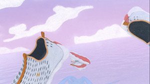


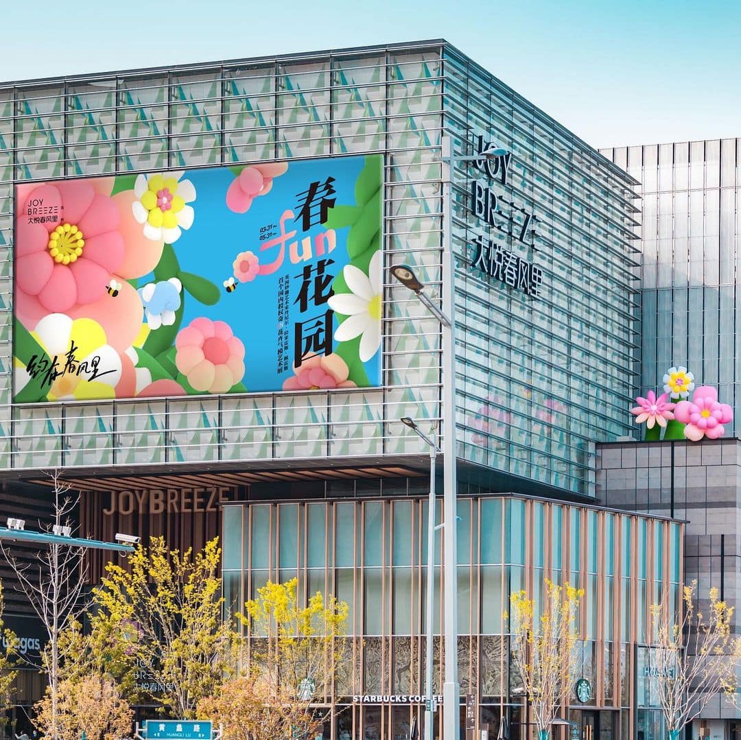


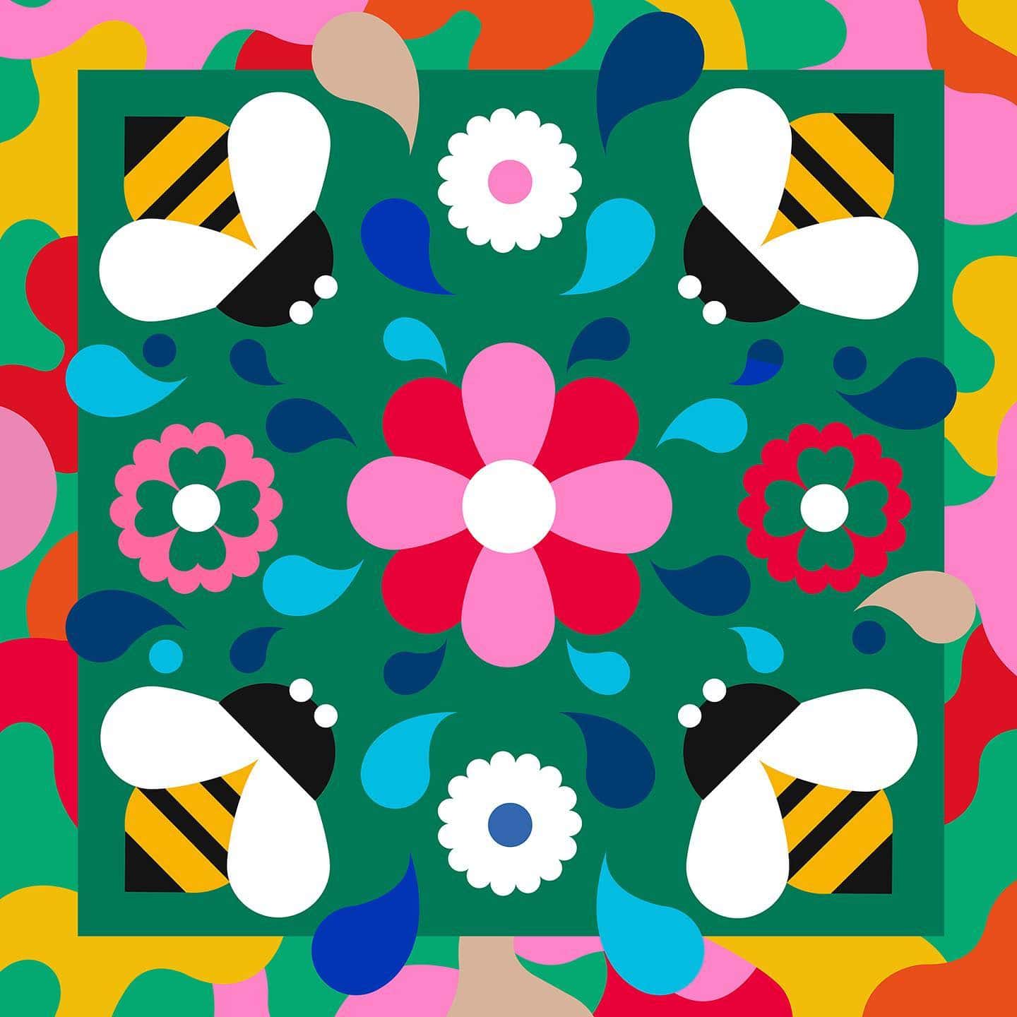


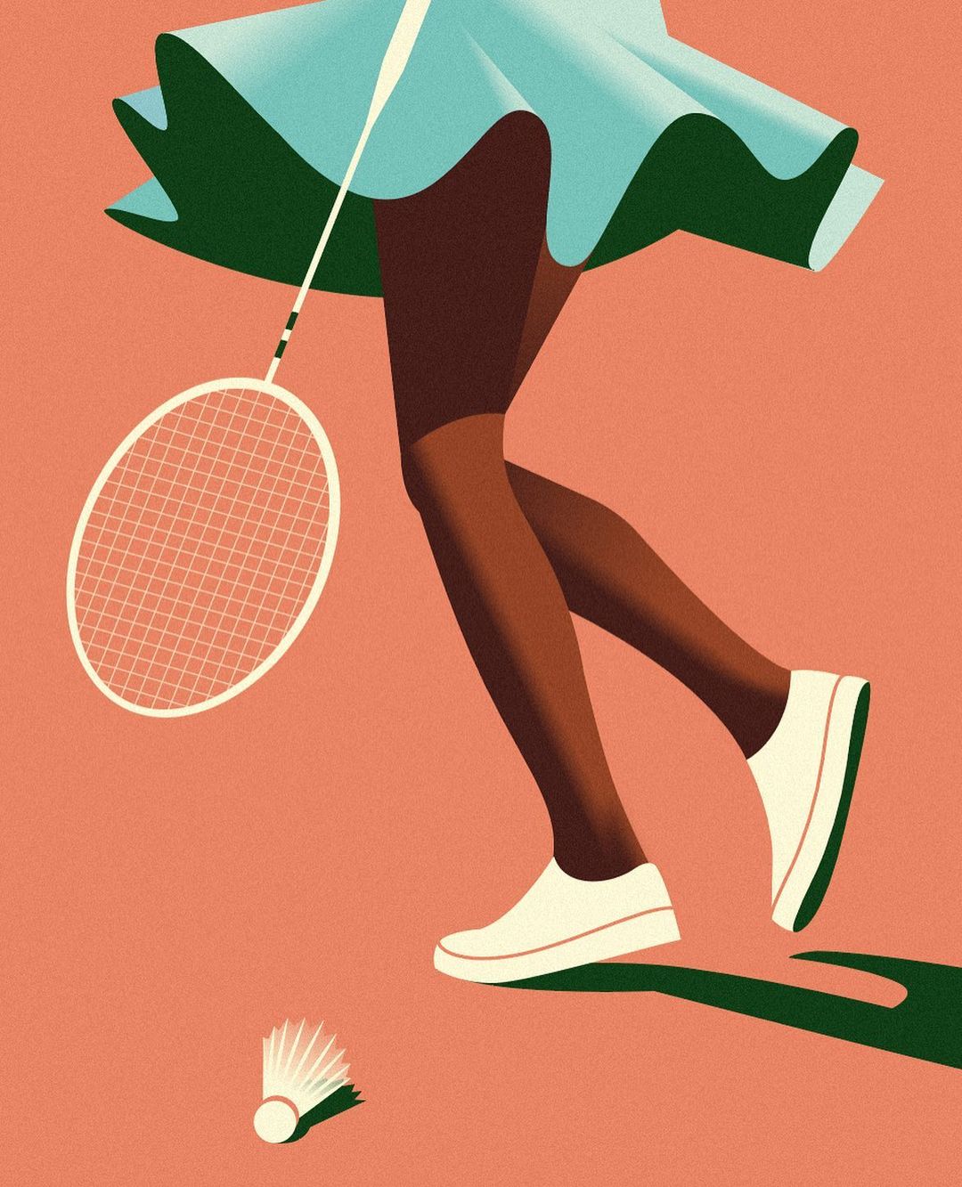

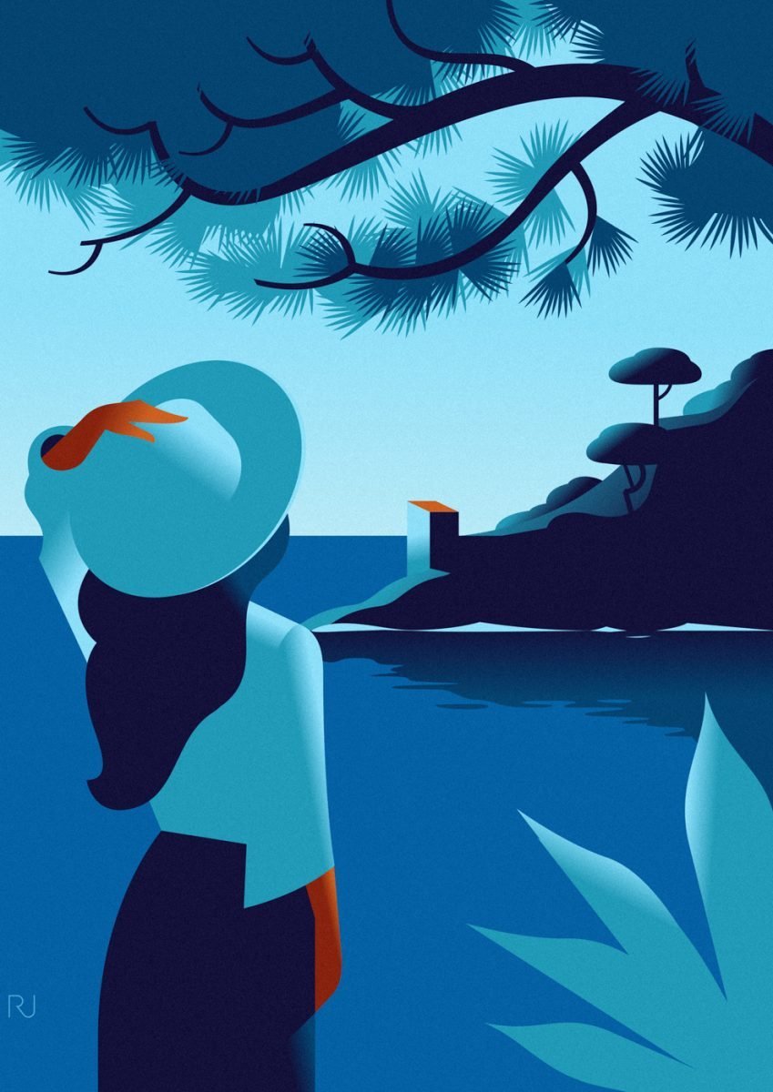


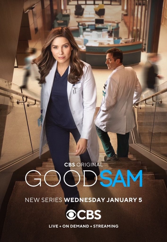


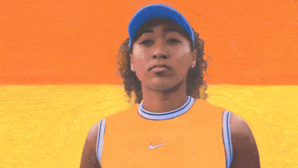


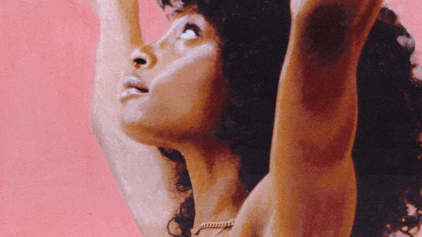


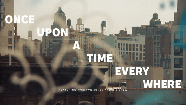


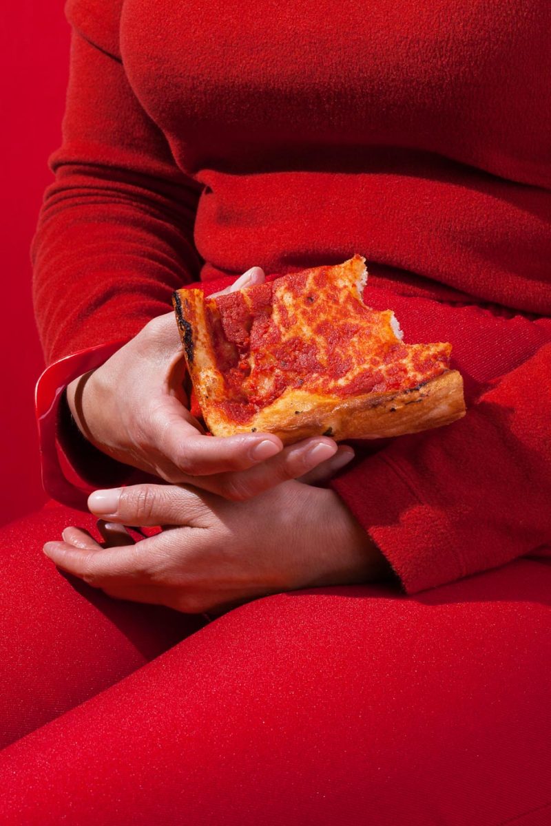


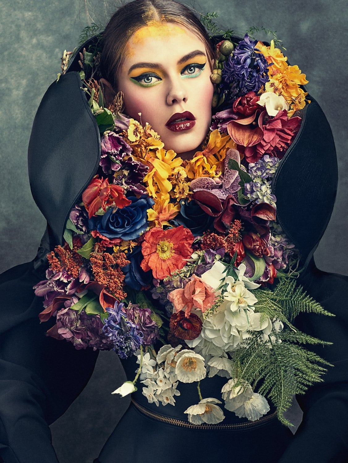


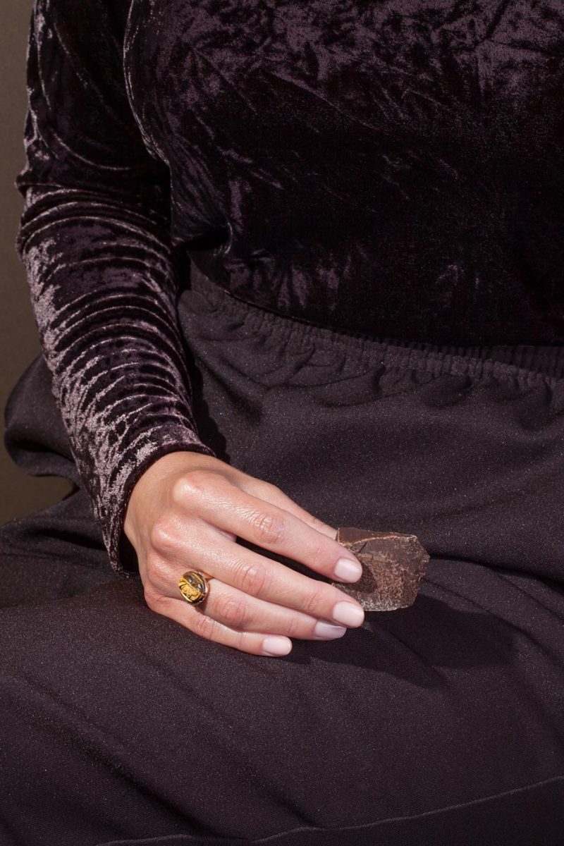
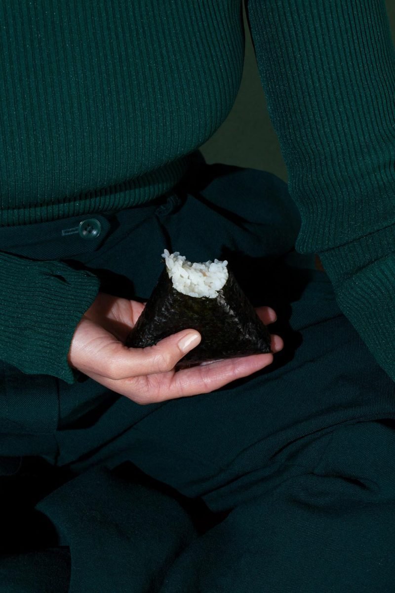


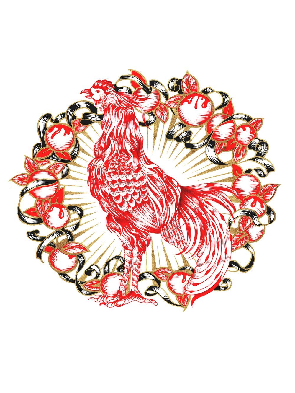


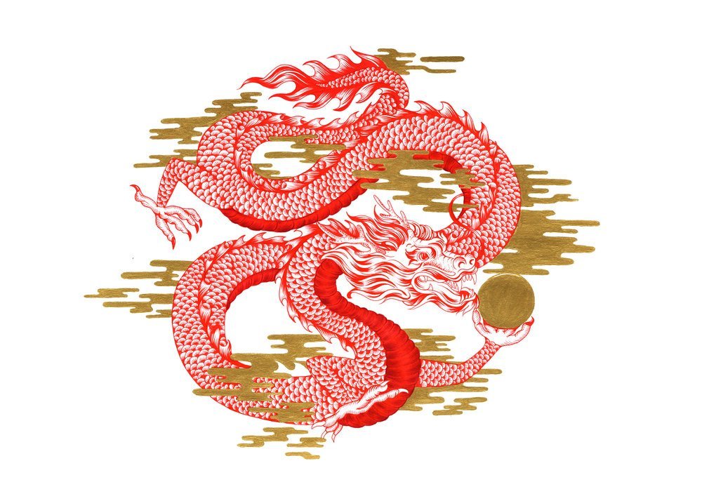


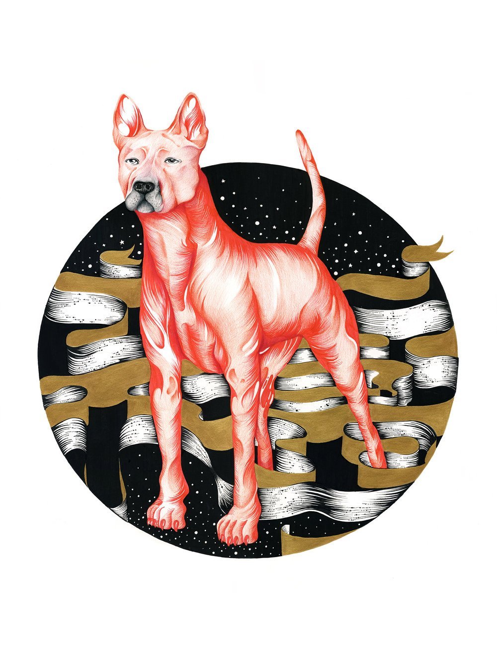


![RamUMGChris Stapleton Spread_Hits Magazine[1]](https://levineleavitt.com/wp-content/uploads/2016/04/RamUMGChris-Stapleton-Spread_Hits-Magazine1-1600x1044.jpg)


 !
!


 “Fine Line is a whole new series created with a kinetic art technique. The appearance of these pieces change in relation with the observer’s point of view and perspective towards the subject, creating a new perception based on the angle the subject is viewed. Fine Line uses the language and lettering as the medium to focus on the paradoxes and contradictions of human existence.”


 This launch kicks off an initiative that combines the campaign, a behind-the-scenes short film and a dynamic social media component all to support


 What are some of the biggest challenges that come with working so far away from your partner? Do you find it easier when you work in the same city or across the universe?


 The Flaming Lips


")


")


")


 A little about the artists:


 “As soon as Obama gave his support for gay marriage it was pretty obvious that he had to go on the cover. There was some discussion as to whether we should carry on with the original concept and have multiple people in the illustration but I really wanted it to be just Obama, I genuinely thought it could be an iconic image… and I think it is!


 Poster by David Calderley of Graphic Therapy. Photo of Tom Waits by Danny Clinch.


 You can see more work by Sean Freeman on the Levine/Leavitt site.


 You can see more work by Sean Freeman on the Levine/Leavitt site.


")
")


 From the press release:


 You can see more work by Danny Clinch on the


 You can see more work by Brosmind on the


")
")
")


AlexT")
JamesDay")
Brosmind")


